Python Machine Learning
Python Tutorial
Python Visualization
Getting Start
W3School - Python Machine Learning
Get more information about Statistics, see Enterprise Analytics
Numpy.org
Pandas.org
SciPy.org
Matplotlib.org
Data Set
In the mind of a computer, a data set is any collection of data. It can be anything from an array to a complete database.
Example of an array:
1 | [99,86,87,88,111,86,103,87,94,78,77,85,86] |
Example of a database:
| Carname | Color | Age | Speed | AutoPass |
|---|---|---|---|---|
| BMW | red | 5 | 99 | Y |
| Volvo | black | 7 | 86 | Y |
| VW | gray | 8 | 87 | N |
| VW | white | 7 | 88 | Y |
| Ford | white | 2 | 111 | Y |
| VW | white | 17 | 86 | Y |
| Tesla | red | 2 | 103 | Y |
| BMW | black | 9 | 87 | Y |
| Volvo | gray | 4 | 94 | N |
| Ford | white | 11 | 78 | N |
| Toyota | gray | 12 | 77 | N |
| VW | white | 9 | 85 | N |
| Toyota | blue | 6 | 86 | Y |
By looking at the array, we can guess that the average value is probably around 80 or 90, and we are also able to determine the highest value and the lowest value, but what else can we do?
And by looking at the database we can see that the most popular color is white, and the oldest car is 17 years, but what if we could predict if a car had an AutoPass, just by looking at the other values?
That is what Machine Learning is for! Analyzing data and predict the outcome!
In Machine Learning it is common to work with very large data sets. In this tutorial we will try to make it as easy as possible to understand the different concepts of machine learning, and we will work with small easy-to-understand data sets.
Descriptive Statistics for Numerical Data
- Measures of location
- Measures of dispersion
- Measures of shape
- Measures of association
Measures of Location
- Measures of Central Tendency
- Data Profile
Measures of Central Tendency
- Mean - The average value
- Median - The midpoint value
- Mode - The most common value
Mean
The mean value is the average value.
- Population mean: $\mu = \displaystyle \frac{\sum^N_{i=1}x_i}{N}$
- Sample mean: $\bar x = \displaystyle \frac{\sum^N_{i=1}x_i}{n}$
To calculate the mean, find the sum of all values, and dived the sum by the number of values:
Example: We have registered the speed of 13 cars:
1 | speed = [99,86,87,88,111,86,103,87,94,78,77,85,86] |
1 | speed = [99,86,87,88,111,86,103,87,94,78,77,85,86] |
Use the NumPy mean() method to find the average speed:
1 | import numpy as np |
1 | speed <- c(99,86,87,88,111,86,103,87,94,78,77,85,86) |
Median
The median value is the value in the middle, after you have sorted all the values:
It is important that the numbers are sorted before you can find the median.
Example: We have registered the speed of 13 cars:
1 | speed = [99,86,87,88,111,86,103,87,94,78,77,85,86] |
1 | speed = [99,86,87,88,111,86,103,87,94,78,77,85,86] |
Use the NumPy median() method to find the middle value:
1 | import numpy as np |
1 | speed <- c(99,86,87,88,111,86,103,87,94,78,77,85,86) |
If there are two numbers in the middle, divide the sum of those numbers by two.
Example: We have registered the speed of 12 cars:
1 | speed = [77, 78, 85, 86, 86, 86, 87, 87, 94, 98, 99, 103] |
1 | speed = [77, 78, 85, 86, 86, 86, 87, 87, 94, 98, 99, 103] |
Use the NumPy median() method to find the middle value:
1 | import numpy as np |
1 | speed <- c(77, 78, 85, 86, 86, 86, 87, 87, 94, 98, 99, 103) |
Mode
The Mode value is the value that appears the most number of times:
Use the SciPy mode() method to find the number that appears the most:
Example: We have registered the speed of 13 cars:
1 | speed = [99,86,87,88,111,86,103,87,94,78,77,85,86] |
1 | from scipy import stats |
1 | # Create the function. |
Data Profiles (Fractiles)
Describe the location and spread of data over its range
- Quartiles – a division of a data set into four equal parts; shows the points below which 25%, 50%, 75% and 100% of the observations lie (25% is the first quartile, 75% is the third quartile, etc.)
- Deciles – a division of a data set into 10 equal parts; shows the points below which 10%, 20%, etc. of the observations lie
- Percentiles – a division of a data set into 100 equal parts; shows the points below which “k” percent of the observations lie
Measures of Dispersion
- Dispersion – the degree of variation in the data.
- Example:
- {48, 49, 50, 51, 52} vs. {10, 30, 50, 70, 90}
- Both means are 50, but the second data set has larger dispersion
- Example:
Variance
- Population variance: $\displaystyle \sigma^2 = \frac{\sum^N_{i=1}(x_i - \mu)^2}{N}$
- Sample variance: $\displaystyle s^2 = \frac{\sum^N_{i=1}(x_i - \bar x)^2}{n - 1}$
Standard Deviation
- Population SD: $\displaystyle \sigma = \sqrt{\frac{\sum^N_{i=1}(x_i - \mu)^2}{N}}$
- Sample SD: $\displaystyle s = \sqrt{\frac{\sum^N_{i=1}(x_i - \bar x)^2}{n - 1}}$
- The standard deviation has the same units of measurement as the original data, unlike the variance
Measures of Shape
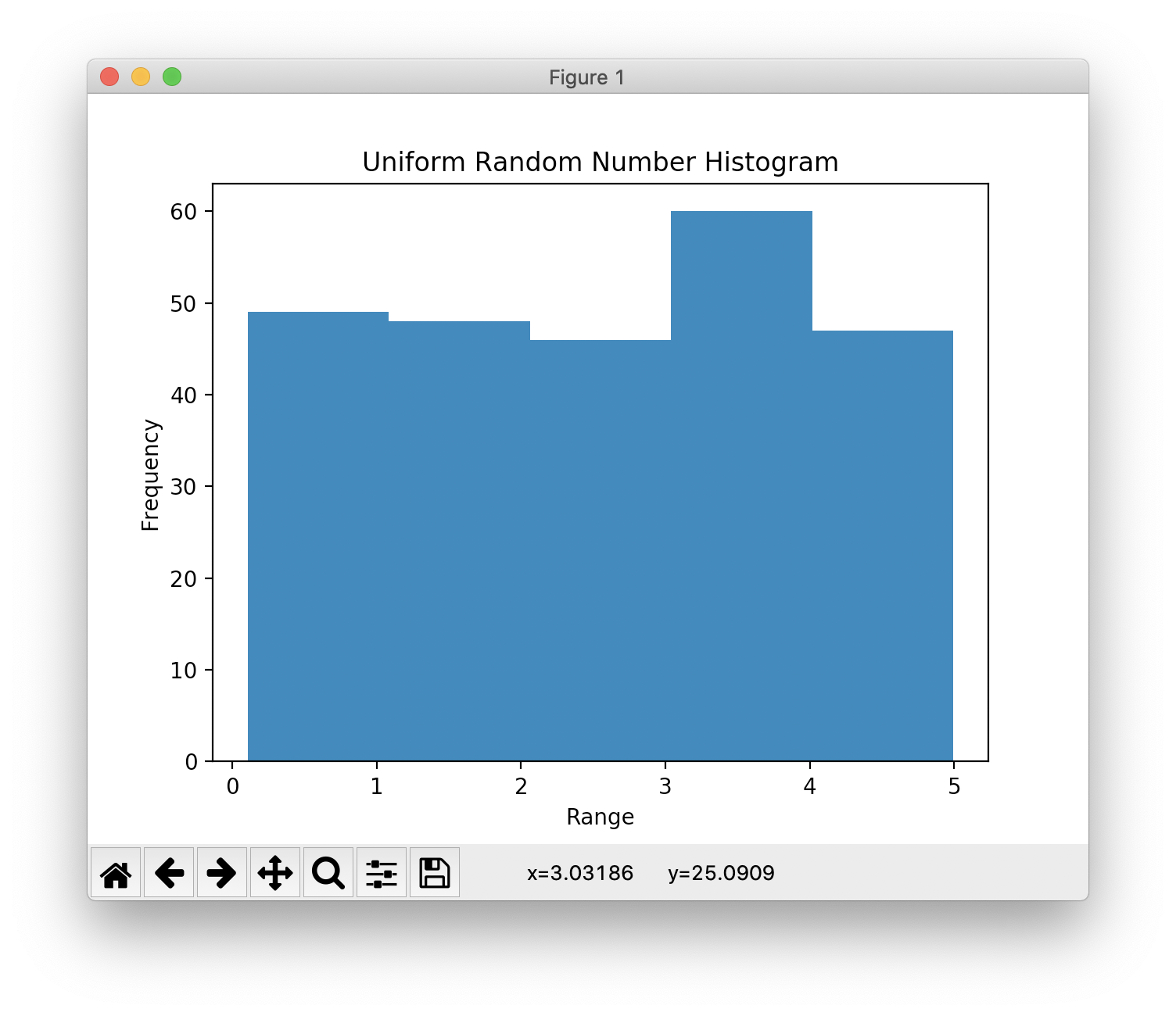
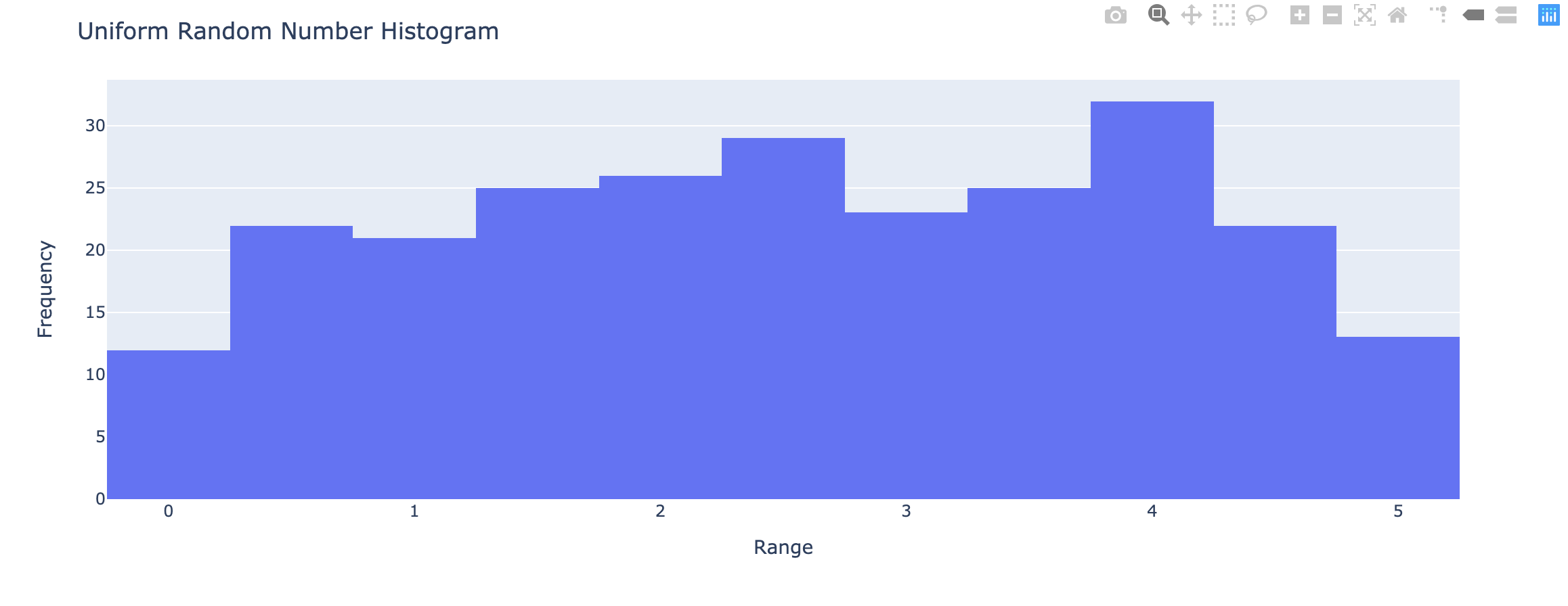
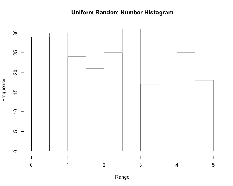
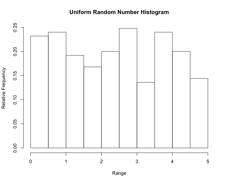
Uniform Distribution
Earlier in this tutorial we have worked with very small amounts of data in our examples, just to understand the different concepts.
In the real world, the data sets are much bigger, but it can be difficult to gather real world data, at least at an early stage of a project.
How Can we Get Big Data Sets?
To create big data sets for testing, we use the Python module NumPy, which comes with a number of methods to create random data sets, of any size.
Create an array containing 250 random floats between 0 and 5:
1 | import numpy as np |
1 | x <- runif(250, min = 0, max = 5) |
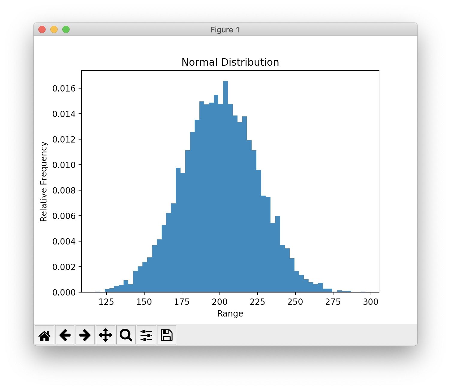
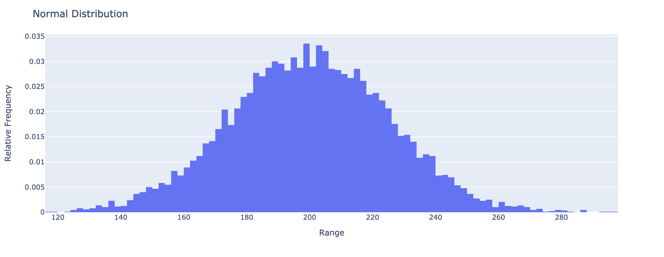
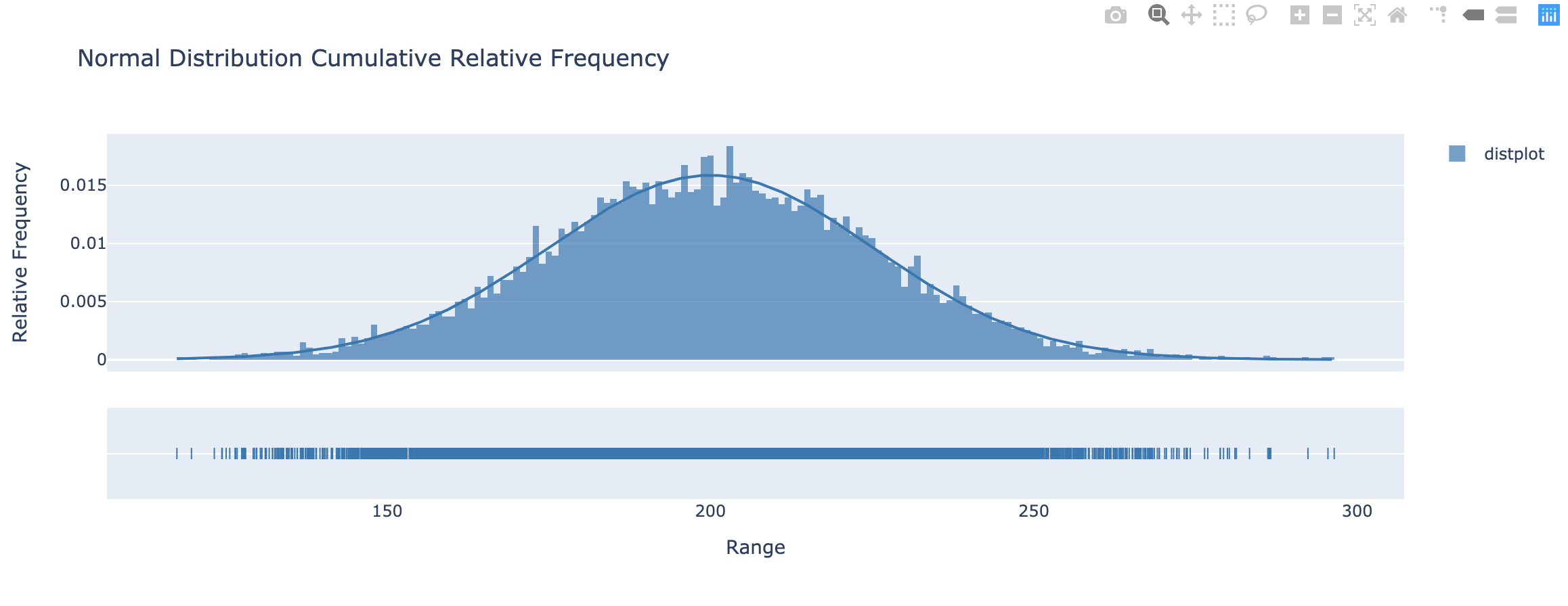
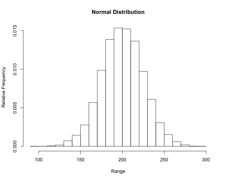
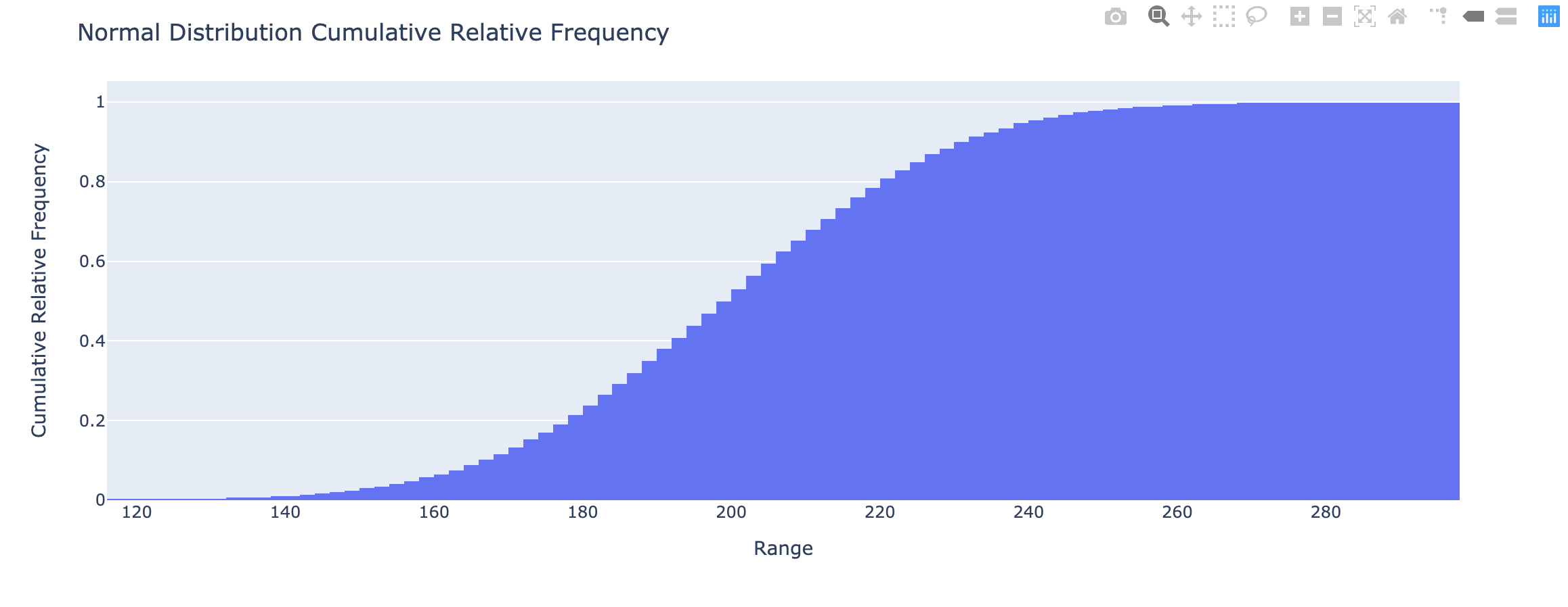
Histogram & Relative Frequency Distribution
- A graphical representation of a frequency distribution
- Relative frequency – fraction or proportion of observations that fall within a cell
Histogram & Relative Frequency Distribution in matplotlib
1 | import numpy as np |

1 | import numpy as np |

1 | x <- runif(250, min = 0, max = 5) |
1 | import numpy as np as np |
1 | import numpy as np |
1 | import plotly.figure_factory as ff |
1 | set.seed(100) |
- Cumulative relative frequency – proportion or percentage of observations that fall below the upper limit of a cell
https://matplotlib.org/3.1.1/gallery/statistics/histogram_cumulative.html
https://docs.scipy.org/doc/scipy/reference/generated/scipy.stats.cumfreq.html
1 | import numpy as np |
Unsupervised Learning
What is unsupervised machine learning?
- Unsupervised learning finds patterns in data
- E.g. clustering customers by their purchases
- Compressing the data using purchase patterns (dimension reduction)
Supervised learning vs Unsupervised learning
- Supervised learning finds patterns for a prediction task
- E.g. classify tumors as benign or cancerous (labels)
- Unsupervised learning finds patterns in data
- but without a specific prediction task in mind
k-means clustering
- Finds clusters of samples
- Number of clusters must be specified
- Implemented in sklearn (“
scikit-learn“)
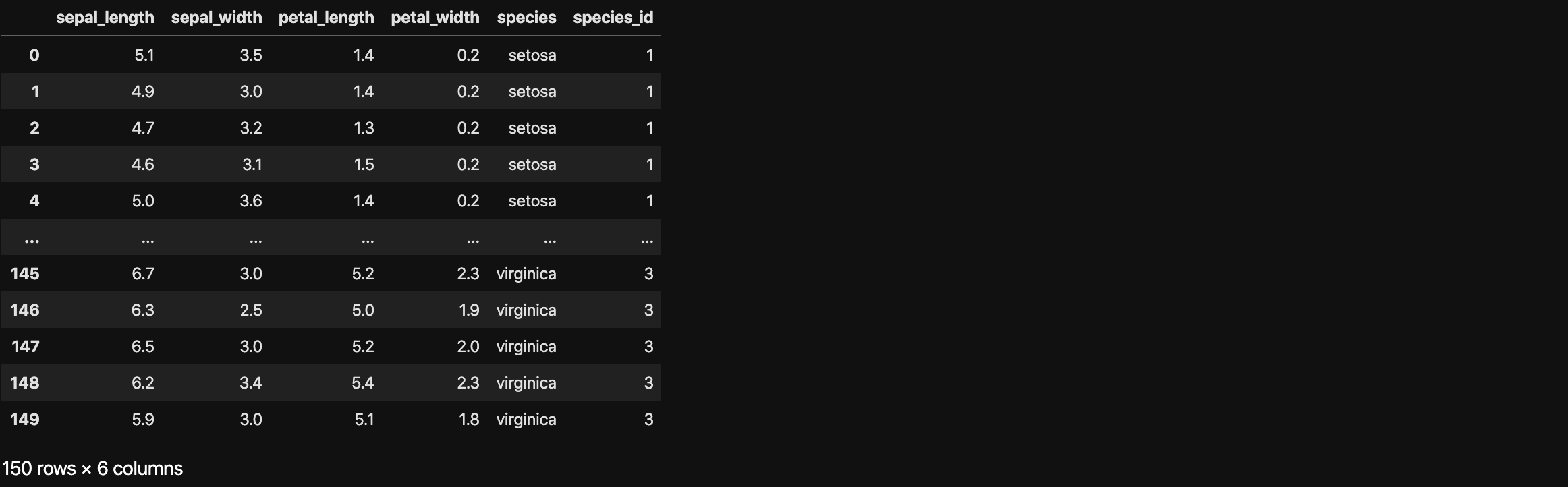
Example: Iris dataset
- Description: Measurements of many iris plants
- Columns are measurements (the features)
- Rows represent iris plants (the samples)
- Classification: 3 species of iris:
setosa,versicolor,virginica - Features:
Petal length,petal width,sepal length,sepal width(the features of the dataset) - Targets: Try to classify flowers in different species based on the four features
Dimensions
Iris data is 4-dimensional
- Iris samples are points in 4 dimensional space
- Dimension = number of features
- Dimension too high to visualize!
- … but unsupervised learning gives insight
1 | # import data and modules |
Take a glance at the dataset, the petal_length is a huge difference between setosa and virginica. For example, the average height of humans must be a number between 1 meter to 2 meters. If there is one has 5 meters height, you would better do not classify it as a human; you would better just run away. So you might not classify a iris plant with 5 cm petal_length as a setosa.
Clusters
1 | # Kmeans |
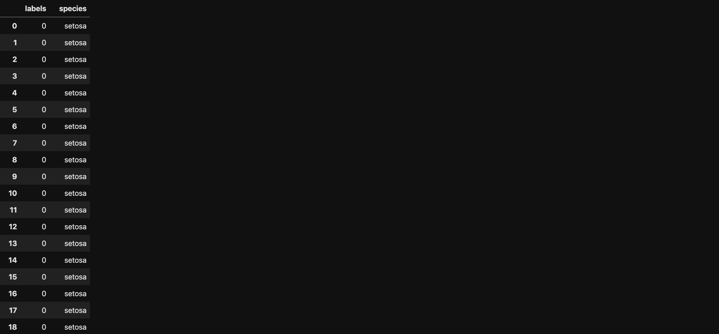
In the original dataset, 150 rows are 100 rows are setosa, 51versicolor, and 101~150 rows are virginica. After observing the results. We can replace the results from numbers to string leading to more readable.
1 | # Convert labels from ndarray to dataframe |
Predictive testing
- New samples can be assigned to existing clusters
- k-means remembers the mean of each cluster (the “centroids”)
- Finds the nearest centroid to each new sample
- In other words, checking the accuracy through testing dataset
1 | # Predictive testing |

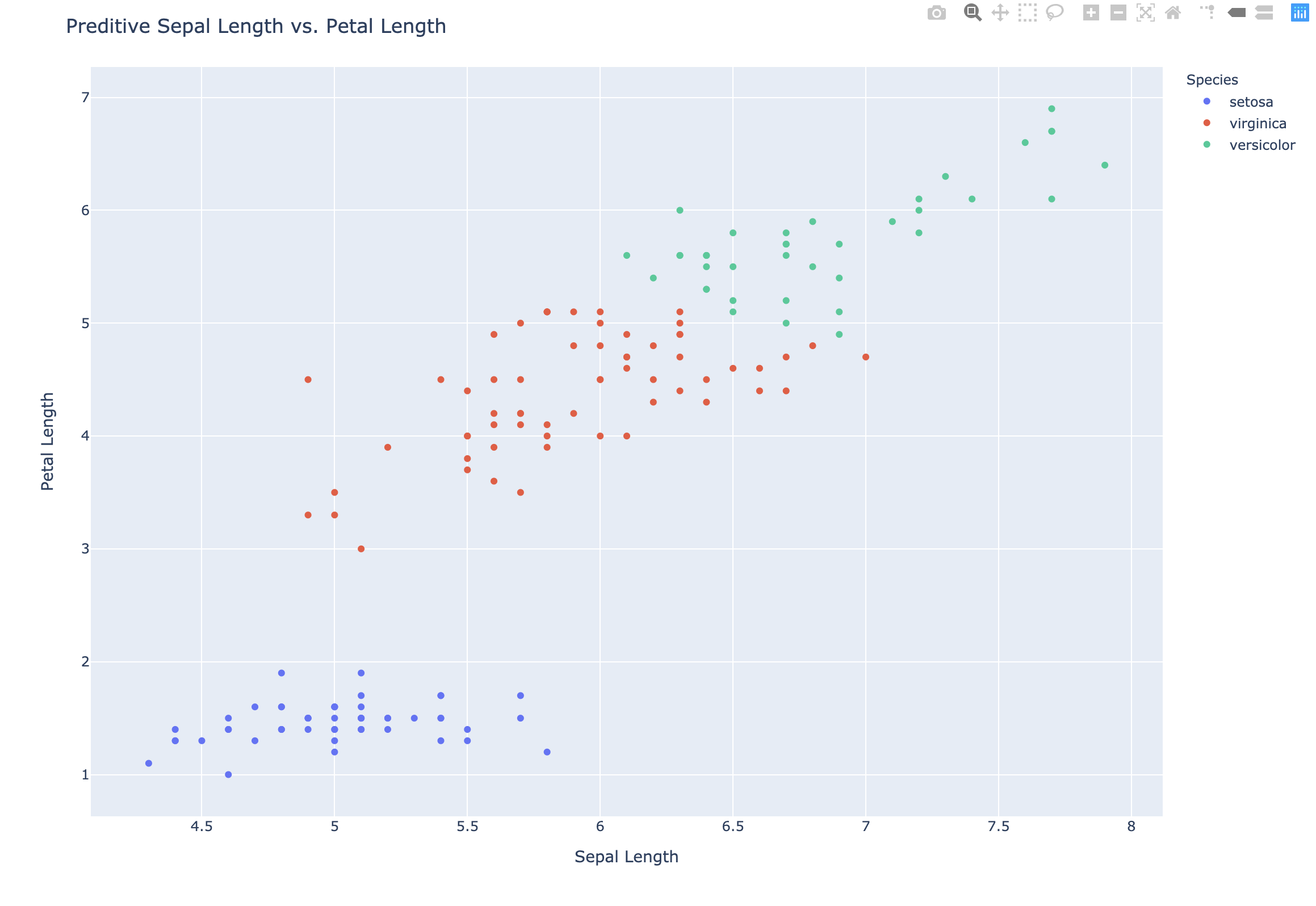
Here are three new samples. And after using our model, we predict that a flower has the following features should be classified to setosa:
Petal length: 5.7petal width: 4.4sepal length: 1.5sepal width: 0.4
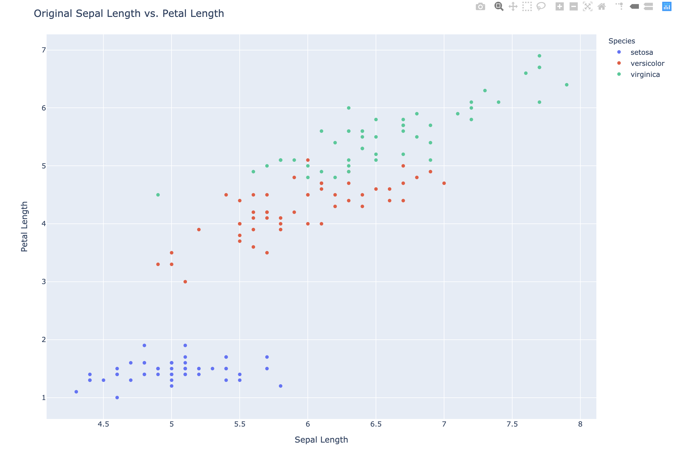
Scatter plots
- Scatter plot of sepal length vs. petal length
- Each point represents an iris sample
- Color points by cluster labels
- PyPlot (`plotly.express)
1 | # Original Scatter plot |
1 | # Preditive Scatter plot |
Evaluating a clustering
- Can check correspondence with e.g. iris species
- … but what if there are no species to check against?
- Measure quality of a clustering
- Informs choice of how many clusters to look for
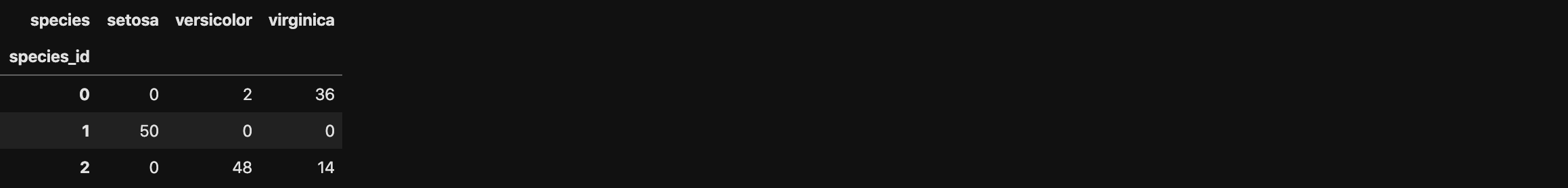
Cross tabulation with pandas
- Clusters vs species is a “cross-tabulation”
- Use the
pandaslibrary - Given the species of each sample as a list species
1 | # Create new dataframe df2 combined labels and species from df |
1 | # Create the cross table |
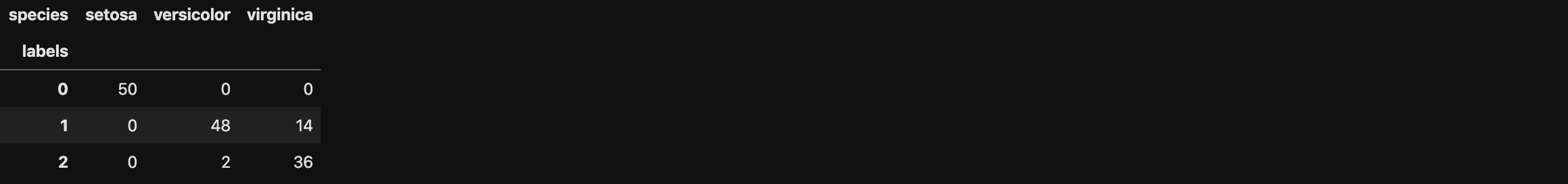
Iris: clusters vs species
- k-means found 3 clusters amongst the iris samples
- Do the clusters correspond to the species?
Notice this is the distribution of the result. We can see that setosa has a 100% accuracy. And versicolor is also good enough. But the accuracy of virginica should be improved.
Measuring clustering quality
- Using only samples and their cluster labels
- A good clustering has tight clusters
- … and samples in each cluster bunched together
Inertia measures clustering quality
- Measures how spread out the clusters are (lower is better)
- Distance from each sample to centroid of its cluster
- After fit(), available as attribute
inertia_ - k-means attempts to minimize the inertia when choosing clusters
1 | # model inertia |
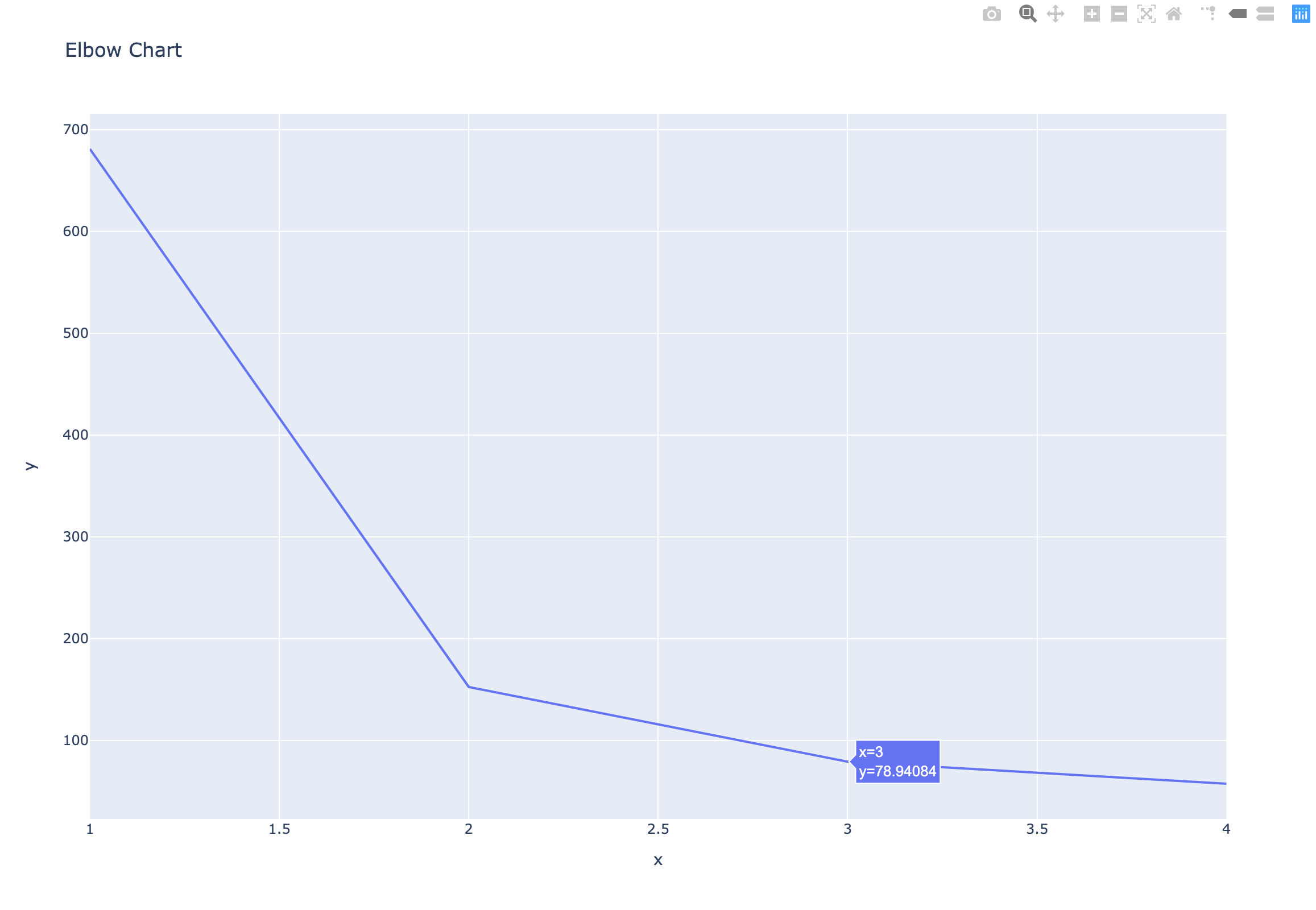
The number of clusters - Elbow Chart
- Clusterings of the iris dataset with different numbers of clusters
- More clusters means lower inertia
- What is the best number of clusters?
1 | # Define number of clusters & inertias |
How many clusters to choose?
- A good clustering has tight clusters (so low inertia)
- … but not too many clusters!
- Choose an “elbow” in the inertia plot
- Where inertia begins to decrease more slowly
- E.g. for iris dataset, 3 is a good choice
1 | # Draw the Elbow Chart |
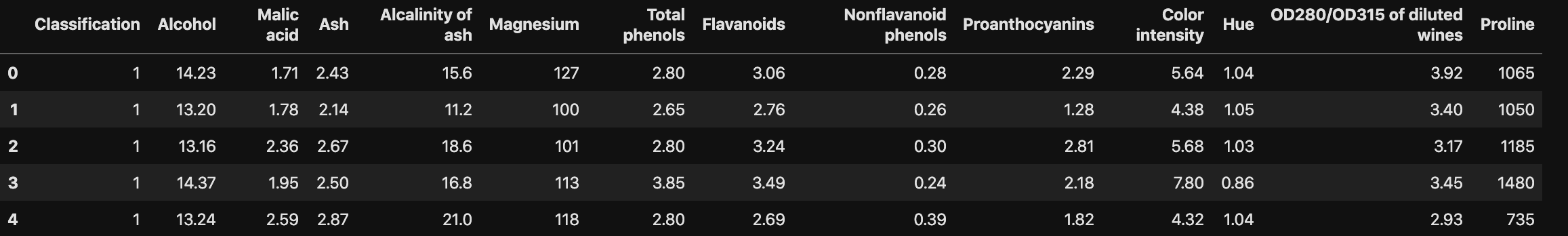
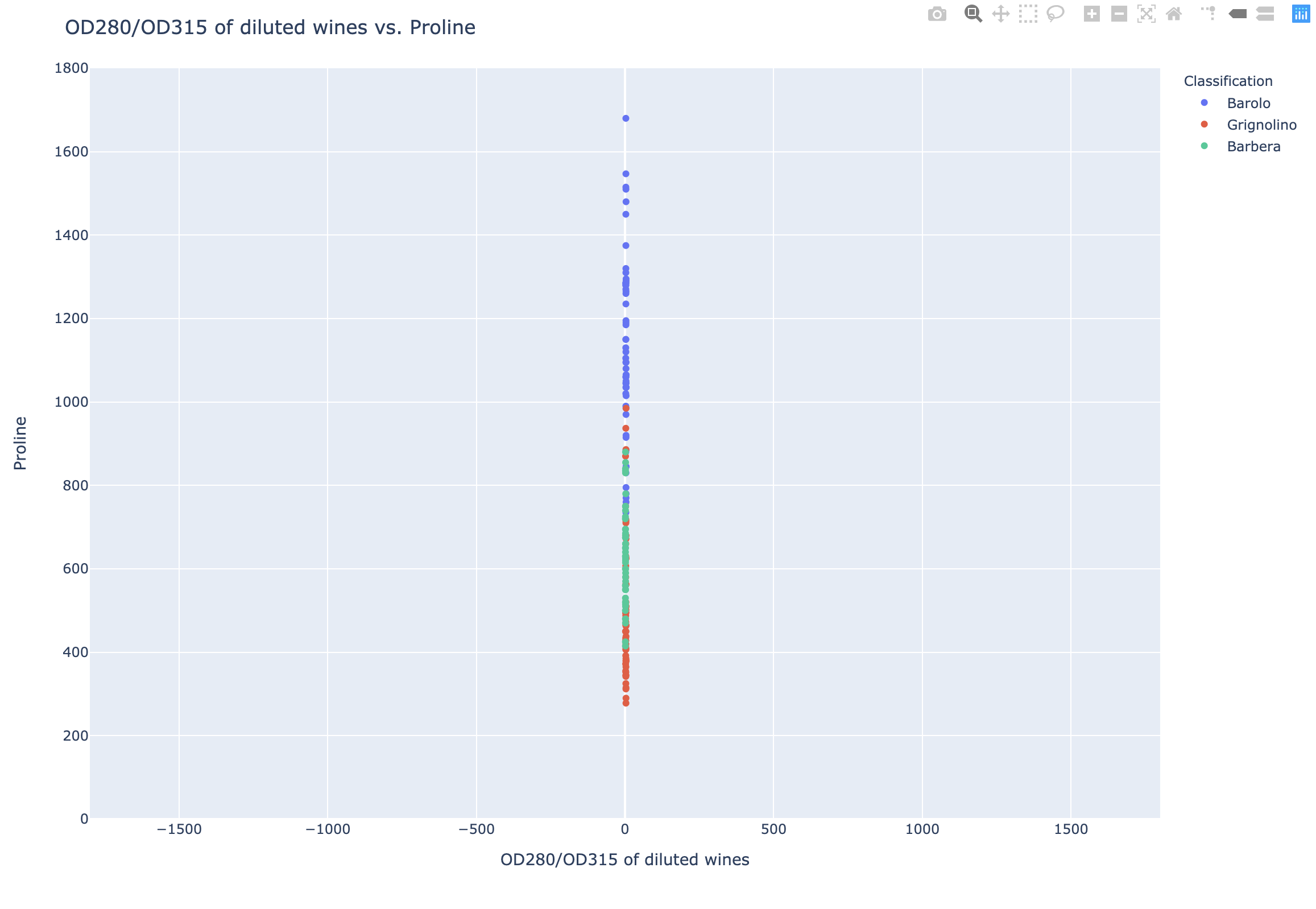
Example: Piedmont wines dataset
- 178 samples from 3 distinct varieties of red wine:
Barolo,GrignolinoandBarbera - Features measure chemical composition e.g. alcohol content
- … also visual properties like “color intensity”
Data Set Information:
These data are the results of a chemical analysis of wines grown in the same region in Italy but derived from three different cultivars. The analysis determined the quantities of 13 constituents found in each of the three types of wines.
I think that the initial data set had around 30 variables, but for some reason I only have the 13 dimensional version. I had a list of what the 30 or so variables were, but a.) I lost it, and b.), I would not know which 13 variables are included in the set.
The attributes are (dontated by Riccardo Leardi, riclea ‘@’ anchem.unige.it )
- Alcohol
- Malic acid
- Ash
- Alcalinity of ash
- Magnesium
- Total phenols
- Flavanoids
- Nonflavanoid phenols
- Proanthocyanins
- Color intensity
- Hue
- OD280/OD315 of diluted wines
- Proline
Data Preprocessing
1 | # import data and modules |
1 | # Replace the Classification value from number to wine name |
K-means clustering without standardization
1 | # k-means clustering without standardization |

1 | df3 = pd.DataFrame({'labels': labels, 'varieties': df2['Classification']}) |

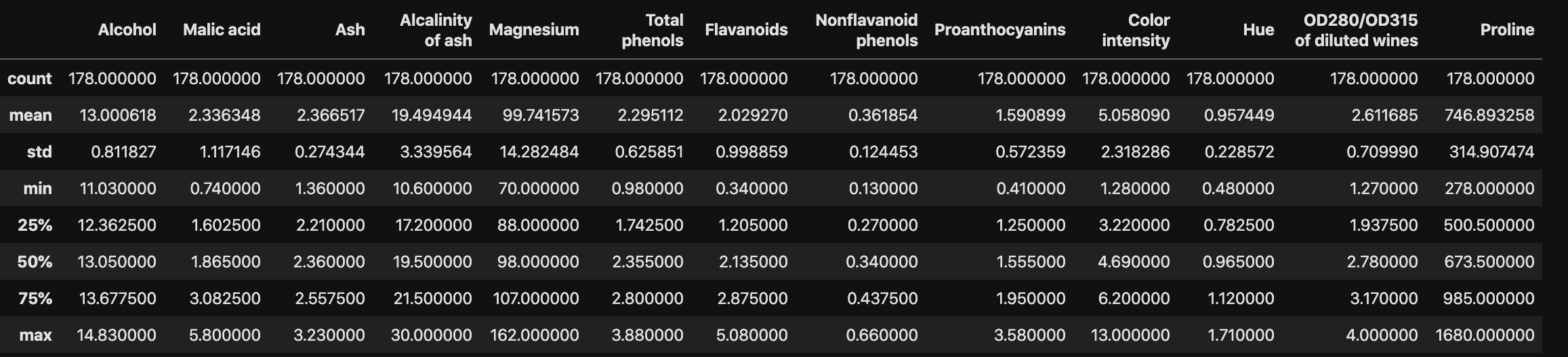
Data Profile
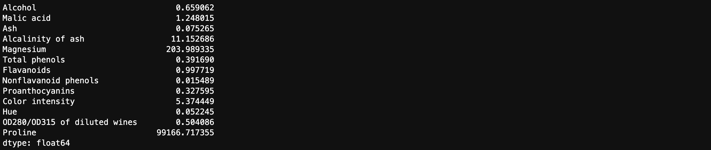
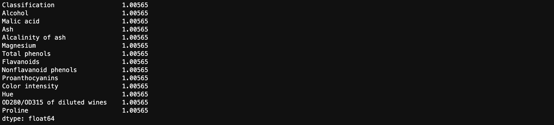
Feature variances
- The wine features have very different variances!
- Variance of a feature measures spread of its values
1 | # descriptive analytics |
1 | # descriptive analytics |
1 | fig = px.scatter(df, x = 'OD280/OD315 of diluted wines', y = 'Proline', color = 'Classification', |
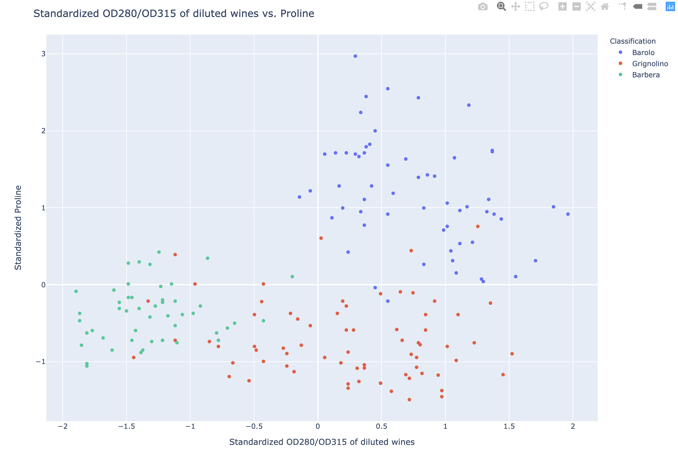
Standardization: StandardScaler
- In kmeans: feature variance = feature influence
- StandardScaler transforms each feature to have mean 0 and variance 1
- Features are said to be “standardized”
1 | # Standardization |
1 | fig = px.scatter(df2, x = df_scaled['OD280/OD315 of diluted wines'], y = df_scaled['Proline'], color = 'Classification', |
Similar methods
- StandardScaler and KMeans have similar methods, BUT
- Use
fit()/ transform() with StandardScaler - Use
fit()/ predict() with KMeans
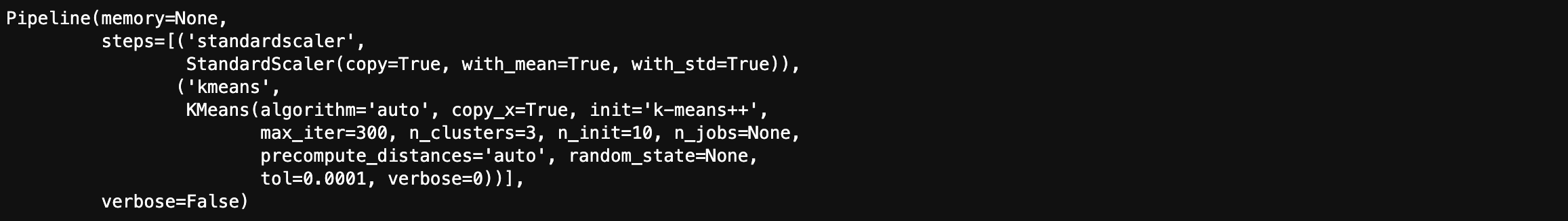
K-means clustering with standardization
StandardScaler, then KMeans
- Need to perform two steps: StandardScaler, then KMeans
- Use sklearn
pipelineto combine multiple steps - Data flows from one step into the next
Standardization rescales data to have a mean ($\mu$) of 0 and standard deviation ($\sigma$) of 1 (unit variance).
$$X_{changed} = \frac{X - \mu}{\sigma}$$
For most applications standardization is recommended.
1 | # K-means clustering with standardization |
1 | scaled_labels = pipeline.predict(df.iloc[:, 1:14]) |

1 | df_scaled = pd.DataFrame({'labels': scaled_labels, 'varieties': df2['Classification']}) |

Without feature standardization was very bad:
K-means clustering with normalization
- StandardScaler is a “preprocessing” step
- MaxAbsScaler and Normalizer are other examples
Normalization rescales the values into a range of $[0,1]$. This might be useful in some cases where all parameters need to have the same positive scale. However, the outliers from the data set are lost.
$$X_{changed} = \frac{X - X_{min}}{X_{max} - X_{min}}$$
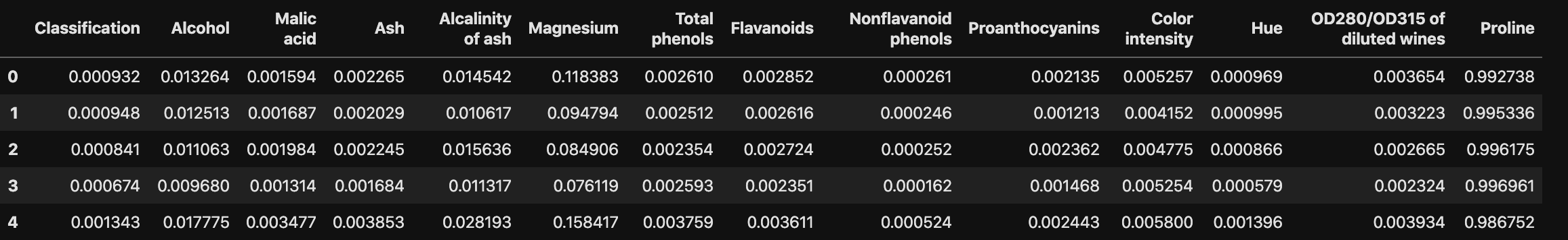
1 | # Another option: Normalization |
1 | df_norm.head() |
1 | # Make a pipeline chaining normalizer and kmeans: pipeline |
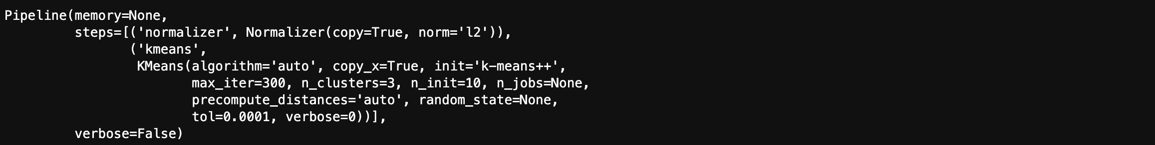
1 | norm_labels = pipeline.predict(df.iloc[:, 1:14]) |

1 | df_norm = pd.DataFrame({'labels': norm_labels, 'varieties': df2['Classification']}) |

Supervised Machine Learning
ML: The art and science of:
- Giving computers the ability to learn to make decisions from data
- without being explicitly programmed!
Examples:
- Learning to predict whether an email is spam or not
- Clustering wikipedia entries into different categories
Difference between Supervised learning and Unsupervised learning:
- Supervised learning: Uses labeled data
- Unsupervised learning: Uses unlabeled data
Unsupervised learning
- Uncovering hidden patterns from unlabeled data
- Example: Grouping customers into distinct categories (Clustering)
Reinforcement learning
- Software agents interact with an environment
- Learn how to optimize their behavior
- Given a system of rewards and punishments
- Draws inspiration from behavioral psychology
- Applications
- Economics
- Genetics
- Game playing
- AlphaGo: First computer to defeat the world champion in Go
Supervised learning
- Predictor variables/features and a target variable
- Aim: Predict the target variable, given the predictor variables
- Classification: Target variable consists of categories
- Regression: Target variable is continuous
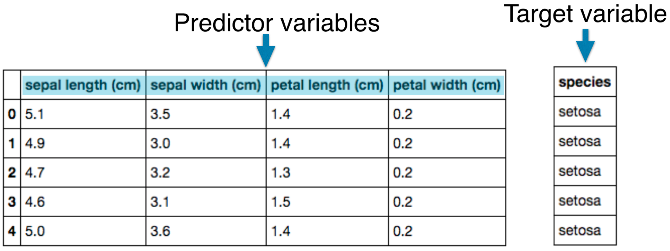
Naming conventions
- Features = predictor variables = independent variables
- Target variable = dependent variable = response variable
Supervised learning
- Automate time-consuming or expensive manual tasks
- Example: Doctor’s diagnosis
- Make predictions about the future
- Example: Will a customer click on an ad or not?
- Need labeled data
- Historical data with labels
- Experiments to get labeled data
- Crowd-sourcing labeled data
Supervised learning in Python
- We will use scikit-learn/sklearn
- Integrates well with the SciPy stack
- Other libraries
- TensorFlow
- keras
Matplotlib
Intro to pyplot
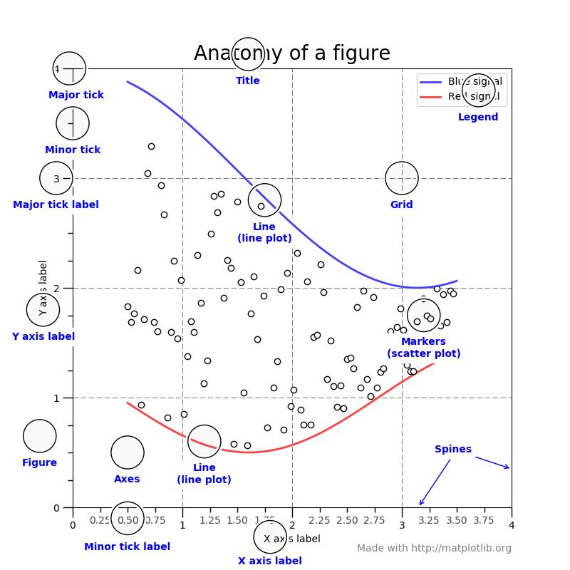
matplotlib.pyplot is a collection of command style functions that make matplotlib work like MATLAB. Each pyplot function makes some change to a figure: e.g., creates a figure, creates a plotting area in a figure, plots some lines in a plotting area, decorates the plot with labels, etc.
In matplotlib.pyplot various states are preserved across function calls, so that it keeps track of things like the current figure and plotting area, and the plotting functions are directed to the current axes (please note that “axes” here and in most places in the documentation refers to the axes part of a figure and not the strict mathematical term for more than one axis).
Generating visualizations with pyplot is very quick:
1 | import matplotlib.pyplot as plt |
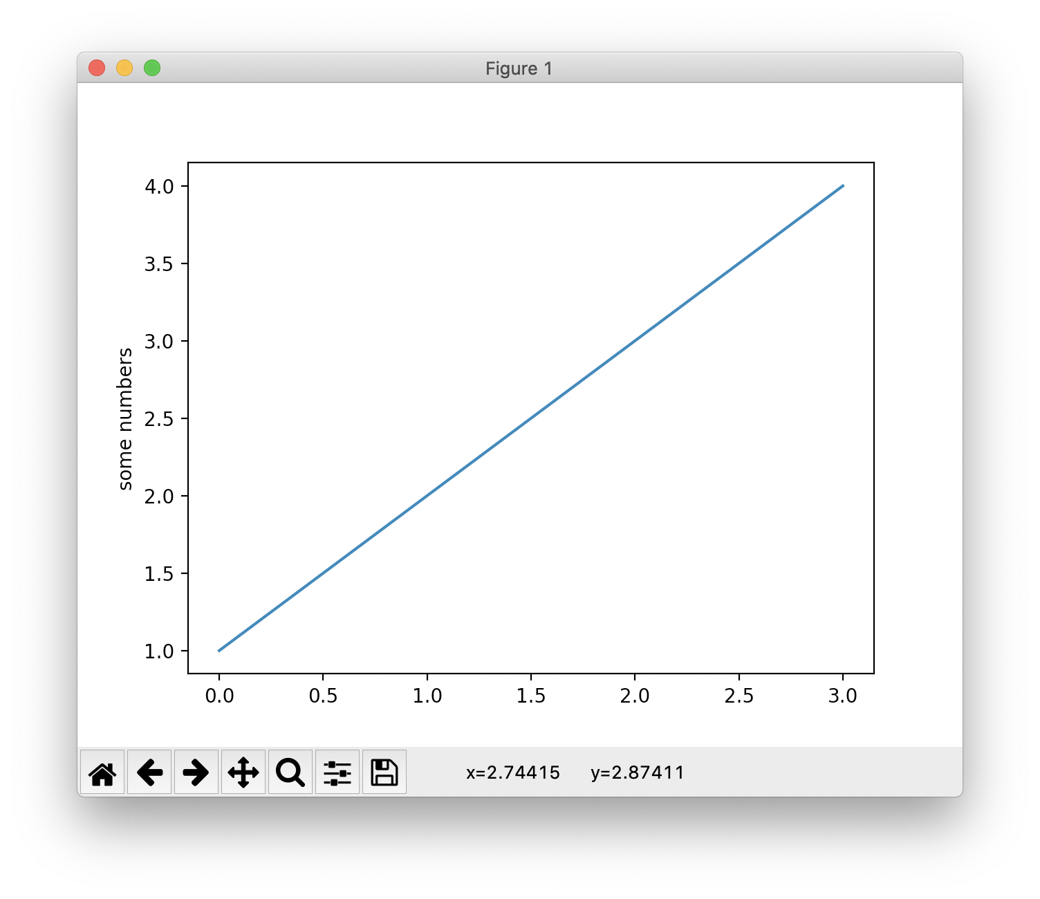
You may be wondering why the x-axis ranges from 0-3 and the y-axis from 1-4. If you provide a single list or array to the plot() command, matplotlib assumes it is a sequence of y values, and automatically generates the x values for you. Since python ranges start with 0, the default x vector has the same length as y but starts with 0. Hence the x data are [0,1,2,3].
Therefore, matplotlib automatically generate the x value [0, 1, 2, 3] for the counterpart y value [1, 2, 3, 4]. Then you have the coordinates (0, 1), (1, 2), (2, 3), (3, 4).
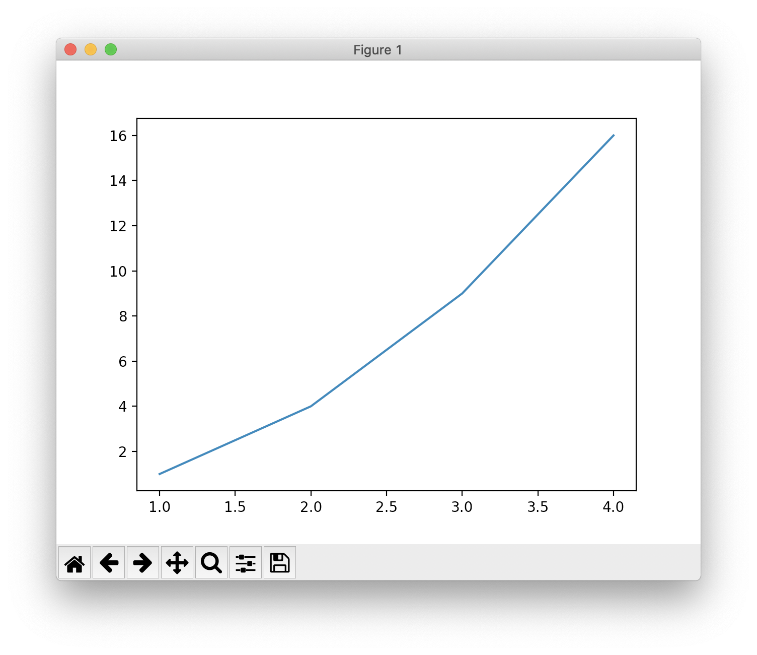
plot() is a versatile command, and will take an arbitrary number of arguments. For example, to plot x versus y, you can issue the command:
1 | plt.plot([1, 2, 3, 4], [1, 4, 9, 16]) |
Formatting the style of your plot
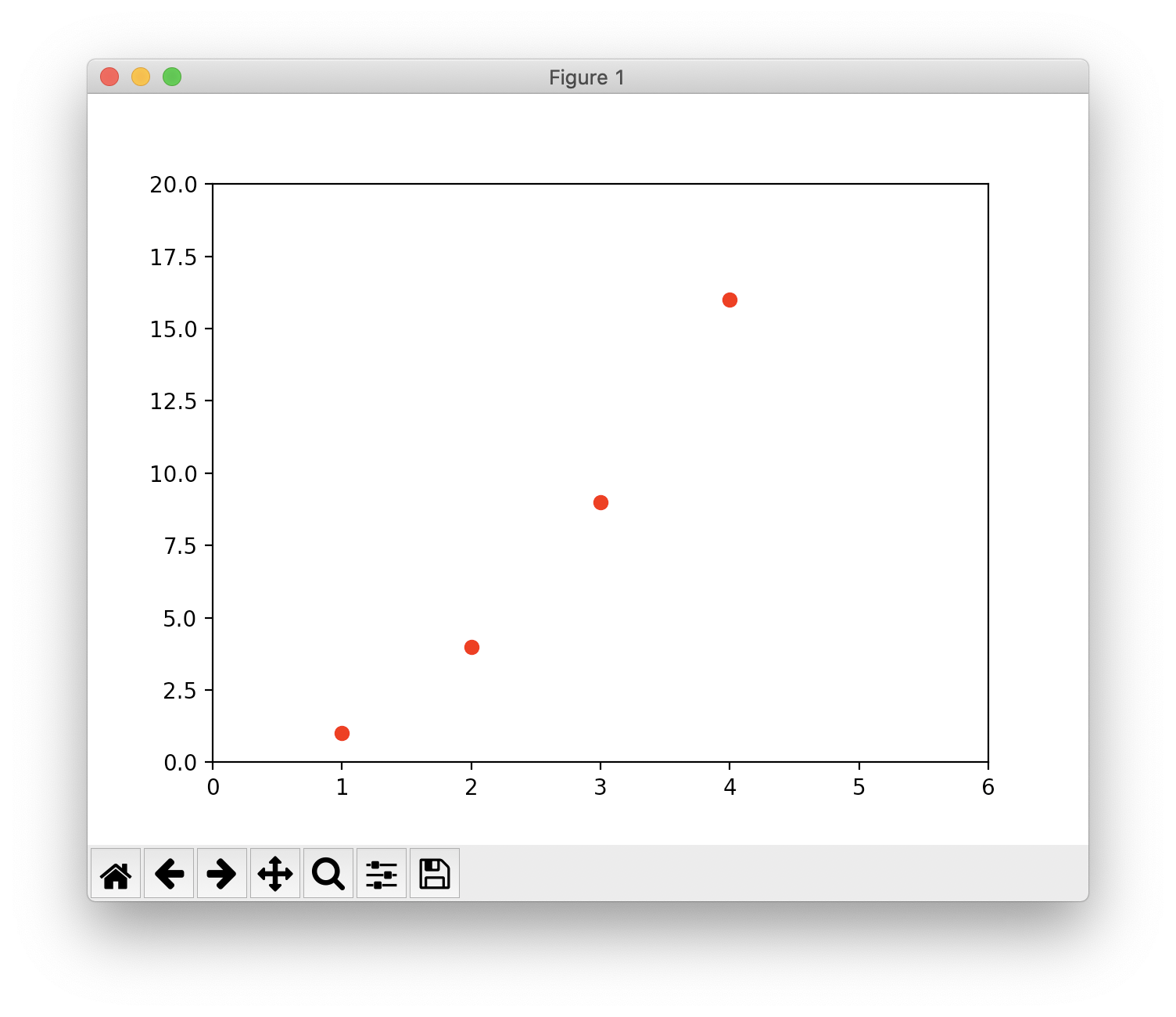
For every x, y pair of arguments, there is an optional third argument which is the format string that indicates the color and line type of the plot. The letters and symbols of the format string are from MATLAB, and you concatenate a color string with a line style string. The default format string is ‘b-‘, which is a solid blue line. For example, to plot the above with red circles, you would issue
1 | plt.plot([1, 2, 3, 4], [1, 4, 9, 16], 'ro') # 'ro' for red circles |
One More Thing
Python Algorithms - Words: 2,640
Python Crawler - Words: 1,663
Python Data Science - Words: 4,551
Python Django - Words: 2,409
Python File Handling - Words: 1,533
Python Flask - Words: 874
Python LeetCode - Words: 9
Python Machine Learning - Words: 5,532
Python MongoDB - Words: 32
Python MySQL - Words: 1,655
Python OS - Words: 707
Python plotly - Words: 6,649
Python Quantitative Trading - Words: 353
Python Tutorial - Words: 25,451
Python Unit Testing - Words: 68