XN Project for GE Aviation
ALY6080
Northeastern University
February 12, 2020
Danlin Shen

Data Preview:
Let’s take a overall look from the four GE Aviation files:
Table heat_scores:SHARED_INDICATION_NAME = SHARED_INDICATOR_APPLICATION + SHARED_INDICATOR_TYPE + SHARED_INDICATOR_ACTIVITY + SHARED_INDICATOR_SUFFIX
1 | SELECT * FROM heat_scores LIMIT 10 \G |
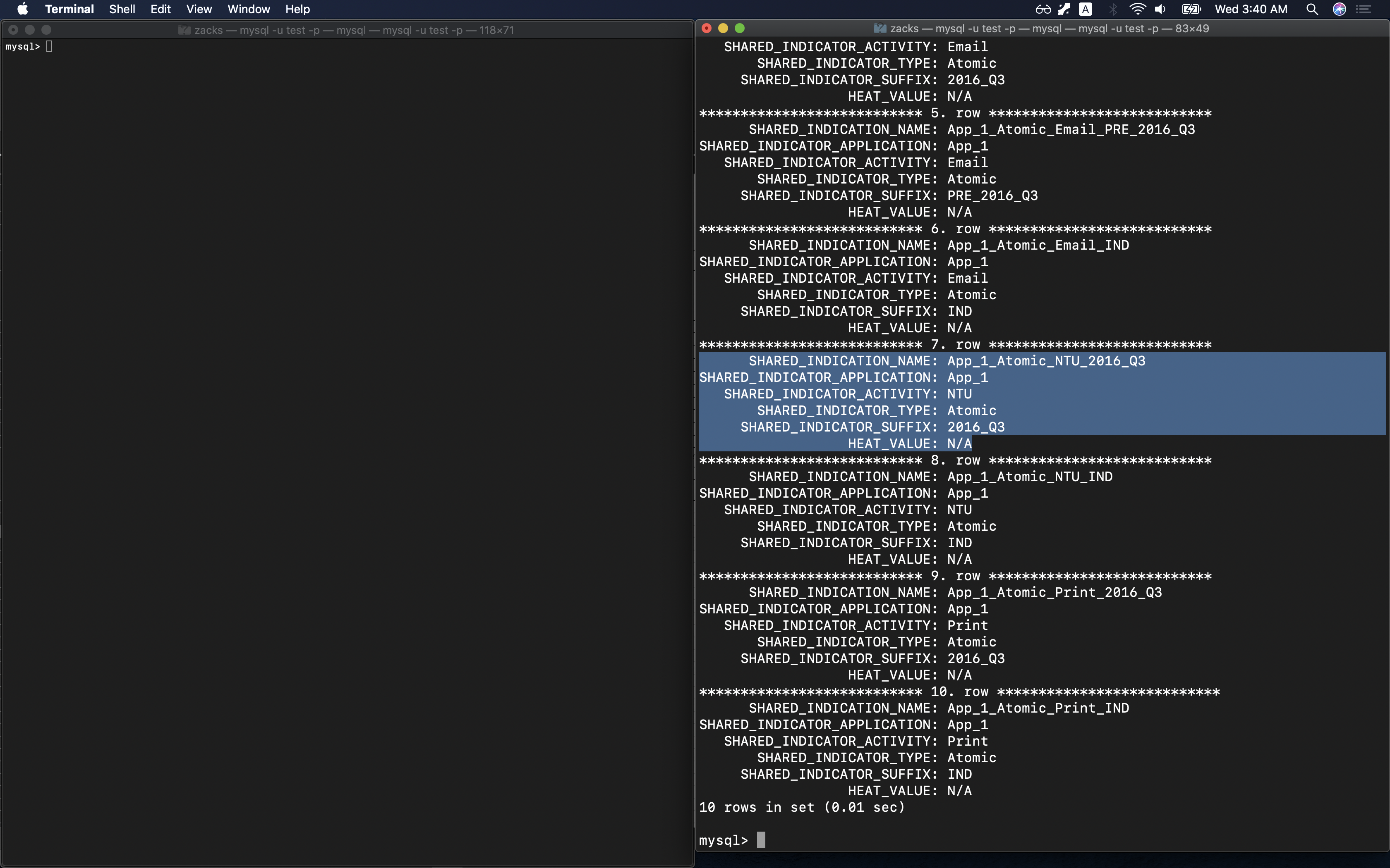
Table obfuscated_demo_data has a description file Data Dictionary - Demographics. Expect the following columns:
DEPARTMENT_NAMEJOB_TITLELEGAL_ENTITY_NAMEDIVISION_NAMEBUSINESS_SEGMENT
1 | SELECT * FROM obfuscated_demo_data LIMIT 10 \G |
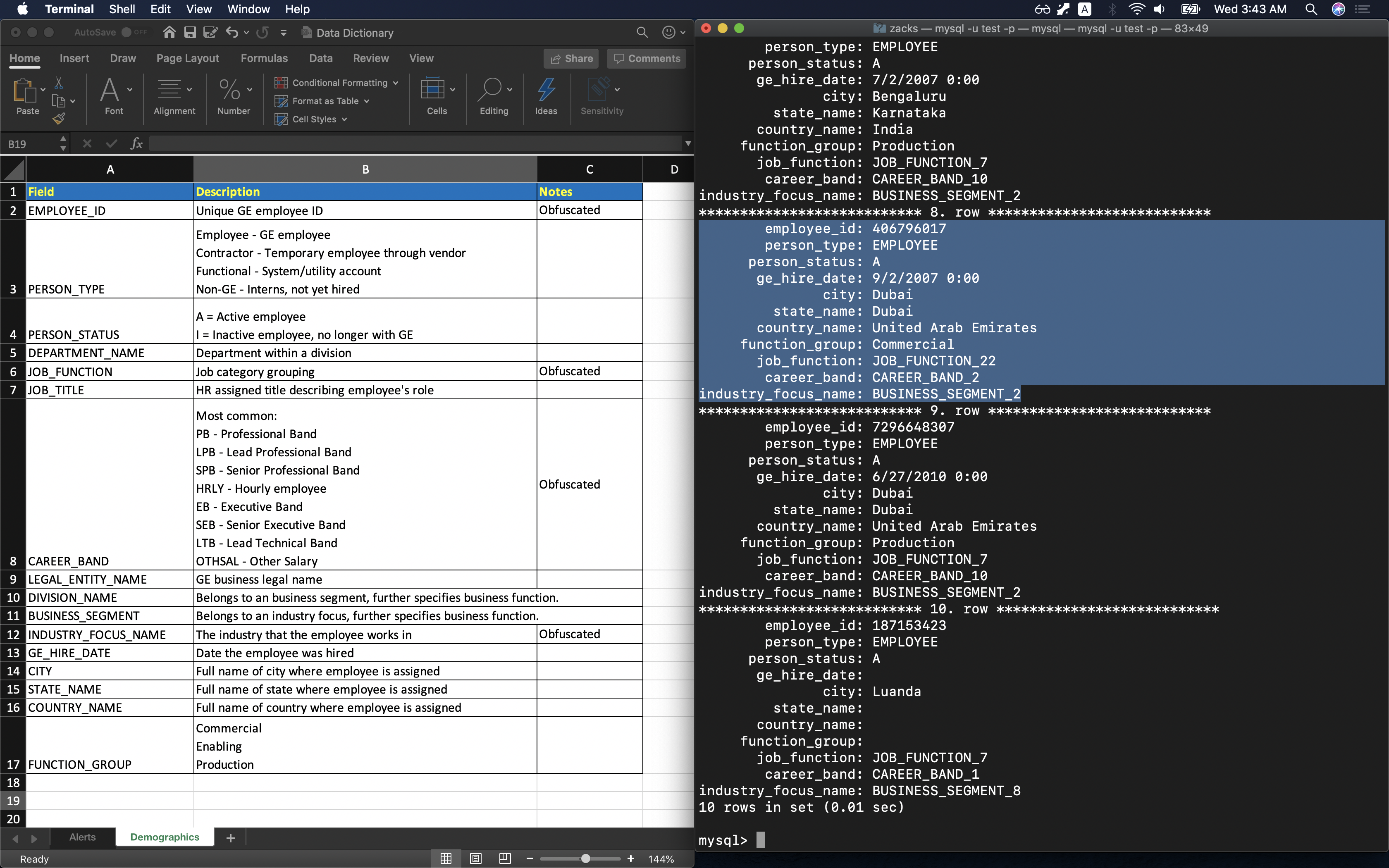
Table indicator_data has a description file Data Dictionary - Alerts. Expect three columns that are stored in table heat_scores:
indicatorsindicator_sourceindicator_heat_score.
1 | SELECT * FROM indicator_data LIMIT 10 \G |
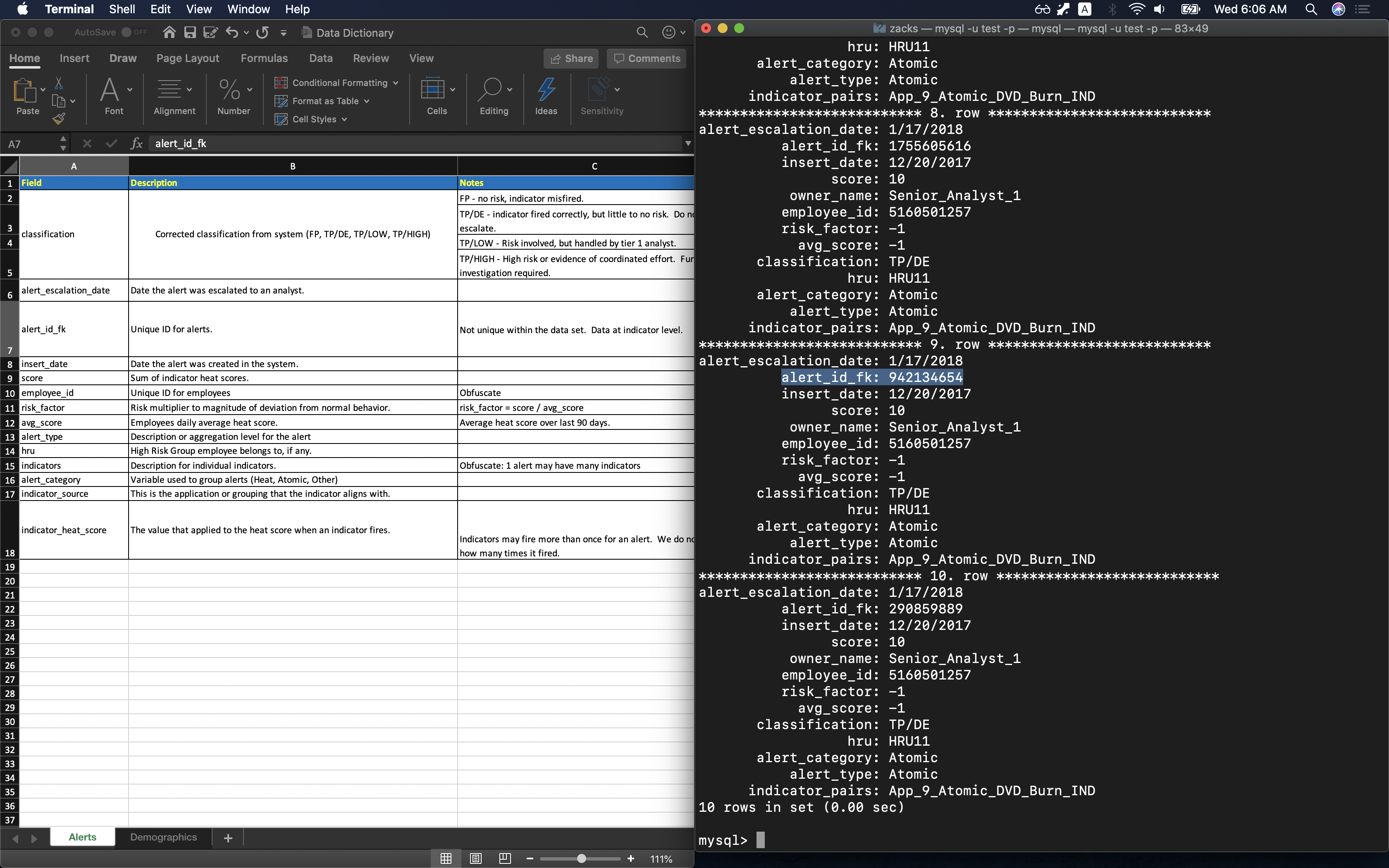
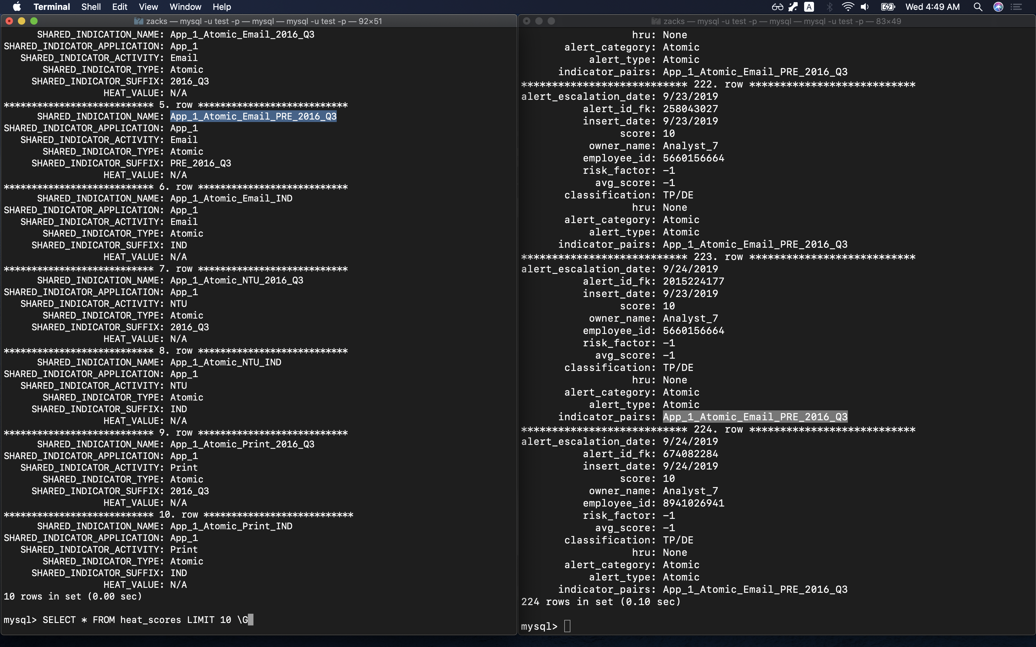
Table indicator_data is related to heat_scores:
indicator_data:indicator_pairsheat_scores:SHARED_INDICATION_NAME
SELECT one SHARED_INDICATION_NAME in table heat_scores to compare with the countpart in table indicator_data:
1 | SELECT * FROM heat_scores LIMIT 10 \G |
What are the current alerts and indicators?
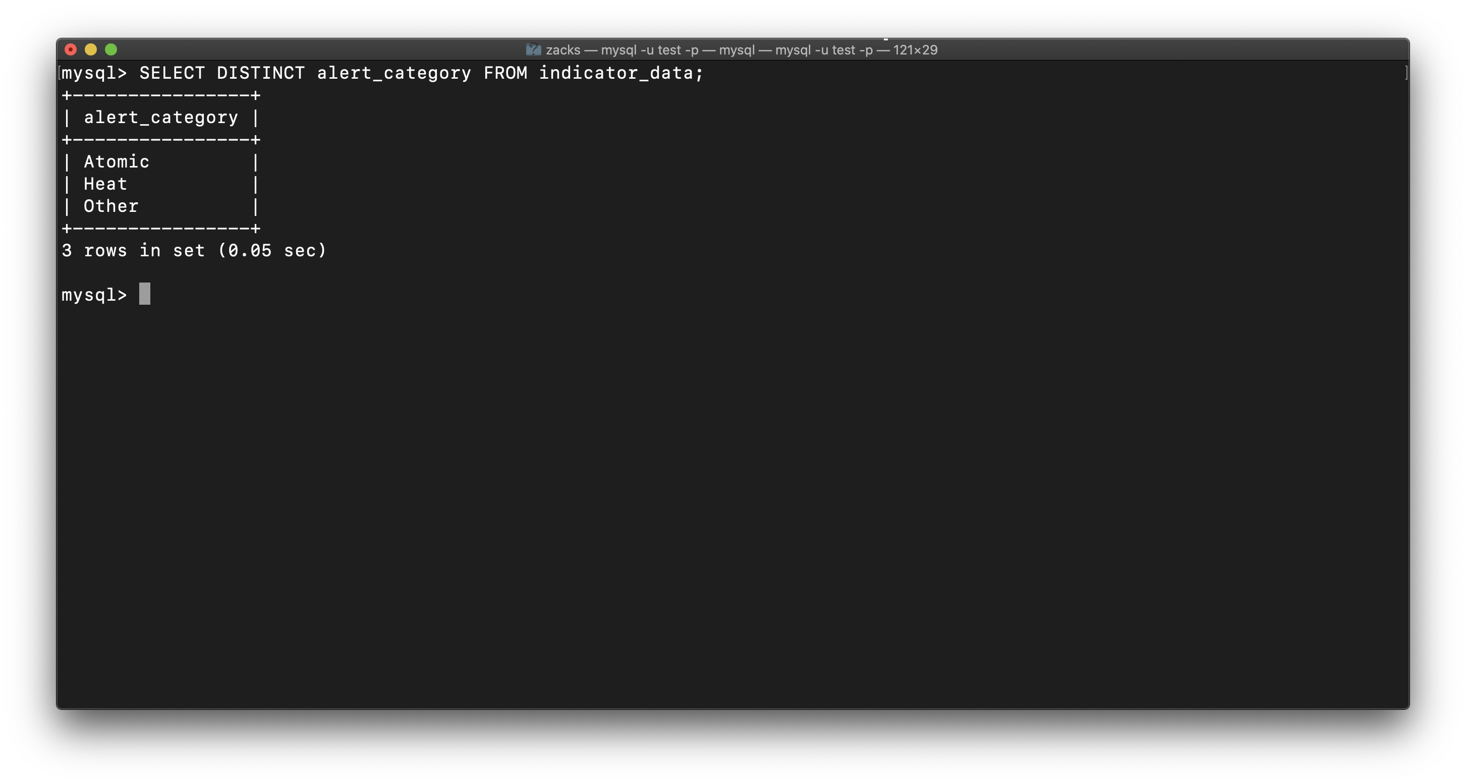
We have only three categories of alerts: SELECT DISTINCT alert_category FROM indicator_data;
- Atomic
- Heat
- Other
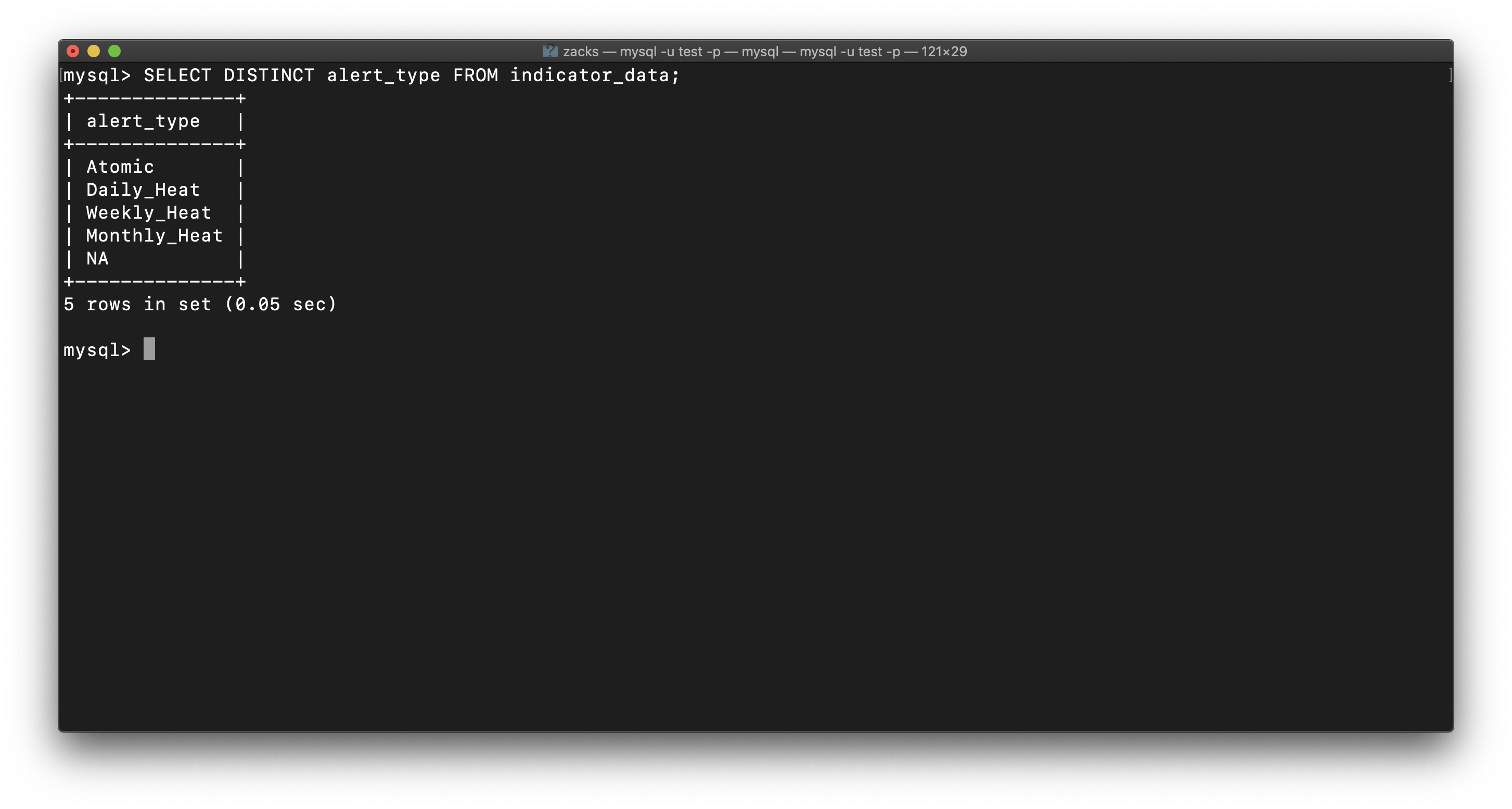
And alertes have been classified as time range: SELECT DISTINCT alert_type FROM indicator_data;
- Atomic
- Daily_Heat
- Weekly_Heat
- Monthly_Heat
- NA
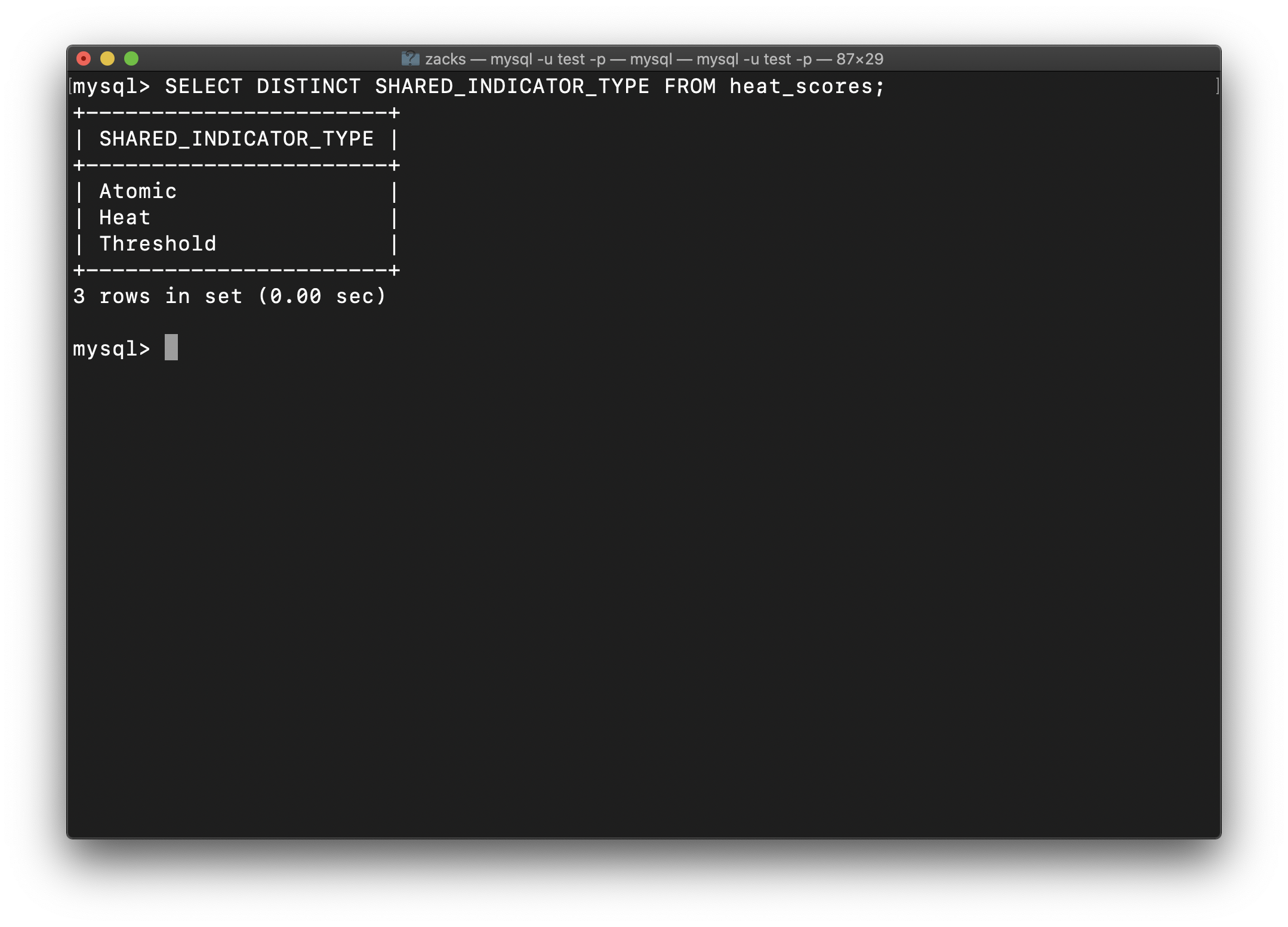
We have three indicator types:
- Atomic
- Heat
- Threshold
As
1.Briefly assess data files in terms of #items, sizes and variable entities.
Table indicator_data is related to heat_scores:
indicator_data:indicator_pairsheat_scores:SHARED_INDICATION_NAME
SELECT one SHARED_INDICATION_NAME in table heat_scores to compare with the countpart in table indicator_data:
1 | SELECT * FROM heat_scores LIMIT 10 \G |
Table indicator_data has data that records each case. Each row has a score and average to measure how serious is the case.
2.Integrate data files to support the analytics – describe the resultant tables and how they are needed for analysis.
Work flow:
Uses a static table with indicator and value.
As the indicator fires, the heat score value is added to the employee’s
accumulated heat score.Once the accumulated heat score reaches a threshold, an alert is raised.
Therefore,
classificationis the final measurement for each case. There are other factors will influenceclassification.
3.Perform Exploratory Data Analysis (EDA) to better understand the business motivation: Heat score distributions per indicator types, thresholds for ”triggering” alerts, false positives and true positives etc.
Here, the cases has been classified by Alert Type and Classification. The thresholds is extremely low, but the heat score is extremely high, which means “Environment changes rapidly but scores do not reflect changes (need dynamic heat scores)”.
4.Provide a summary of steps that potential analytics may be done to answer project questions (predictive models for heat scores and/or thresholds for significant events e.g.,TP/Low and TP/High)
- Data understand
- Data preparing, including data cleasning
- Modling. Probably checking independence, calculating p-value, and building decision tree.
- Through decision tree we may make a conclusion.
5.Characterize the model DV’s and IV’s
DV’s: Score, Ave Score, Risk Factor
IV’s: employee, HRU, Career Band, Job Title, Industry Focus, Business Segment, Time, City, State, Country
W2
Dis
Introduction
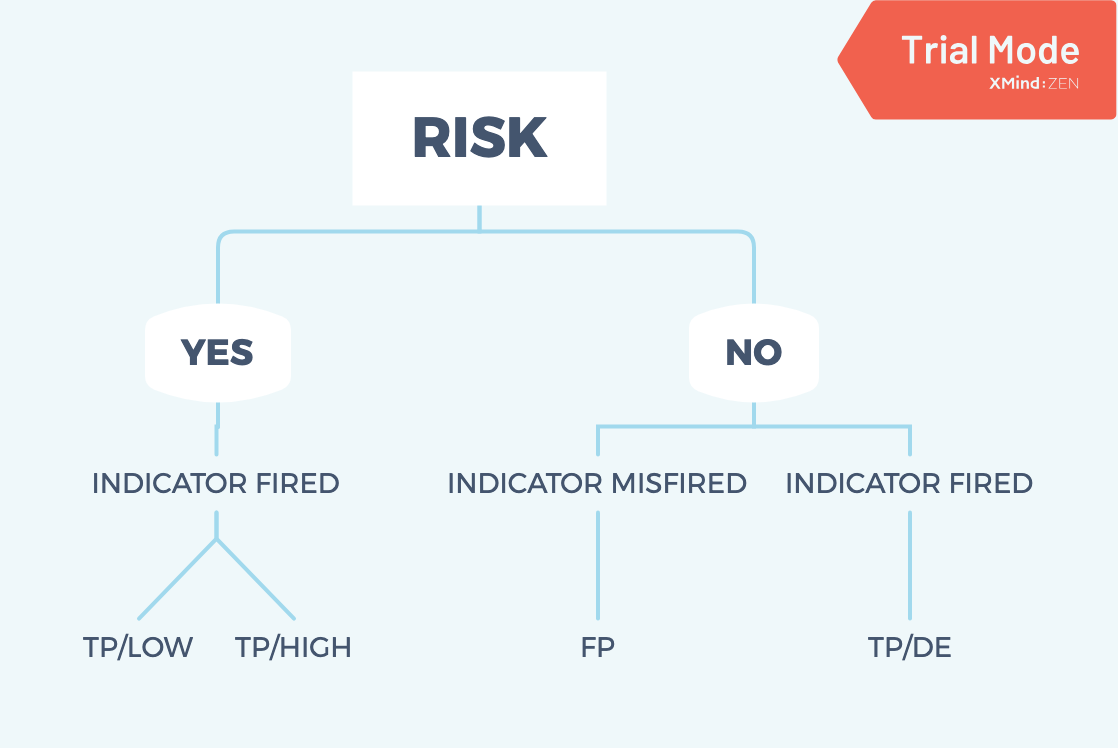
Basically, there are four scenarios:
- TP/DE: No risk but the system raise an alert, which means fake alert.
- FP: No risk and the system does not raise any alert.
- TP/LOW: True risk and the analysts classify them as low risk.
- TP/HIGH: True risk and the analysts classify them as high risk.
What kind of unsupervised learning would you propose and what would that help your overall analytics?
I prefer the k-means clustering. Because datasets from GE Aviation are really complex. In the initial phase, I am not sure which variables are valuable. That’s why I need to do Machine Learning. I will try to analyze the GE Aviation datasets and find out the relationship in each variable and how does the classification system work. In k-means clustering, it is possible to set up the best number of clusters, which could help avoid errors. Also, it supports standardization and normalization, which can help me improve the accuracy of the model.
List 3 notable insights or observations you have obtained from your analytics that will help GE to better detect potential IP risks and/or save efforts of the analysts in investigating FP or TP/DE indicators for ATOMIC i.e., single indicator events.
Analyzing the distribution of FP or TP/DE indicators.
1 | # Import modules |
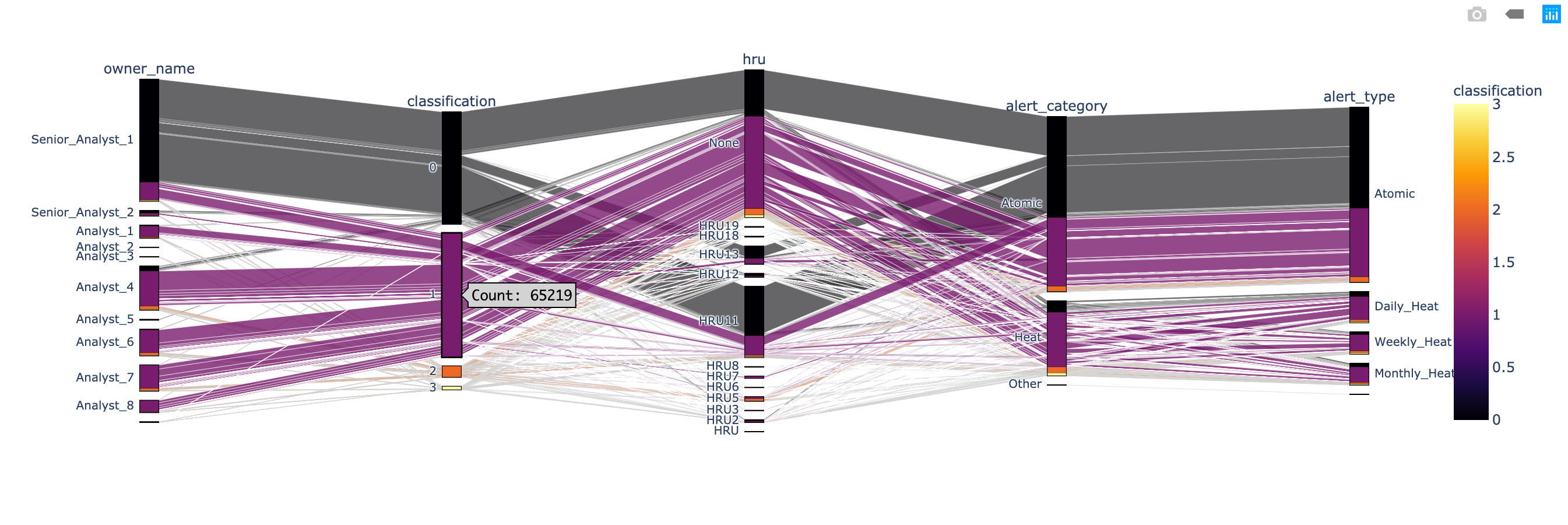
This chart is parallel category. “In a parallel categories (or parallel sets) plot, each row of data_frame is grouped with other rows that share the same values of dimensions and then plotted as a polyline mark through a set of parallel axes, one for each of the dimensions.” I use classification as the color to mark the data. For example, classification - 0, equaled to classification - FP, highlight every columns which belong to FP in a black color.
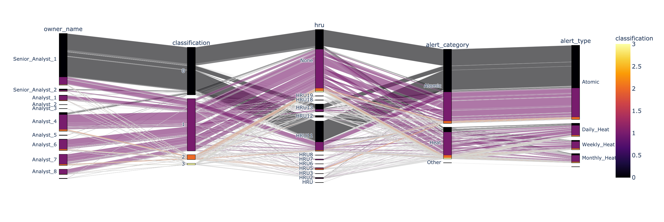
According to the classification - 0 (FP) chart, there are 59315 records. And most of them are related to hru - None, hru - 11 , and hru - 13. The most import thing is: almost all classification - 0 (FP) are related to Atomic alert.
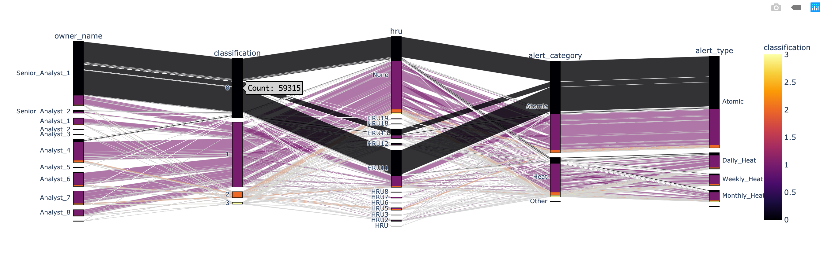
According to the classification - 1 (TP/DE) chart, there are 65219 records. And most of them are related to hru - None, hru - 11 , and hru - 13. Half of the classification - 1 (TP/DE) are related to Atomic alert; the other part is related to Heat alter.
1 | # Filter person_type not null records |
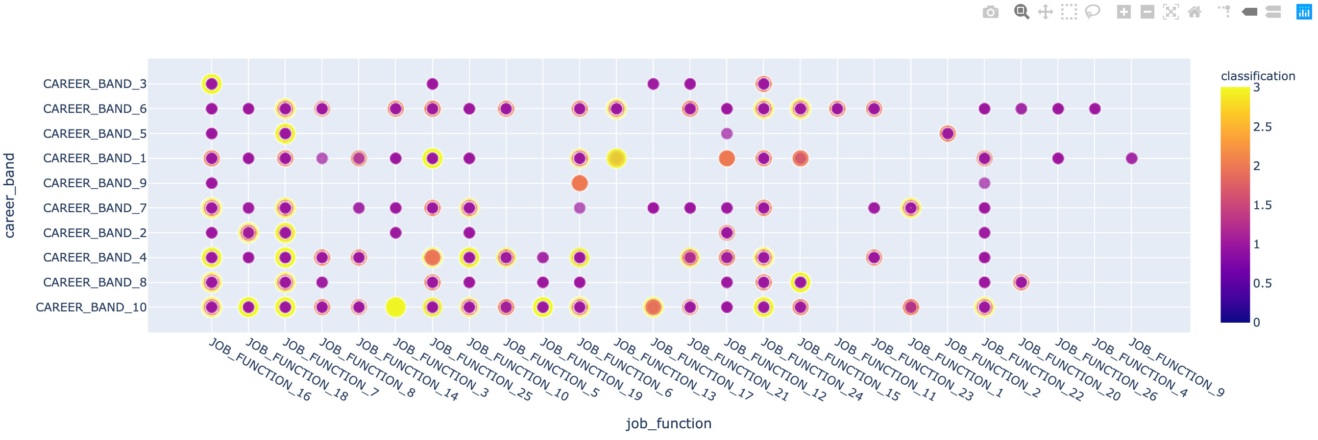
When I exploring the relationship between job_function and career_band, I notice that some combination provides more TP/HIGH and TP/LOW records but others are not.
Module III
Perform relevant analytics and show results (not more than 5 pages and not more than 5 charts and tables) (2/10-2/23)
Source Code and Full Report: https://github.com/ZacksAmber/Code/blob/master/Python/GE%20Aviation/GE%20Aviation.ipynb
1
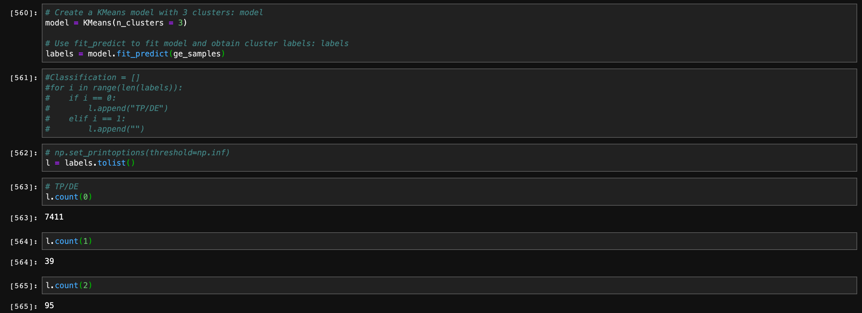
Perform unsupervised learning on ATOMIC Alerts Only to see how many types of risk groups are there and does the clustering result help your understanding of the project?
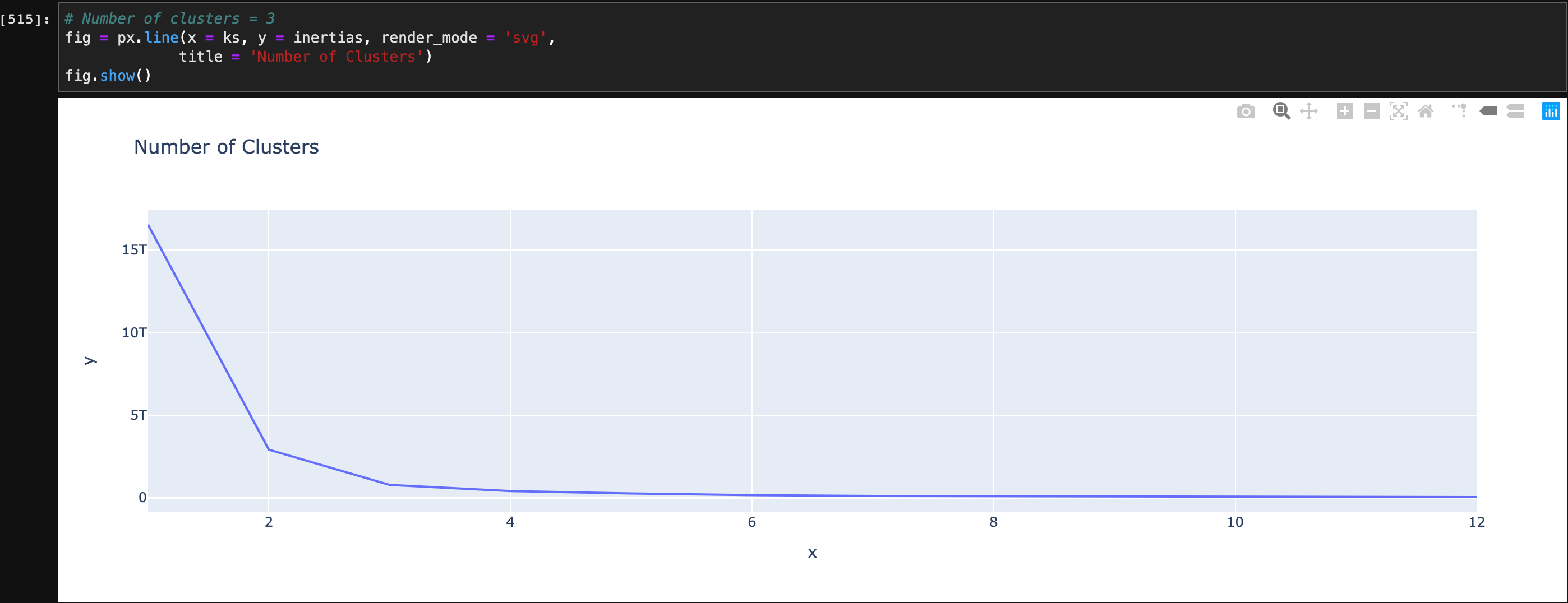
The number of clusters should be 3, which means there three types of risk groups. The result help me understanding the project. Because classification - TP/DE is a wrong indicator. After filtering it and classification - FP, the relationships between each variables become clearly.
1 | # Number of clusters = 3 |
2 & 3
Perform predictive analytics to predict High risks (TP/HIGH), Notable Risks (TP/HIGH & LOW) for Atomic Indicators.
Show results and performance measures such as TP, FP, FN,TN, confusion table and lift charts and what threshold of probabilities would you use to trigger the alerts and optimize the results for different business considerations?
First, I join the table indicator_data and obfuscated_demo_data Then I extract the columns I need.
1 | # Join data.frame indicator_data and obfuscated_demo_data as ge_i_o |
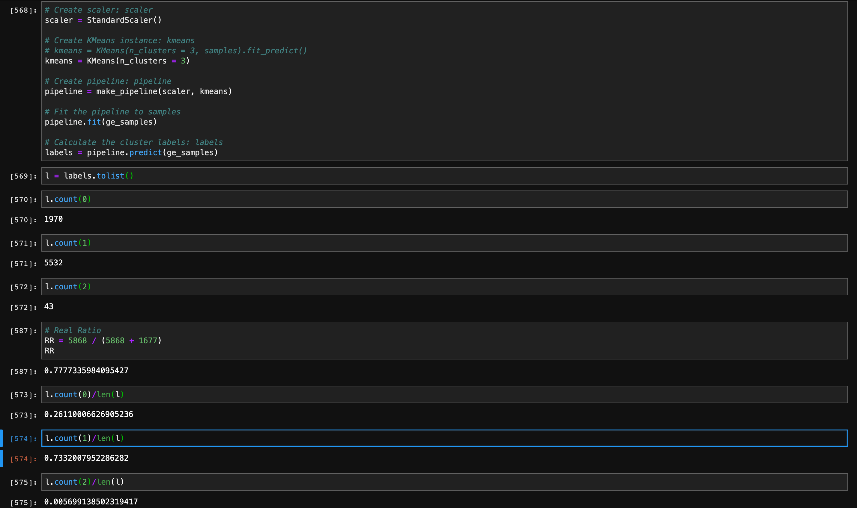
After transferring the variables from categorical data to dummy data, the initial result is still not accurate due to the scale.
The I Try to standardize the variables, and figure out a very accurate k-means clustering model - 73.3%.
4
How do your results compare with the existing system?
I think my model is better because I drop several confused variables and keep a high accuracy.