KNN of CKD
Author Information
Author: Zacks Shen
Github: https://github.com/ZacksAmber/KNN-of-CKD
Blog: https://zacks.one
LinkedIn: https://www.linkedin.com/in/zacks-shen/
Introduction
Chronic Kidney Disease
One in Seven American Adults Estimated to Have Chronic Kidney Disease
This is a Machine Learning project for predicting Chronic Kidney Disease (CKD) by using K-Nearest Neighbors (KNN).
The project is about forecasting if a person has CKD based on two or three attributes from Hemoglobin, Glucose, and White Blood Cell Count. If the one has CKD the Class is 1.
Package Introduction
The module I developed is KNN, which is included in the package datascientists. The minimum version of datascientists must greater than or equal to 0.0.5.KNN can predict the Class or any category marked as 1 and 0. It accepts at least 2 attributes (the columns of your pandas DataFrame) and returns the following results:
- Pandas DataFrame: The predicted class of test.
- The validation method for the predictions.
- Plotly graph object: A static 2 dimensional scatter plot with train data or predictions or Decision Boundary.
- Plotly graph object: A static 3 dimensional scatter plot with train data or predictions.
- Plotly graph object: An animated 2 dimensional scatter plot to present the process that how KNN algorithm finds the neareast neighbor. (
k=1, ork>1). - Pandas DataFrame: The best k, the mean of k calculated by default 100 times from random train-test datasets, based on the user-specified attributes.
Dataset
Original Dataset
| Age | Blood Pressure | Specific Gravity | Albumin | Sugar | Red Blood Cells | Pus Cell | Pus Cell clumps | Bacteria | Blood Glucose Random | ... | Packed Cell Volume | White Blood Cell Count | Red Blood Cell Count | Hypertension | Diabetes Mellitus | Coronary Artery Disease | Appetite | Pedal Edema | Anemia | Class | |
|---|---|---|---|---|---|---|---|---|---|---|---|---|---|---|---|---|---|---|---|---|---|
| 0 | 48 | 70 | 1.005 | 4 | 0 | normal | abnormal | present | notpresent | 117 | ... | 32 | 6700 | 3.9 | yes | no | no | poor | yes | yes | 1 |
| 1 | 53 | 90 | 1.020 | 2 | 0 | abnormal | abnormal | present | notpresent | 70 | ... | 29 | 12100 | 3.7 | yes | yes | no | poor | no | yes | 1 |
| 2 | 63 | 70 | 1.010 | 3 | 0 | abnormal | abnormal | present | notpresent | 380 | ... | 32 | 4500 | 3.8 | yes | yes | no | poor | yes | no | 1 |
| 3 | 68 | 80 | 1.010 | 3 | 2 | normal | abnormal | present | present | 157 | ... | 16 | 11000 | 2.6 | yes | yes | yes | poor | yes | no | 1 |
| 4 | 61 | 80 | 1.015 | 2 | 0 | abnormal | abnormal | notpresent | notpresent | 173 | ... | 24 | 9200 | 3.2 | yes | yes | yes | poor | yes | yes | 1 |
| ... | ... | ... | ... | ... | ... | ... | ... | ... | ... | ... | ... | ... | ... | ... | ... | ... | ... | ... | ... | ... | ... |
| 153 | 55 | 80 | 1.020 | 0 | 0 | normal | normal | notpresent | notpresent | 140 | ... | 47 | 6700 | 4.9 | no | no | no | good | no | no | 0 |
| 154 | 42 | 70 | 1.025 | 0 | 0 | normal | normal | notpresent | notpresent | 75 | ... | 54 | 7800 | 6.2 | no | no | no | good | no | no | 0 |
| 155 | 12 | 80 | 1.020 | 0 | 0 | normal | normal | notpresent | notpresent | 100 | ... | 49 | 6600 | 5.4 | no | no | no | good | no | no | 0 |
| 156 | 17 | 60 | 1.025 | 0 | 0 | normal | normal | notpresent | notpresent | 114 | ... | 51 | 7200 | 5.9 | no | no | no | good | no | no | 0 |
| 157 | 58 | 80 | 1.025 | 0 | 0 | normal | normal | notpresent | notpresent | 131 | ... | 53 | 6800 | 6.1 | no | no | no | good | no | no | 0 |
Selected Columns and Standardized Dataset
| Hemoglobin | Glucose | White Blood Cell Count | Class | |
|---|---|---|---|---|
| 0 | -0.865744 | -0.221549 | -0.569768 | 1 |
| 1 | -1.457446 | -0.947597 | 1.162684 | 1 |
| 2 | -1.004968 | 3.841231 | -1.275582 | 1 |
| 3 | -2.814879 | 0.396364 | 0.809777 | 1 |
| 4 | -2.083954 | 0.643529 | 0.232293 | 1 |
| ... | ... | ... | ... | ... |
| 153 | 0.700526 | 0.133751 | -0.569768 | 0 |
| 154 | 0.978974 | -0.870358 | -0.216861 | 0 |
| 155 | 0.735332 | -0.484162 | -0.601850 | 0 |
| 156 | 0.178436 | -0.267893 | -0.409356 | 0 |
| 157 | 0.735332 | -0.005280 | -0.537686 | 0 |
The last step of data preprocessing is randomly and evenly split dataset ckd into two DataFrames: train and test.
We will use the train to build the KNN model. Module KNN can forecast the class of the test based on the KNN model. Because we already know the class of test. We can compare the class and predicted class to evaluate the accuracy of the model.
Visualizations
2D Static Scatter


Hemoglobin vs. Glucose has higher accuracy than White Blood Cell Count vs. Glucose for predicting Class of CKD.
Because the latter plot shows that the separation between the two attributes is not so clean.
3D Static Scatter
Although we already know which two attributes have better accuracy, how about three of them?


The 3D Scatter: KNN of CKD shows that the accuracy of three attributes seems not better than Hemoglobin vs. Glucose. Therefore, for resource-saving, we will focus on Hemoglobin vs. Glucose.
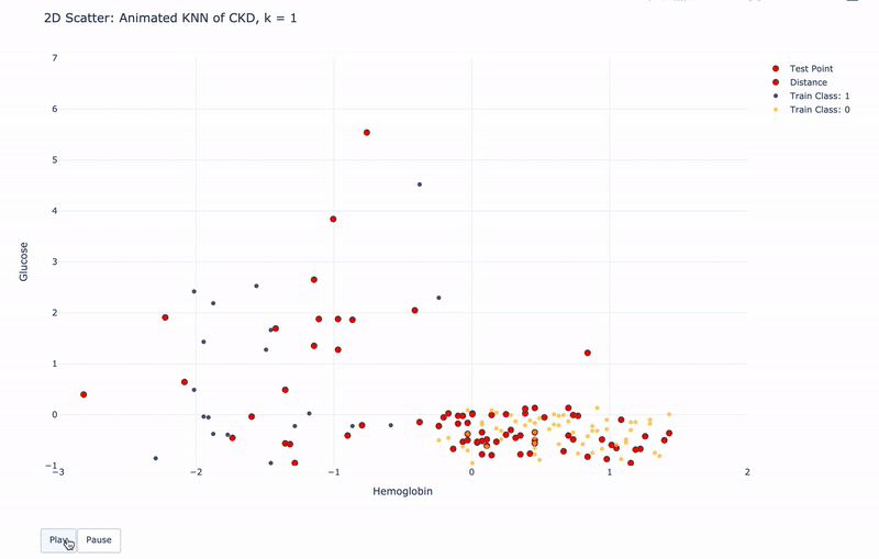
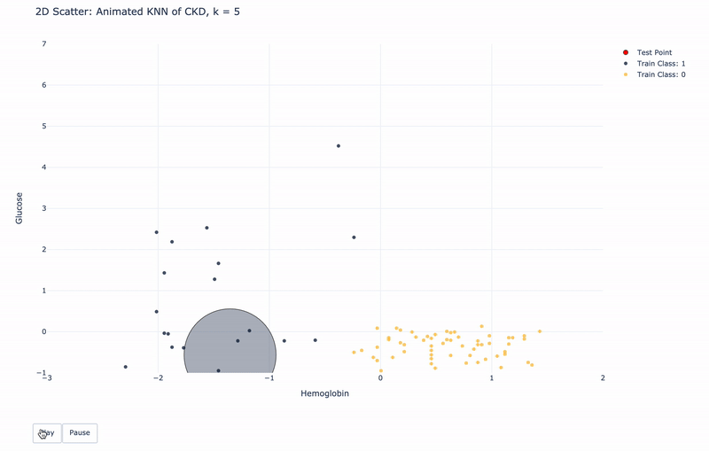
2D Animated Scatter
Let’s see how module KNN works.
For k=1, KNN will find 1 nearest train point to the test point. Then assign the same Class as the 1 nearest train point to the test point.
For k>1, KNN will find k nearest train points to the test point. Then assign the most frequent Class of the k nearest points to the test point.
For higher resolution, please run KNN-of-CKD.ipynb on your local machine.
2D Static Scatter with Decision Boundary
What if all of the points on the plot are available for predicting?
Assume we have unlimited data from patients and the data have huge variations. The Decision Boundary can simulate this scenario.
You can see the transparent dots and opaque dots on the scatter plot.
The boundary between them is Decision Boundary.
Any new point that more close to the side of blue will be classified as CKD; vice versa, Any new point that more close to the side of gold will be classified as healthy.

Predictions and Best k
Now we have the best attributes. And we know how KNN works.
But what k is proper to forecast the Class?
KNN has a method best_k to help the user make a decision.
Let’s see the current predictions.
| Hemoglobin | Glucose | White Blood Cell Count | Class | Predicted Class | |
|---|---|---|---|---|---|
| 0 | -0.030400 | -0.376028 | 0.809777 | 0.0 | 0.0 |
| 1 | 0.213242 | -0.484162 | -0.569768 | 0.0 | 0.0 |
| 2 | -3.685029 | 0.689873 | -0.986840 | 1.0 | 1.0 |
| 3 | 0.700526 | -0.406923 | 0.617283 | 0.0 | 0.0 |
| 4 | 1.292227 | -0.175206 | -0.473521 | 0.0 | 0.0 |
| ... | ... | ... | ... | ... | ... |
| 74 | -1.283416 | -0.221549 | 3.408455 | 1.0 | 1.0 |
| 75 | -2.223178 | 1.910252 | 0.424788 | 1.0 | 1.0 |
| 76 | 0.282854 | -0.298788 | 0.296458 | 0.0 | 0.0 |
| 77 | -2.083954 | 0.643529 | 0.232293 | 1.0 | 1.0 |
| 78 | -1.283416 | -0.947597 | 3.344290 | 1.0 | 1.0 |
We can also calculate the accuracy of the model.
For each row in DataFrame predictions, we can count the number of column Predicted Class that is the same as the column Class. Then let it divided by the length of the DataFrame test. The result is the accuracy under the current train test distribution.
The current Accuracy is 0.9746835443037974.
So let’s see how KNN makes a prediction for each row.
The 1st row of the DataFrame test is the 1st row in the DataFrame predictions. The Class is 0, and the Predicted Class is 0, too.
| Hemoglobin | Glucose | White Blood Cell Count | Class | |
|---|---|---|---|---|
| 119 | -0.0304 | -0.376028 | 0.809777 | 0 |
The top k(k=5) nearest neighbors to the 1st row in test.
| Hemoglobin | Glucose | White Blood Cell Count | Class | distance | |
|---|---|---|---|---|---|
| 137 | 0.039212 | -0.530506 | -0.666015 | 0 | 0.169438 |
| 156 | 0.178436 | -0.267893 | -0.409356 | 0 | 0.235171 |
| 78 | -0.065206 | -0.623193 | 0.039798 | 0 | 0.249604 |
| 60 | 0.074018 | -0.144310 | 0.328540 | 0 | 0.254158 |
| 120 | -0.239236 | -0.221549 | -1.051005 | 0 | 0.259761 |
We can call function _distance to get the top k nearest neighbors. All of the neighbors are 0, so the Predicted Class of this point is 0.
The predict function works well.
It’s time to calculate the best k.
The best_k method concatenates train and test in the KNN instance. So KNN instance has a complete DataFrame ckd. Then it splits the ckd into train and test for 100 times. For each repetition, it stores the current Accuracy according to the current k. Finally, it returns the average Accuracy for each k.
For example, I passed k = 5 to the best_k function. Then it returned the average accuracy of 100 repetitions for k from 1 to 5.
| k | Average Accuracy of 100 Boostrap | |
|---|---|---|
| 0 | 1 | 0.983671 |
| 2 | 3 | 0.982025 |
| 1 | 2 | 0.981139 |
| 4 | 5 | 0.977975 |
| 3 | 4 | 0.977468 |
Conclusion
With k=1 and the attributes of Hemoglobin and Glucose, We have 98.56% accuracy for predicting if a person has CKD by applying the KNN algorithm.
The CKD dataset has a clear separation in Hemoglobin and Glucose. Thus we only need these two attributes with k=1 to make an accurate prediction. For more complicated datasets, we can use more than two attributes and let the KNN module find the best k for prediction.