Python Plotly
Python Tutorial
Getting Started with Plotly in Python
Plotly Express in Python
Plotly Python Open Source Graphing Library Basic Charts
Overview
The plotly Python library (plotly.py) is an interactive, open-source plotting library that supports over 40 unique chart types covering a wide range of statistical, financial, geographic, scientific, and 3-dimensional use-cases.
Installation & Loading
- Download Anaconda Environment, otherwise you will not have package
pandasandnumpy. - Download package
plotlythroughconda.
1 | conda install -c plotly "plotly>=4.5.1" |
JupyterLab Support (Python 3.5+)
For use in JupyterLab, install the jupyterlab and ipywidgets packages using conda:
1 | conda update --all |
Then run the following commands to install the required JupyterLab extensions (note that this will require node to be installed):
1 | node --version |
For Mac OS only:
If it shows command not found: node, you should install node first:
1 | conda install -c conda-forge nodejs |
For Mac OS only:
Then run the following commands to install the required JupyterLab extensions (note that this will require node to be installed):
1 | # (OS X/Linux) |
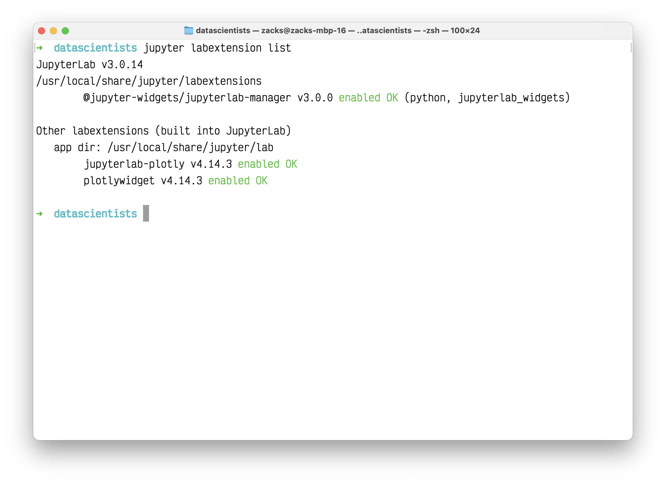
After you installed all extensions, list the extensions for last check.
1 | jupyter labextension list |
Run Jupyter lab on the directory lower than your data source directory.
1 | jupyter lab |
1 | import plotly.graph_objects as go |
See Displaying Figures in Python for more information on the renderers framework, and see Plotly FigureWidget Overview for more information on using FigureWidget.
Static Image Export Support
plotly.py supports static image export using the to_image and write_image functions in the plotly.io package. This functionality requires the installation of the plotly orca command line utility and the psutil and requests Python packages.
Note: The requests library is used to communicate between the Python process and a local orca server process, it is not used to communicate with any external services.
These dependencies can all be installed using conda:
1 | conda install -c plotly plotly-orca psutil requests |
These packages contain everything you need to save figures as static images.
1 | import plotly.graph_objects as go |
See Static Image Export in Python for more information on static image export.
Extended Geo Support
Some plotly.py features rely on fairly large geographic shape files. The county choropleth figure factory is one such example. These shape files are distributed as a separate plotly-geo package. This package can be installed using conda.
1 | conda install -c plotly plotly-geo |
See USA County Choropleth Maps in Python for more information on the county choropleth figure factory.
Chart Studio Support
The chart-studio package can be used to upload plotly figures to Plotly’s Chart Studio Cloud or On-Prem services. This package can be installed using conda.
1 | conda install -c plotly chart-studio |
Note: This package is optional, and if it is not installed it is not possible for figures to be uploaded to the Chart Studio cloud service.
Plotly Express
Introduction
Plotly Express is a terse, consistent, high-level API for rapid data exploration and figure generation.
Let’s try the same experiments from R ggplot.
Understanding plotly through ggplot
plotly has the similar concepts - Layer as ggplot.
Like this:
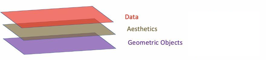
- Data: Data must be
data.frame. - Aesthetics: Aesthetics is used to indicate x and y variables. It can also be used to control the color, the size or the shape of points, the height of bars, or etc.
- Geometric Objects: A layer combines data, aesthetic mapping, a geom (geometric object), a stat (statistical transformation), and a position adjustment. Typically, you will create layers using a
geom_function, overriding the default position and stat if needed.
1 | # Define data frame |
1 | import pandas as pd |
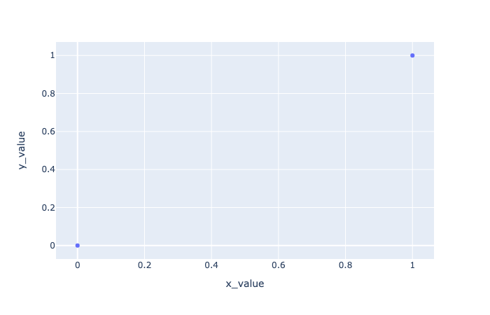
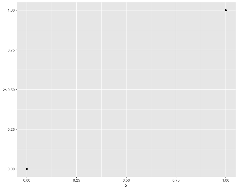
In comparison with the R code, we can see that they have the same concepts. Additionally, plotly is based on matplolib. Therefore, we are used to using a variable fig to inherit our plot value. And using show() function to show the picture:
1 | # Draw two points |
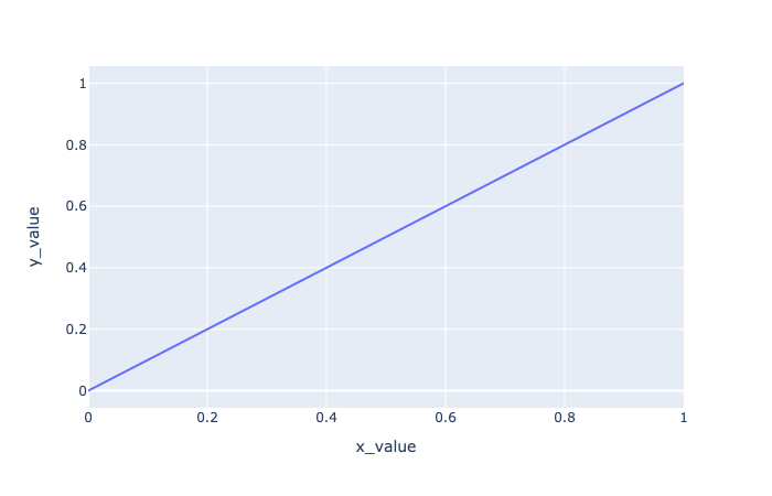
In order connecting the two points, we should add a line. In R, we just draw a line from a point to the other one:
1 | # Connect two points |
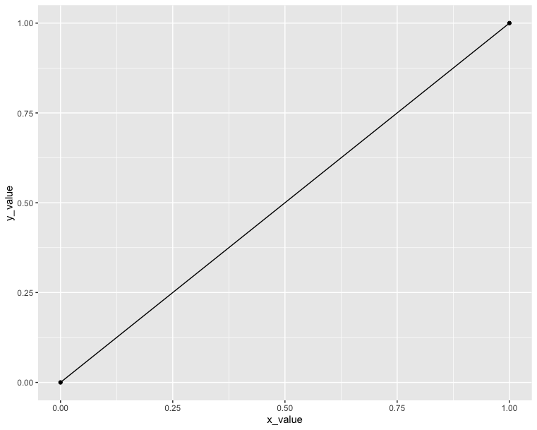
However, in plotly we cannot do it since it is actually not a type point; instead, it is a type scatter. So the only thing we need to do is to change the chart type from scatter to line:
1 | # Connect two points |
Data format and preparation
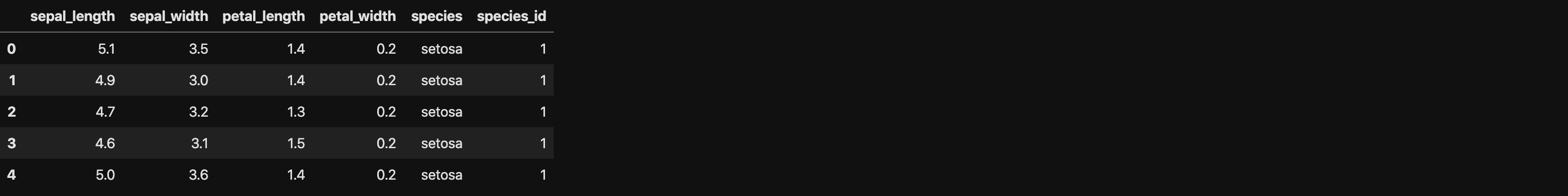
The data set mtcars is used in the examples below:
Data profile:
- mtcars : Motor Trend Car Road Tests.
- Description: The data comprises fuel consumption and 10 aspects of automobile design and performance for 32 automobiles (1973 - 74 models).
- Format: A data frame with 32 observations on 3 variables.
- [, 1] mpg Miles/(US) gallon
- [, 2] cyl Number of cylinders
- [, 3] wt Weight (lb/1000)
1 | # Load the data |
1 | import pandas as pd |
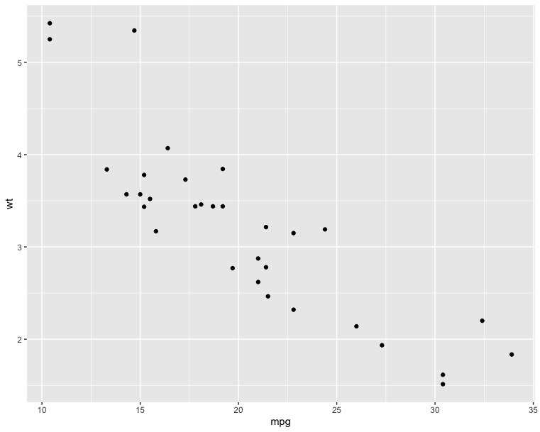
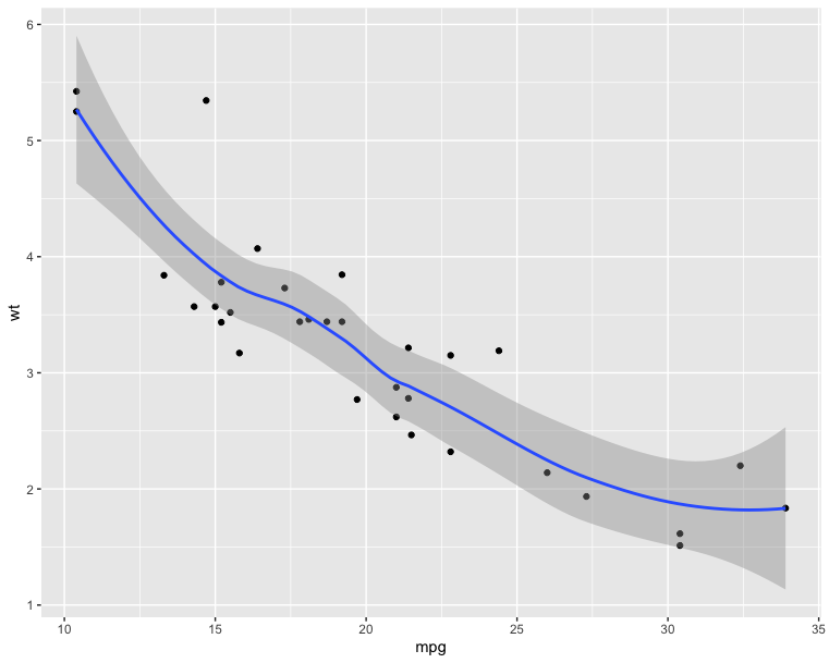
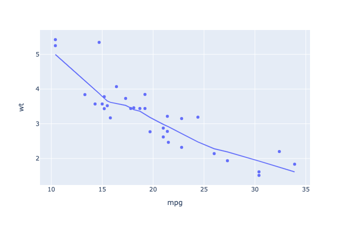
Scatter plots - Compare with ggplot2
The R code below creates basic scatter plots using the argument geom = “point”. It’s also possible to combine different geoms (e.g.: geom = c(“point”, “smooth”)).
1 | # Basic scatter plot |
1 | # Scatter plot with smoothed line |
1 | # Basic scatter plot |
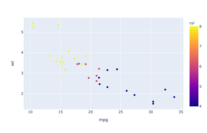
1 | import plotly.express as px |
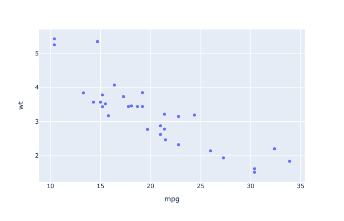
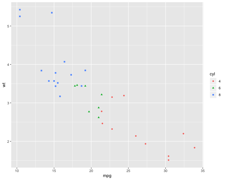
The following R code will change the color and the shape of points by groups. The column cyl will be used as grouping variable. In other words, the color and the shape of points will be changed by the levels of cyl.
1 | qplot(mpg, wt, data = df, color = cyl, shape = cyl) |
1 | import plotly.express as px |
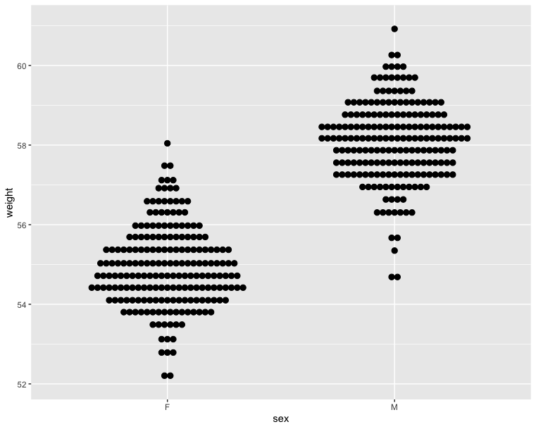
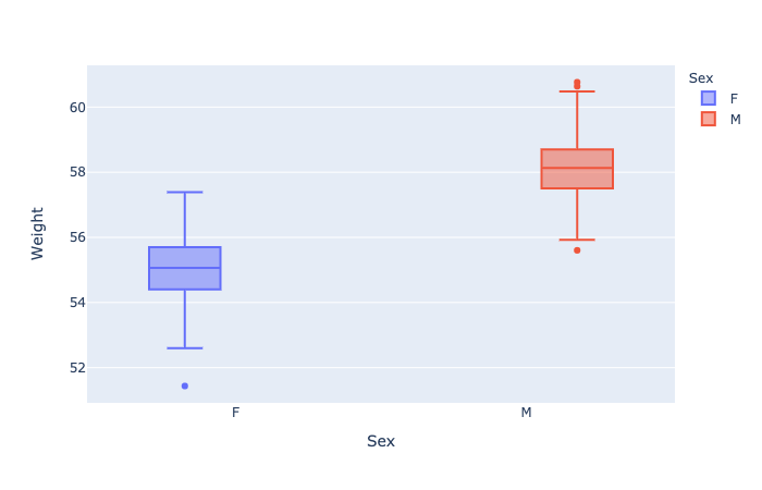
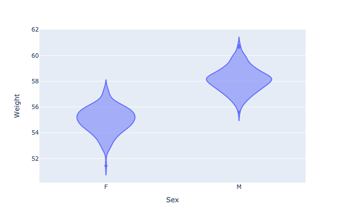
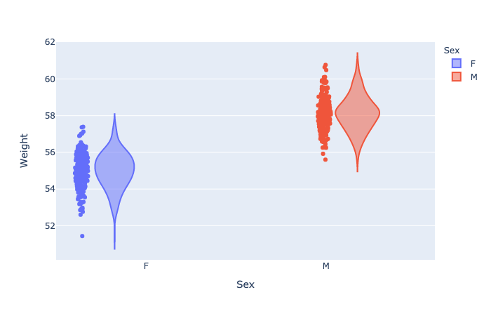
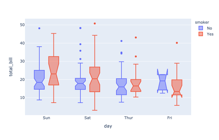
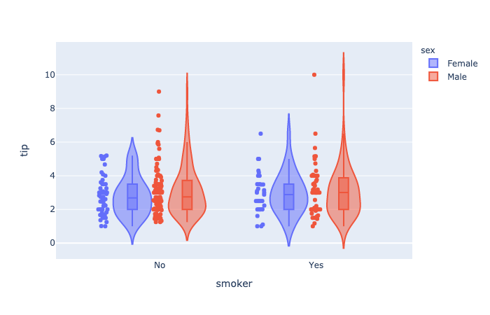
Box plot, violin plot and dot plot - Compare with ggplot2
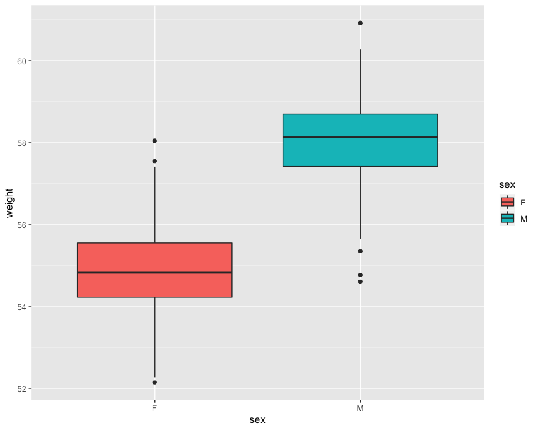
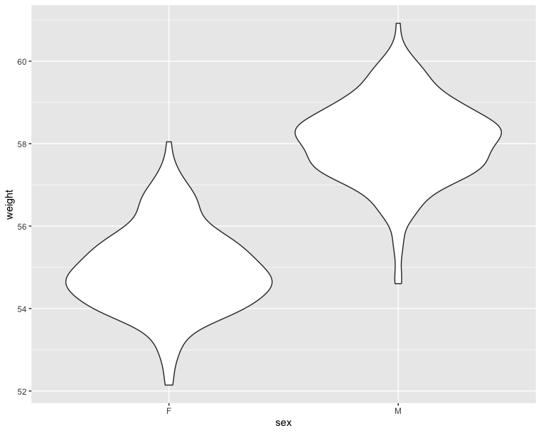
The R code below generates some data containing the weights by sex (M for male; F for female):
1 | # Define Data Frame |
1 | import pandas as pd |
1 | # Basic box plot from data frame |
1 | # Violin plot |
1 | # Dot plot |
1 | fig = px.box(wdata, x = 'Sex', y = 'Weight', color = 'Sex') |
1 | fig = px.violin(wdata, x = 'Sex', y = 'Weight', color = 'Sex') |
1 | fig = px.violin(wdata, x = 'Sex', y = 'Weight', color = 'Sex', points = 'all') |
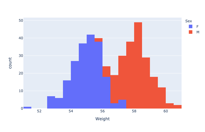
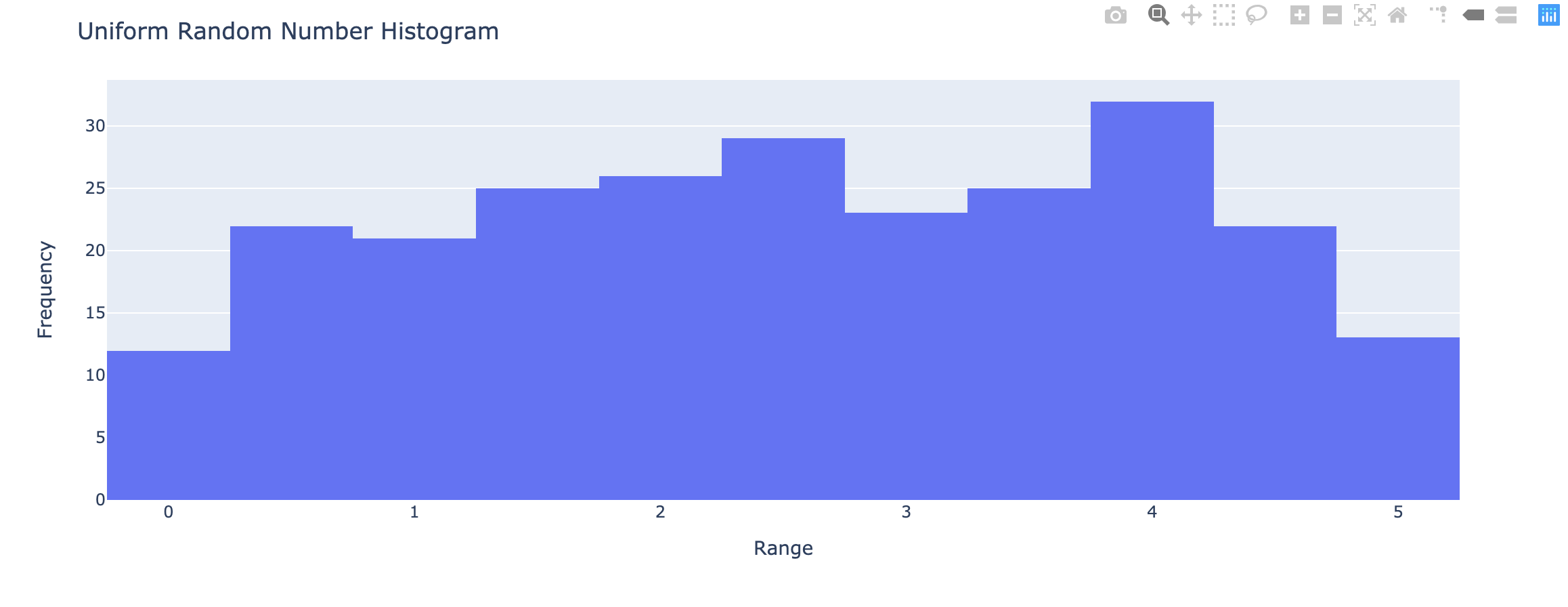
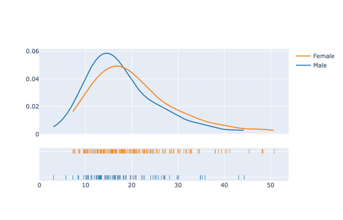
Histogram and density plots - Compare with ggplot2
The histogram and density plots are used to display the distribution of data.
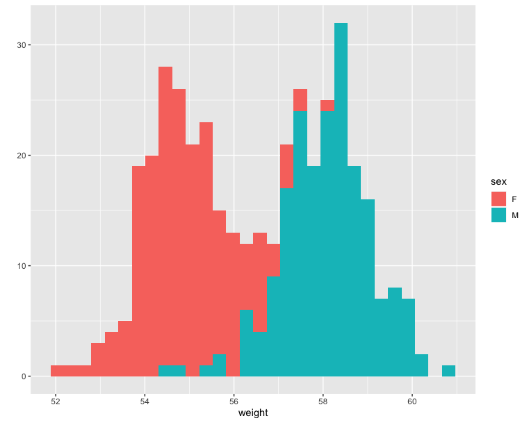
1 | # Histogram plot |
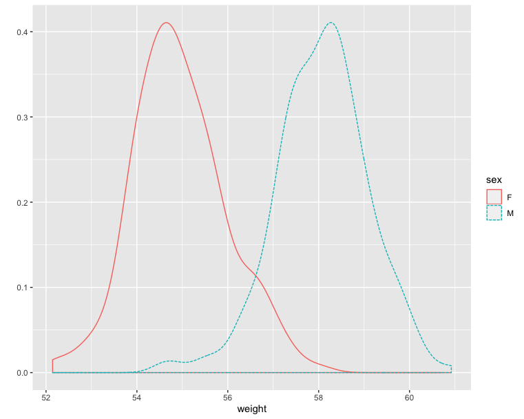
1 | # Density plot |
1 | fig = px.histogram(wdata, 'Weight', color = 'Sex') |
1 | import plotly.figure_factory as ff |
Scatter and Line plots
Refer to the main scatter and line plot page for full documentation.
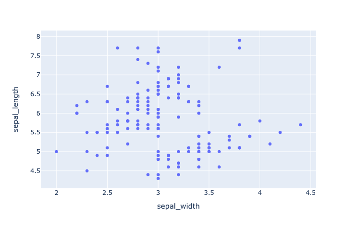
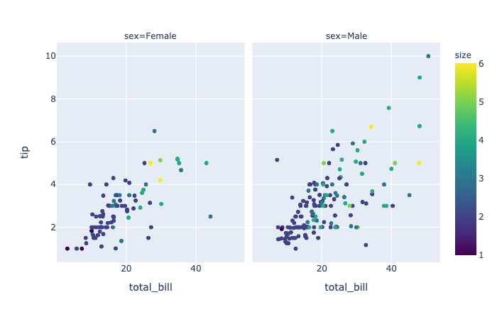
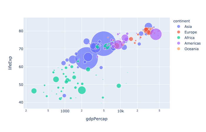
plotly.express.scatter
In a scatter plot, each row of data_frame is represented by a symbol mark in 2D space.
1 | import plotly.express as px |
1 | import plotly.express as px |
1 | import plotly.express as px |
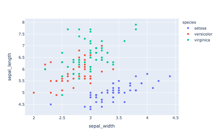
color(strorintorSeriesorarray-like) – Either a name of a column indata_frame, or a pandas Series or array_like object. Values from this column or array_like are used to assign color to marks.
1 | import plotly.express as px |
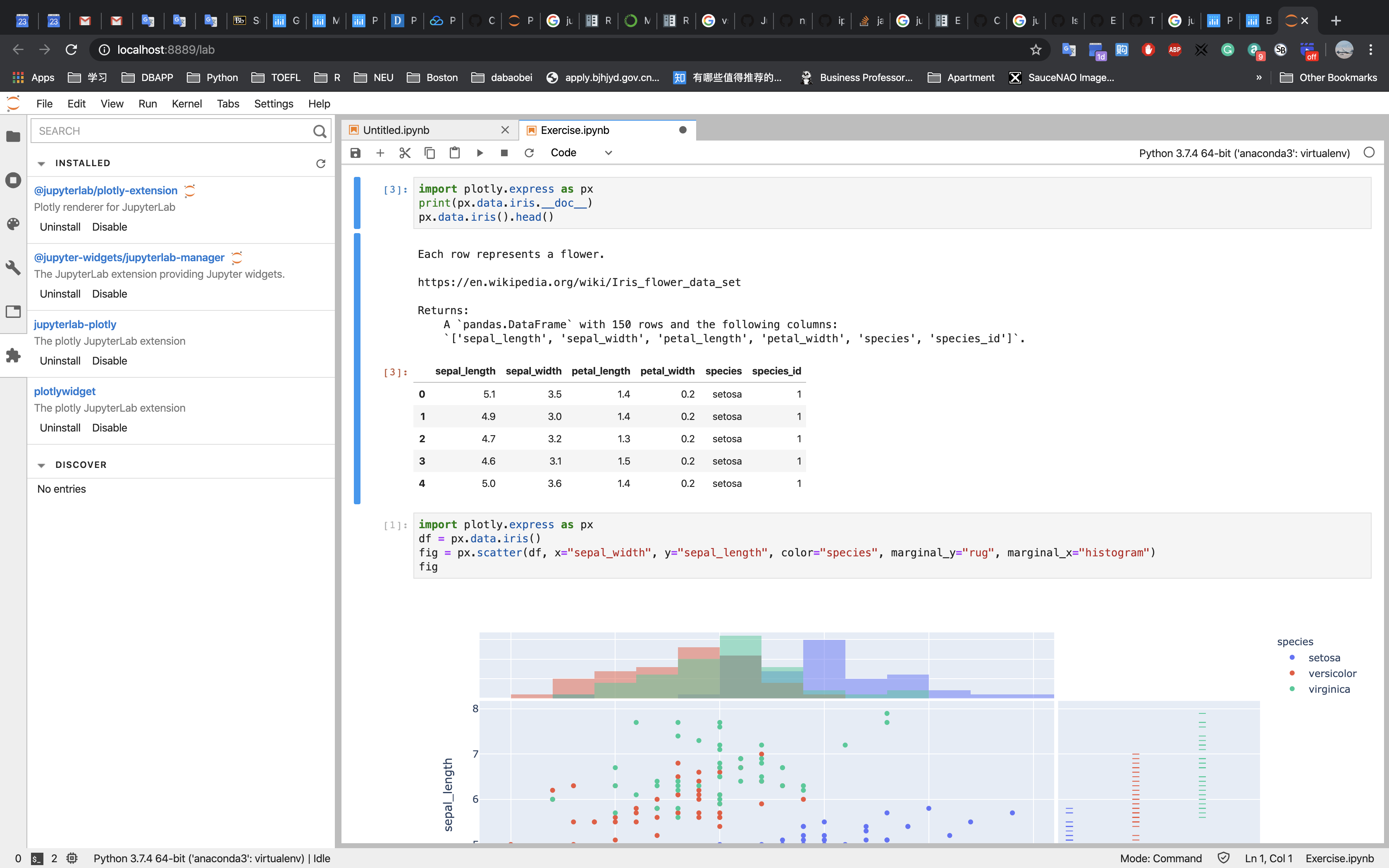
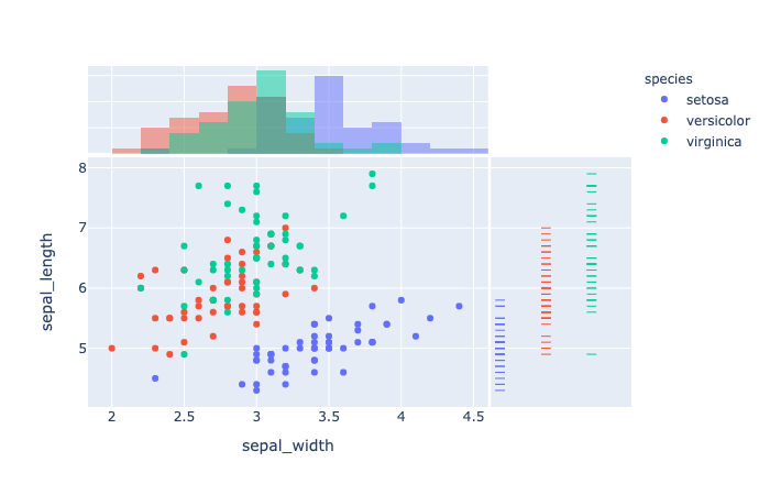
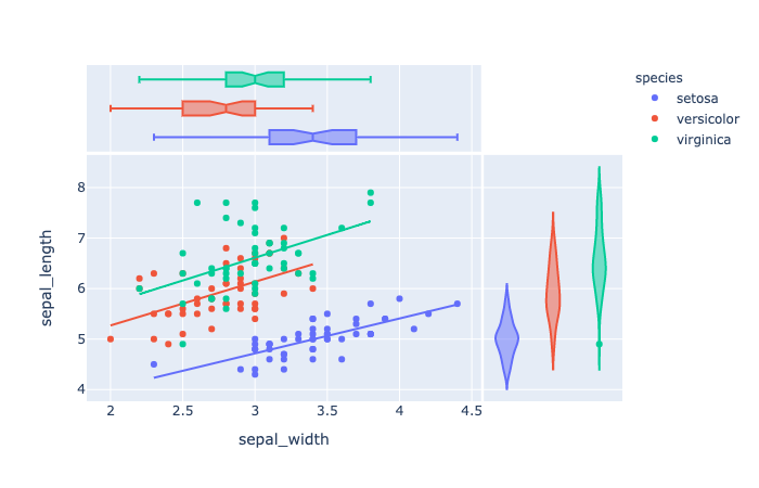
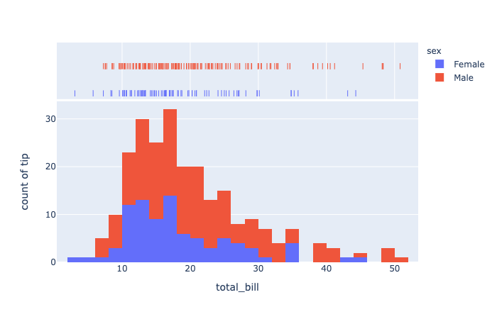
marginal_x (str) – One of 'rug', 'box', 'violin', or 'histogram`’. If set, a vertical subplot is drawn to the right of the main plot, visualizing the x-distribution.
1 | import plotly.express as px |
trendline(str) – One of ‘ols‘ or ‘lowess‘. If ‘ols‘, an Ordinary Least Squares regression line will be drawn for each discrete-color/symbol group. If ‘lowess’, a Locally Weighted Scatterplot Smoothing line will be drawn for each discrete-color/symbol group.
1 | import plotly.express as px |
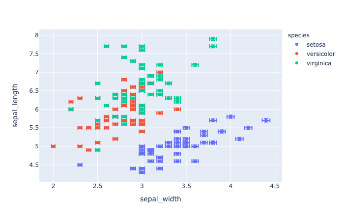
error_x(strorintorSeriesorarray-like) – Either a name of a column indata_frame, or a pandas Series or array_like object. Values from this column or array_like are used to size x-axis error bars. If error_x_minus is None, error bars will be symmetrical, otherwise error_x is used for the positive direction only.
1 | import plotly.express as px |
1 | import plotly.express as px |
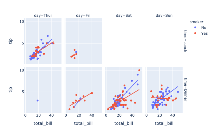
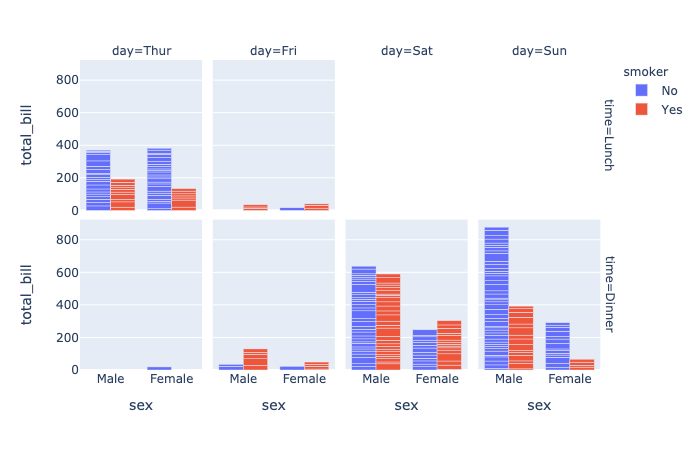
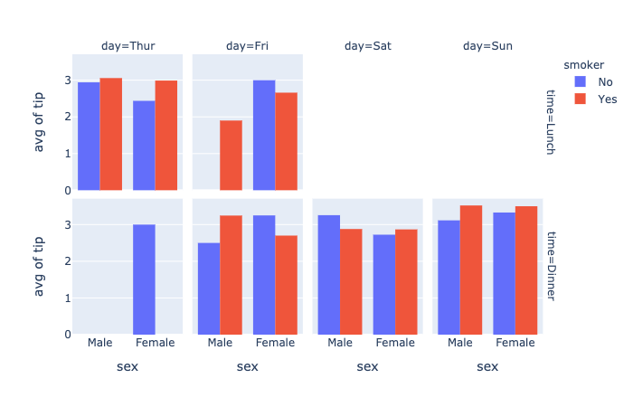
facet_row(strorintorSeriesorarray-like) – Either a name of a column indata_frame, or a pandas Series or array_like object. Values from this column or array_like are used to assign marks to facetted subplots in the vertical direction.facet_col(strorintorSeriesorarray-like) – Either a name of a column indata_frame, or a pandas Series or array_like object. Values from this column or array_like are used to assign marks to facetted subplots in the horizontal direction.category_orders(dictwithstrkeys andlistofstrvalues (default{})) – By default, in Python 3.6+, the order of categorical values in axes, legends and facets depends on the order in which these values are first encountered indata_frame(and no order is guaranteed by default in Python below 3.6). This parameter is used to force a specific ordering of values per column. The keys of this dict should correspond to column names, and the values should be lists of strings corresponding to the specific display order desired.
1 | import plotly.express as px |
render_mode(str) – One of ‘auto‘, ‘svg‘ or ‘webgl‘, default ‘auto‘ Controls the browser API used to draw marks. ‘svg’is appropriate for figures of less than 1000 data points, and will allow for fully-vectorized output. ‘webgl‘ is likely necessary for acceptable performance above 1000 points but rasterizes part of the output. ‘auto‘ uses heuristics to choose the mode.
1 | import plotly.express as px |
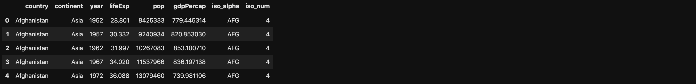
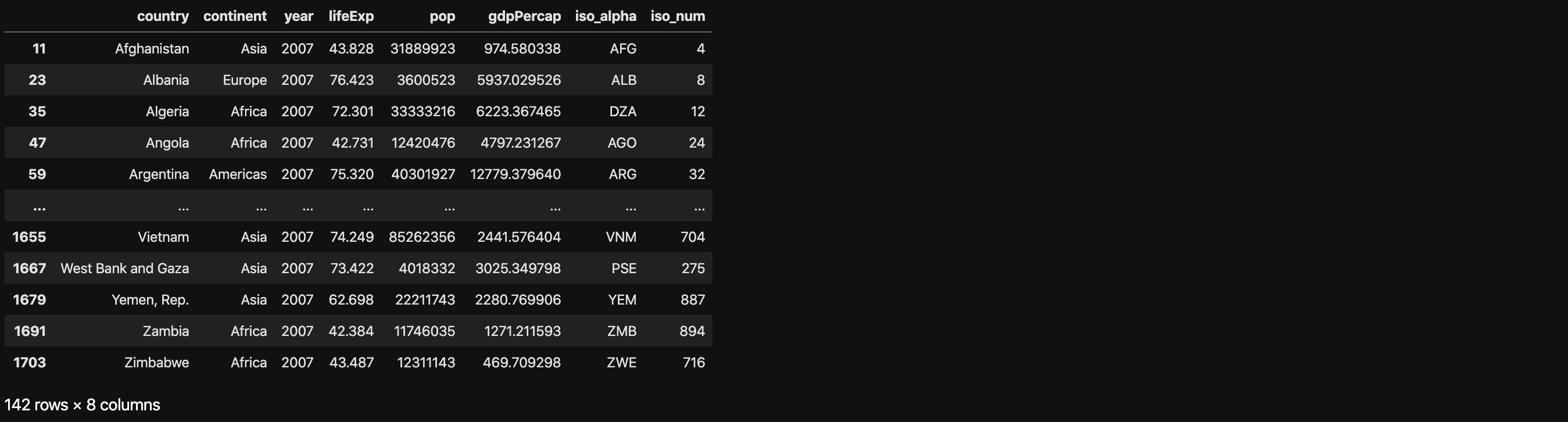
1 | df[df["year"] == 2007] |
1 | import plotly.express as px |
DataFrame.query(self, expr, inplace=False, **kwargs)
Package plotly.express:
hover_name(strorintorSeriesorarray-like) – Either a name of a column indata_frame, or a pandas Series or array_like object. Values from this column or array_like appear in bold in the hover tooltip.log_x(boolean(defaultFalse)) – IfTrue, the x-axis is log-scaled in cartesian coordinates.

1 | import plotly.express as px |
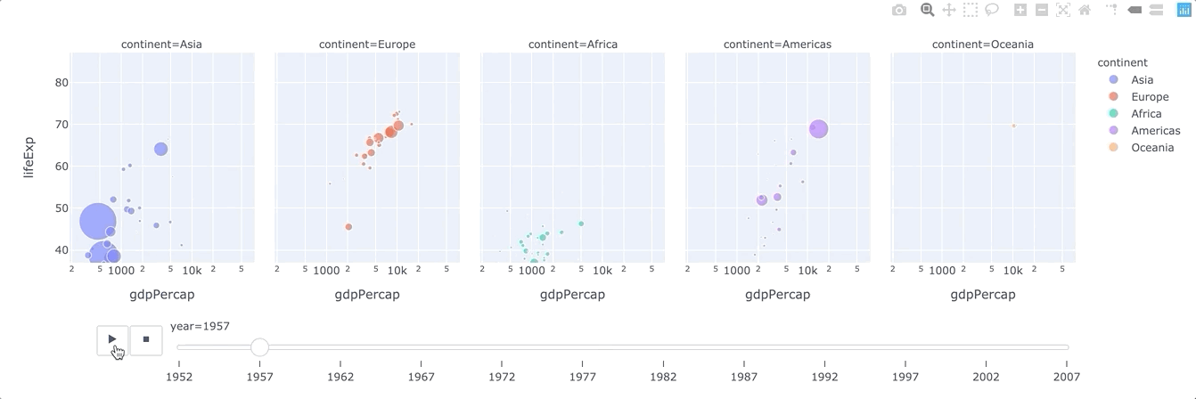
animation_frame(strorintorSeriesorarray-like) – Either a name of a column indata_frame, or a pandas Series or array_like object. Values from this column or array_like are used to assign marks to animation frames.animation_group(strorintorSeriesorarray-like) – Either a name of a column indata_frame, or a pandas Series or array_like object. Values from this column or array_like are used to provide object-constancy across animation frames: rows with matchinganimation_group‘s will be treated as if they describe the same object in each frame.range_x(list of two numbers) – If provided, overrides auto-scaling on the x-axis in cartesian coordinates.
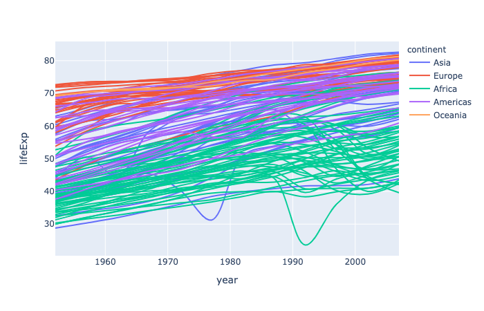
plotly.express.line
In a 2D line plot, each row of data_frame is represented as vertex of a polyline mark in 2D space.
1 | import plotly.express as px |
line_group(strorintorSeriesorarray-like) – Either a name of a column indata_frame, or a pandas Series or array_like object. Values from this column or array_like are used to group rows ofdata_frameinto lines.line_shape(str (default ‘linear‘)) – One of ‘linear‘ or ‘spline‘.
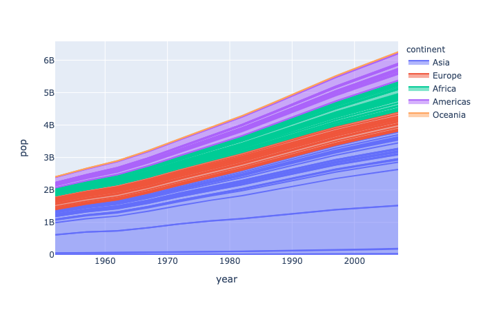
plotly.express.area
In a stacked area plot, each row of data_frame is represented as vertex of a polyline mark in 2D space. The area between successive polylines is filled.
1 | import plotly.express as px |
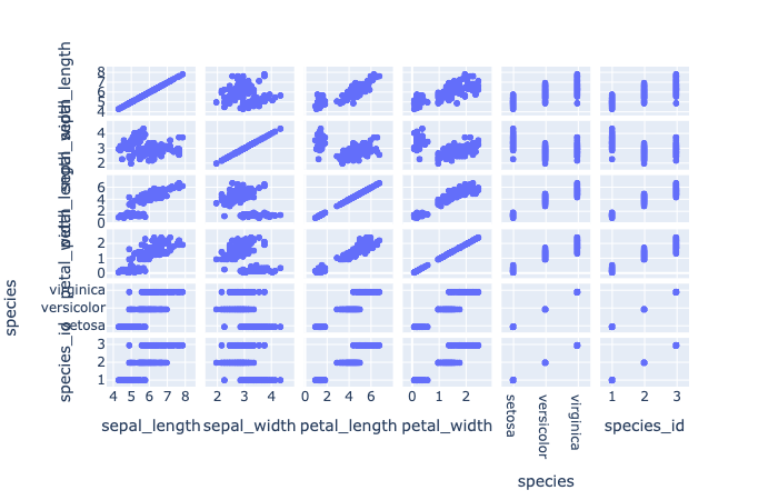
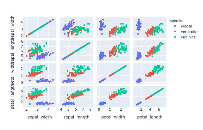
plotly.express.scatter_matrix
In a scatter plot matrix (or SPLOM), each row of data_frame is represented by a multiple symbol marks, one in each cell of a grid of 2D scatter plots, which plot each pair of dimensions against each other.
1 | import plotly.express as px |
1 | import plotly.express as px |
1 | import plotly.express as px |
1 | import plotly.express as px |
dimensions(listofstrorint, orSeriesorarray-like) – Either names of columns indata_frame, or pandas Series, or array_like objects Values from these columns are used for multidimensional visualization.
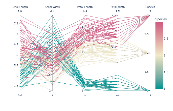
plotly.express.parallel_coordinates
In a parallel coordinates plot, each row of data_frame is represented by a polyline mark which traverses a set of parallel axes, one for each of the dimensions.
1 | import plotly.express as px |
1 | import plotly.express as px |
labels(dictwithstrkeys andstrvalues (default{})) – By default, column names are used in the figure for axis titles, legend entries and hovers. This parameter allows this to be overridden. The keys of this dict should correspond to column names, and the values should correspond to the desired label to be displayed.color_continuous_scale(listofstr) – Strings should define valid CSS-colors This list is used to build a continuous color scale when the column denoted bycolorcontains numeric data. Various useful color scales are available in theplotly.express.colorssubmodules, specificallyplotly.express.colors.sequential,plotly.express.colors.divergingandplotly.express.colors.cyclical.color_continuous_midpoint(number (default None)) – If set, computes the bounds of the continuous color scale to have the desired midpoint. Setting this value is recommended when using plotly.express.colors.diverging color scales as the inputs to color_continuous_scale.
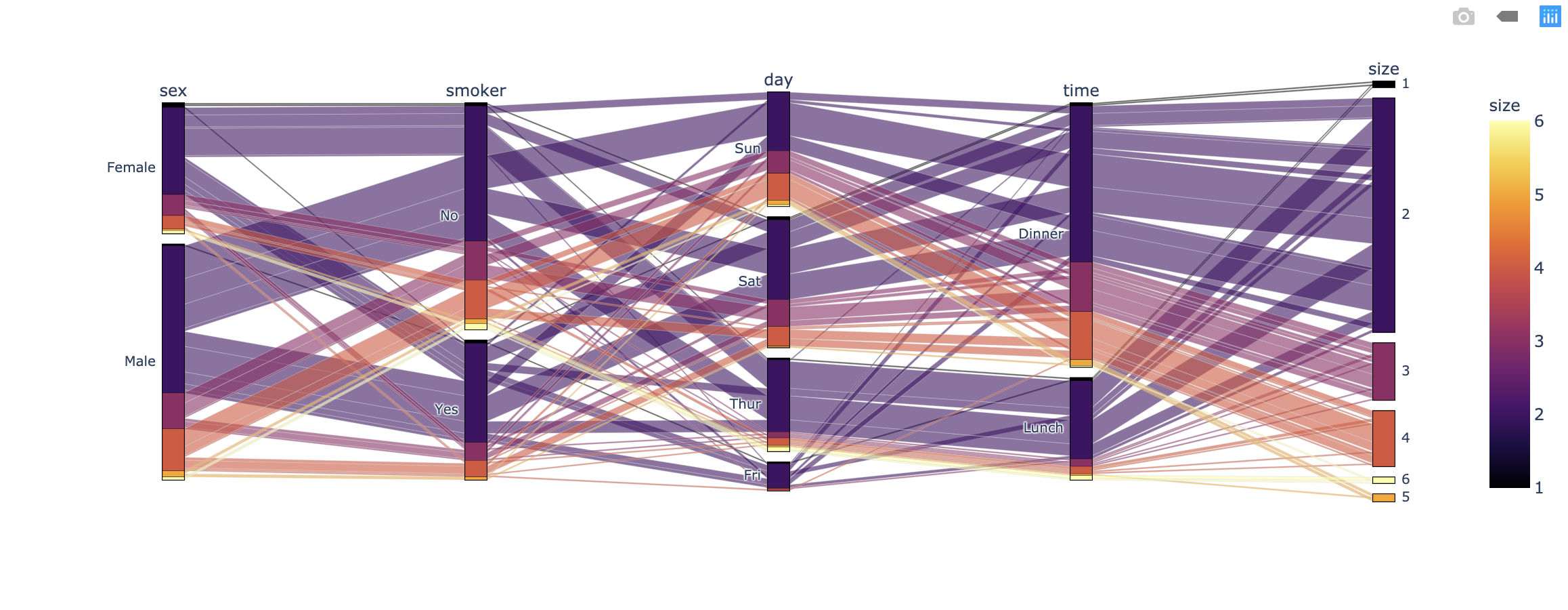
plotly.express.parallel_categories
In a parallel categories (or parallel sets) plot, each row of data_frame is grouped with other rows that share the same values of dimensions and then plotted as a polyline mark through a set of parallel axes, one for each of the dimensions.
1 | import plotly.express as px |
1 | import plotly.express as px |
Visualize Distributions
Refer to the main statistical graphs page for full documentation.
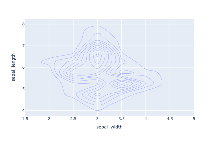
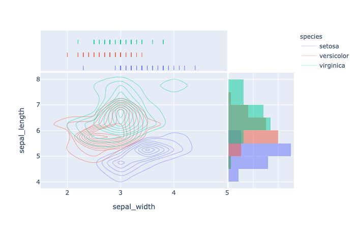
plotly.express.density_contour
In a density contour plot, rows of data_frame are grouped together into contour marks to visualize the 2D distribution of an aggregate function histfunc (e.g. the count or sum) of the value z.
1 | import plotly.express as px |
1 | import plotly.express as px |
1 | import plotly.express as px |
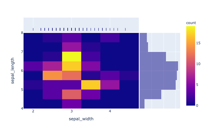
plotly.express.density_heatmap
In a density heatmap, rows of data_frame are grouped together into colored rectangular tiles to visualize the 2D distribution of an aggregate function histfunc (e.g. the count or sum) of the value z.
1 | import plotly.express as px |
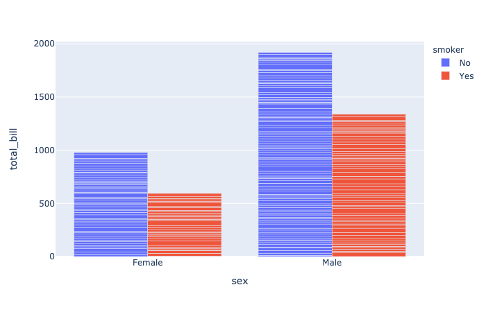
plotly.express.bar
In a bar plot, each row of data_frame is represented as a rectangular mark.
1 | import plotly.express as px |
1 | import plotly.express as px |
barmode(str(default ‘relative‘)) – One of ‘group‘, ‘overlay‘ or ‘relative‘- In ‘
relative‘ mode, bars are stacked above zero for positive values and below zero for negative values. - In ‘
overlay‘ mode, bars are drawn on top of one another. - In ‘
group‘ mode, bars are placed beside each other.
- In ‘
1 | import plotly.express as px |
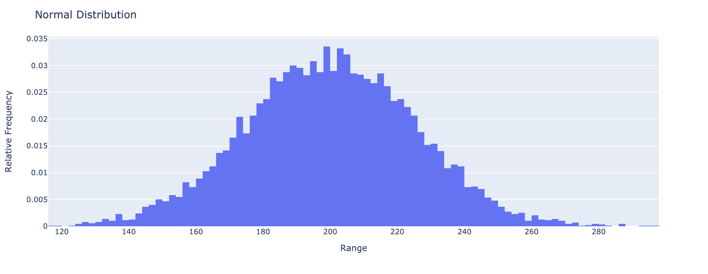
plotly.express.histogram
In a histogram, rows of data_frame are grouped together into a rectangular mark to visualize the 1D distribution of an aggregate function histfunc (e.g. the count or sum) of the value y (or x if orientation is ‘h‘).
1 | import plotly.express as px |
hover_data (list of str or int, or Series or array-like) – Either names of columns in data_frame, or pandas Series, or array_like objects Values from these columns appear as extra data in the hover tooltip.
1 | import plotly.express as px |
histfunc(str(default ‘count‘)) – One of ‘count‘, ‘sum‘, ‘avg‘, ‘min‘, or ‘max‘.Function used to aggregate values for summarization (note: can be normalized withhistnorm). The arguments to this function forhistogramare the values ofyif orientation is ‘v‘, otherwise the arguements are the values ofx. The arguments to this function fordensity_heatmapanddensity_contourare the values ofz.
1 | import numpy as np |
histnorm(str(defaultNone)) – One of ‘percent‘, ‘probability‘, ‘density‘, or ‘probability density‘- If
None, the output of histfunc is used as is. - If ‘
probability‘, the output of histfunc for a given bin is divided by the sum of the output of histfunc for all bins. - If ‘
percent‘, the output of histfunc for a given bin is divided by the sum of the output of histfunc for all bins and multiplied by 100. - If ‘
density‘, the output of histfunc for a given bin is divided by the size of the bin. - If ‘
probability density‘, the output of histfunc for a given bin is normalized such that it corresponds to the probability that a random event whose distribution is described by the output of histfunc will fall into that bin.
- If
1 | import numpy as np |

1 | import numpy as np |
1 | import plotly.figure_factory as ff |
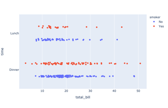
plotly.express.strip
In a strip plot each row of data_frame is represented as a jittered mark within categories.
1 | import plotly.express as px |
orientation(str (default ‘v‘)) – One of ‘h‘ for horizontal or ‘v‘ for vertical)
plotly.express.box
In a box plot, rows of data_frame are grouped together into a box-and-whisker mark to visualize their distribution.
Each box spans from quartile 1 (Q1) to quartile 3 (Q3). The second quartile (Q2) is marked by a line inside the box. By default, the whiskers correspond to the box’ edges +/- 1.5 times the interquartile range (IQR: Q3-Q1), see “points” for other options.
1 | import plotly.express as px |
notched(boolean(defaultFalse)) – IfTrue, boxes are drawn with notches.
plotly.express.violin
In a violin plot, rows of data_frame are grouped together into a curved mark to visualize their distribution.
1 | mport plotly.express as px |
box(boolean(defaultFalse)) – IfTrue, boxes are drawn inside the violins.points(strorboolean(default ‘outliers‘)) – One of ‘outliers‘, ‘suspectedoutliers‘, ‘all‘, orFalse.- If ‘
outliers‘, only the sample points lying outside the whiskers are shown. - If ‘
suspectedoutliers‘, all outlier points are shown and those less than4 * Q1 - 3 * Q3or greater than4 * Q3 - 3 * Q1are highlighted with the marker’s ‘outliercolor‘. If ‘outliers‘, only the sample points lying outside the whiskers are shown. - If ‘
all‘, all sample points are shown. - If
False, no sample points are shown and the whiskers extend to the full range of the sample.
- If ‘
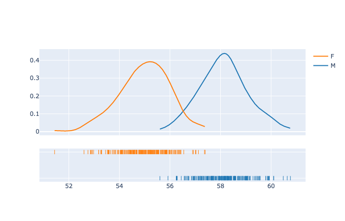
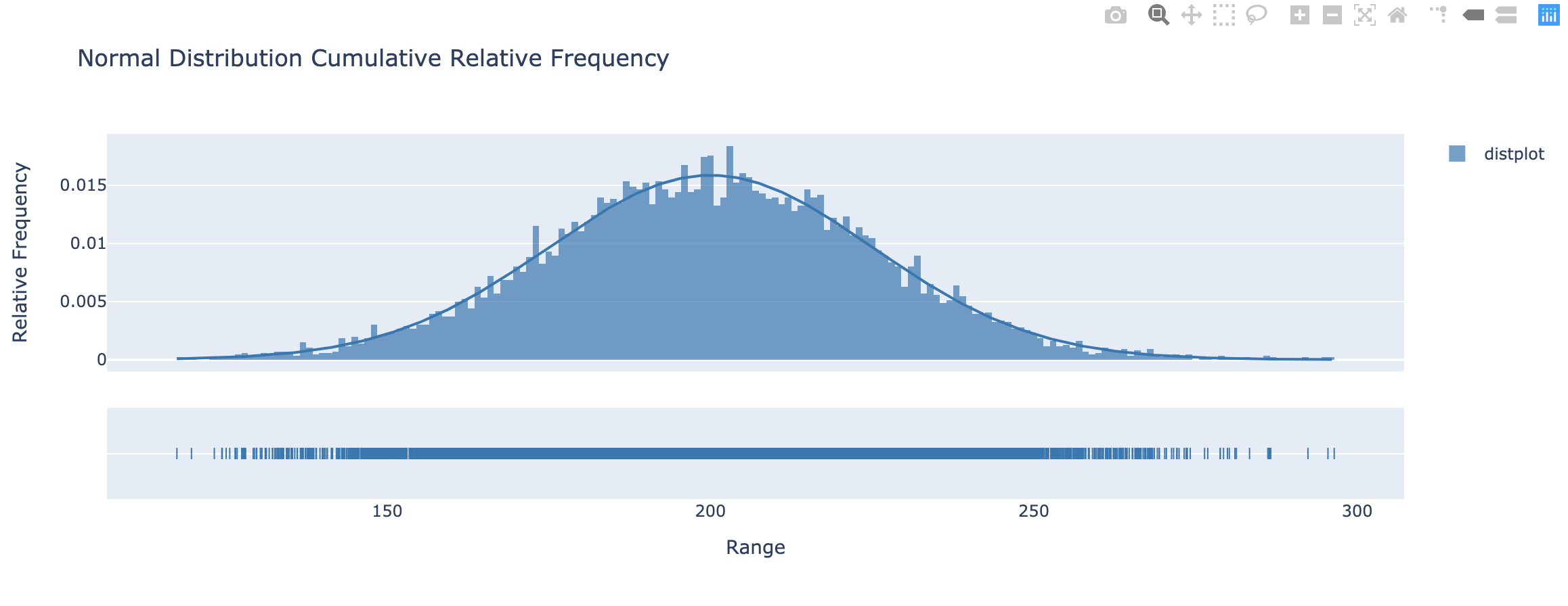
Distplots in Python
1 | import plotly.express as px |
Ternary Coordinates
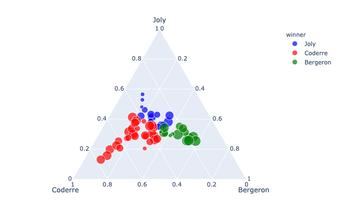
plotly.express.scatter_ternary
In a ternary scatter plot, each row of data_frame is represented by a symbol mark in ternary coordinates.
1 | import plotly.express as px |
1 | import plotly.express as px |
a(strorintorSeriesorarray-like) – Either a name of a column indata_frame, or a pandas Series or array_like object. Values from this column or array_like are used to position marks along the a axis in ternary coordinates.color_discrete_map(dictwithstrkeys andstrvalues (default {})) – String values should define valid CSS-colors Used to overridecolor_discrete_sequenceto assign a specific colors to marks corresponding with specific values. Keys incolor_discrete_mapshould be values in the column denoted bycolor.
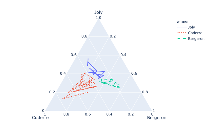
plotly.express.line_ternary
In a ternary line plot, each row of data_frame is represented as vertex of a polyline mark in ternary coordinates.
1 | import plotly.express as px |
1 | import plotly.express as px |
line_dash(strorintorSeriesorarray-like) – Either a name of a column indata_frame, or a pandas Series or array_like object. Values from this column or array_like are used to assign dash-patterns to lines.
Images
Display an image, i.e. data on a 2D regular raster.
1 | import plotly.express as px |
3D Coordinates
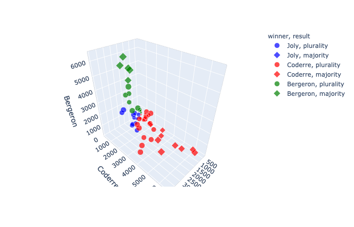
In a 3D scatter plot, each row of data_frame is represented by a symbol mark in 3D space.
1 | import plotly.express as px |
1 | import plotly.express as px |
symbol(strorintorSeriesorarray-like) – Either a name of a column indata_frame, or a pandas Series or array_like object. Values from this column or array_like are used to assign symbols to marks.
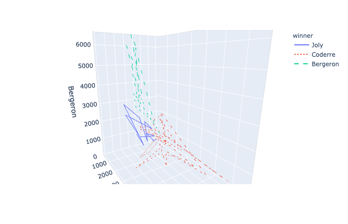
plotly.express.line_3d
In a 3D line plot, each row of data_frame is represented as vertex of a polyline mark in 3D space.
1 | import plotly.express as px |
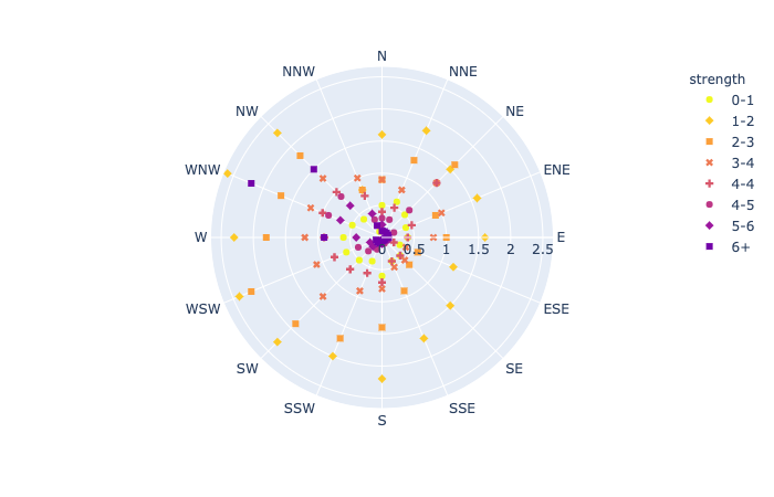
Polar Coordinates
In a polar scatter plot, each row of data_frame is represented by a symbol mark in polar coordinates.
1 | import plotly.express as px |
1 | import plotly.express as px |
r(strorintorSeriesorarray-like) – Either a name of a column indata_frame, or a pandas Series or array_like object. Values from this column or array_like are used to position marks along the radial axis in polar coordinates.theta(strorintorSeriesorarray-like) – Either a name of a column indata_frame, or a pandas Series or array_like object. Values from this column or array_like are used to position marks along the angular axis in polar coordinates.
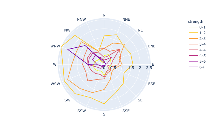
plotly.express.line_polar
In a polar line plot, each row of data_frame is represented as vertex of a polyline mark in polar coordinates.
1 | import plotly.express as px |
1 | import plotly.express as px |
line_close(boolean(defaultFalse)) – IfTrue, an extra line segment is drawn between the first and last point.
plotly.express.bar_polar
In a polar bar plot, each row of data_frame is represented as a wedge mark in polar coordinates.
1 | import plotly.express as px |
template(or dict or plotly.graph_objects.layout.Template instance) – The figure template name or definition.
Maps
Mapbox Access Token and Base Map Configuration
To plot on Mapbox maps with Plotly you may need a Mapbox account and a public Mapbox Access Token. See Mapbox Map Layers documentation for more information.
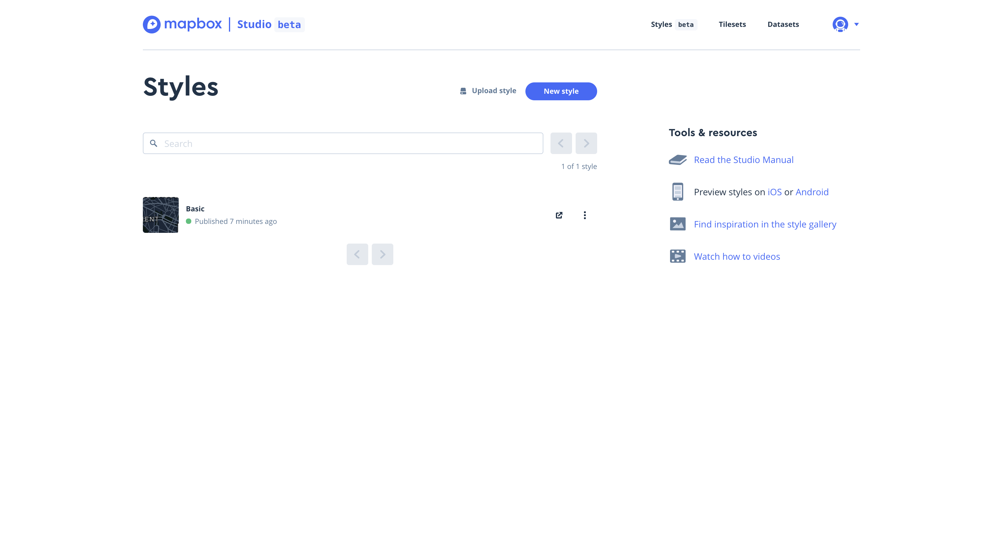
After register an account for Mapbox. Click New Style.
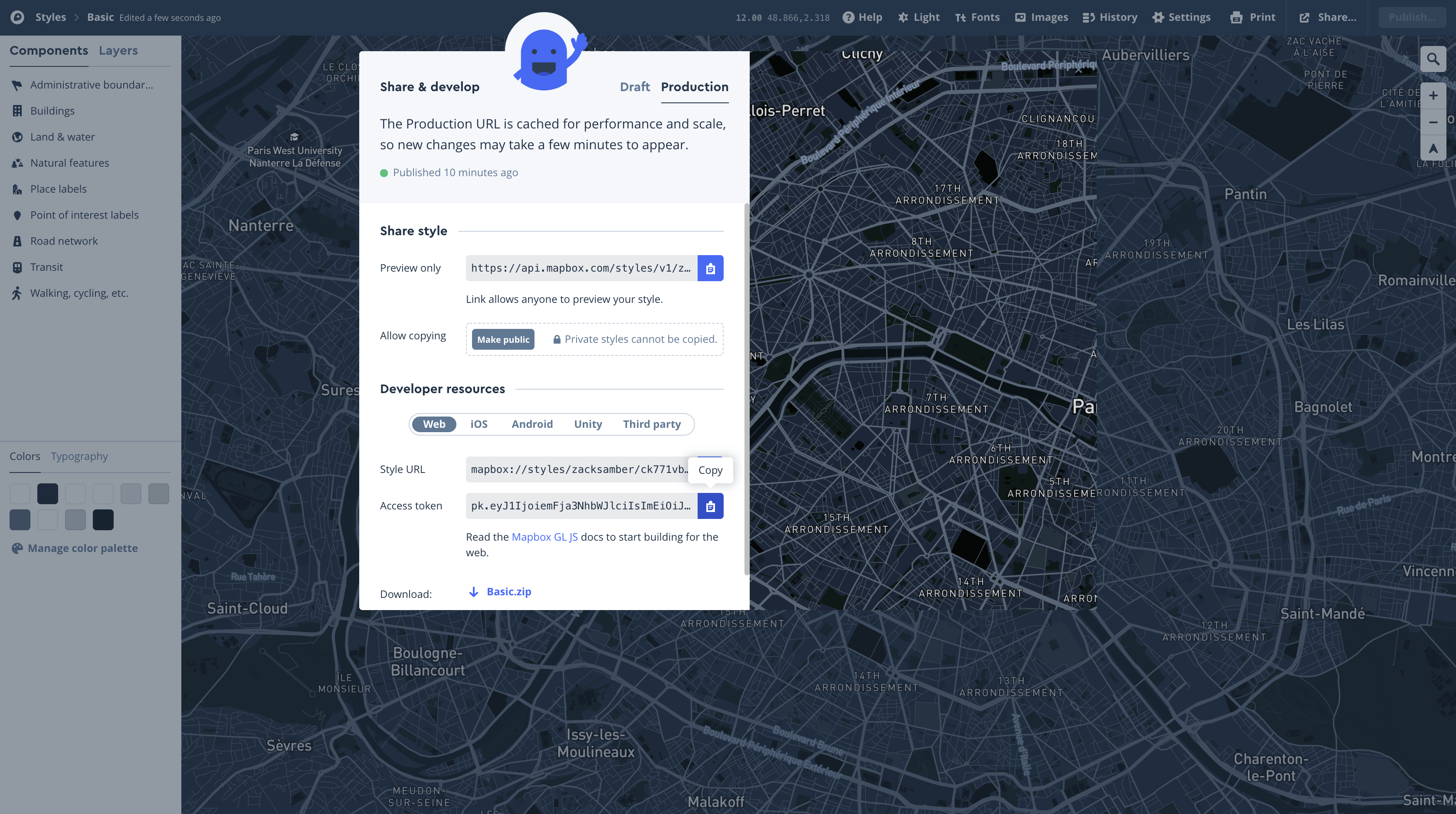
Click Share on the top and right.
Cope your Access Token
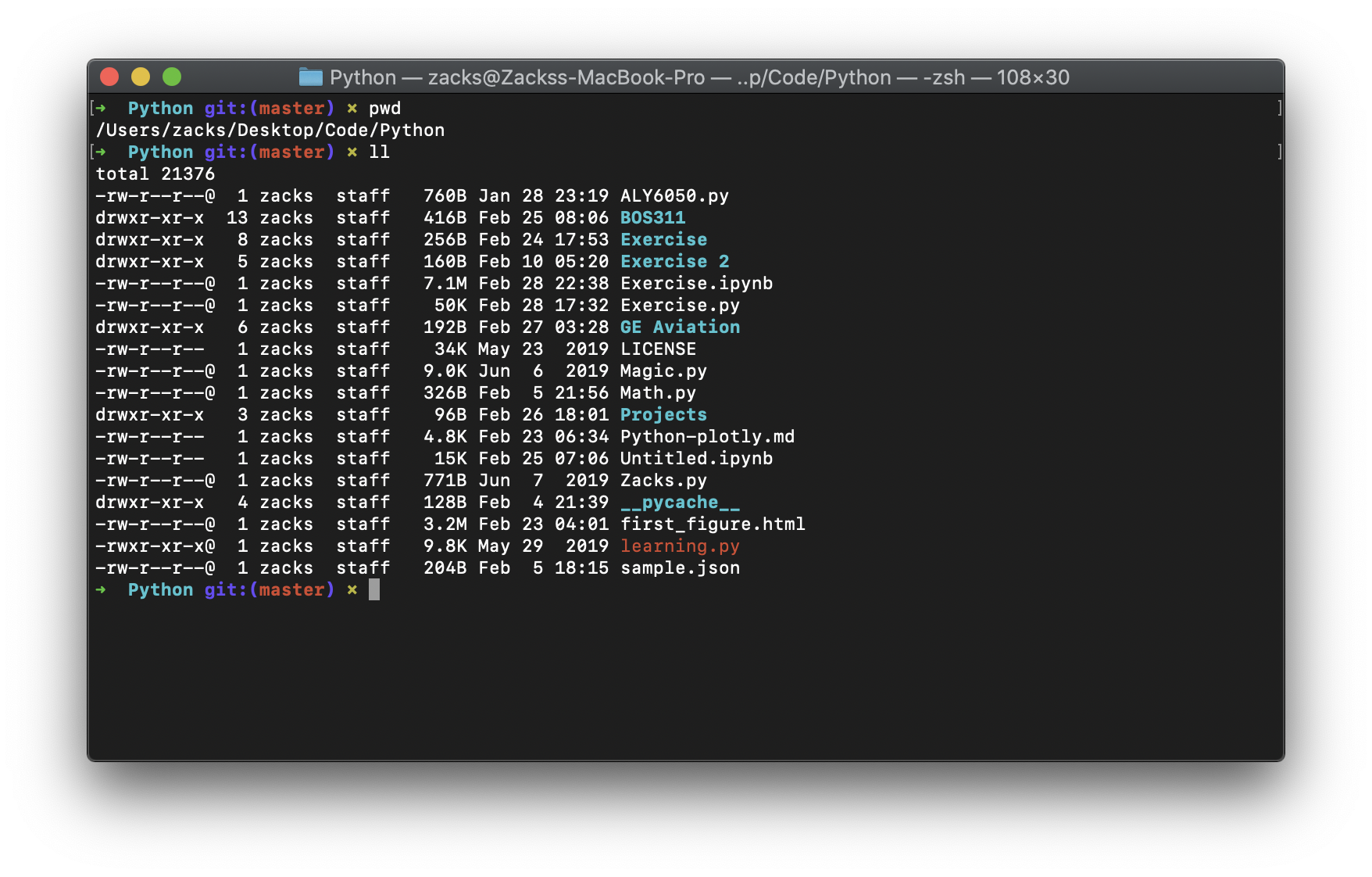
Then open your shell. Make sure you are in your .py file working directory.
1 | pwd |
Then replace your Acess Token to the following command.
1 | touch .mapbox_token |
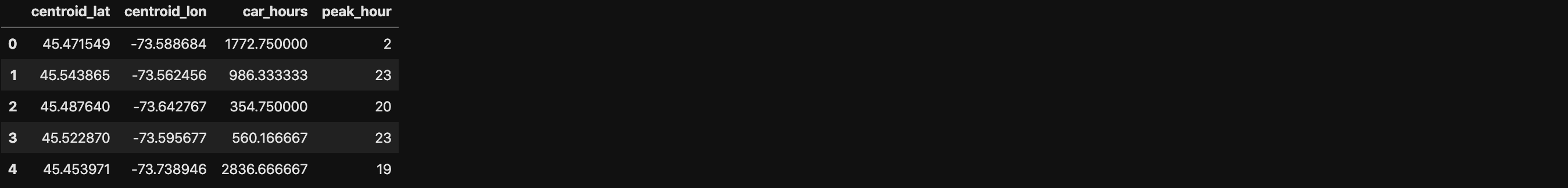
plotly.express.scatter_mapbox
In a Mapbox scatter plot, each row of data_frame is represented by a symbol mark on a Mapbox map.
1 | import plotly.express as px |
1 | import plotly.express as px |
lat(strorintorSeriesorarray-like) – Either a name of a column in data_frame, or a pandas Series or array_like object. Values from this column or array_like are used to position marks according to latitude on a map.lon(strorintorSeriesorarray-like) – Either a name of a column in data_frame, or a pandas Series or array_like object. Values from this column or array_like are used to position marks according to longitude on a map.

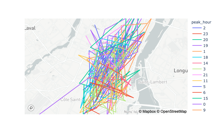
plotly.express.line_mapbox
In a Mapbox line plot, each row of data_frame is represented as vertex of a polyline mark on a Mapbox map.
1 | import plotly.express as px |
1 | import plotly.express as px |
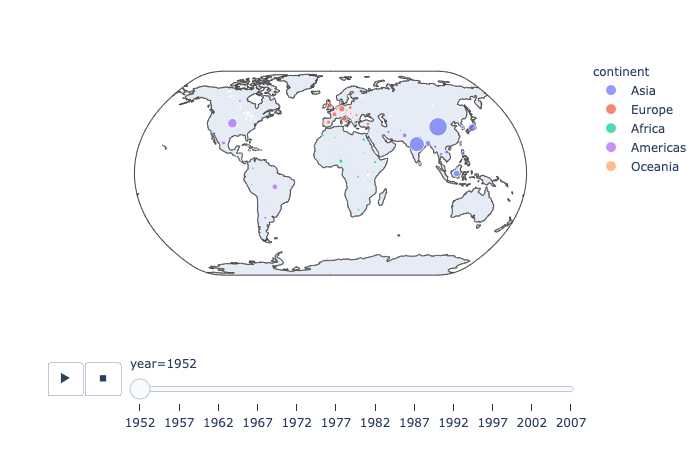
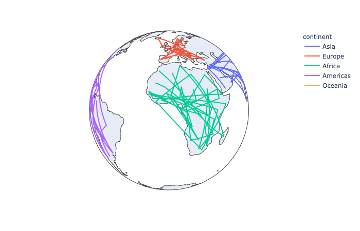
plotly.express.scatter_geo
In a geographic scatter plot, each row of data_frame is represented by a symbol mark on a map.
1 | import plotly.express as px |
1 | import plotly.express as px |
projection(str) – One of ‘equirectangular‘, ‘mercator‘, ‘orthographic‘, ‘natural earth‘, ‘kavrayskiy7‘, ‘miller‘, ‘robinson‘, ‘eckert4‘, ‘azimuthal equal area‘, ‘azimuthal equidistant‘, ‘conic equal area‘, ‘conic conformal‘, ‘conic equidistant‘, ‘gnomonic‘, ‘stereographic‘, ‘mollweide‘, ‘hammer‘, ‘transverse mercator‘, ‘albers usa‘, ‘winkel tripel‘, ‘aitoff‘, or ‘sinusoidal‘Default depends on scope.
plotly.express.line_geo
In a geographic line plot, each row of data_frame is represented as vertex of a polyline mark on a map.
1 | import plotly.express as px |
1 | df[df["year"] == 2007] |
1 | import plotly.express as px |
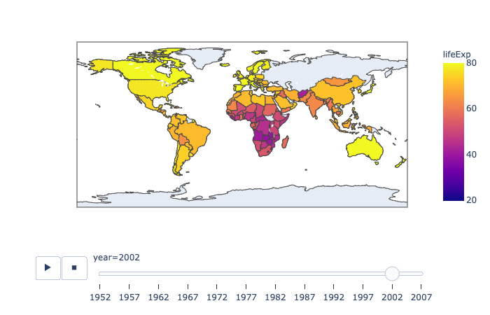
plotly.express.choropleth
In a choropleth map, each row of data_frame is represented by a colored region mark on a map.
1 | import plotly.express as px |
range_color(list of two numbers) – If provided, overrides auto-scaling on the continuous color scale.
Reference Documentation
Statistical
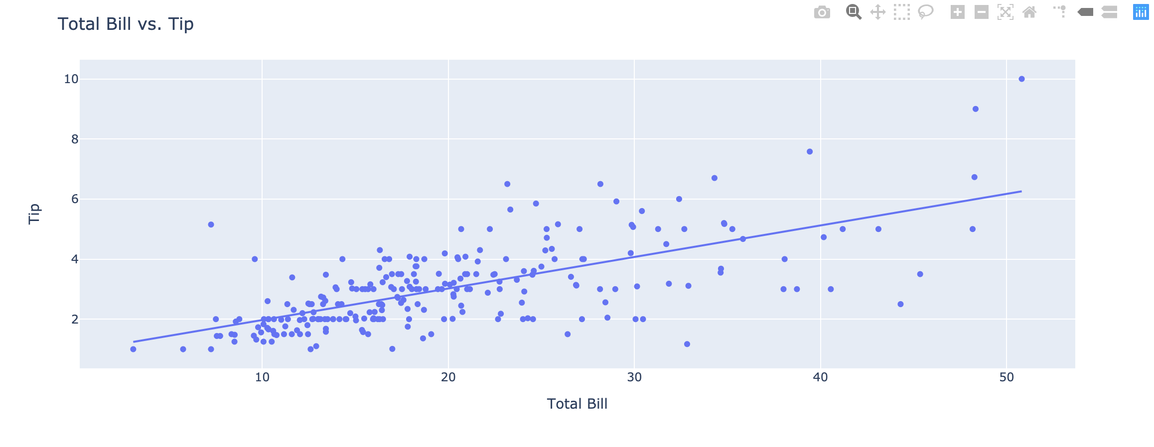
Linear and Non-Linear Trendlines in Python
https://plot.ly/python/linear-fits/
Add linear Ordinary Least Squares (OLS) regression trendlines or non-linear Locally Weighted Scatterplot Smoothing (LOEWSS) trendlines to scatterplots in Python.
Linear fit trendlines with Plotly Express
https://plot.ly/python-api-reference/generated/plotly.express.scatter.html#plotly.express.scatter
Plotly Express is the easy-to-use, high-level interface to Plotly, which operates on “tidy” data and produces easy-to-style figures.
Plotly Express allows you to add Ordinary Least Squares regression trendline to scatterplots with the trendline argument. In order to do so, you will need to install statsmodels and its dependencies. Hovering over the trendline will show the equation of the line and its R-squared value.
1 | import plotly.express as px |
1 | import plotly.express as px |
trendline(str) – One of ‘ols‘ or ‘lowess‘.- If ‘
ols‘, an Ordinary Least Squares regression line will be drawn for each discrete-color/symbol group. - If ‘
lowess’, a Locally Weighted Scatterplot Smoothing line will be drawn for each discrete-color/symbol group.
- If ‘
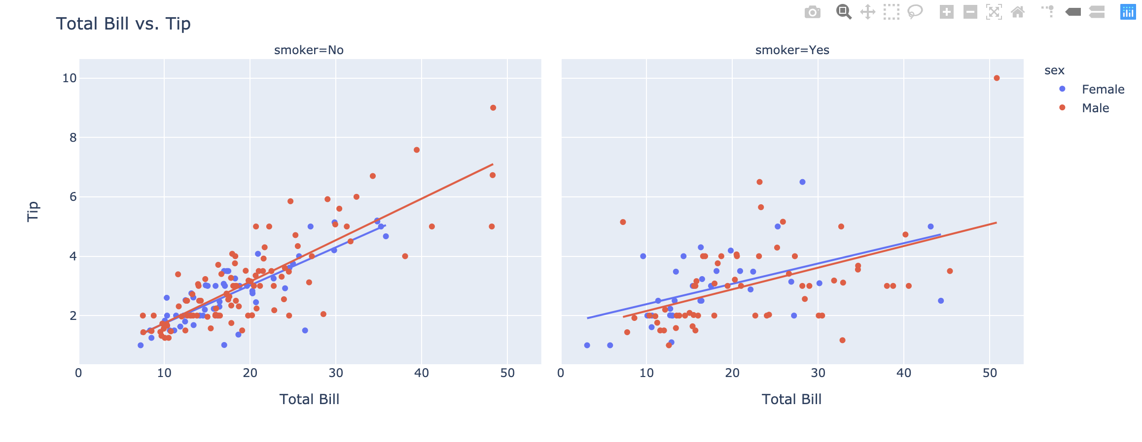
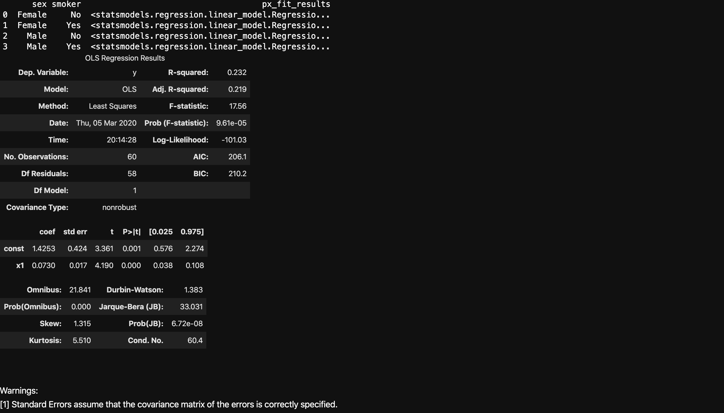
Fitting multiple lines and retrieving the model parameters
https://plot.ly/python-api-reference/generated/plotly.express.scatter.html#plotly.express.scatter
Plotly Express will fit a trendline per trace, and allows you to access the underlying model parameters for all the models.
1 | import plotly.express as px |
1 | import plotly.express as px |
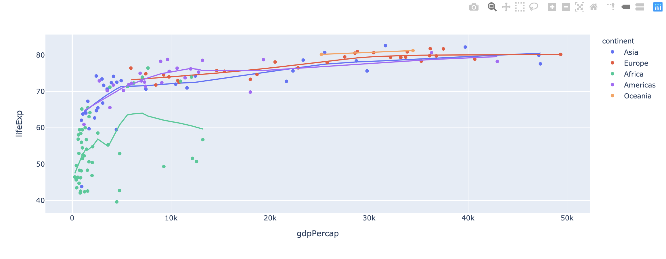
Non-Linear Trendlines
Plotly Express also supports non-linear LOWESS trendlines.
1 | import plotly.express as px |
1 | import plotly.express as px |
One More Thing
Python Algorithms - Words: 2,640
Python Crawler - Words: 1,663
Python Data Science - Words: 4,551
Python Django - Words: 2,409
Python File Handling - Words: 1,533
Python Flask - Words: 874
Python LeetCode - Words: 9
Python Machine Learning - Words: 5,532
Python MongoDB - Words: 32
Python MySQL - Words: 1,655
Python OS - Words: 707
Python plotly - Words: 6,649
Python Quantitative Trading - Words: 353
Python Tutorial - Words: 25,451
Python Unit Testing - Words: 68