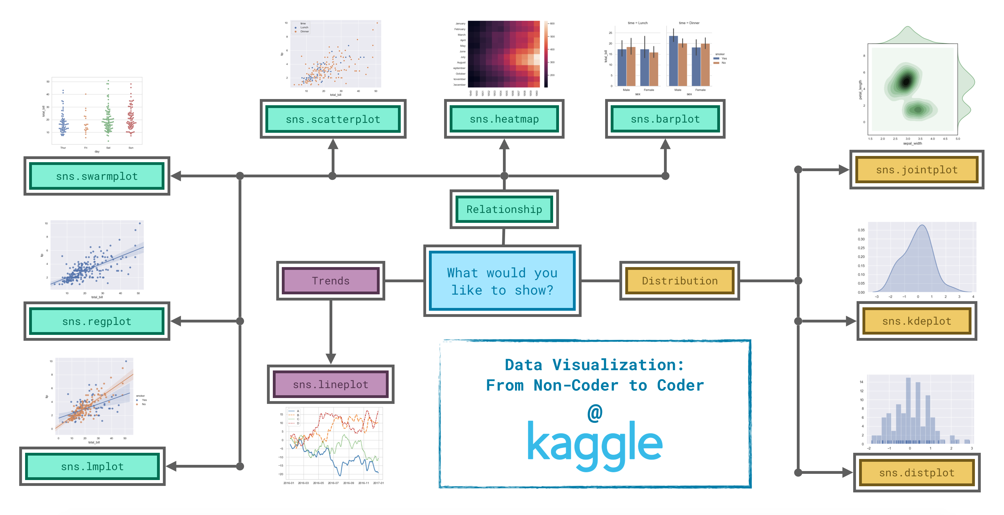
Trends - A trend is defined as a pattern of change.
sns.lineplot - Line charts are best to show trends over a period of time, and multiple lines can be used to show trends in more than one group.
Relationship - There are many different chart types that you can use to understand relationships between variables in your data.
sns.barplot - Bar charts are useful for comparing quantities corresponding to different groups.
sns.heatmap - Heatmaps can be used to find color-coded patterns in tables of numbers.
sns.scatterplot - Scatter plots show the relationship between two continuous variables; if color-coded, we can also show the relationship with a third categorical variable.
sns.regplot - Including a regression line in the scatter plot makes it easier to see any linear relationship between two variables.
sns.lmplot - This command is useful for drawing multiple regression lines, if the scatter plot contains multiple, color-coded groups.
sns.swarmplot - Categorical scatter plots show the relationship between a continuous variable and a categorical variable.
Distribution - We visualize distributions to show the possible values that we can expect to see in a variable, along with how likely they are.
sns.distplot - Histograms show the distribution of a single numerical variable.
sns.kdeplot - KDE plots (or 2D KDE plots) show an estimated, smooth distribution of a single numerical variable (or two numerical variables).
sns.jointplot - This command is useful for simultaneously displaying a 2D KDE plot with the corresponding KDE plots for each individual variable.
Dependencies
Python
1
2
3
4
5
import pandas as pd
pd.plotting.register_matplotlib_converters()
import matplotlib.pyplot as plt
%matplotlib inline
import seaborn as sns
Line Charts
Line chart of whole df
Python
1
2
3
4
5
6
7
8
# Set the width and height of the figure
plt.figure(figsize=(14,6))

# Add title
plt.title("title")

# Line chart showing all columns
sns.lineplot(data=df)
Line chart of parts of df
Python
1
2
3
4
5
6
7
8
9
10
11
12
13
14
15
16
17
# Set the width and height of the figure
plt.figure(figsize=(14,6))

# Add title
plt.title("title")

# Line chart showing df column 1
sns.lineplot(data=df['col1'], label="feature 1")

# Line chart showing df column 2
sns.lineplot(data=df['col2'], label="feature 2")

# Add label for horizontal axis
plt.xlabel("xlabel")

# Add label for vertical axis
plt.ylabel("ylabel")
Bar Charts and Heatmaps
Bar chart
Python
1
2
3
4
5
6
7
8
9
10
11
# Set the width and height of the figure
plt.figure(figsize=(10,6))

# Add title
plt.title("title")

# Bar chart showing df column1 by df.index
sns.barplot(x=df.index, y=df['col1'])

# Add label for vertical axis
plt.ylabel("ylabel")
Heatmap
Python
1
2
3
4
5
6
7
8
9
10
11
# Set the width and height of the figure
plt.figure(figsize=(14,7))

# Add title
plt.title("title")

# Heatmap
sns.heatmap(data=df, annot=True)

# Add label for horizontal axis
plt.xlabel("xlabel")
Scatter Plots, Regression, and Categorical Scatter Plots