Power BI
Introduction
What is Power BI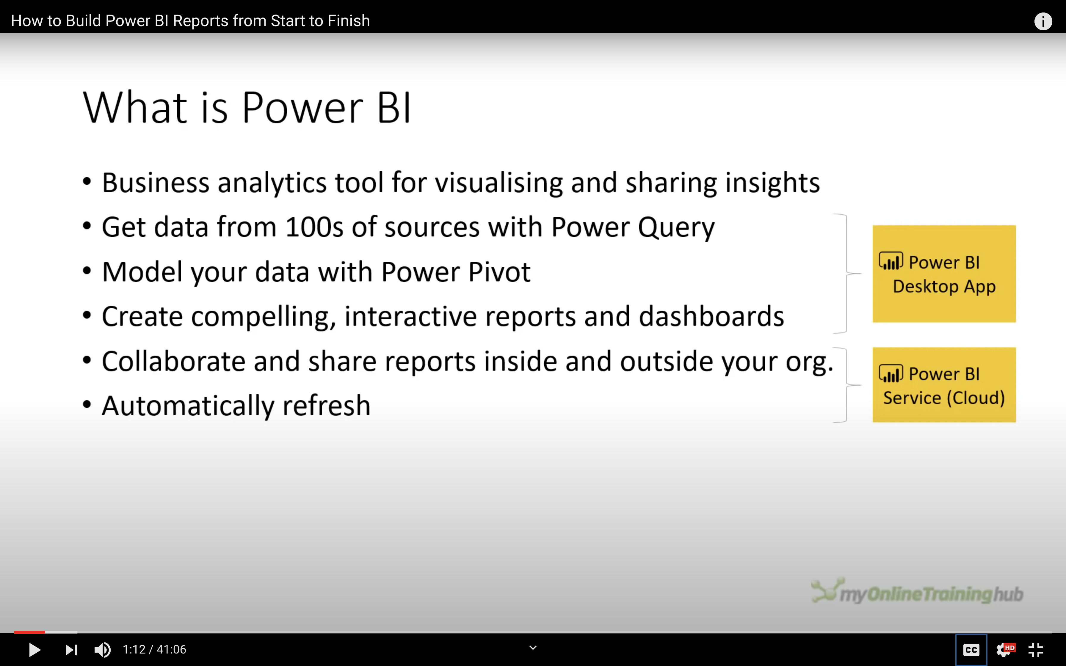
Data Preprocessing
Get Data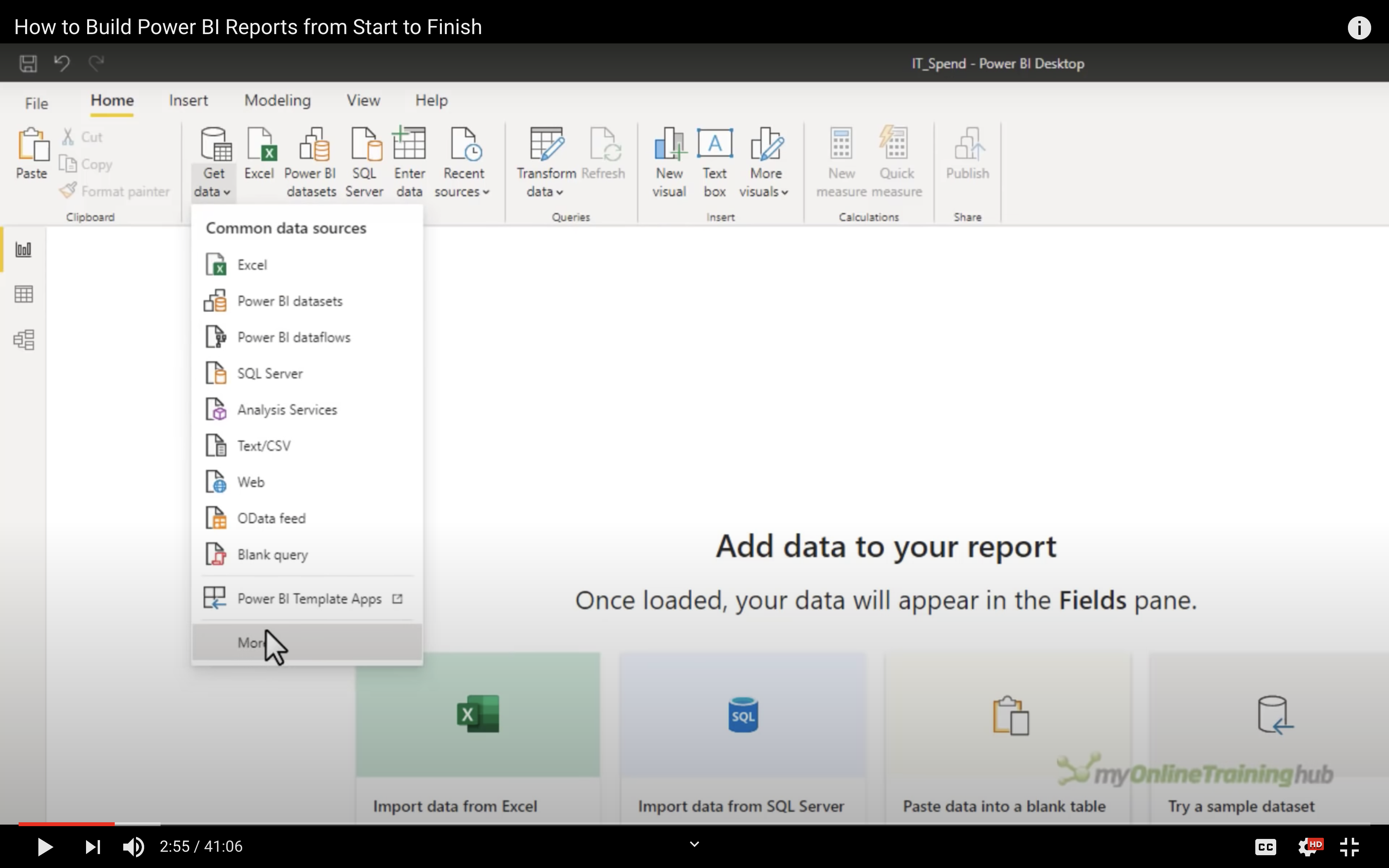
Click on More and get more data source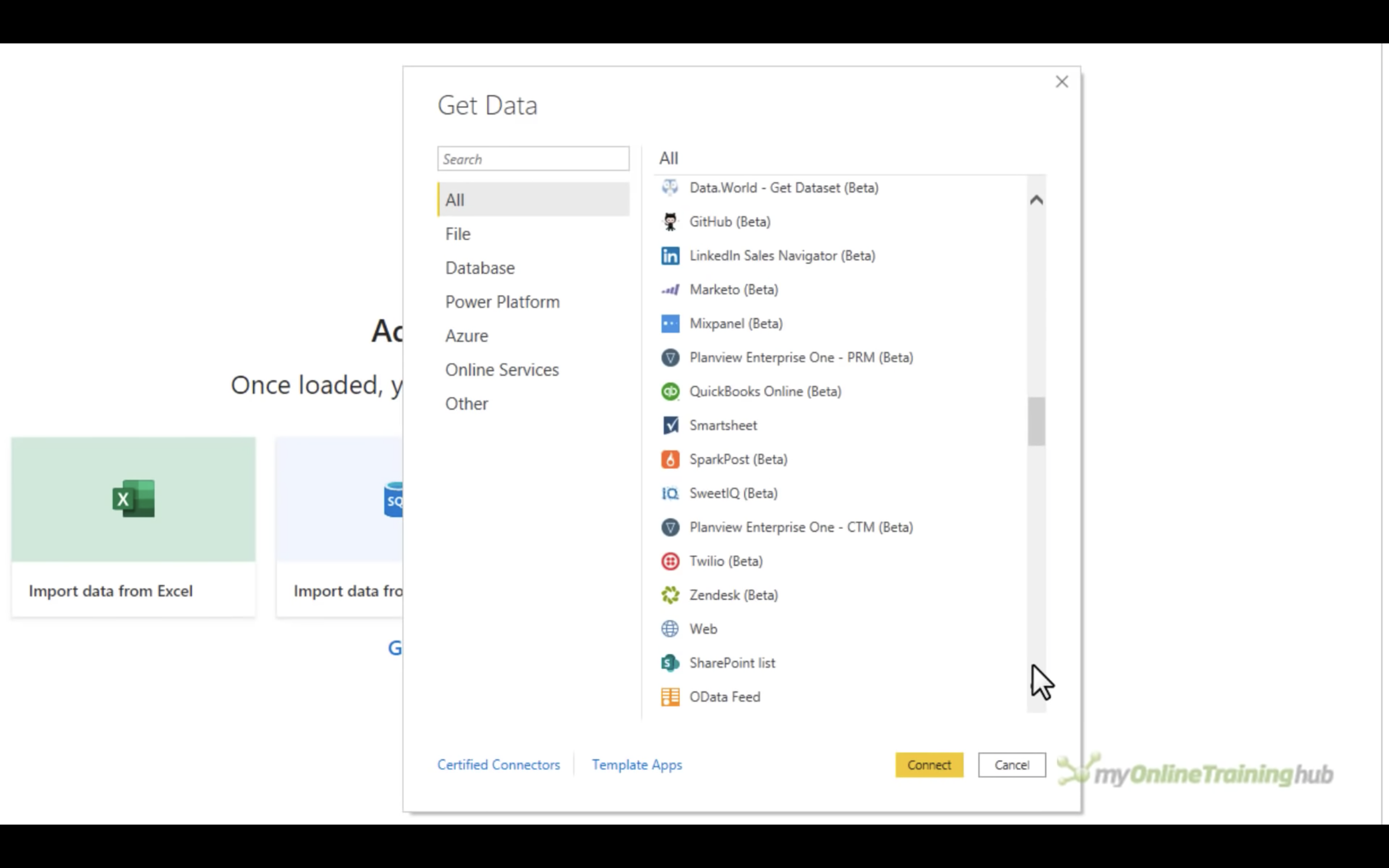
Fields on the right side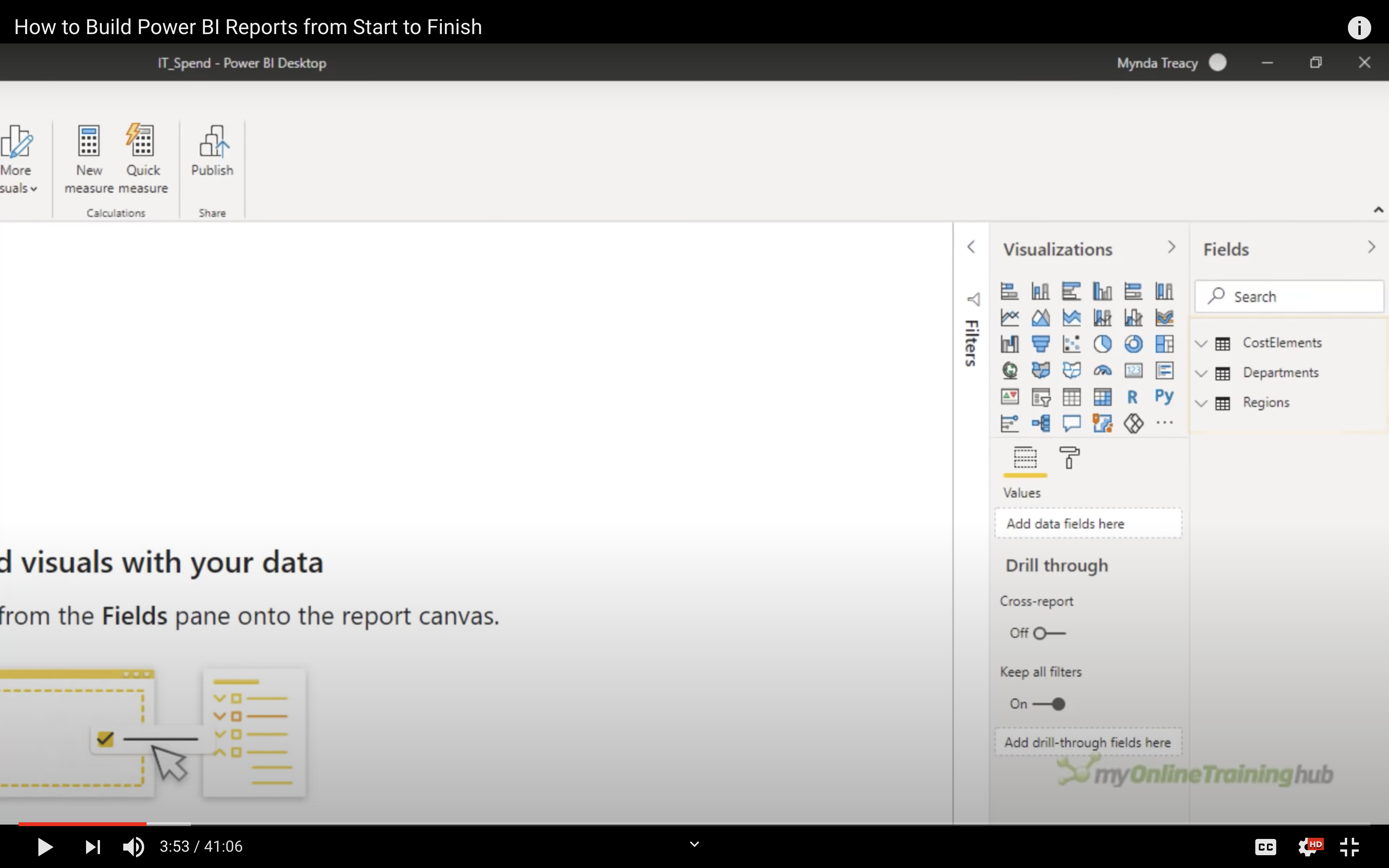
Support CSV file transformation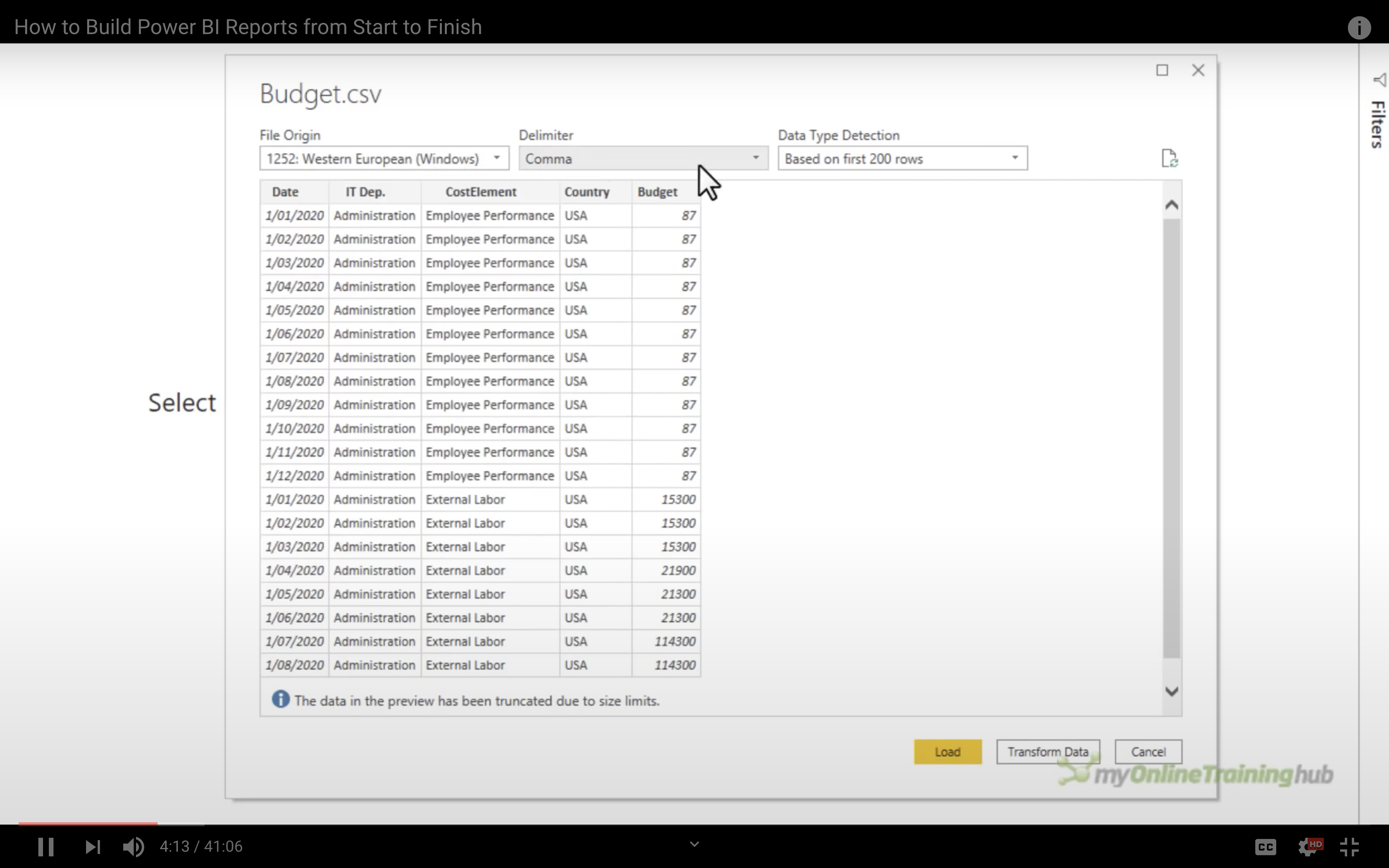
Queries on the left side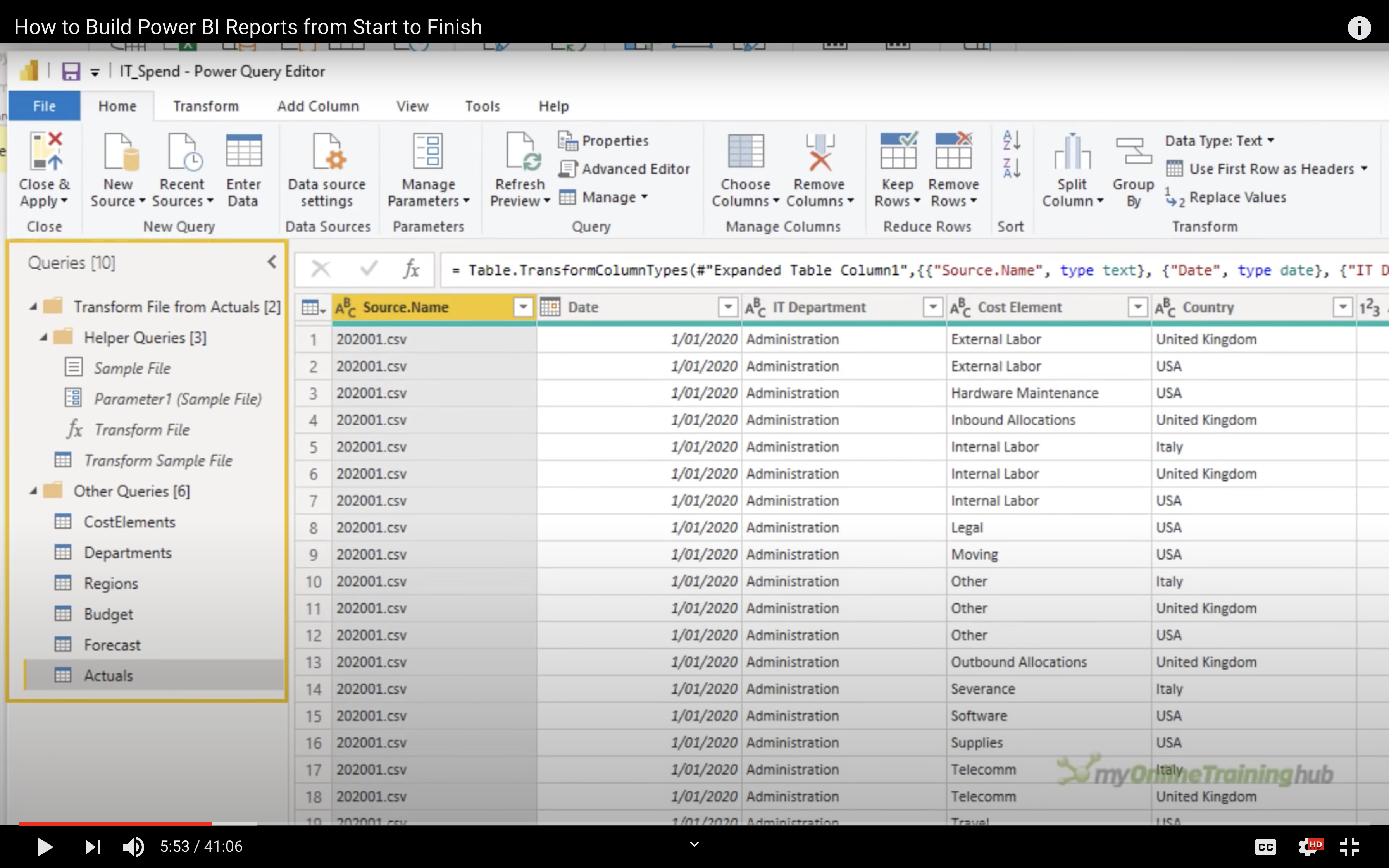
After filter the data you need, and delete the data you don’t need.
Click on Close & Apply on the top and left.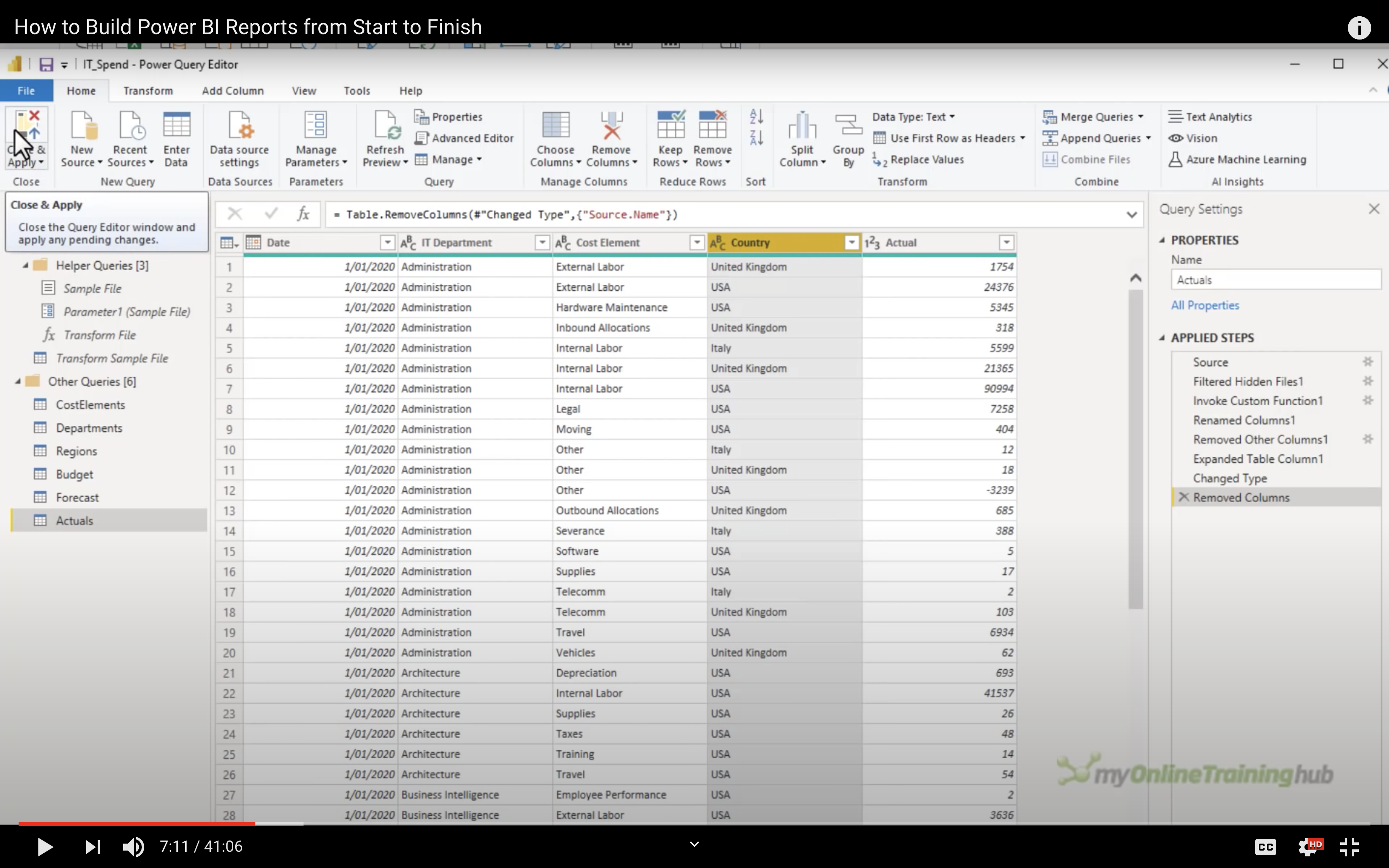
Data Visualization
Then we get the data after cleansing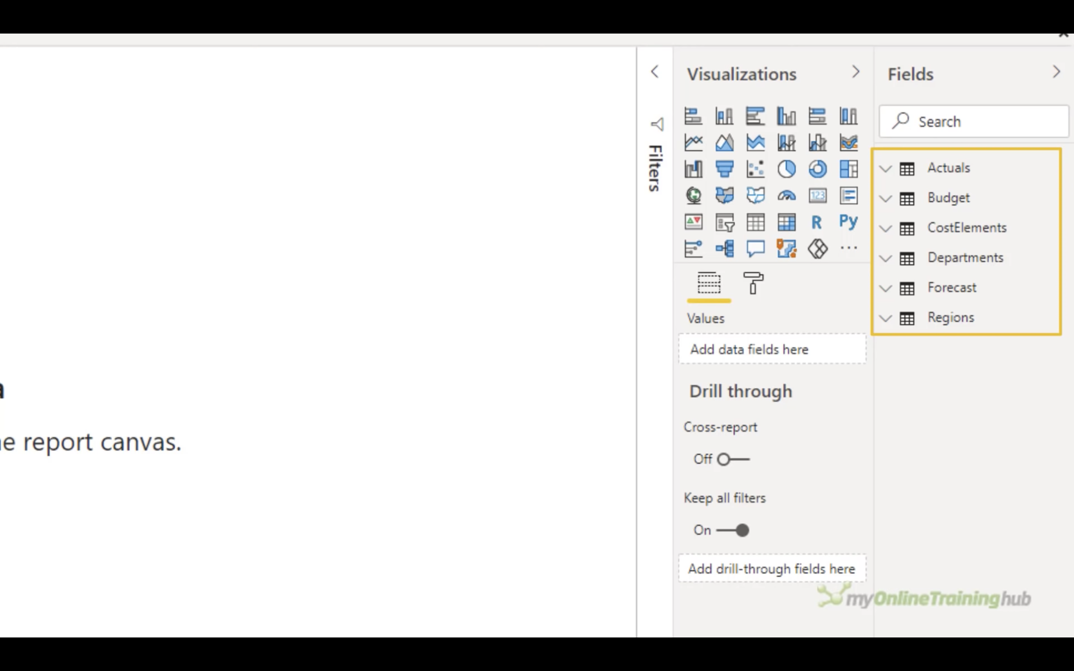
Click on Model button on the left.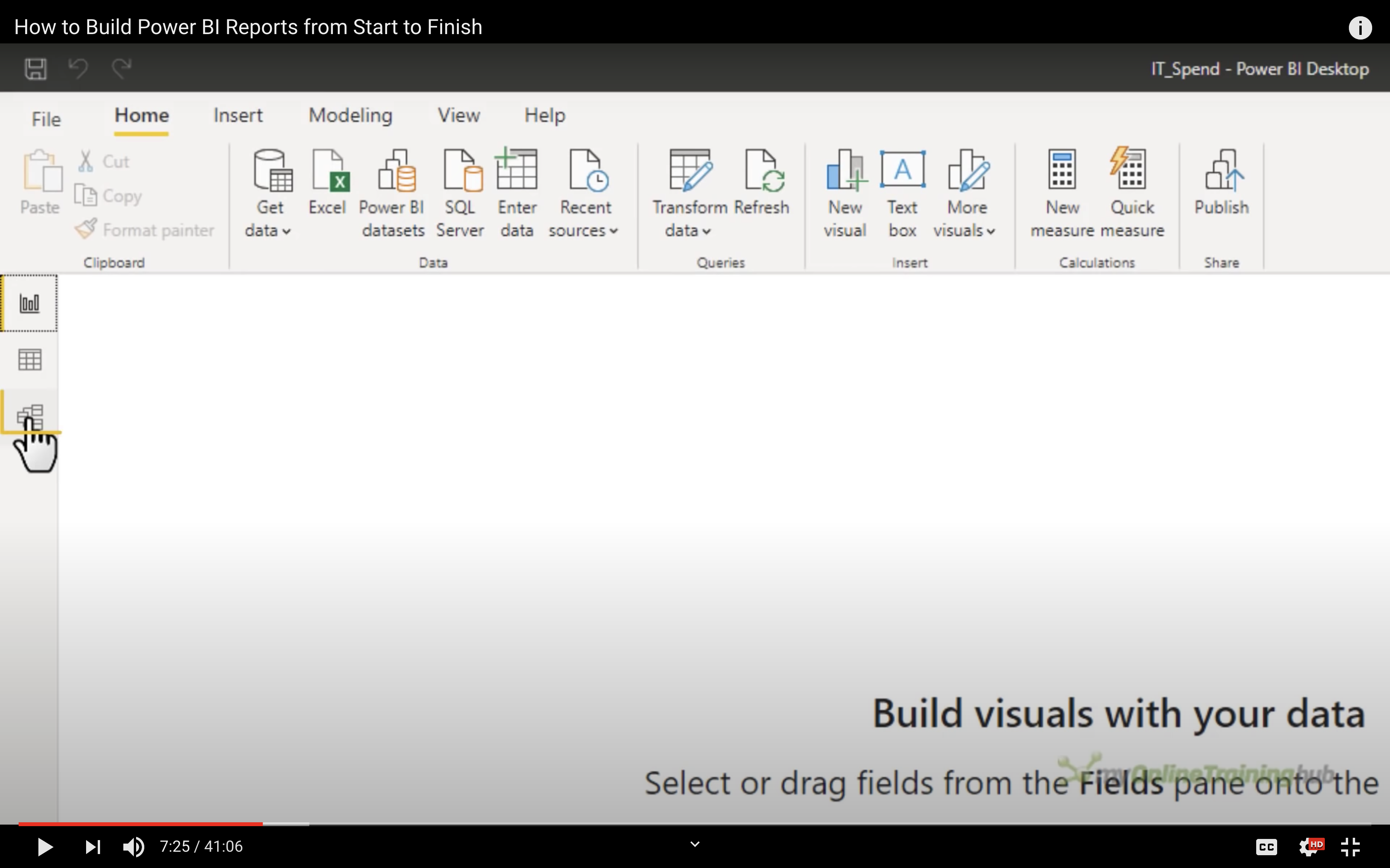
Drag the table to rearrange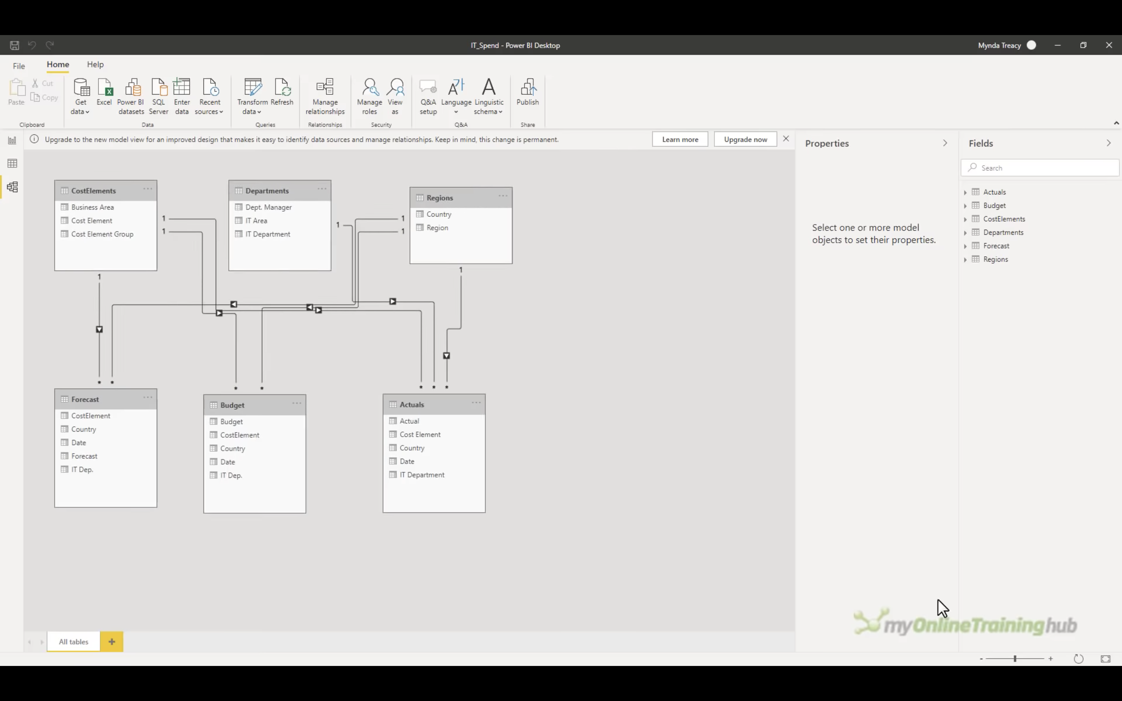
Drag the column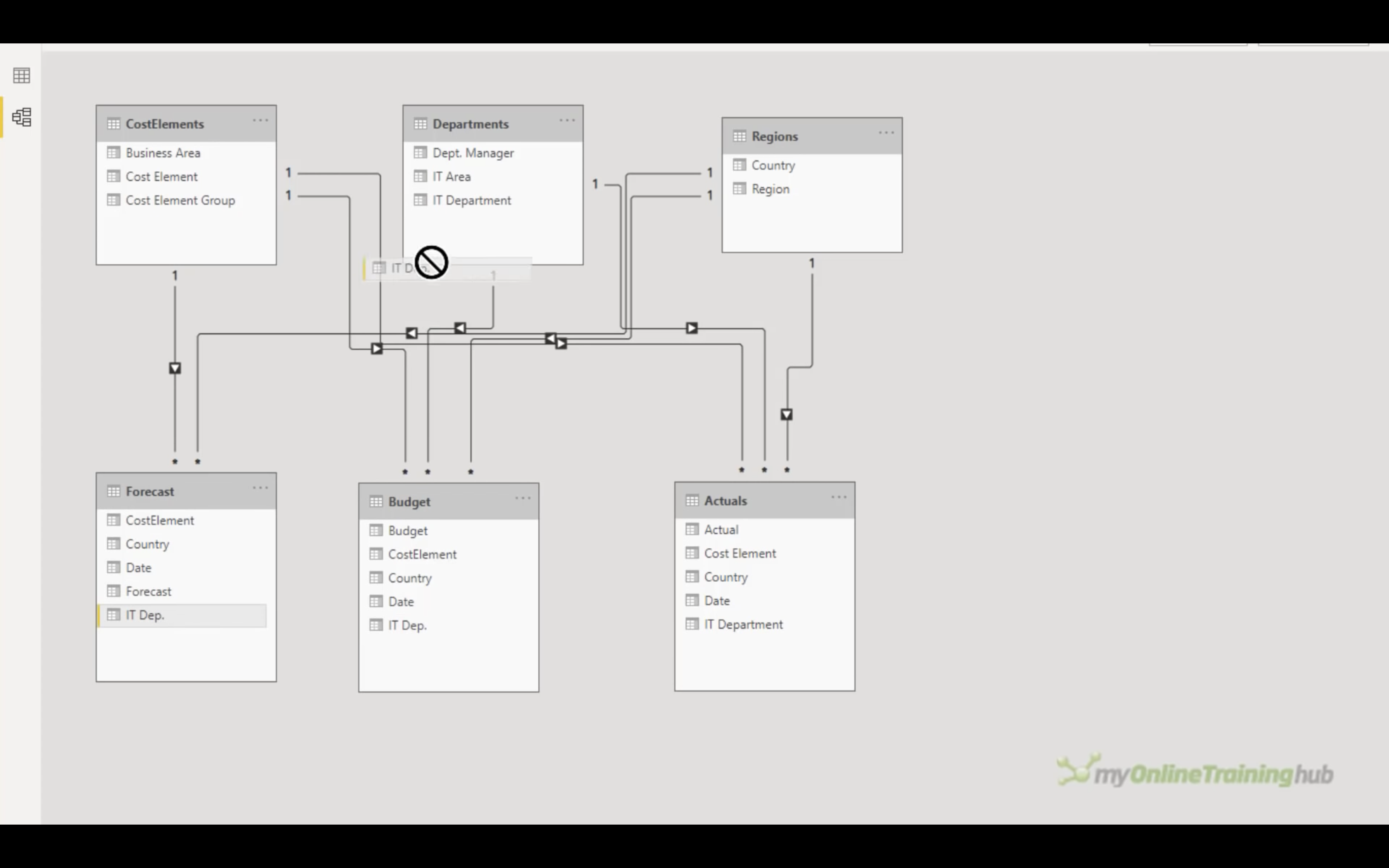
Type to query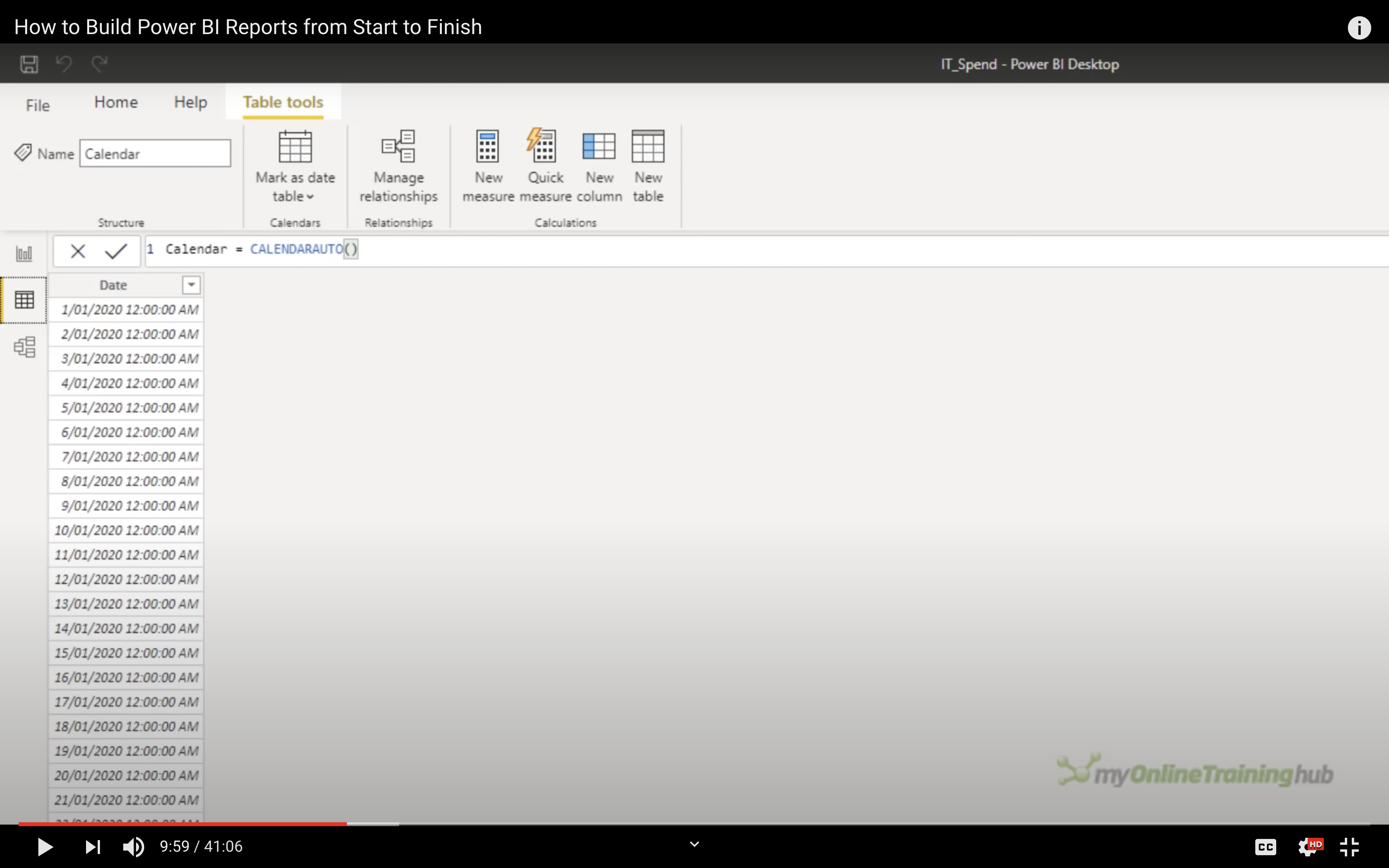
Connect the same filed among plural tables if you need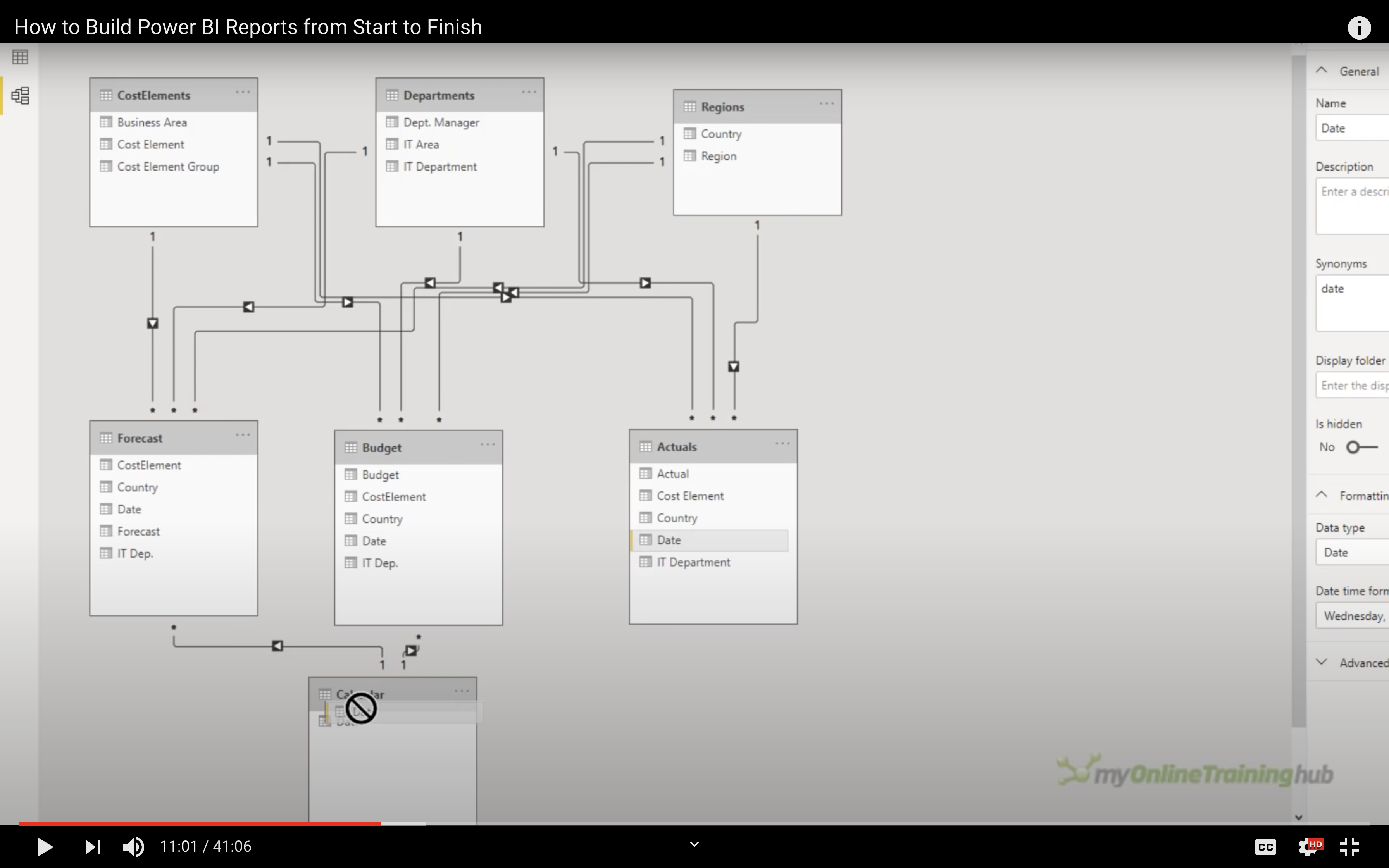
Format your column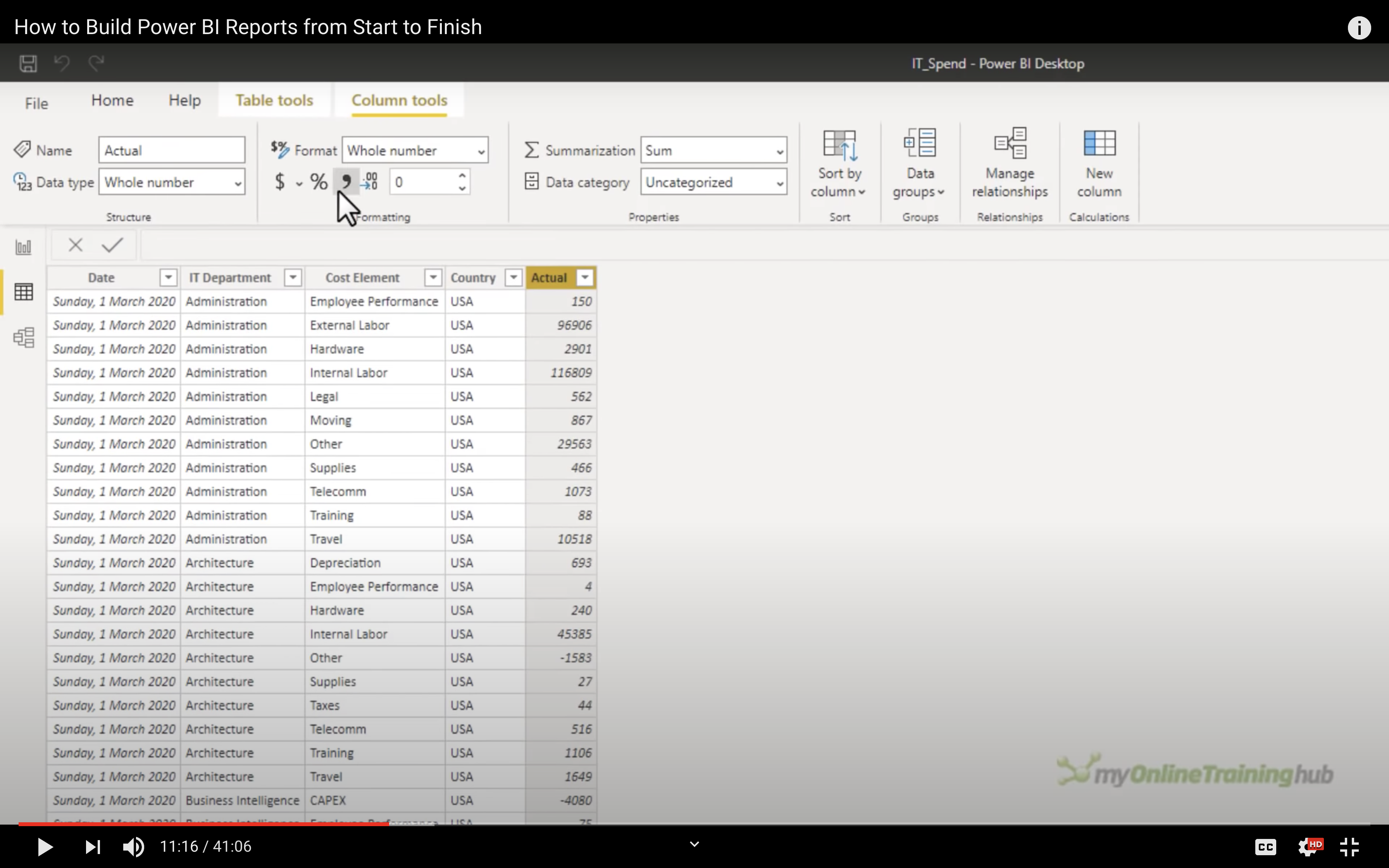
Categorize the column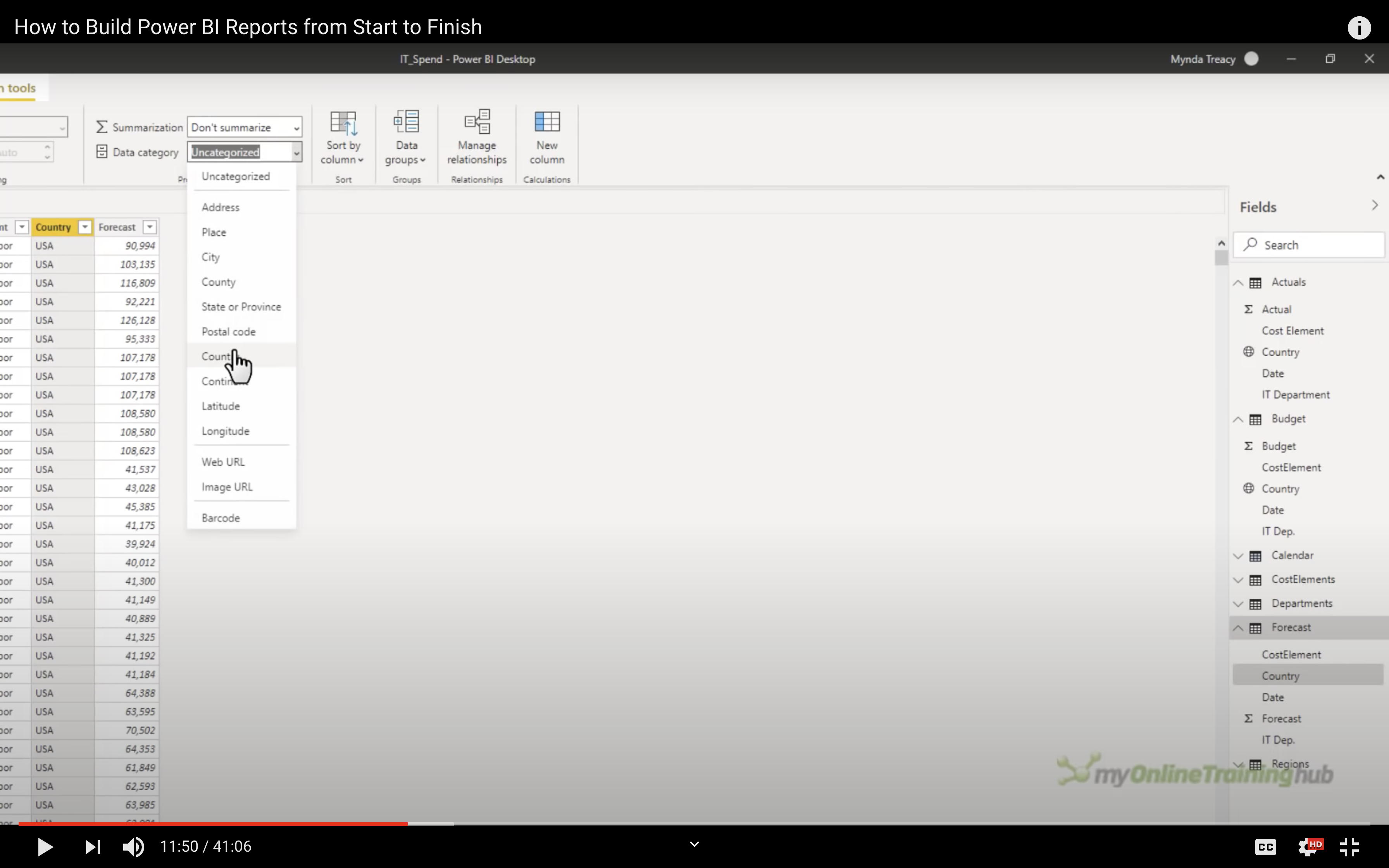
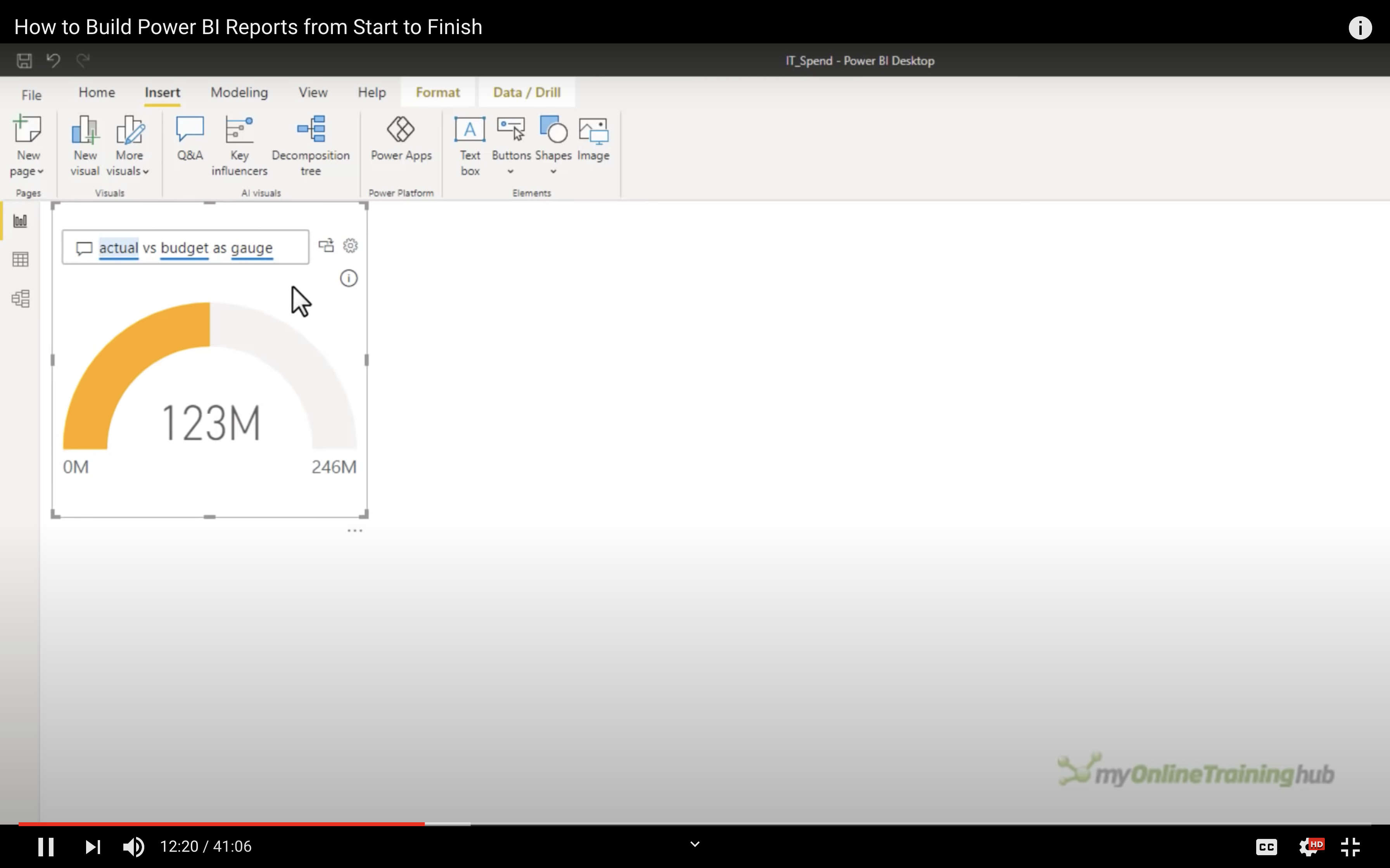
Gauge Chart
Click on Insert, then insert a gauge chart
KPI
Select your visualization type, then select a field, e.g, KPI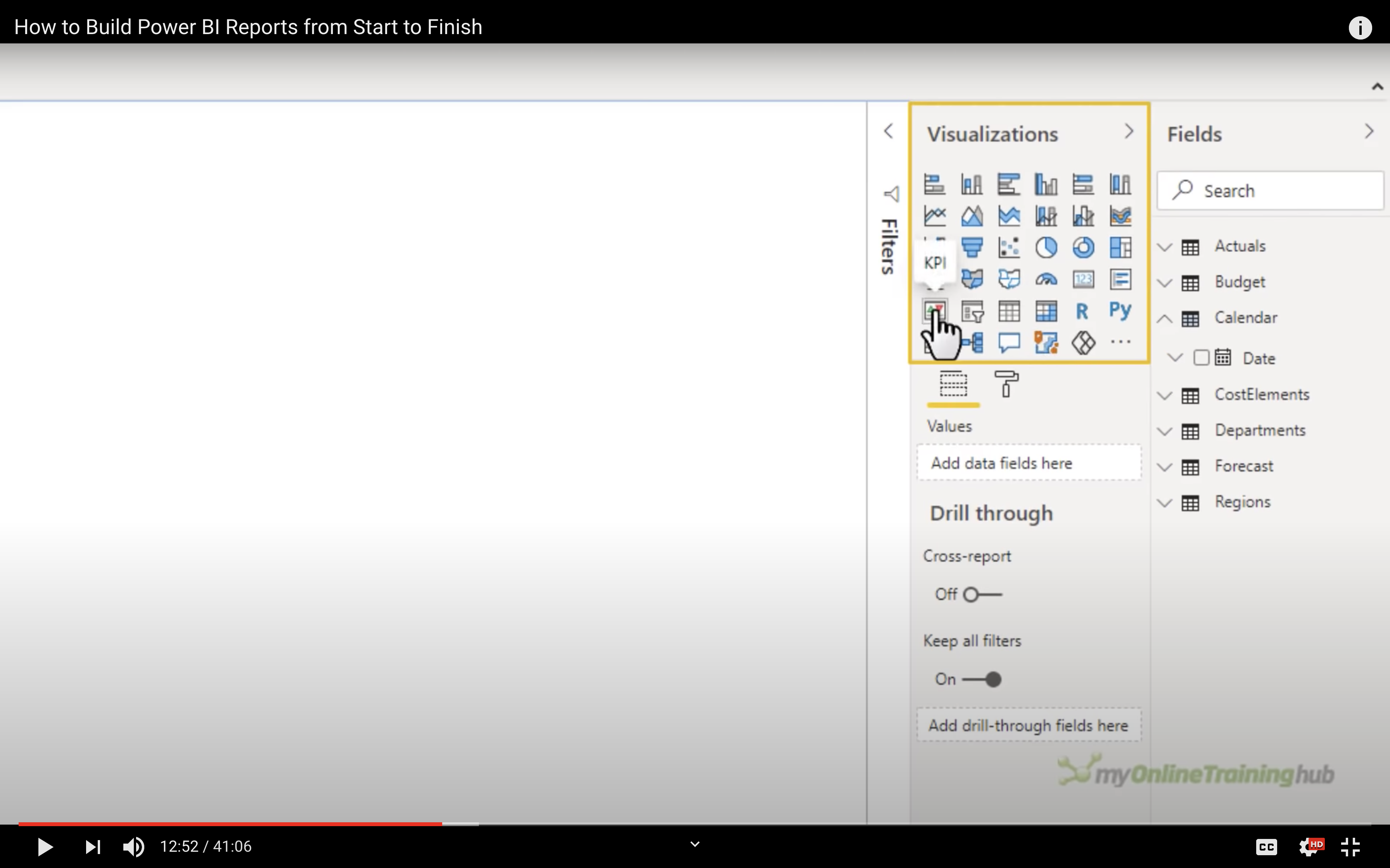
Drag data to KPI: Indicator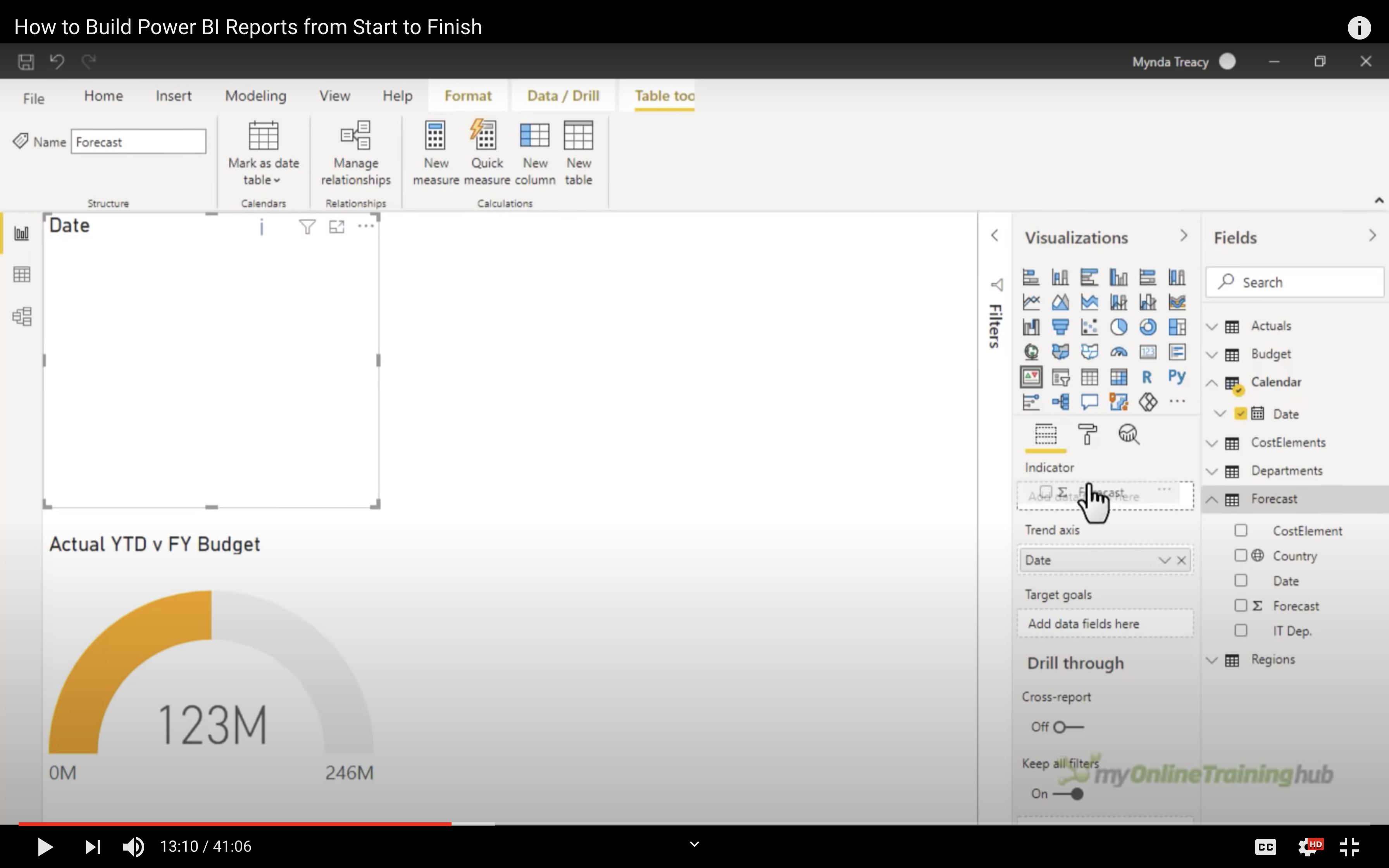
Drag data to KPI: Target goals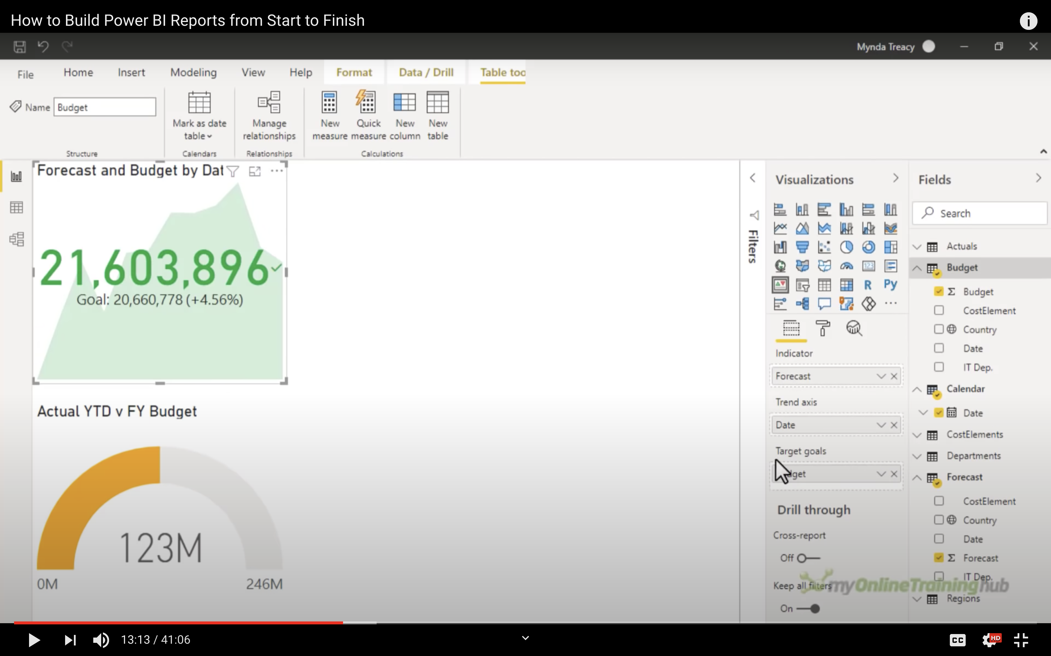
Line Chart
Adjust the details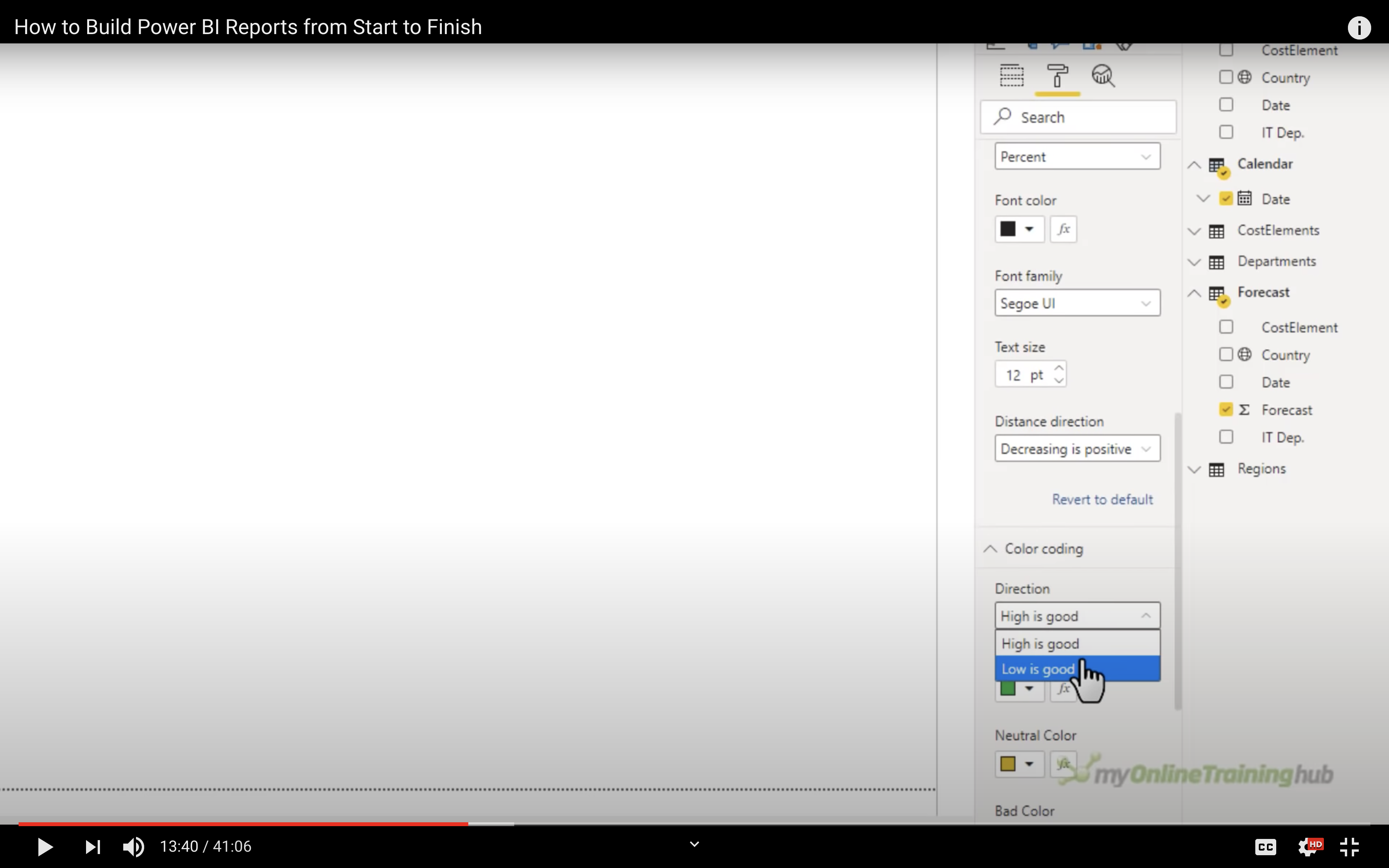
You could also add measure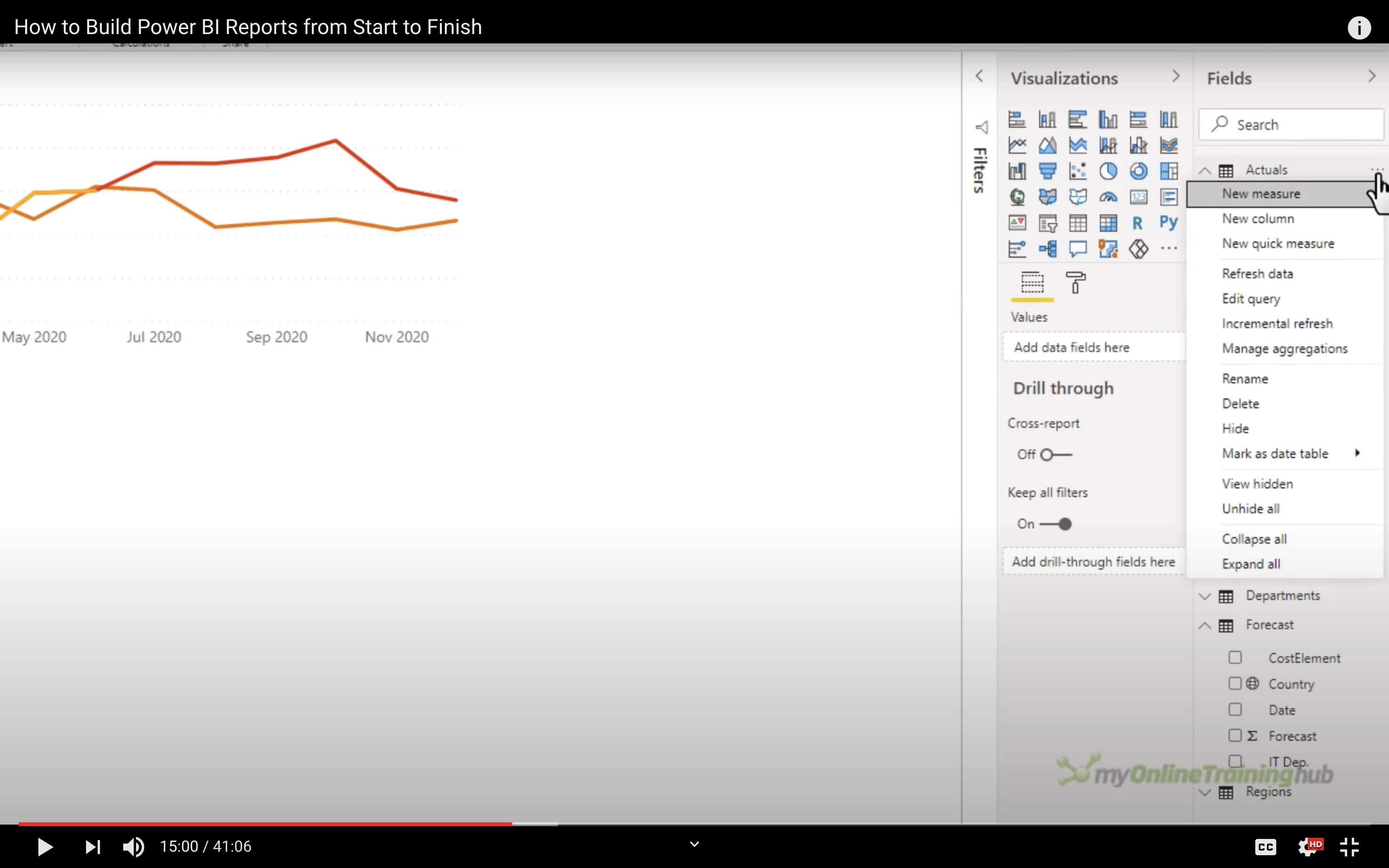
Then add the formula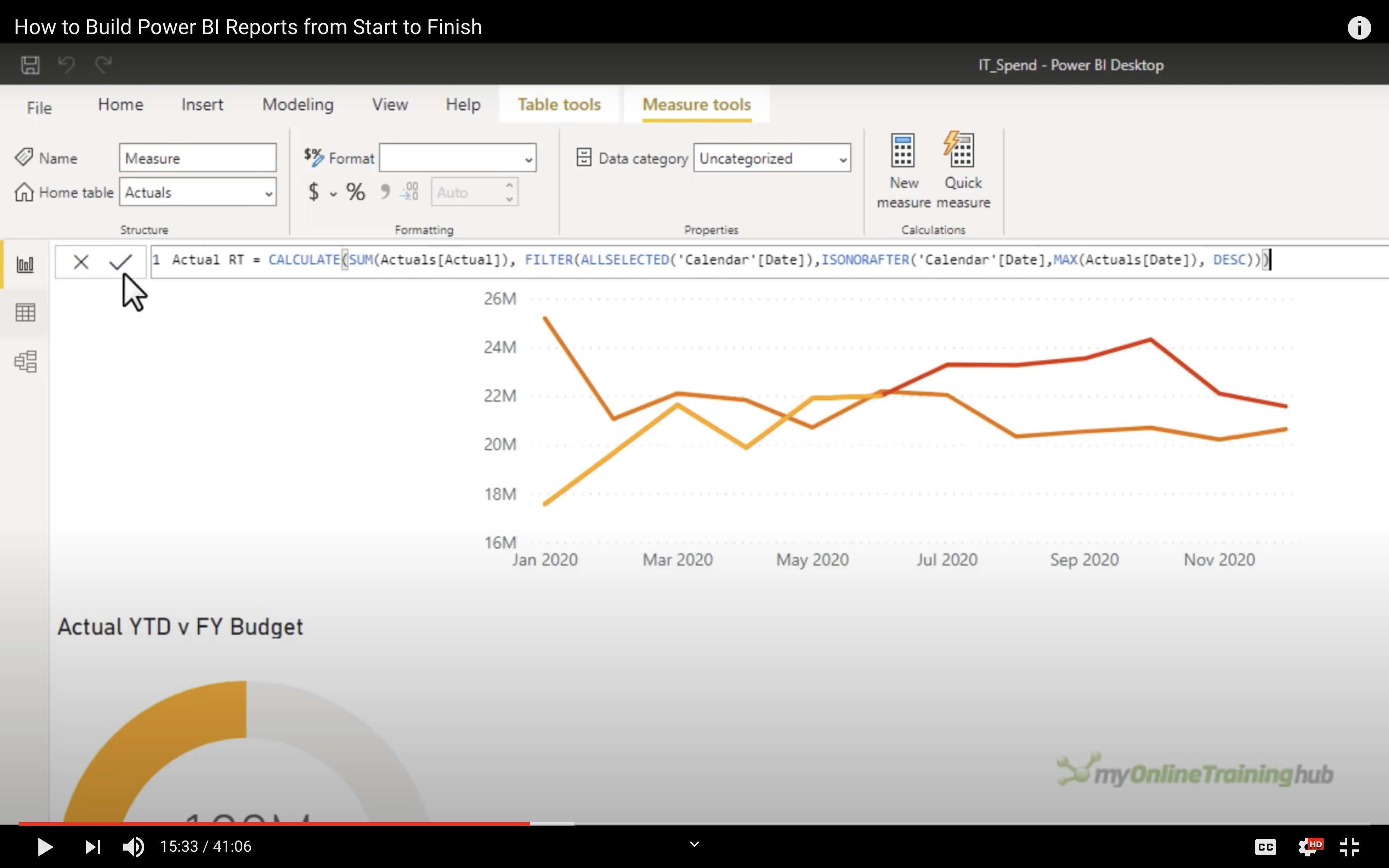
Done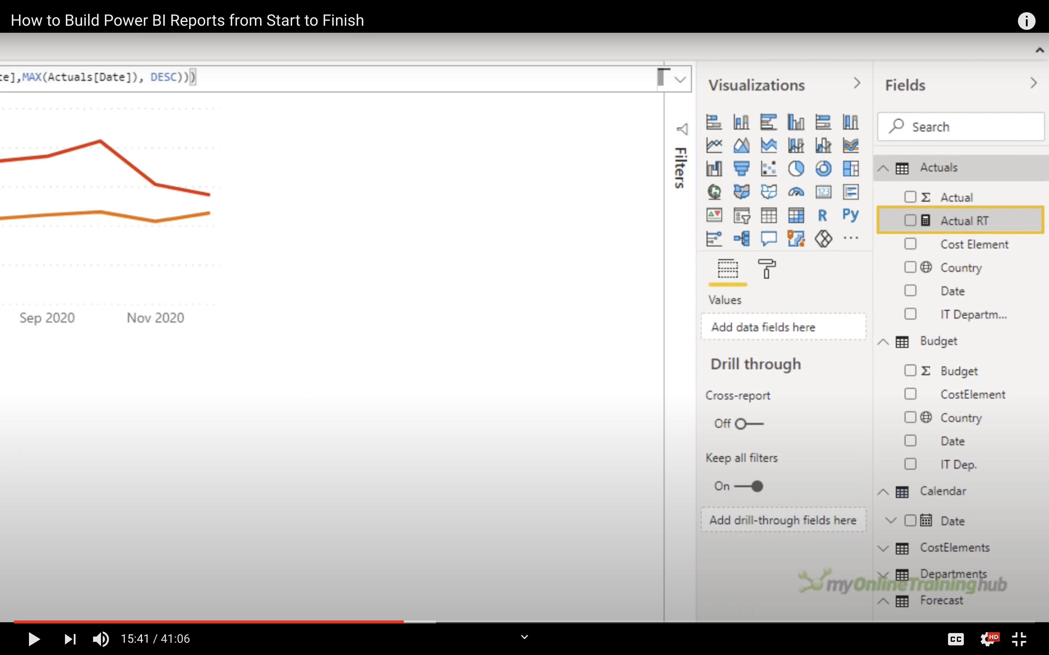
Slicer
Add slicer ‘Jun 2020 YTD’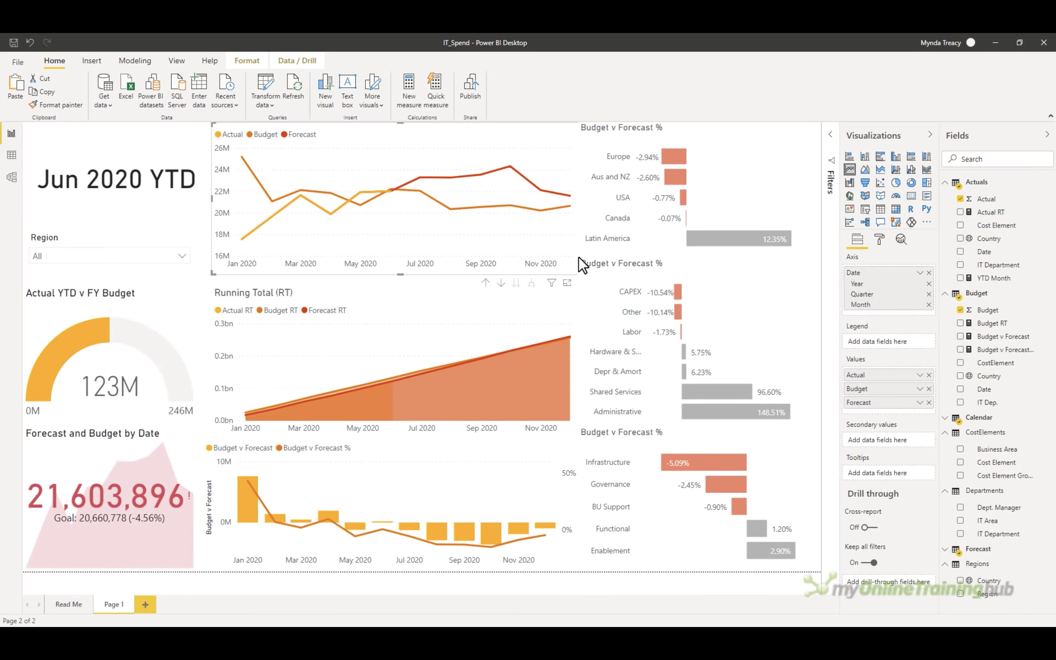
Theme
Choose different theme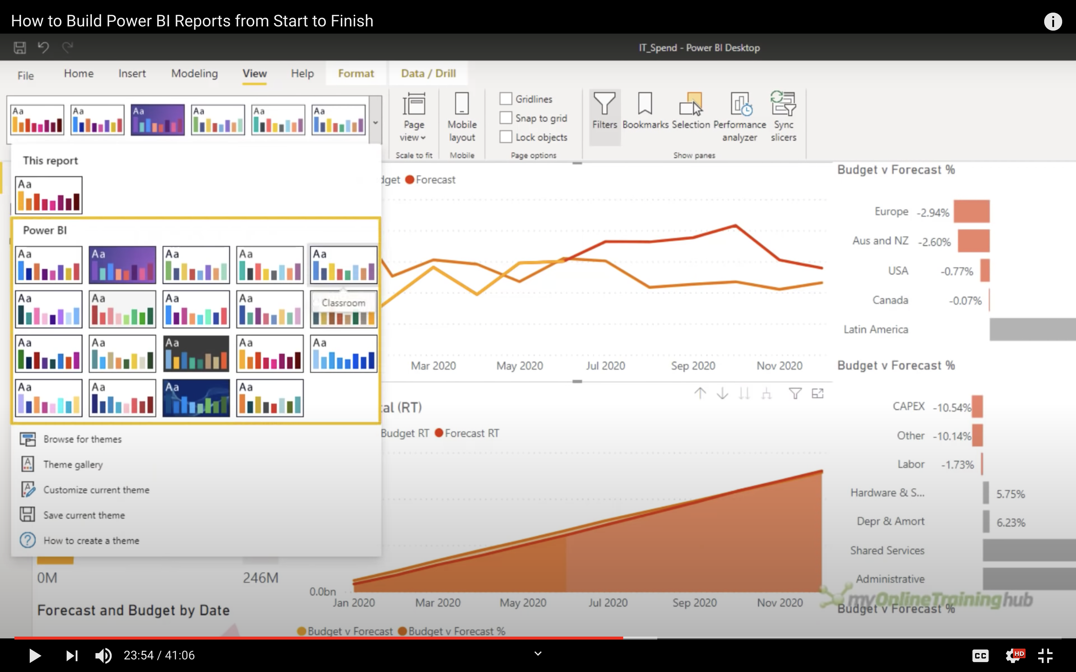
Click on Browse for themes to load themes, e.g, JSON file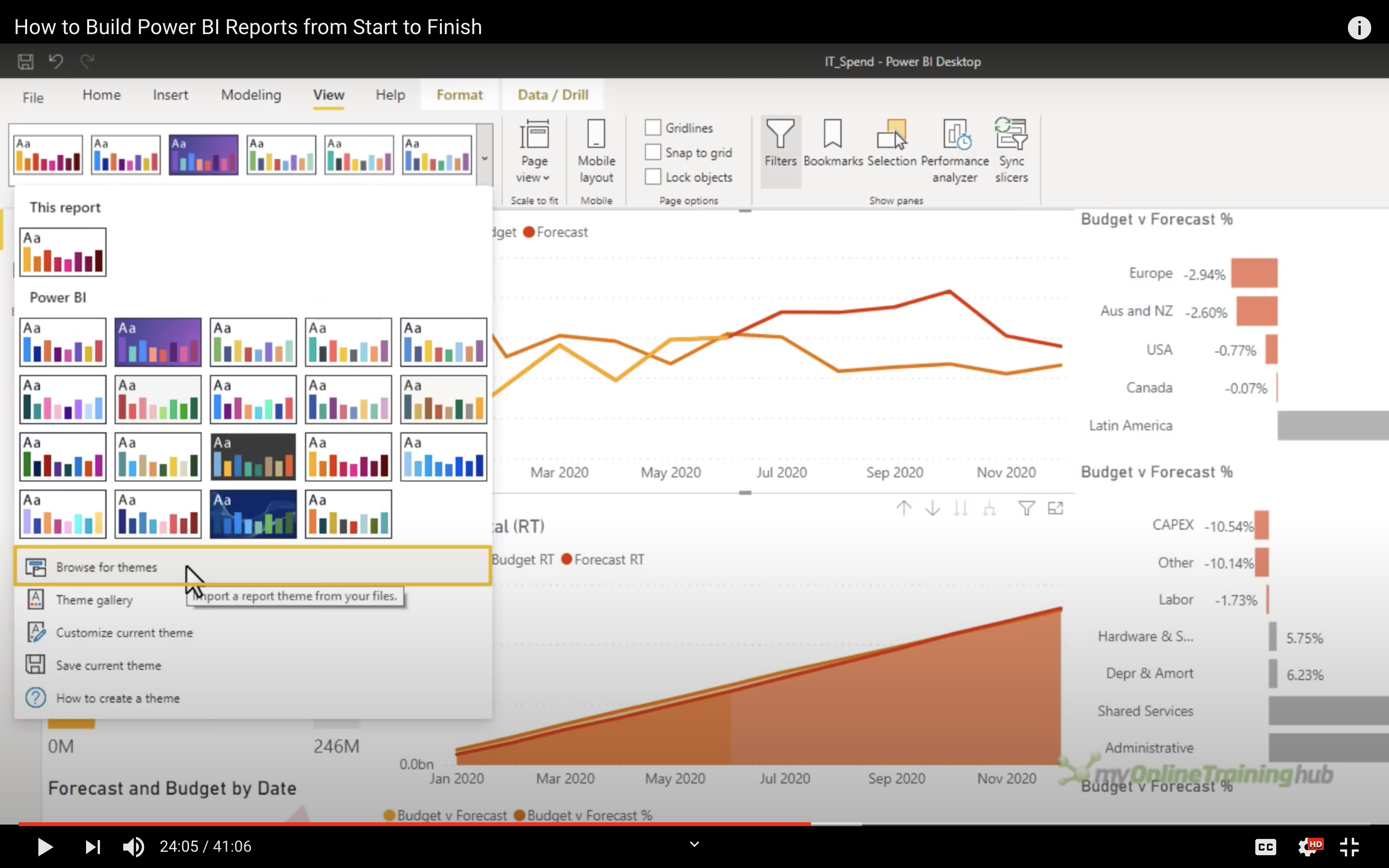
Click on the data you are interested in to use the built-in interactive features for highlighting the data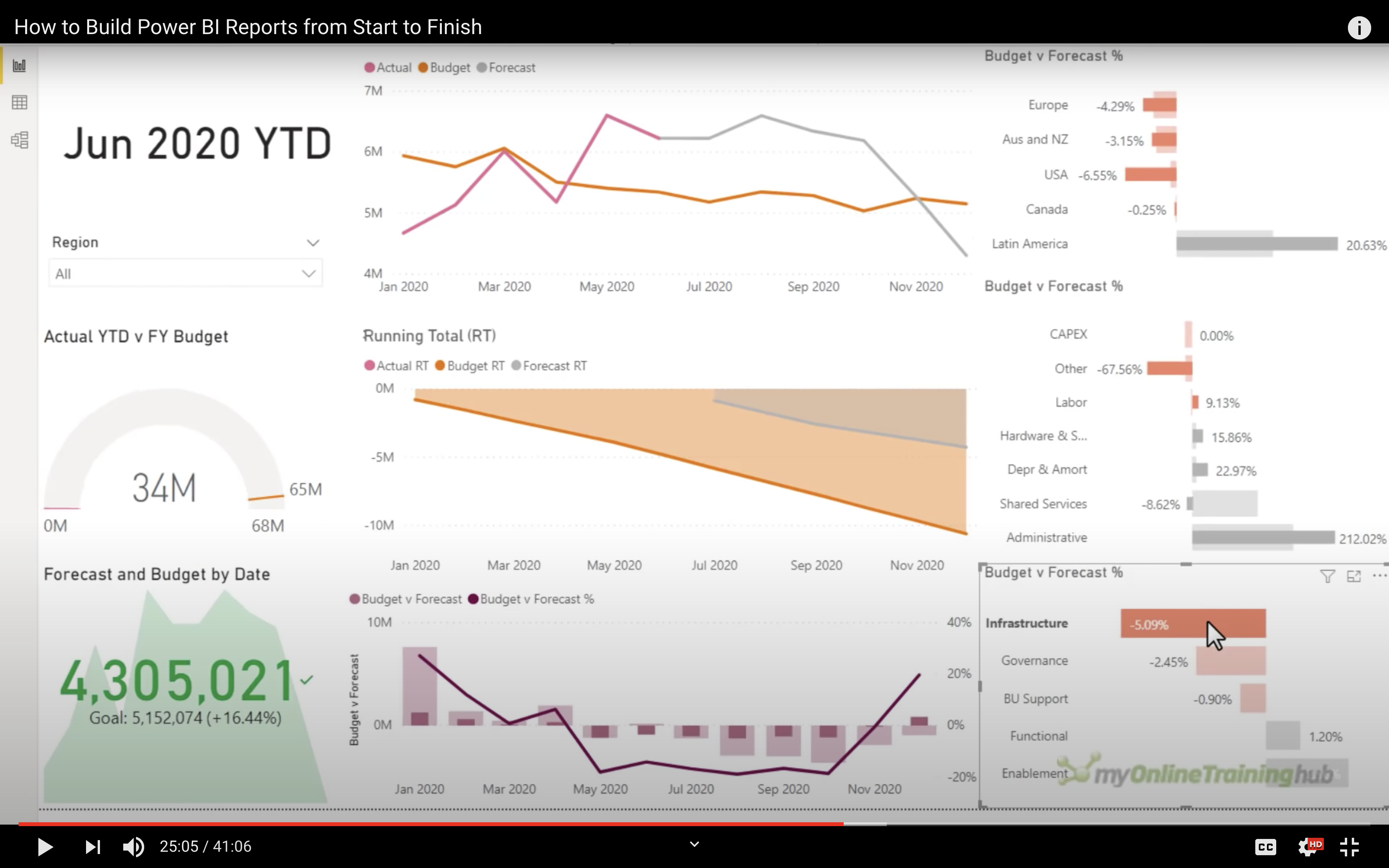
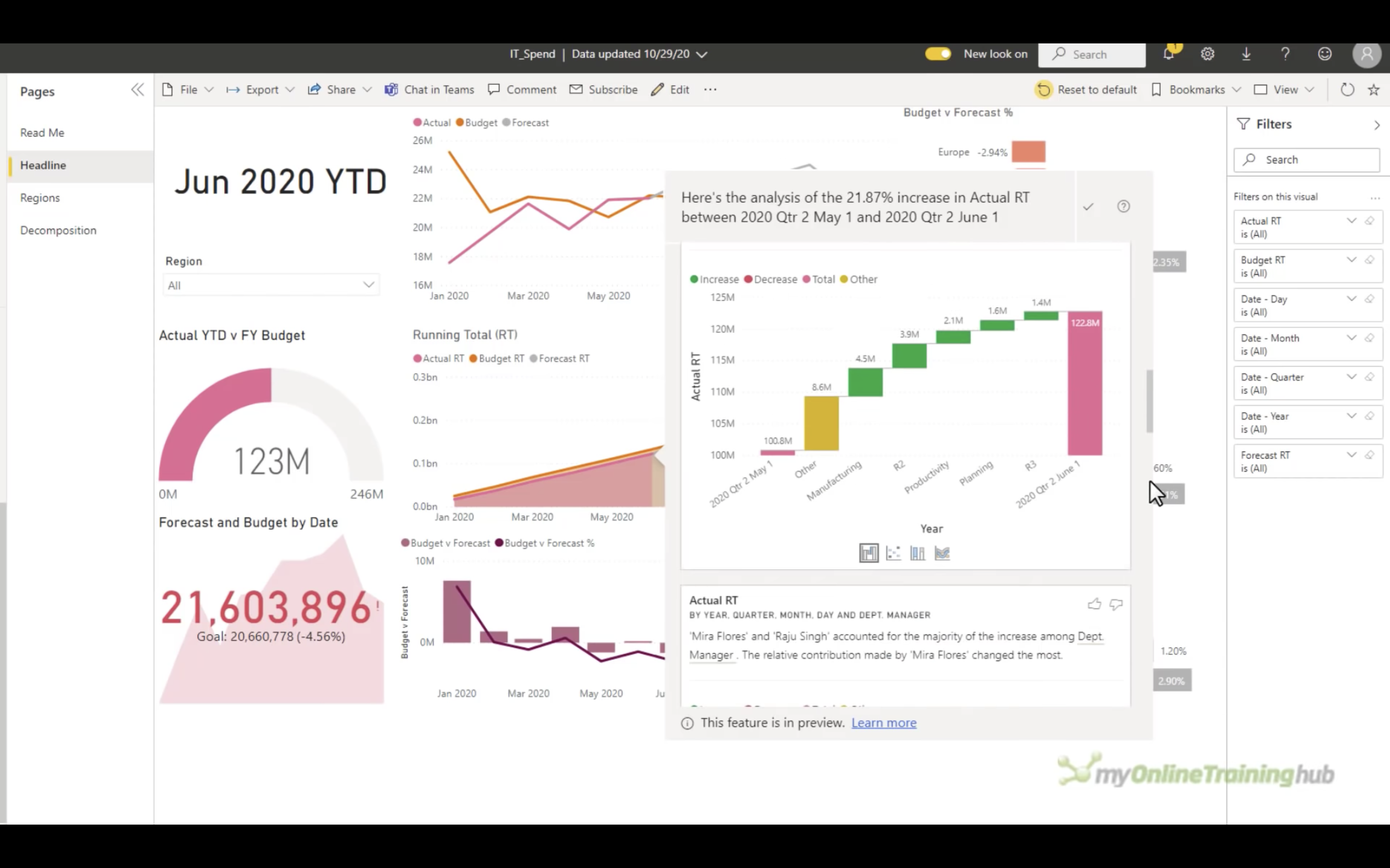
Analyze
Right click the chart and click on Analyze to see explain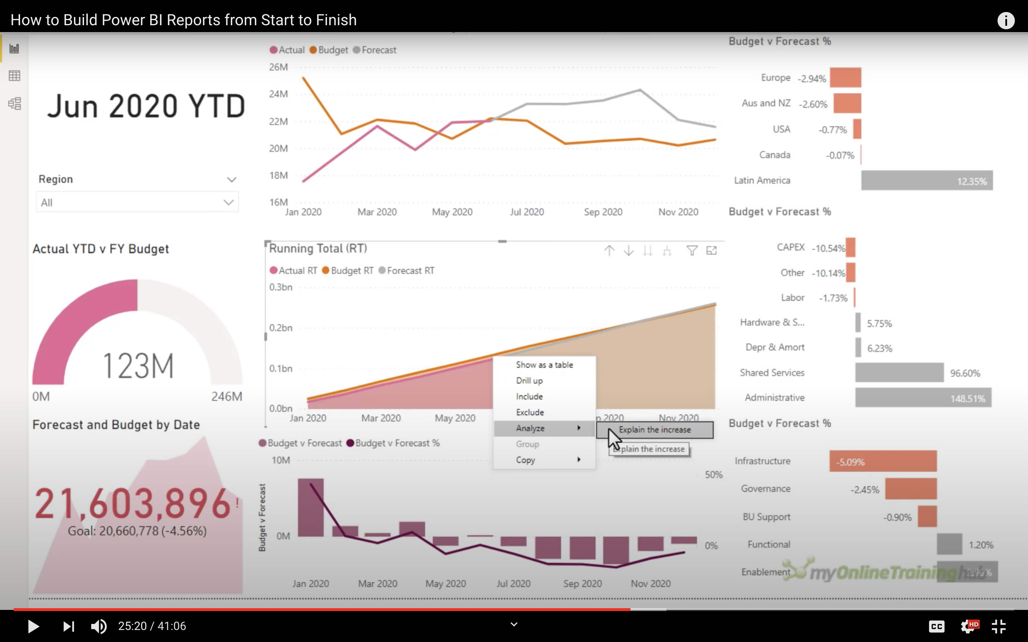
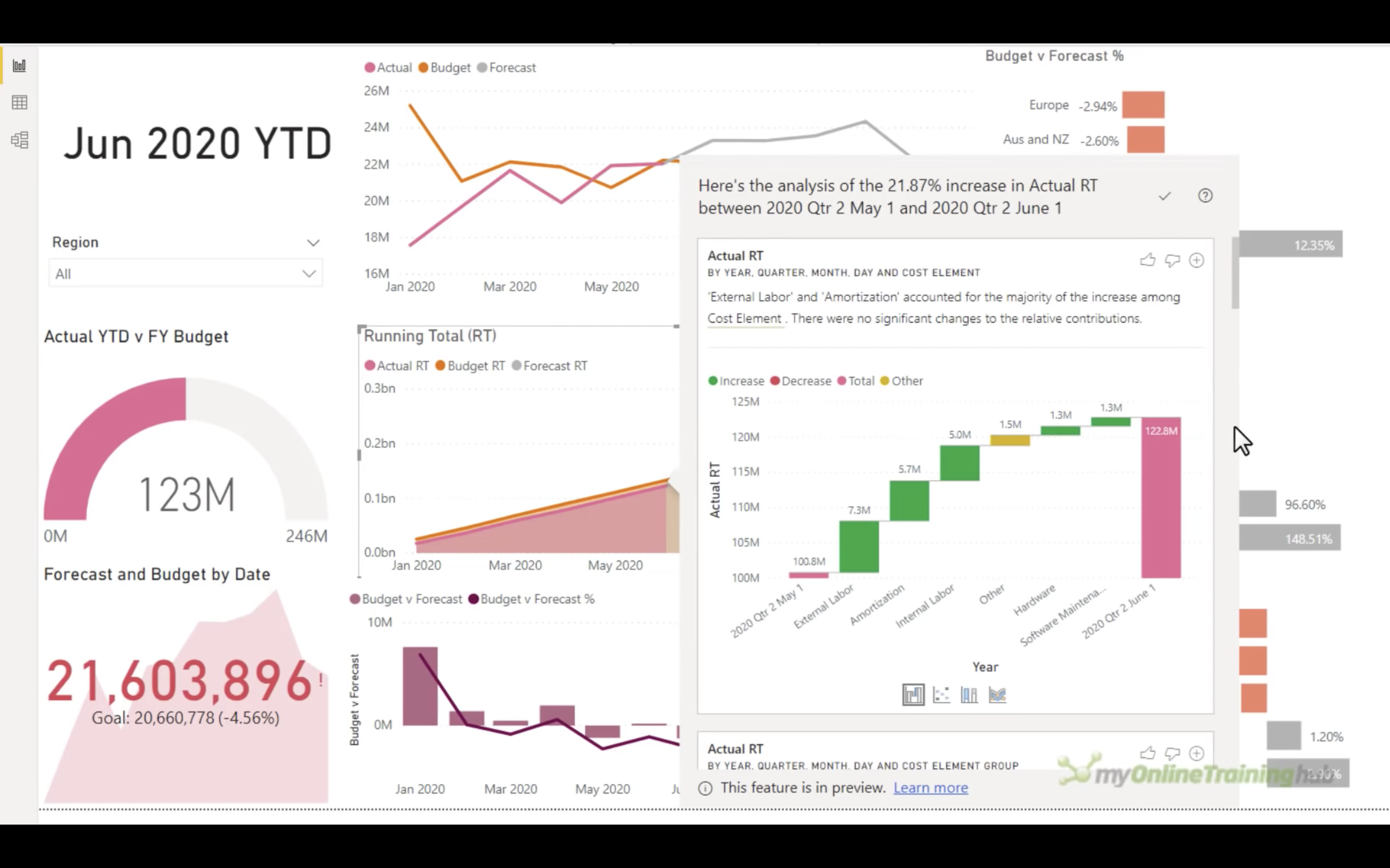
And you can change the analysis chart type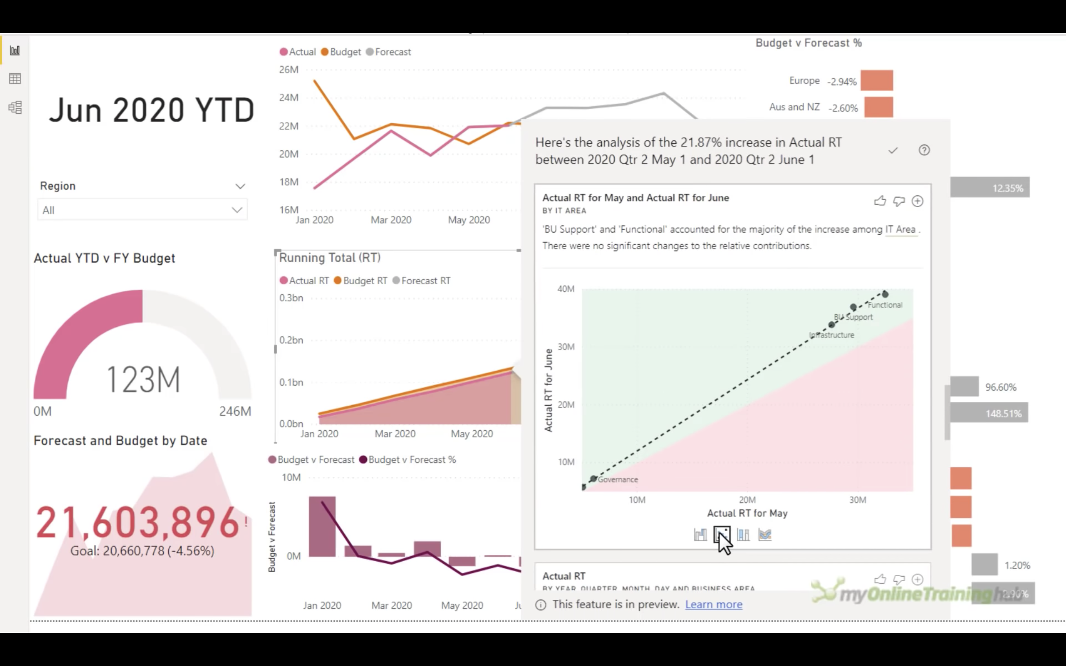
Matrix
You can change the icon to the matrix data for highlighting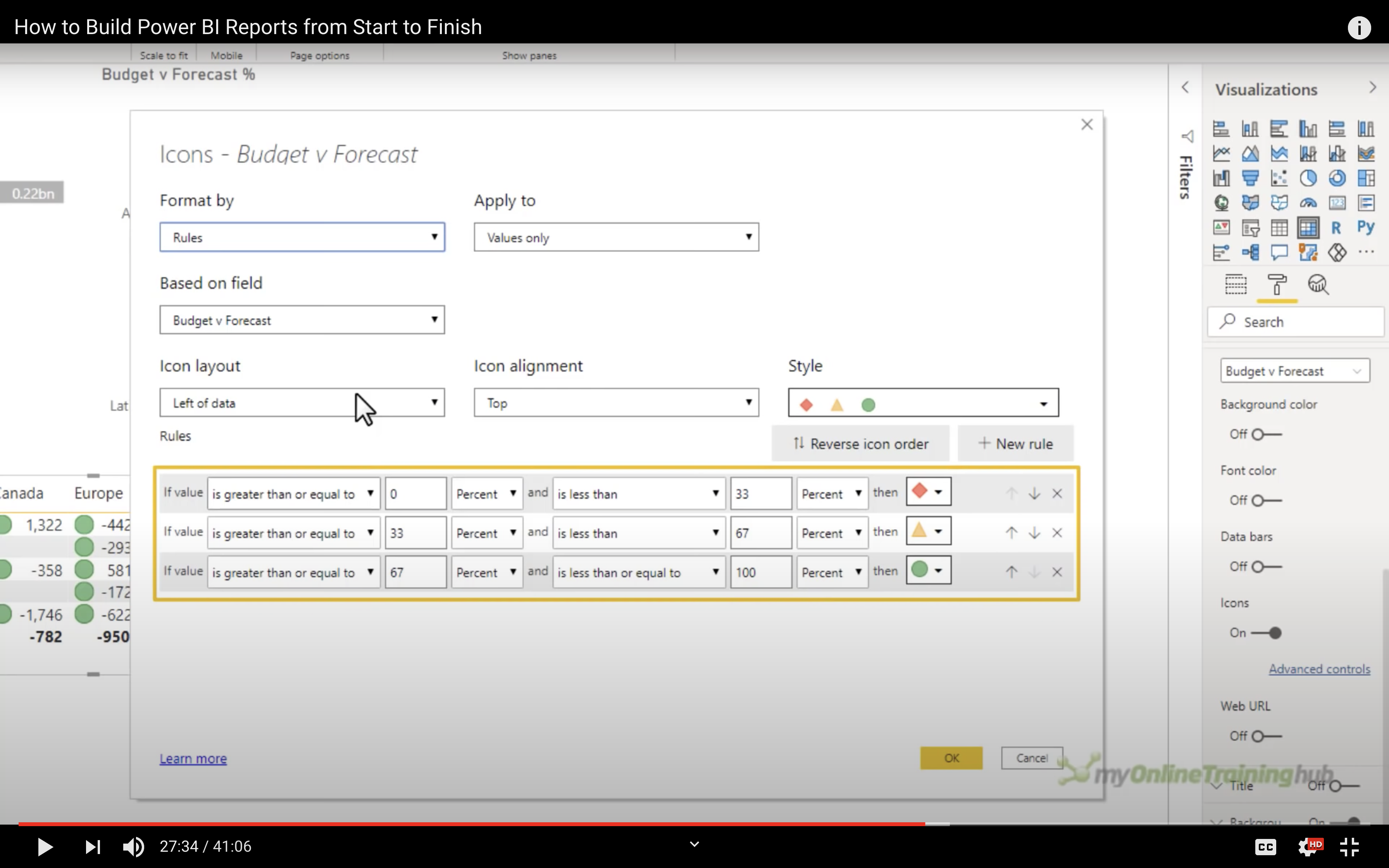
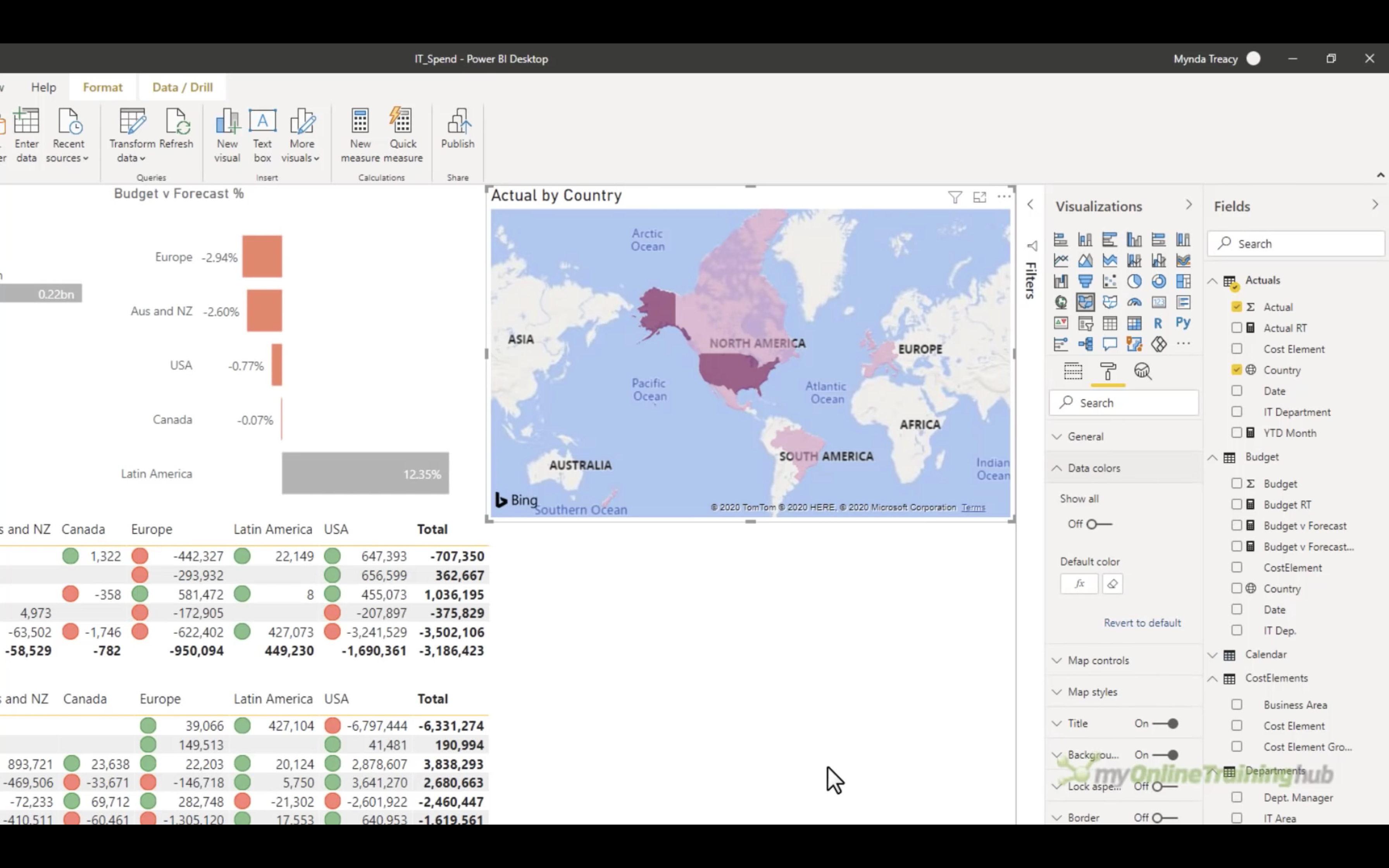
Map
Map visualization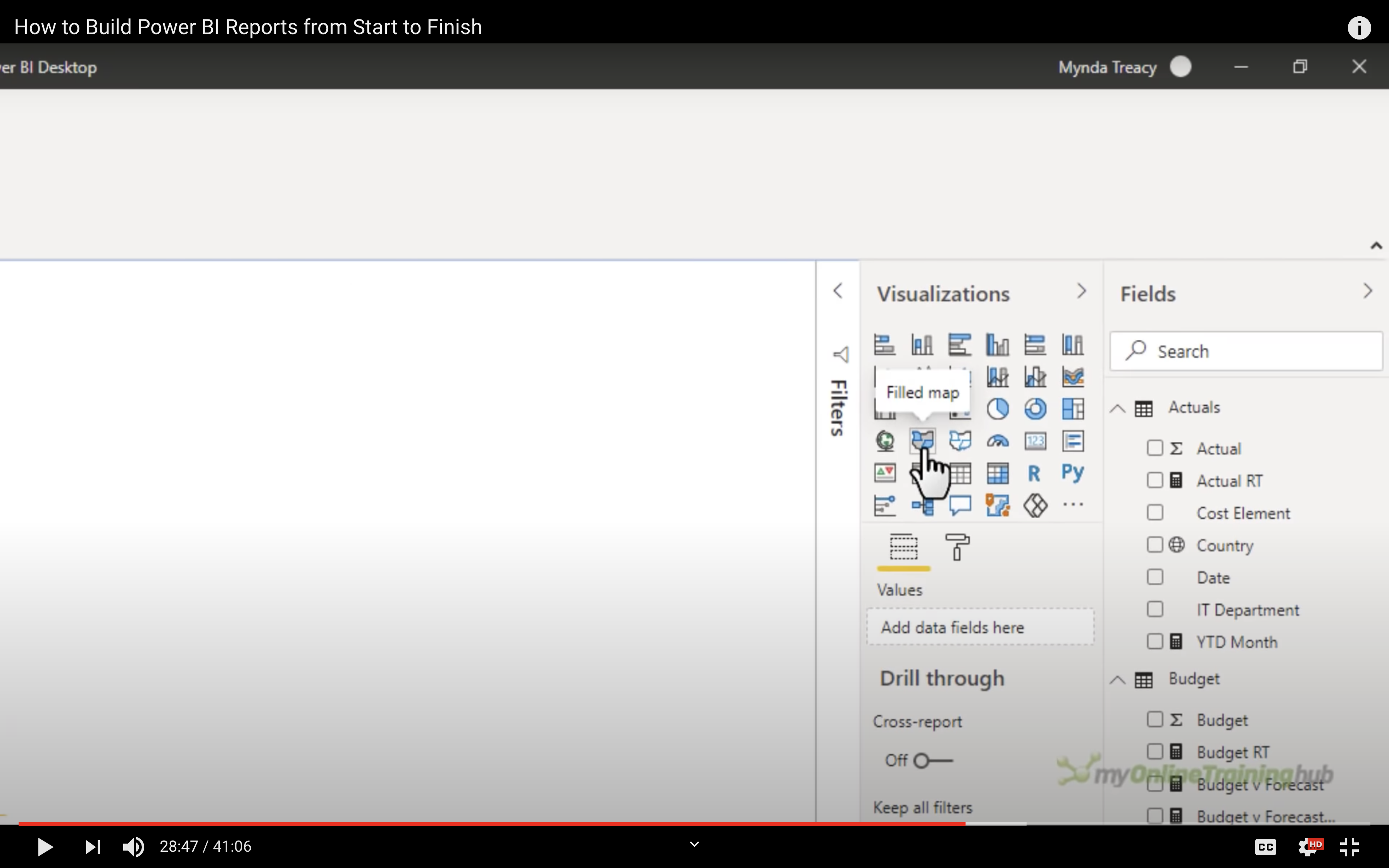
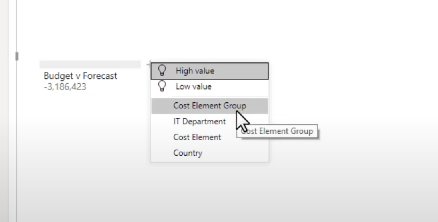
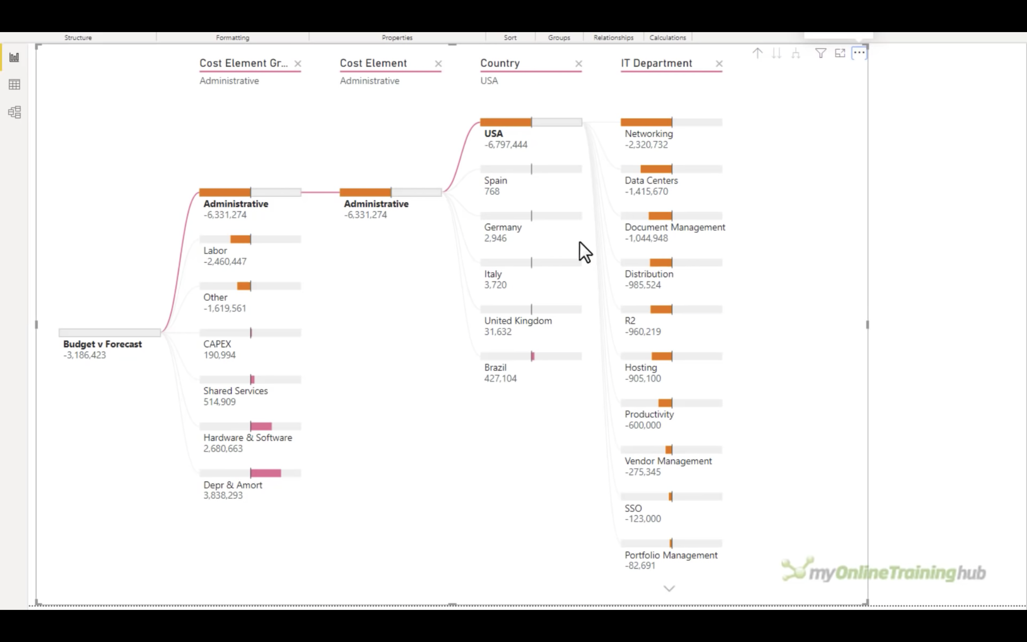
Decomposition Tree
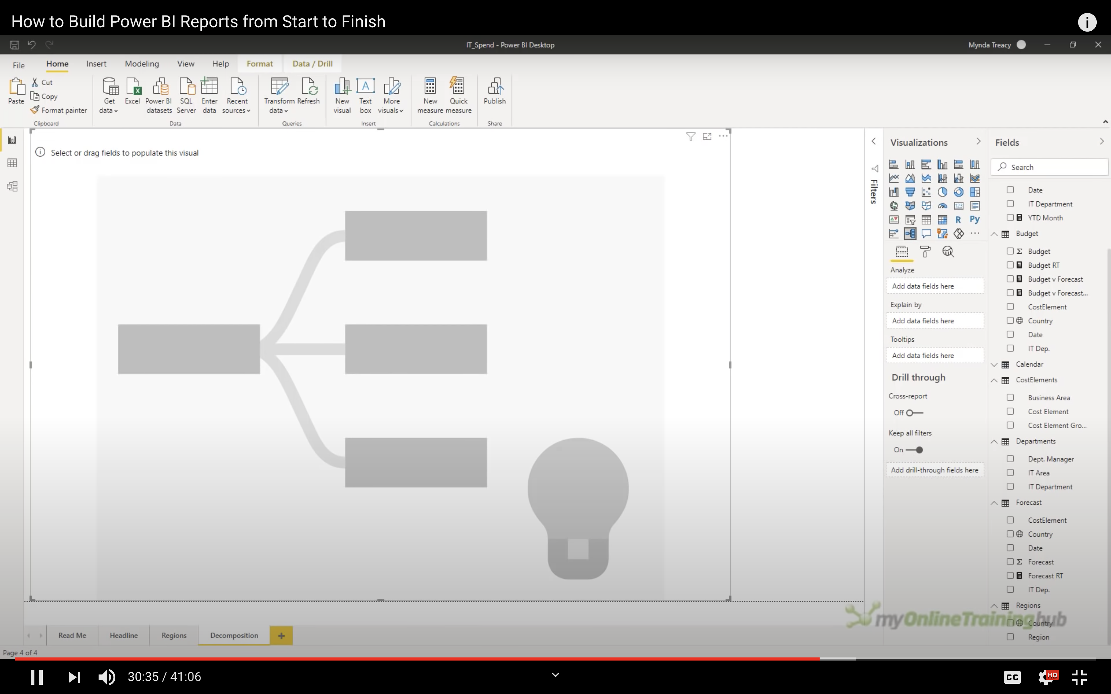
Add fields to Analyze and Explain by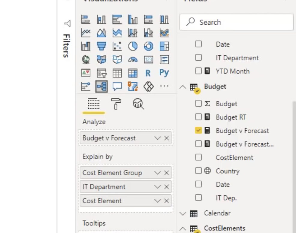
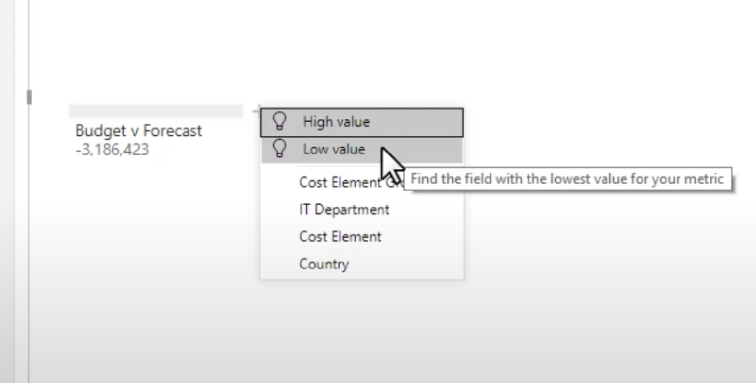
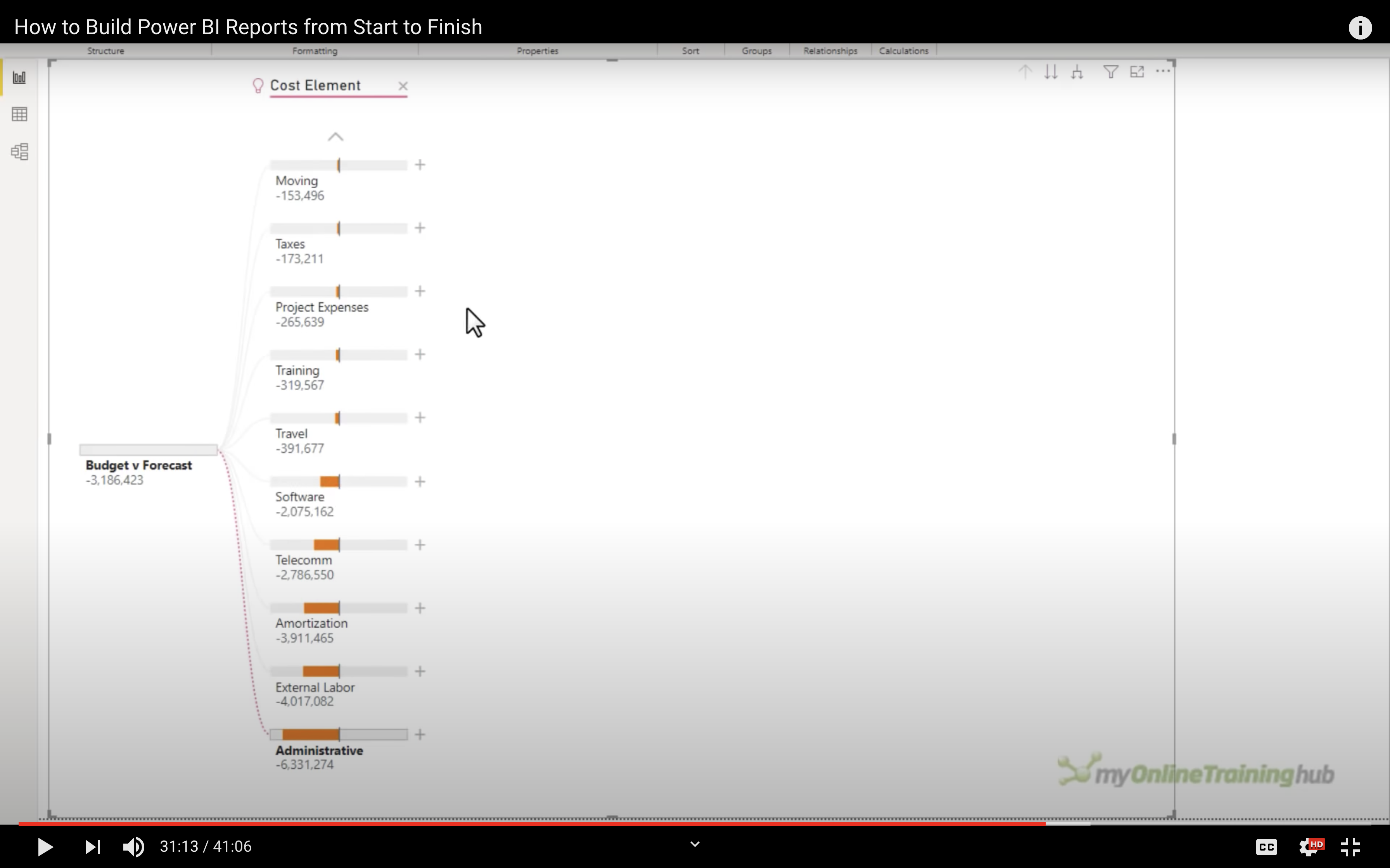
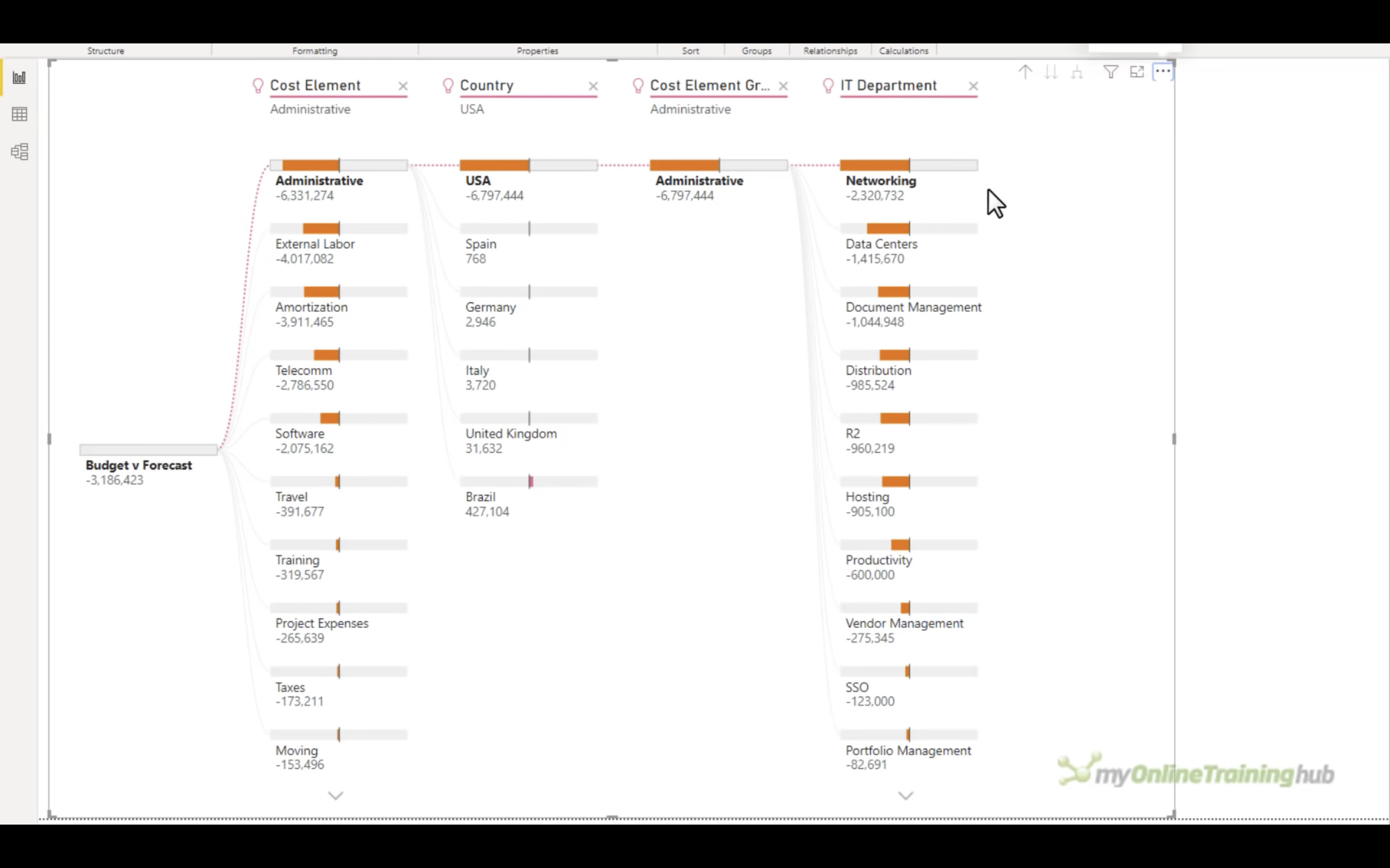
Decomposition Tree: Choose by yourself
Power BI Service
Publish your visualization
Click on Publish
Choose a workspace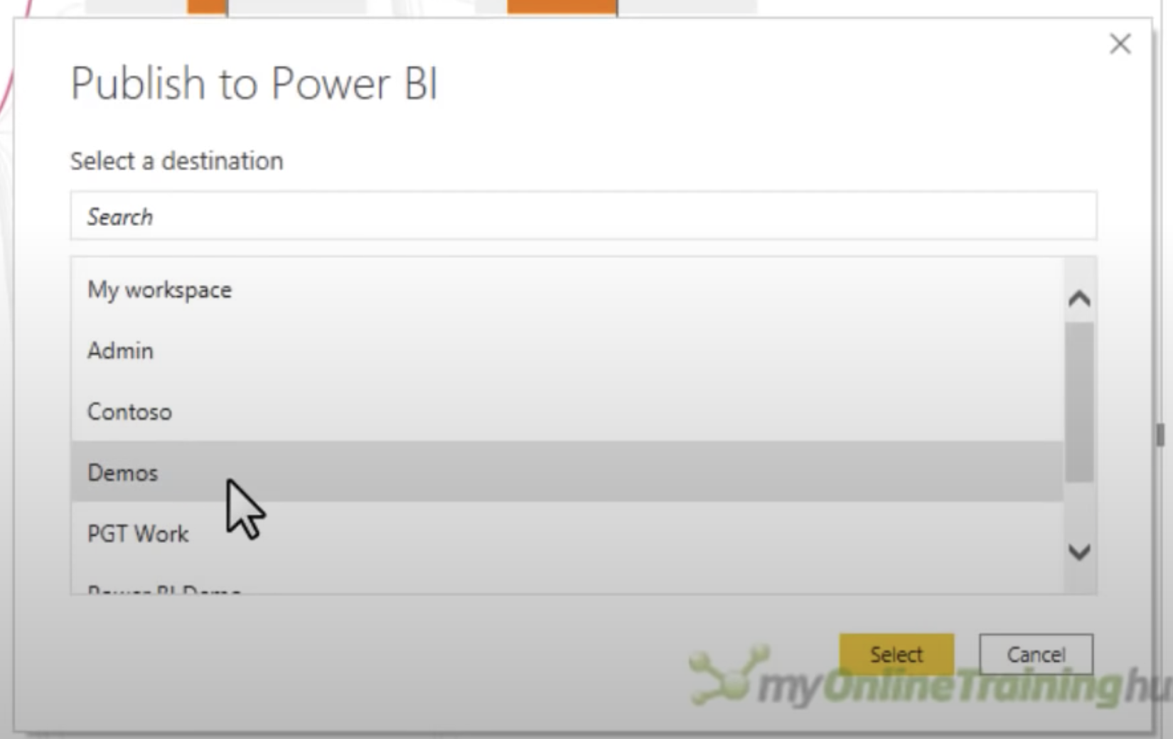
Done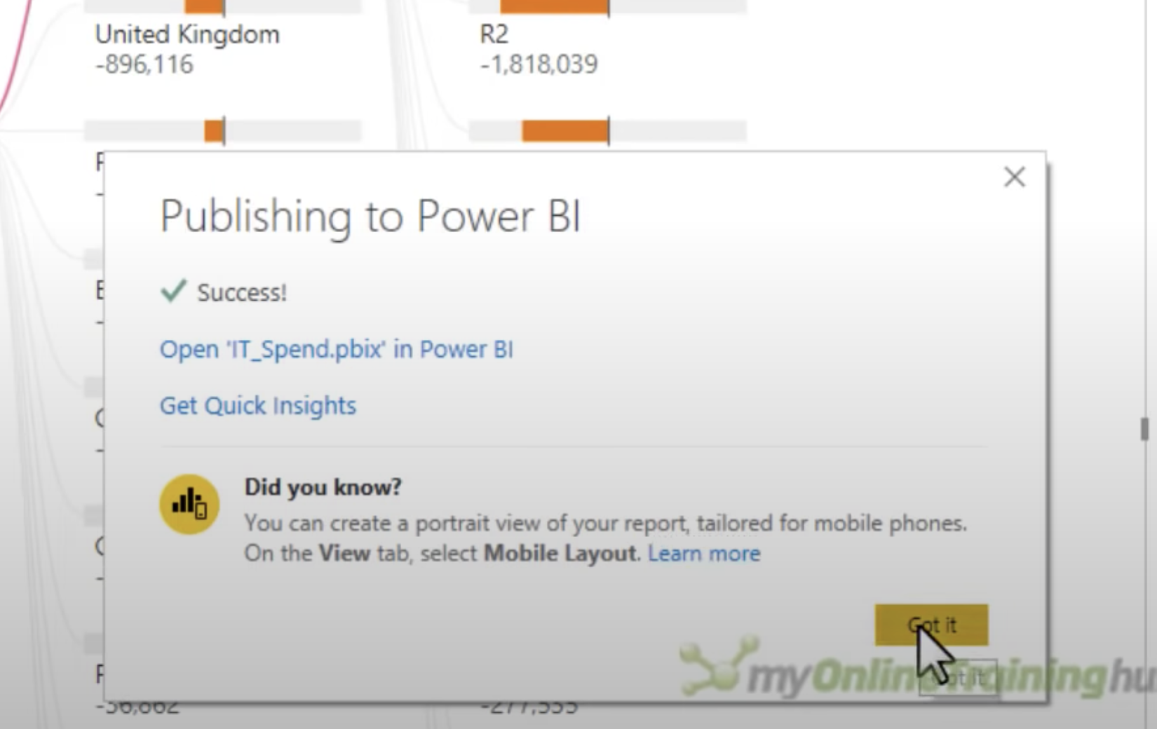
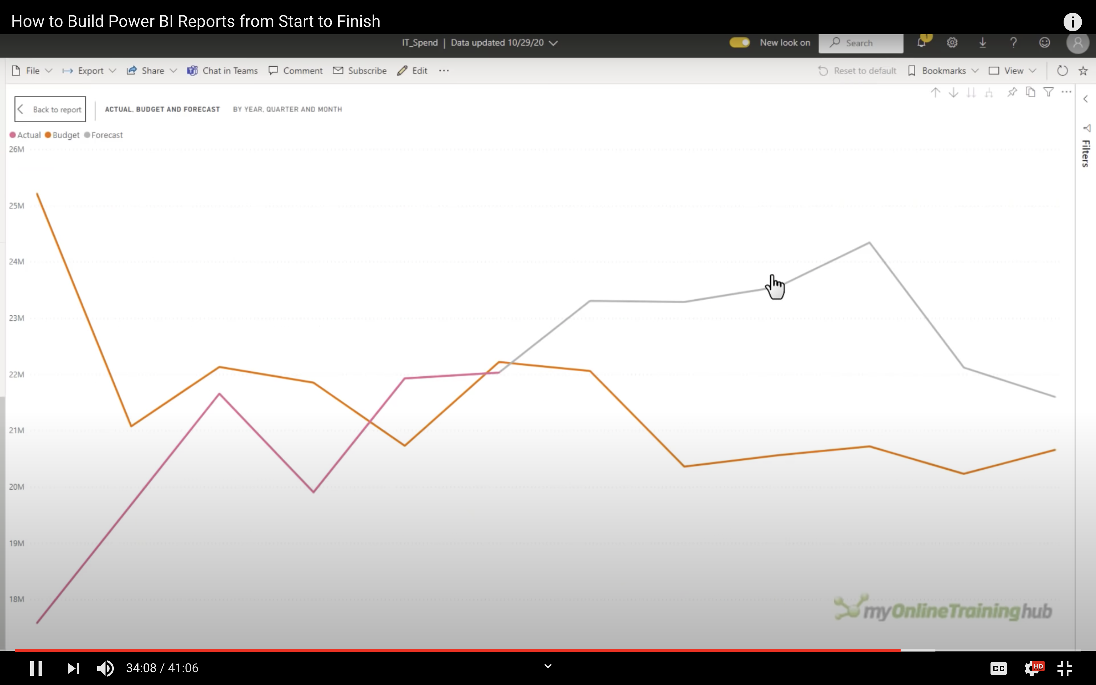
Review your visualization online
Go to your Power BI web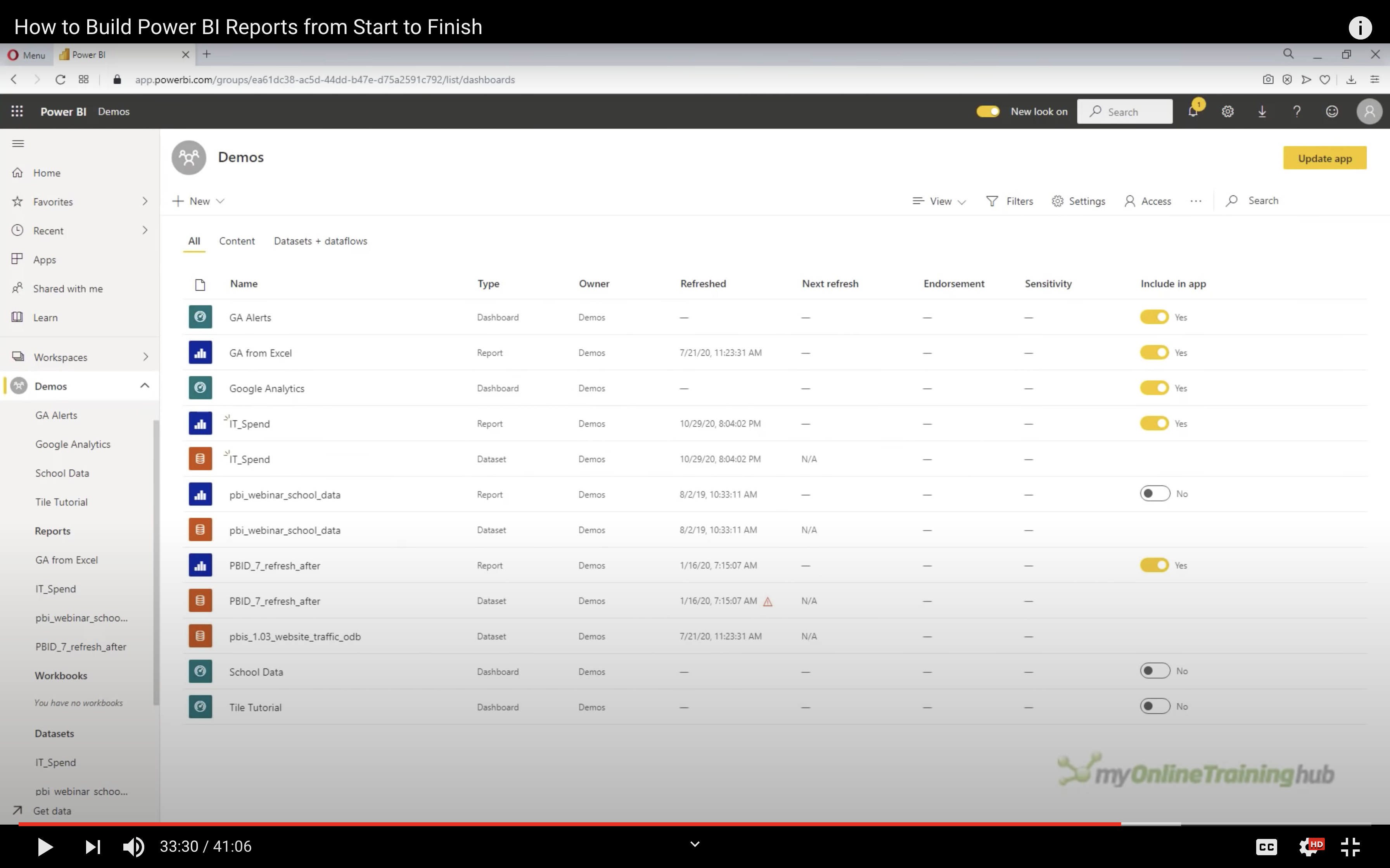
Select the report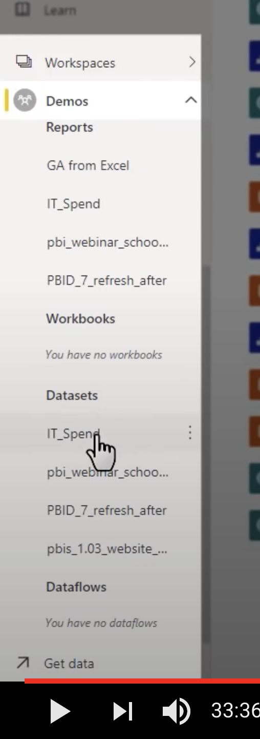
You can interact with the dashboard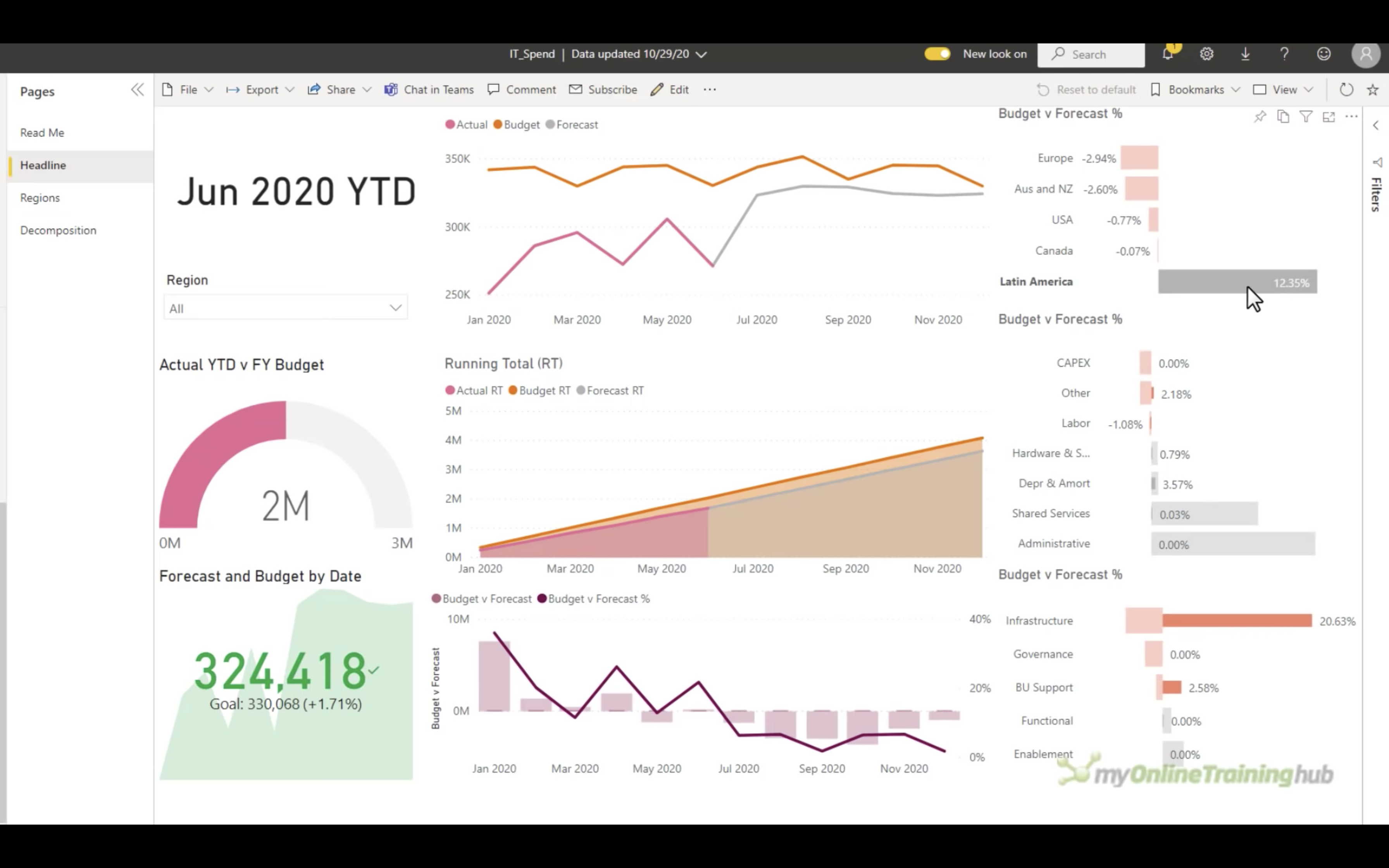
Focus Mode
You can focus on a chart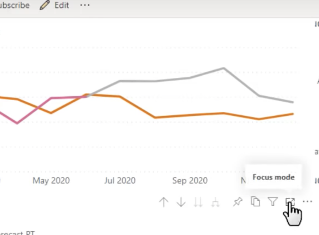
You can filter data on Focus mode.
As a user, any filter you added won’t be saved.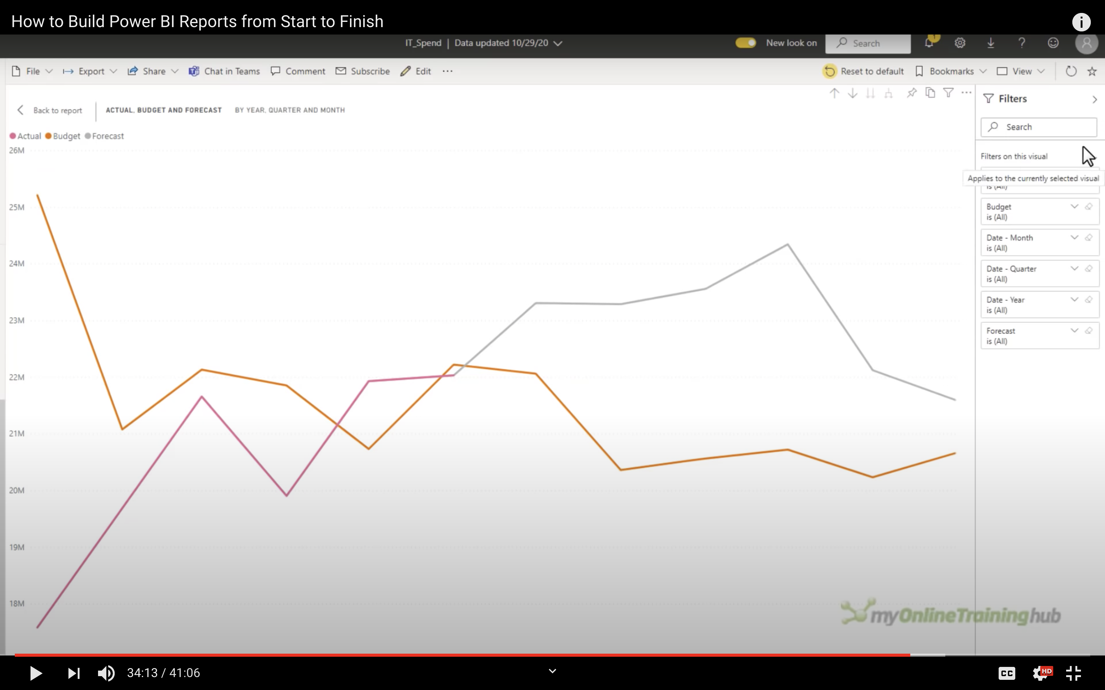
Show as table
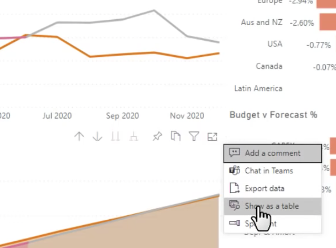
The chart will be showed on top, and below is table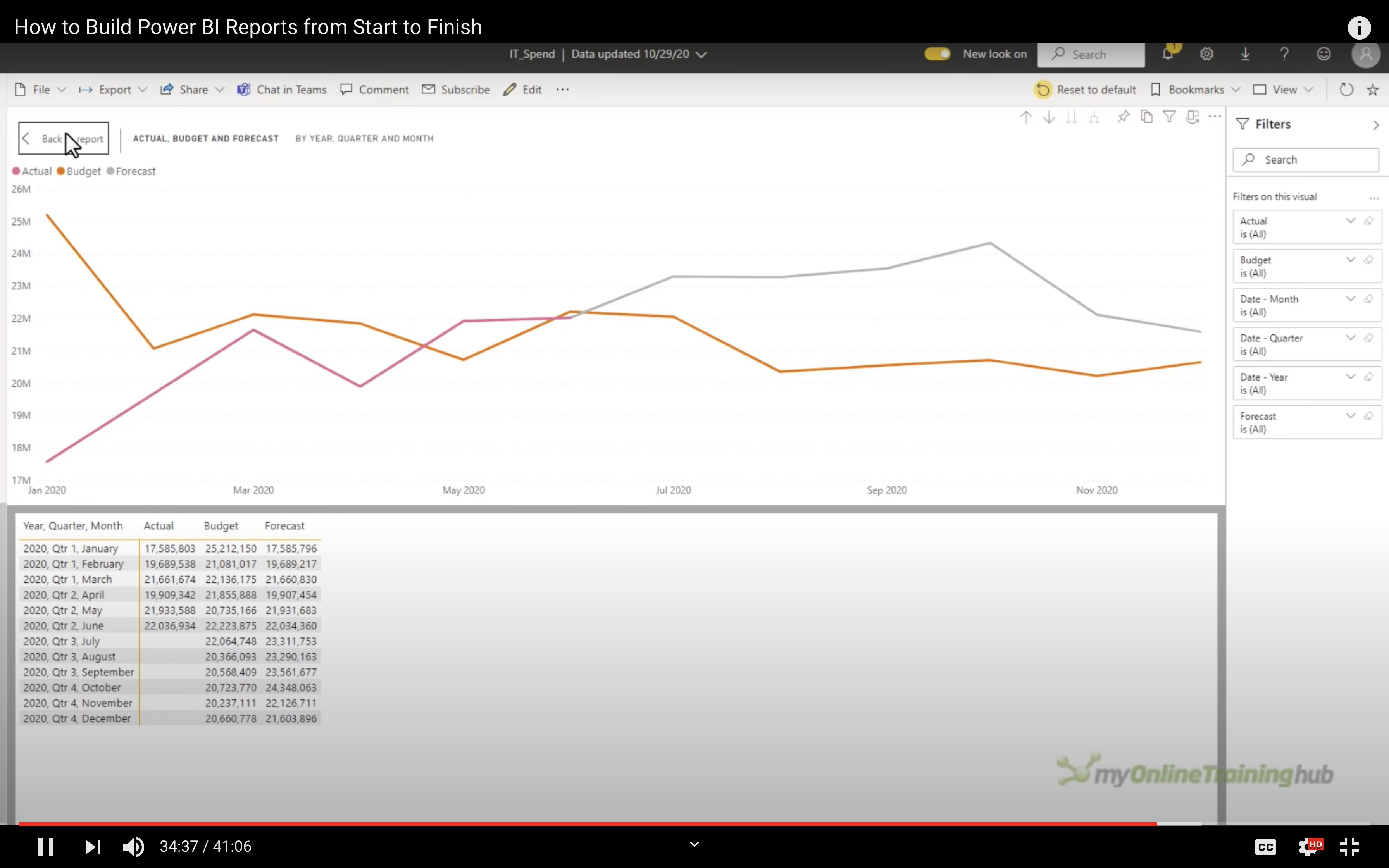
Analyze
You can also use analyze tools in viewer mode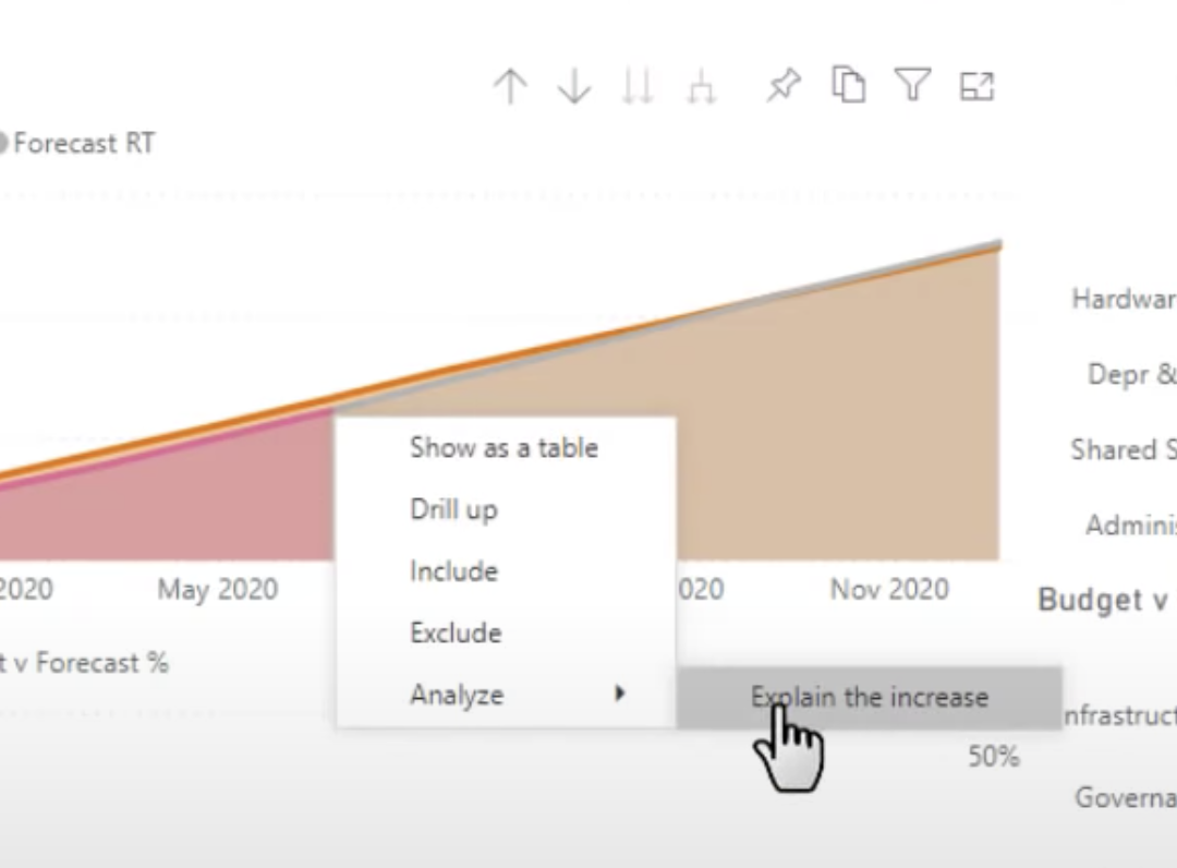
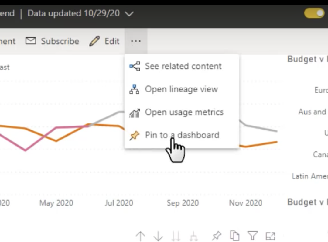
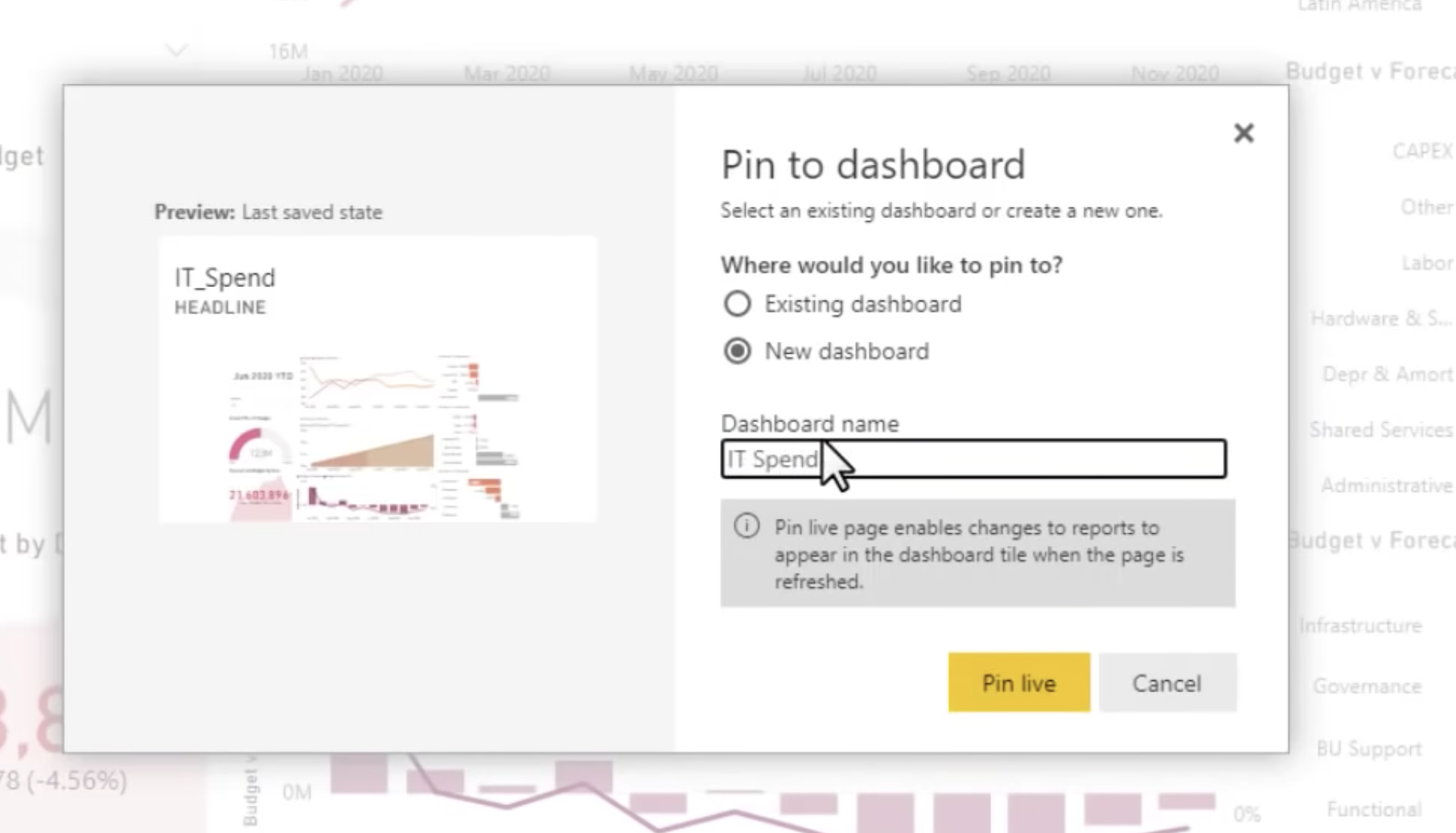
Pin to a dashboard
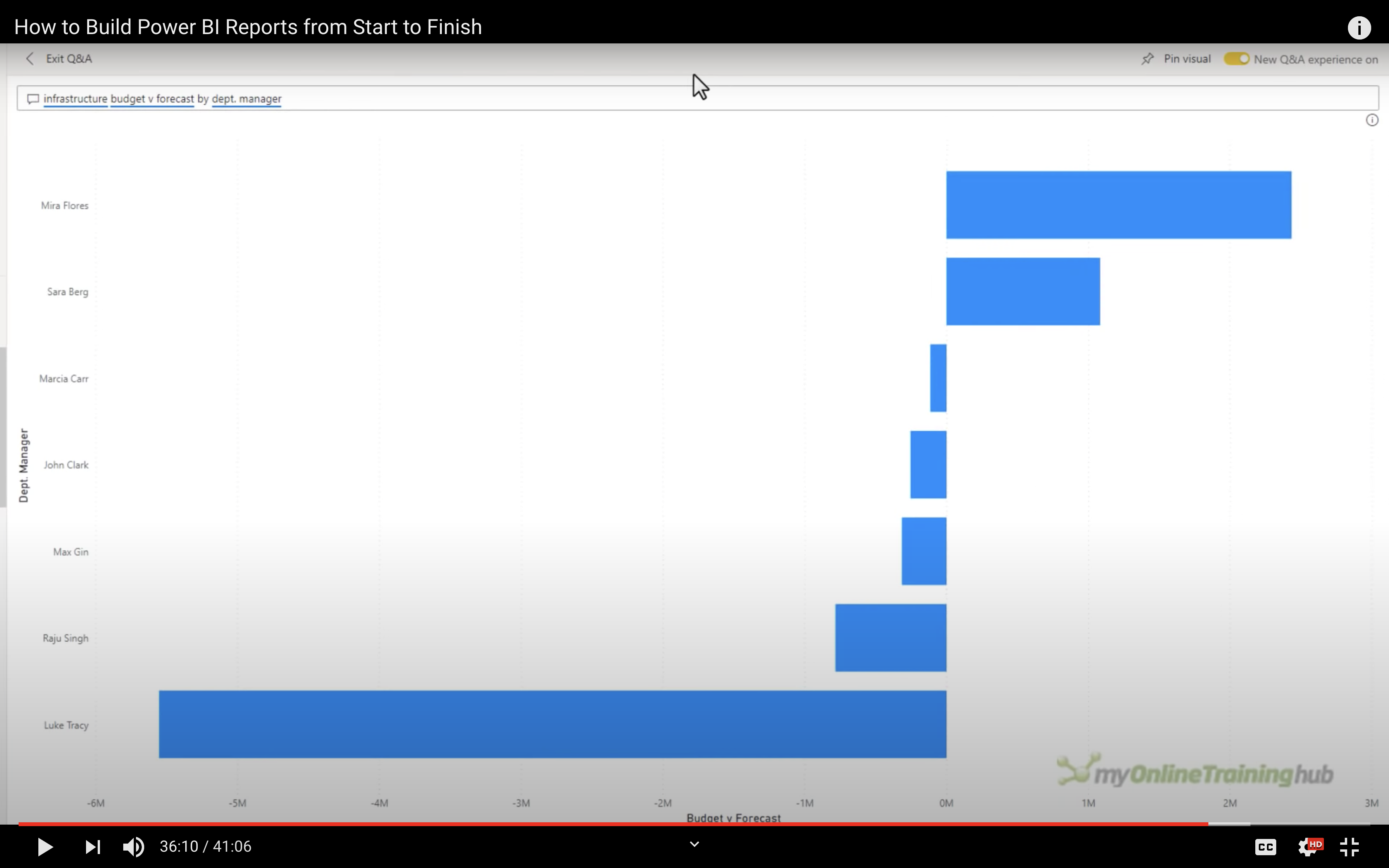
During dashboard mode, no tools available except Ask a question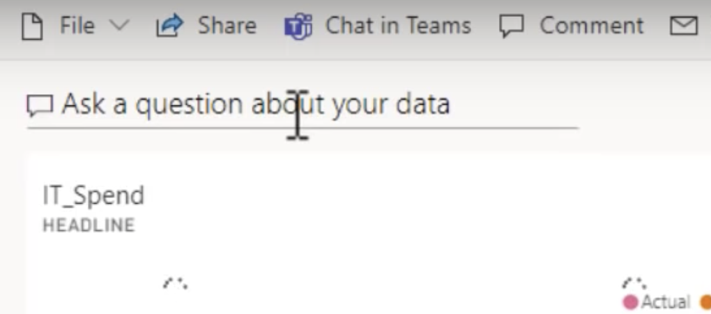
Suggested question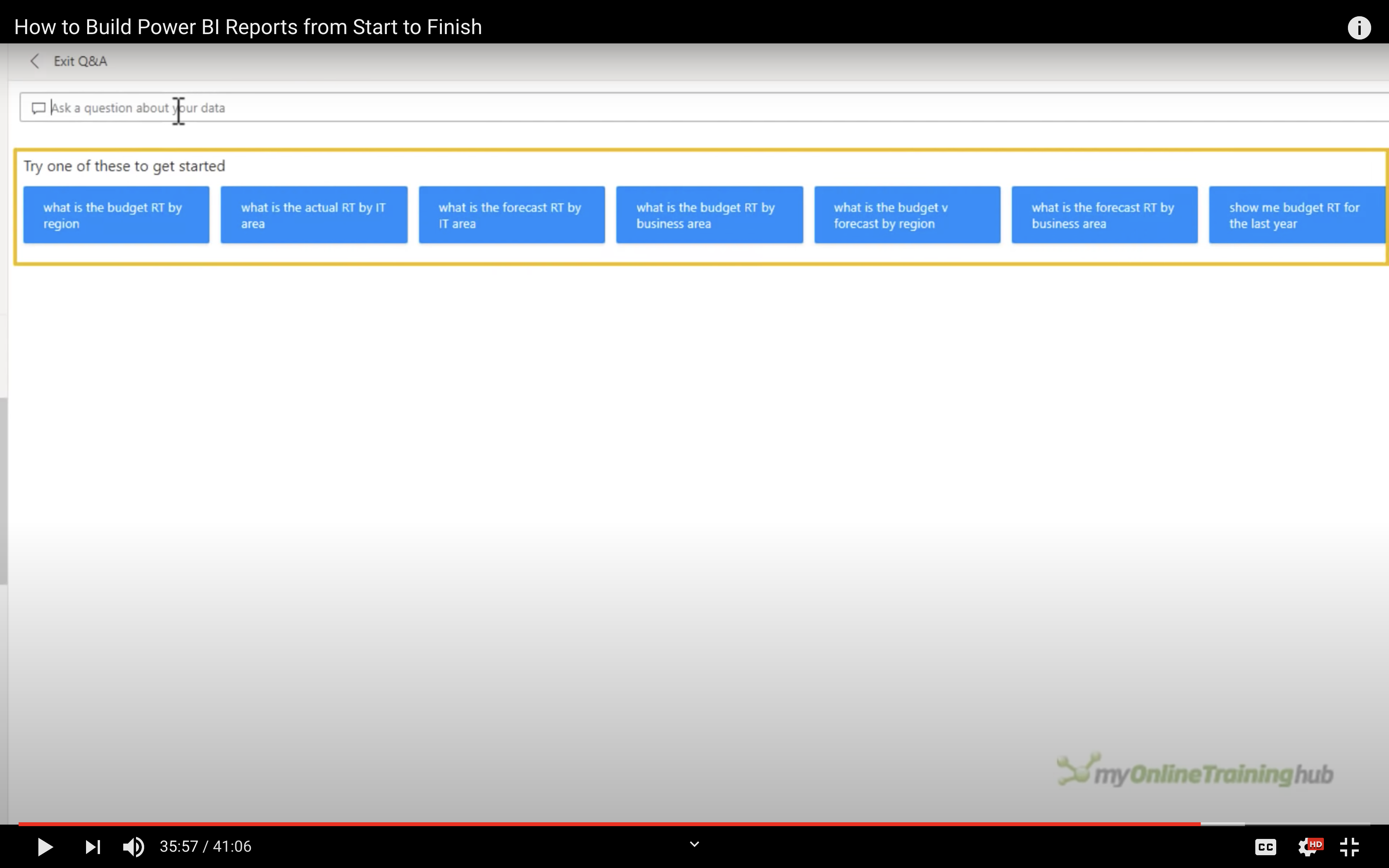
Or ask a question by yourself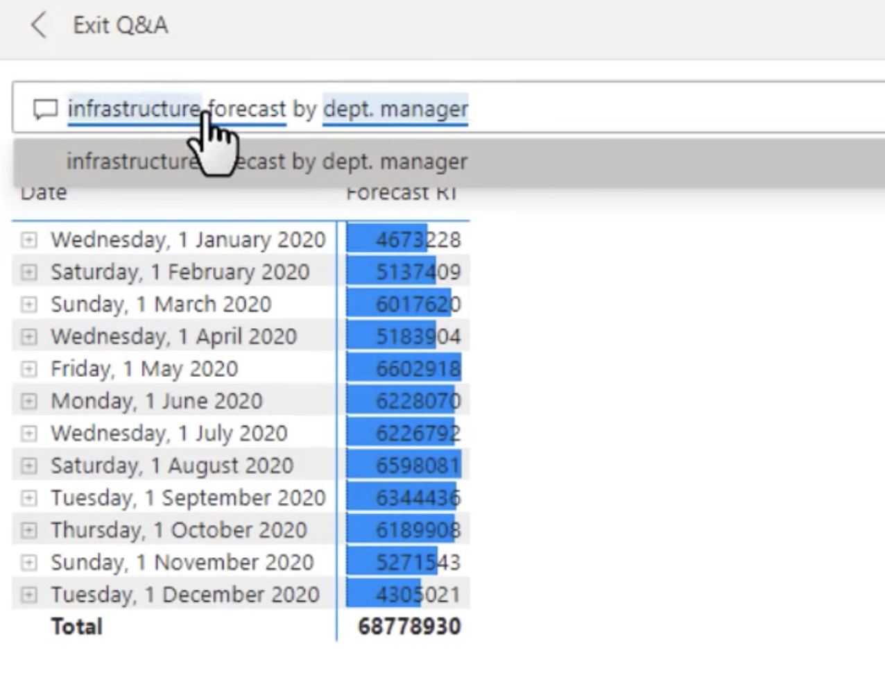
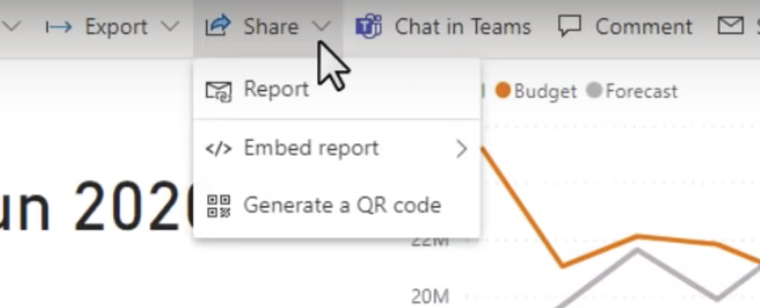
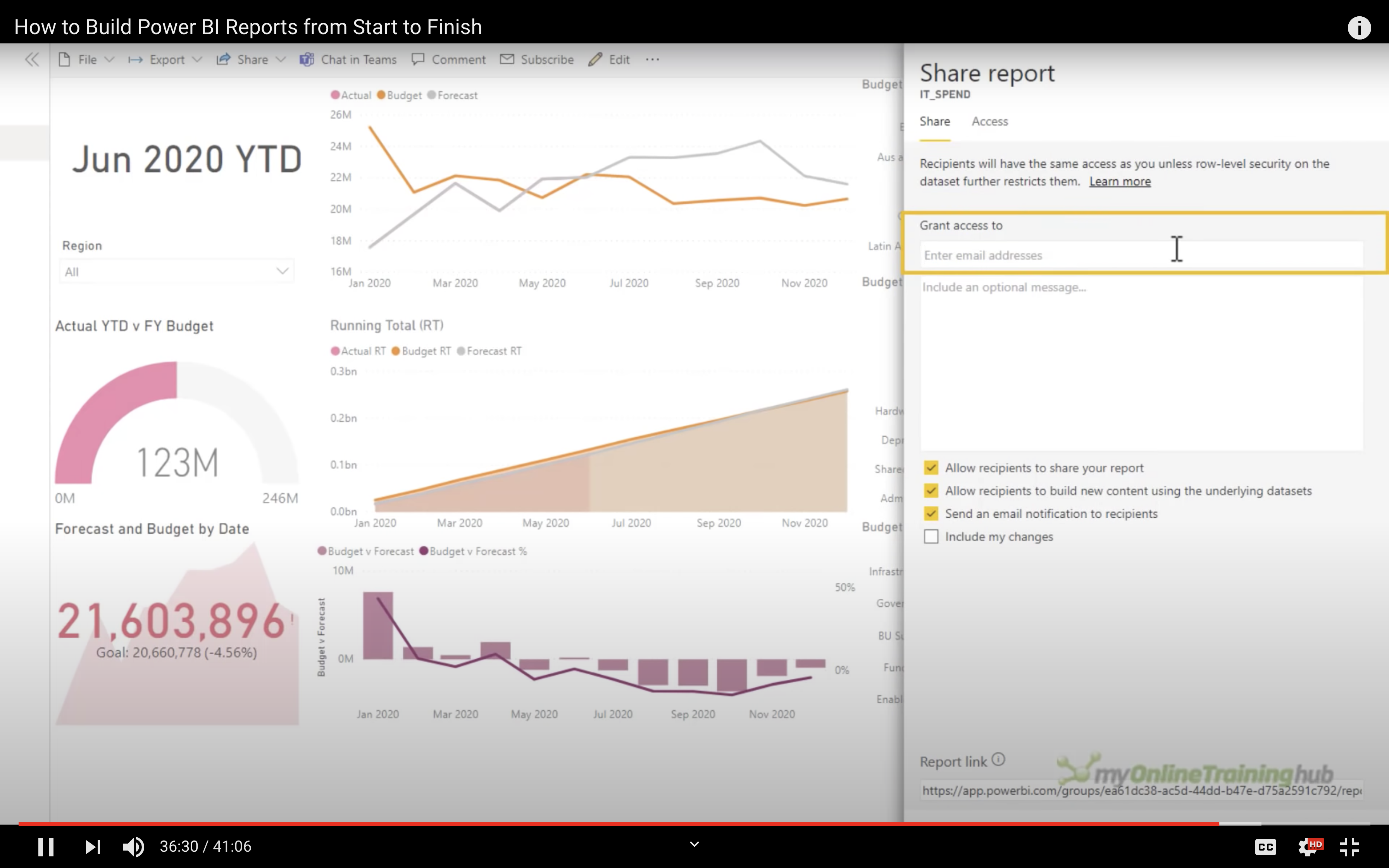
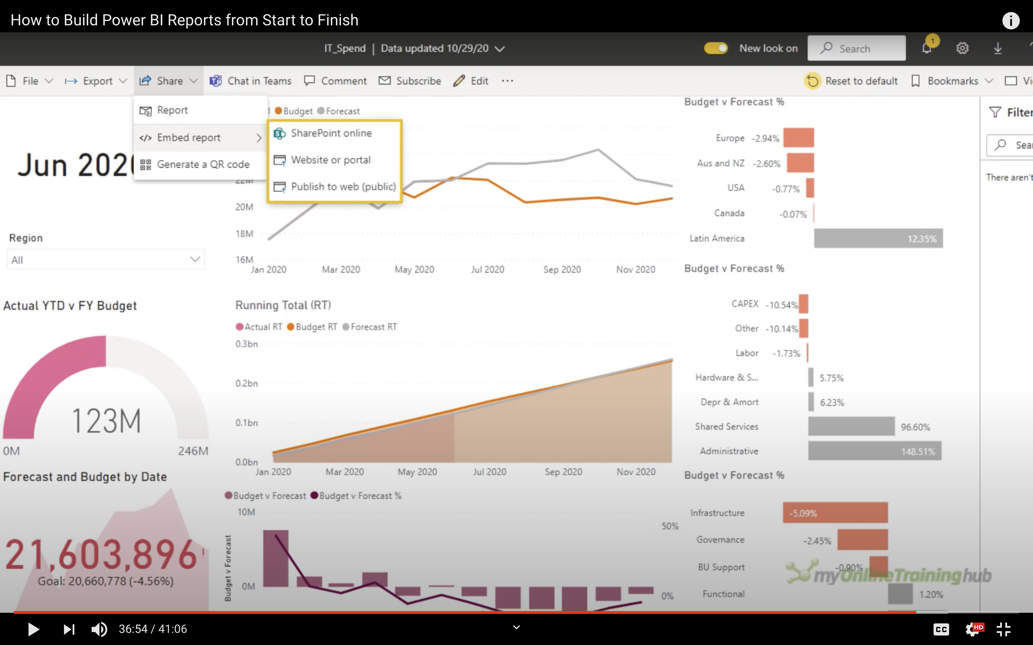
Share
Share report
Embed report
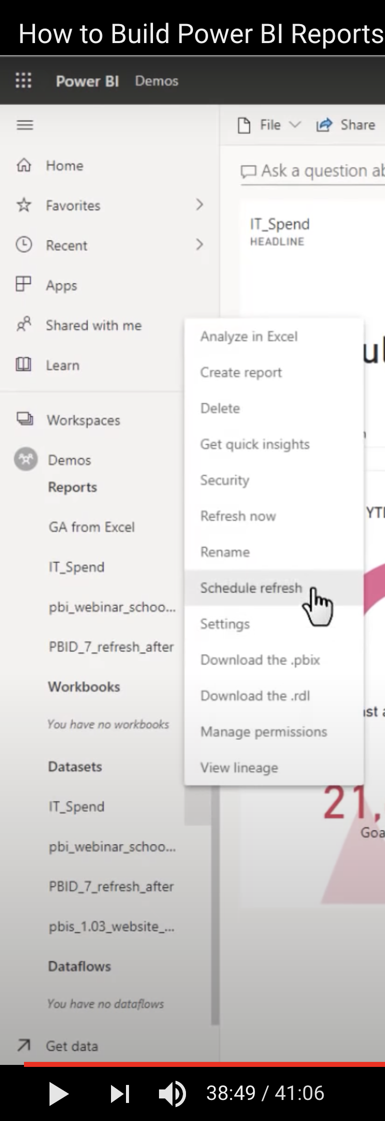
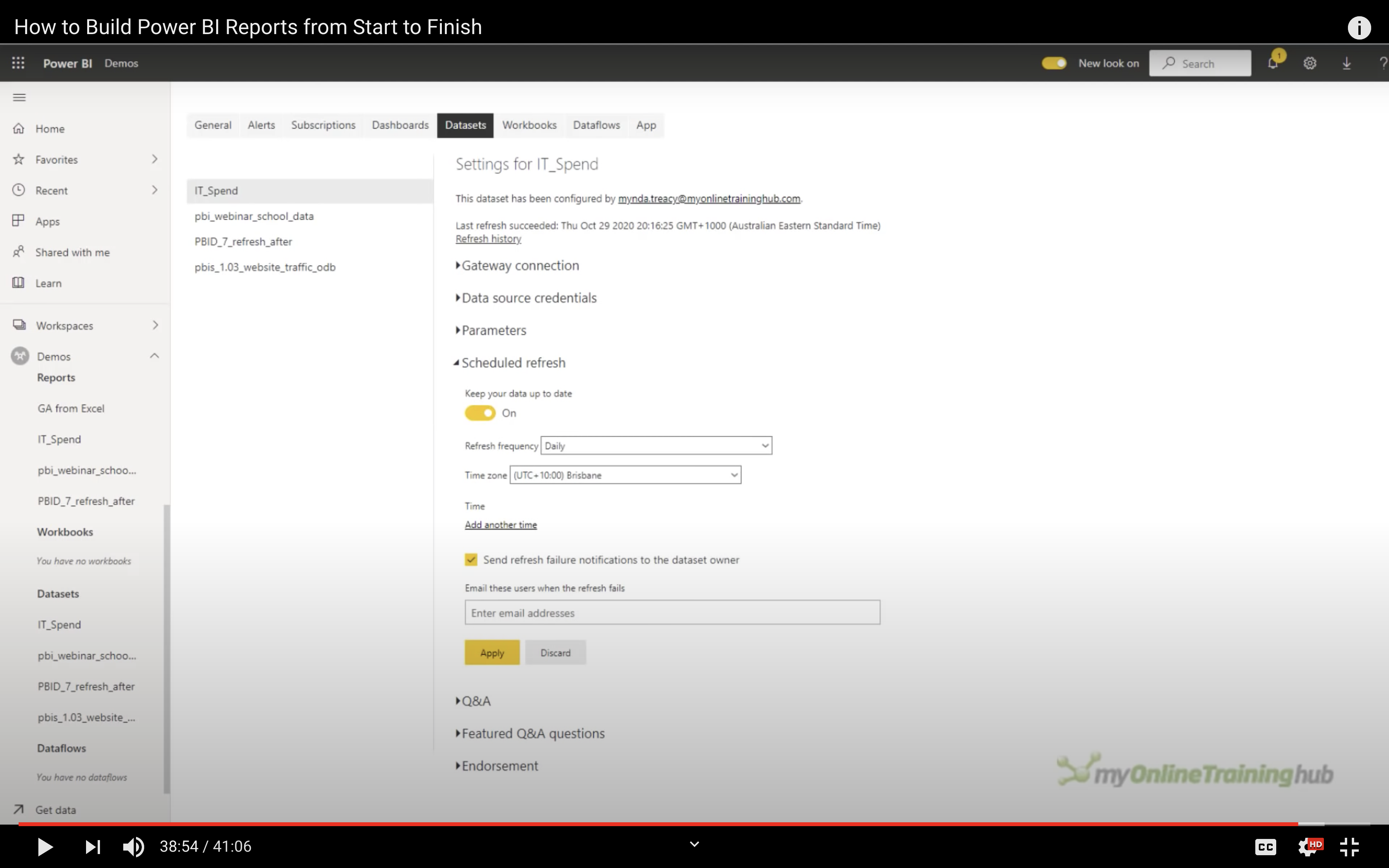
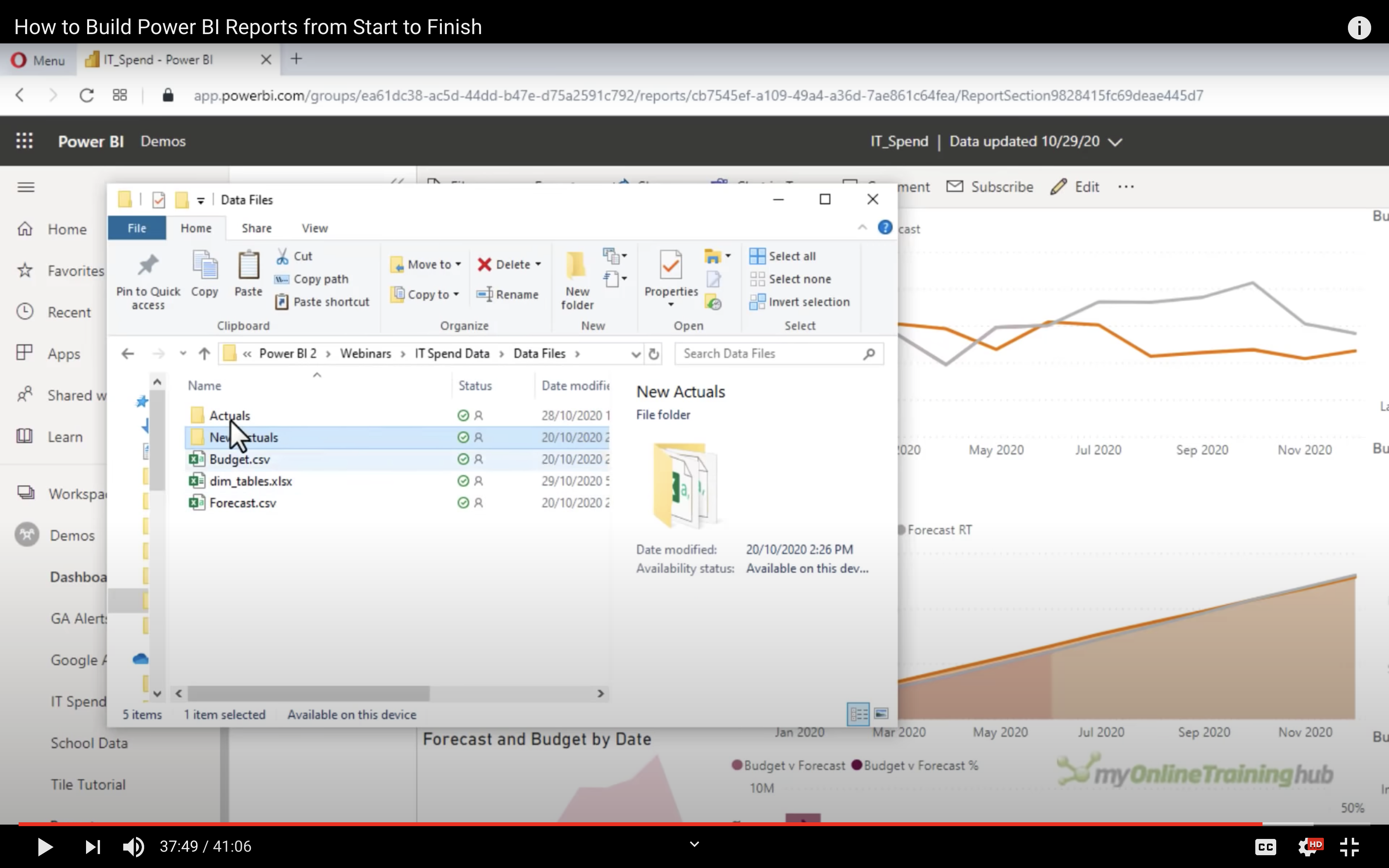
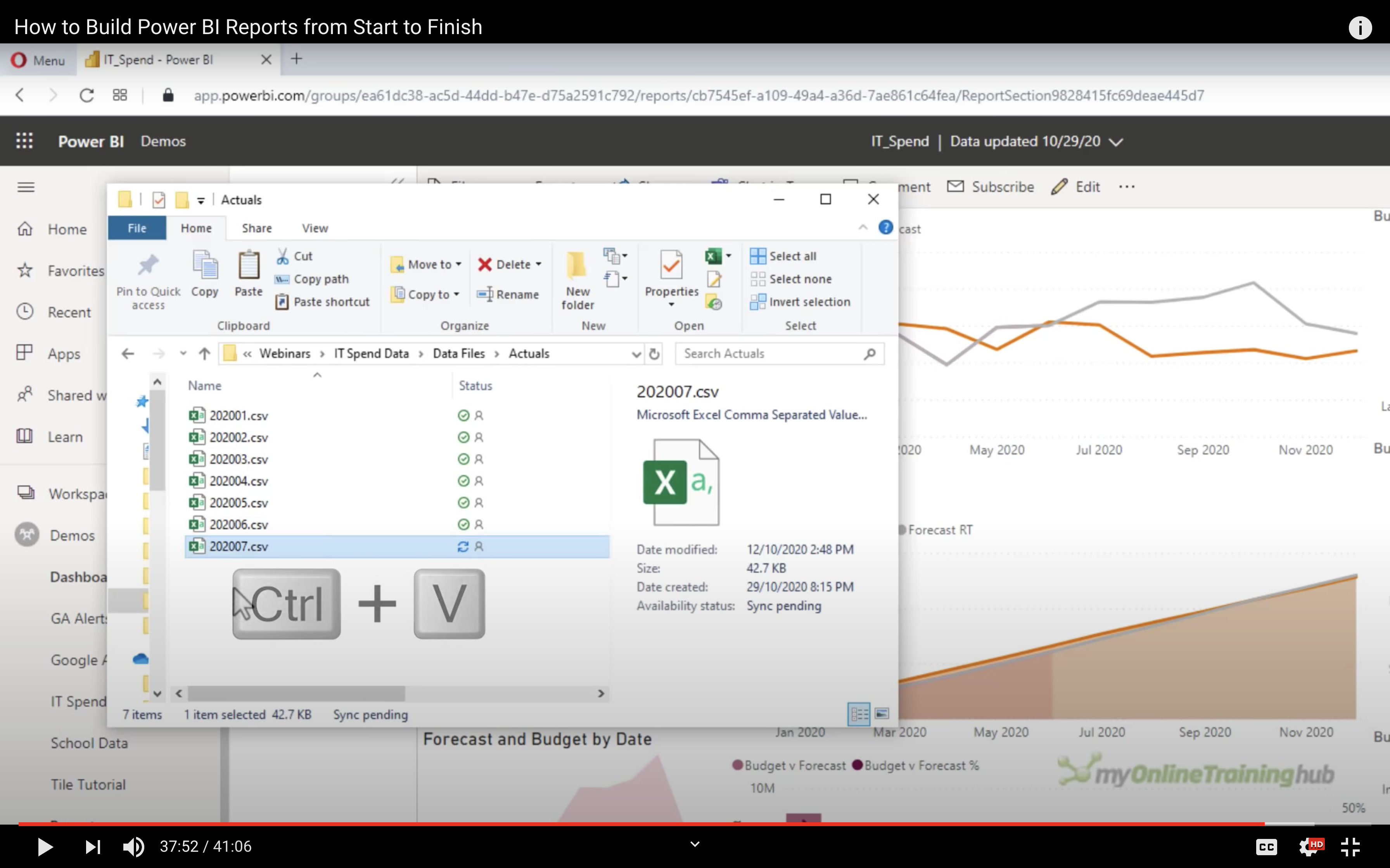
Data Refresh
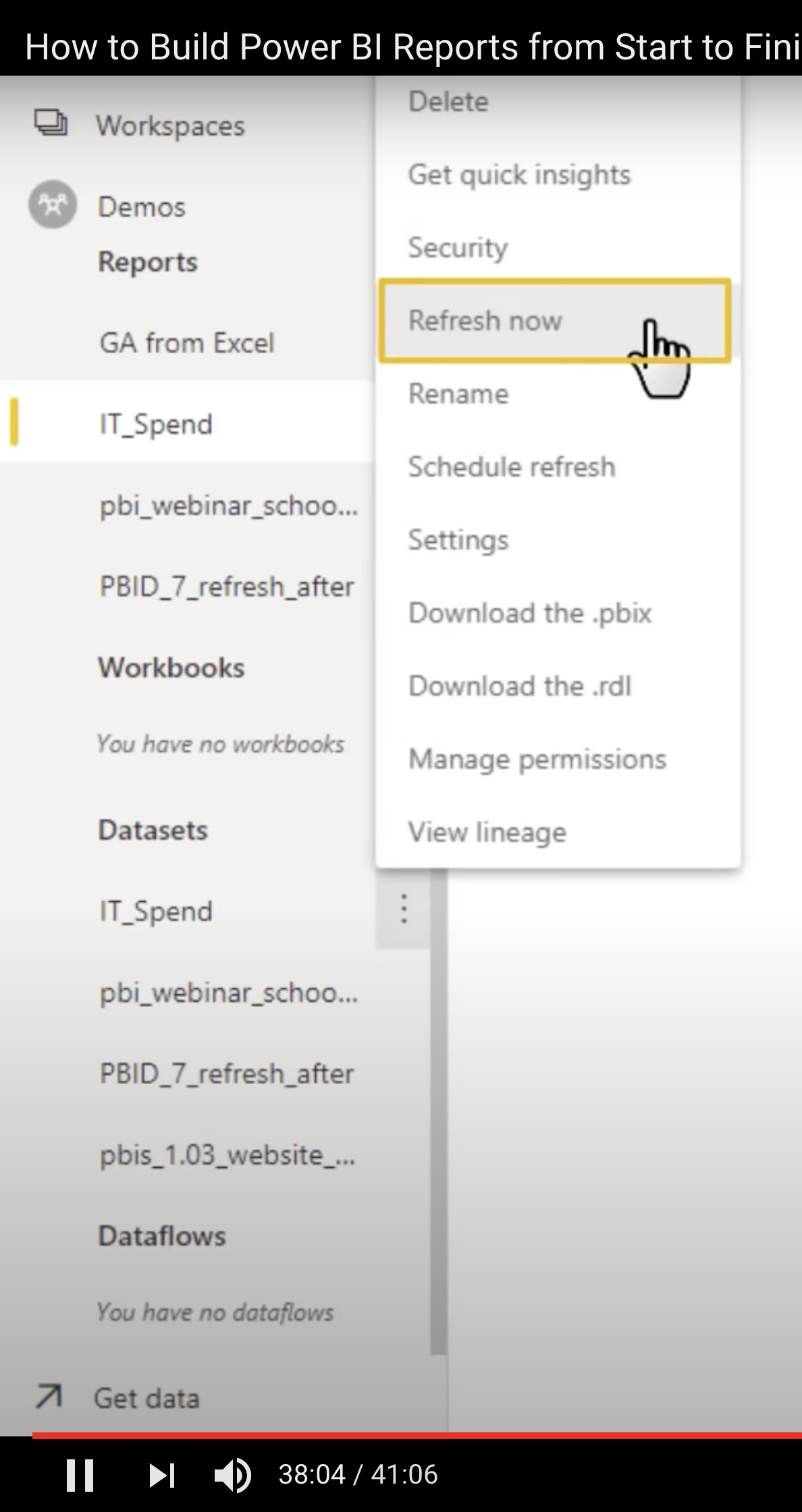
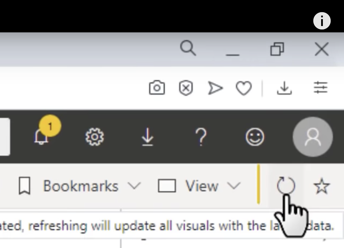
Schedule Refresh