Ggplot2 & Plotnine
Be Awesome in ggplot2: A Practical Guide to be Highly Effective - R software and data visualization
如何在Python里用ggplot2绘图
plotnine
ggplot function reference
Introduction
ggplot() initializes a ggplot object. It can be used to declare the input data frame for a graphic and to specify the set of plot aesthetics intended to be common throughout all subsequent layers unless specifically overridden.
ggplot is a package for R. In Python, we will use plotnine, which is extremely similar to ggplot.
Installation & Loading
For R:
- Download package
ggplotthat integrated in packagetidyverse. - Then load it.
1 | # Installation |
For Python:
- Download Anaconda Environment, otherwise you will not have package
pandasandnumpy. - Download package
plotninethroughcondaShell 1
conda install -c conda-forge plotnine
- Then load them.
Python 1
2
3
4# Loading
import pandas as pd
import numpy as np
from plotnine import *
Understanding ggplot
To understand the logic of ggplot, you’d better learn what is the principles of graphics.
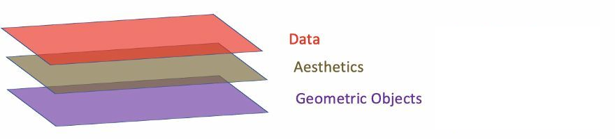
- Data: Data must be
data.frame. - Aesthetics: Aesthetics is used to indicate x and y variables. It can also be used to control the color, the size or the shape of points, the height of bars, or etc.
- Geometric Objects: A layer combines data, aesthetic mapping, a geom (geometric object), a stat (statistical transformation), and a position adjustment. Typically, you will create layers using a
geom_function, overriding the default position and stat if needed.
1 | # Define data frame |
1 | import pandas as pd |
Observe the difference of two part of code from R and Python. You must notice that Python need to create a dictionary first then convert it to data.frame. Because Python do not have data type named data.frame. You have to import package pandas then load data.frame.
Let’s put the main part of R code and Python code together, and find out the difference in Code.
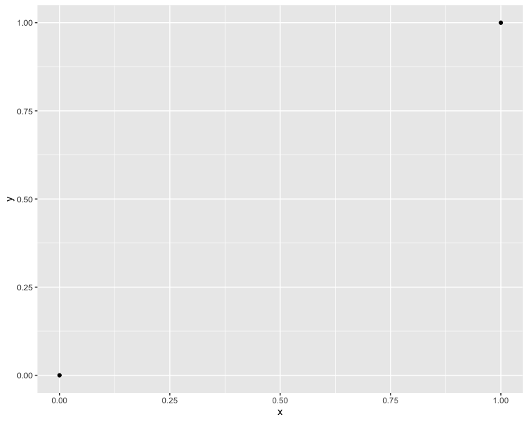
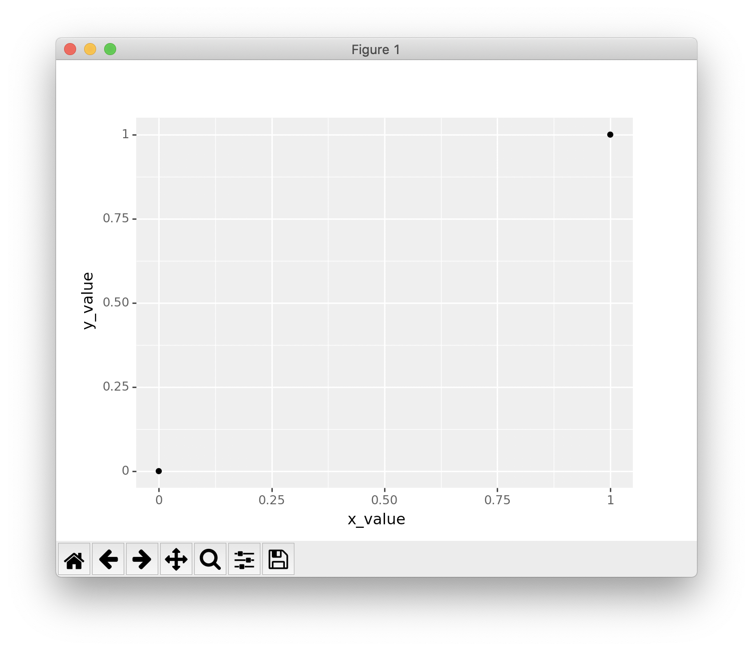
1 | # Draw two points |
1 | # Draw two points |
In Python:
- You must add an extra
()to cover the wholeggplotexpression. - You can declare
data = data framein R; but you cannot declare it in Python. - You must use
''or""to wrap your parameters in theggplotexpression. But NOT fordata frame. - You can put the
+in the end or the beginning of each line.
In R:
- You can omit
data =in the first line. - You must put the
+in the end of each line.
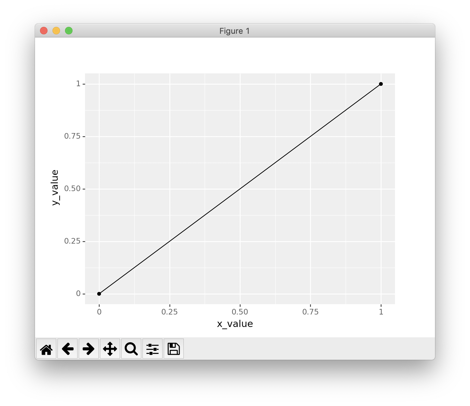
This time, we try to connect the two point. That is the simplest function - directly proportional function. And it is also the simplest plot - line chart.
1 | # Connect two points |
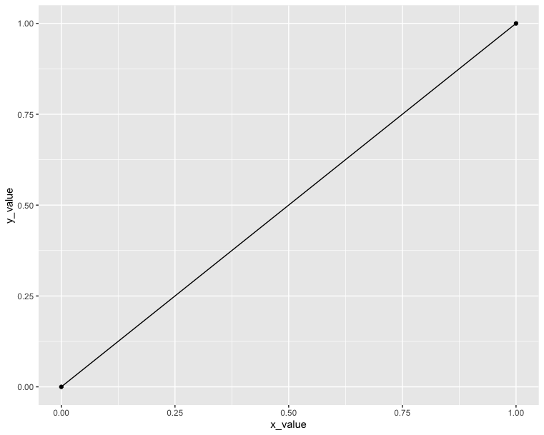
1 | # Connect two points |
Explore more layers
Now we have understood the first three layers. Then let’s try to explore the rest four layers. If you cannot understand now, don’t worry. Just remember the concepts of layers is here.
See more detailed definition, click ggplot function reference.
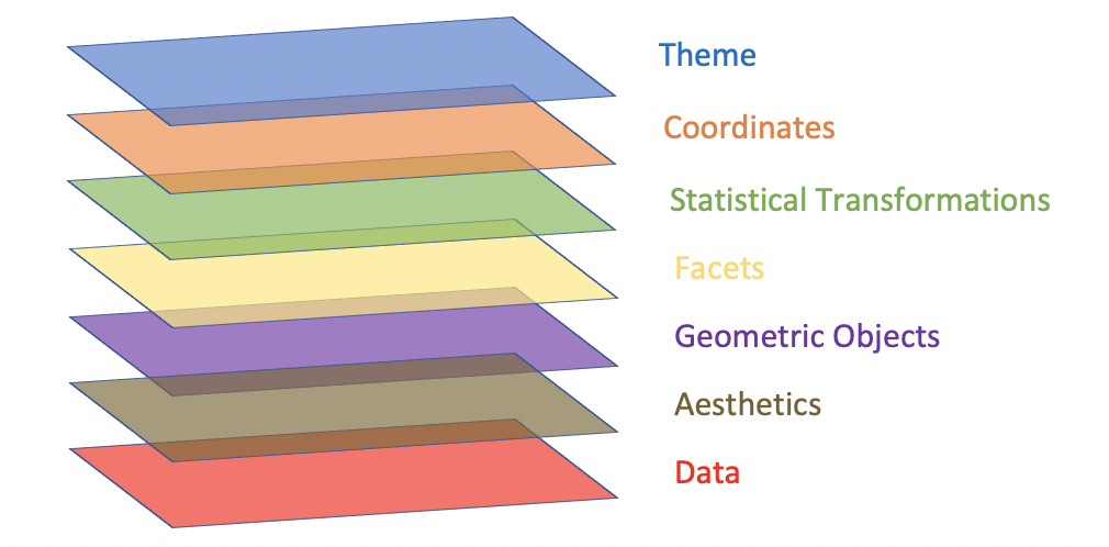
From bottom to top:
- Data: Data must be
data.frame. - Aesthetics: Aesthetics is used to indicate x and y variables. It can also be used to control the color, the size or the shape of points, the height of bars, or etc.
- Geometric Objects: A layer combines data, aesthetic mapping, a geom (geometric object), a stat (statistical transformation), and a position adjustment. Typically, you will create layers using a
geom_function, overriding the default position and stat if needed. - Facets: Facetting generates small multiples, each displaying a different subset of the data. Facets are an alternative to aesthetics for displaying additional discrete variables.
- Statistical Transformations: A handful of layers are more easily specified with a
stat_function, drawing attention to the statistical transformation rather than the visual appearance. The computed variables can be mapped usingstat(). - Coordinates: The coordinate system determines how the
xandyaesthetics combine to position elements in the plot. The default coordinate system is Cartesian (coord_cartesian()), which can be tweaked withcoord_map(),coord_fixed(),coord_flip(), andcoord_trans(), or completely replaced withcoord_polar(). - Themes: Themes control the display of all non-data elements of the plot. You can override all settings with a complete theme like
theme_bw(), or choose to tweak individual settings by usingtheme()and theelement_functions. Usetheme_set()to modify the active theme, affecting all future plots.
qplot(): Quick plot with ggplot2
The qplot() function is very similar to the standard R plot() function. It can be used to create quickly and easily different types of graphs: scatter plots, box plots, violin plots, histogram and density plots.
A simplified format of qplot() is :
1 | qplot(x, y = NULL, data, geom="auto") |
1 | qplot(x = 'NULL', y = 'NULL', data = 'data.frame', geom="auto") |
- x, y : x and y values, respectively. The argument y is optional depending on the type of graphs to be created.
- data : data frame to use (optional).
- geom : Character vector specifying geom to use. Defaults to “point” if x and y are specified, and “histogram” if only x is specified.
Read more about qplot(): Quick plot with ggplot2.
Reproducing our experiment in qplot():
R:
1 | # Loading |
1 | # Draw two points: qplot |
Compare to ggplot:
1 | # Draw two points: ggplot() |
1 | # Connect two points: qplot |
1 | # Connect two points: ggplot() |
Python
1 | import pandas as pd |
1 | # Draw two points: qplot() |
Compare to ggplot: Notice this time you have to add data =. And also without '' or "". If you don’t understand why you have to add data =, click here
1 | # Draw two points: ggplot() |
1 | # Connect two points: qplot() |
Compare to ggplot:
1 | # Connect two points: ggplot() |
Data format and preparation
The data set mtcars is used in the examples below:
Data profile:
- mtcars : Motor Trend Car Road Tests.
- Description: The data comprises fuel consumption and 10 aspects of automobile design and performance for 32 automobiles (1973 - 74 models).
- Format: A data frame with 32 observations on 3 variables.
- [, 1] mpg Miles/(US) gallon
- [, 2] cyl Number of cylinders
- [, 3] wt Weight (lb/1000)
1 | # Load the data |
1 | import pandas as pd |
Scatter plots
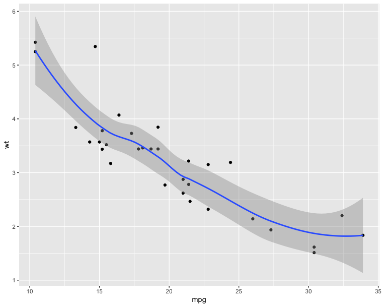
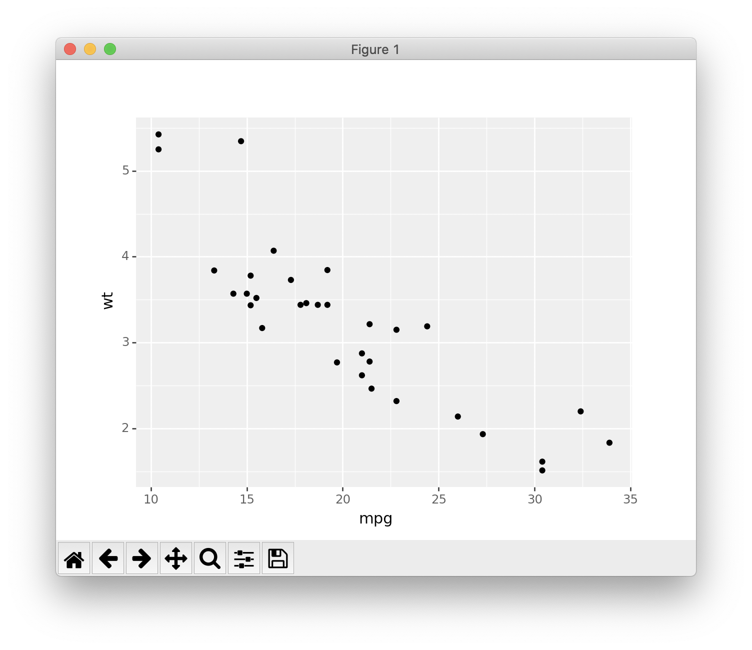
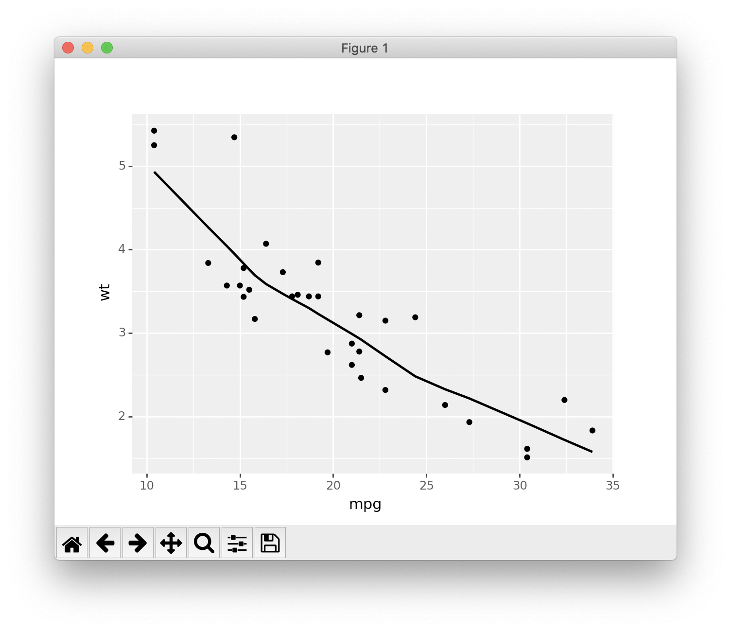
The R code below creates basic scatter plots using the argument geom = “point”. It’s also possible to combine different geoms (e.g.: geom = c(“point”, “smooth”)).
1 | # Basic scatter plot |
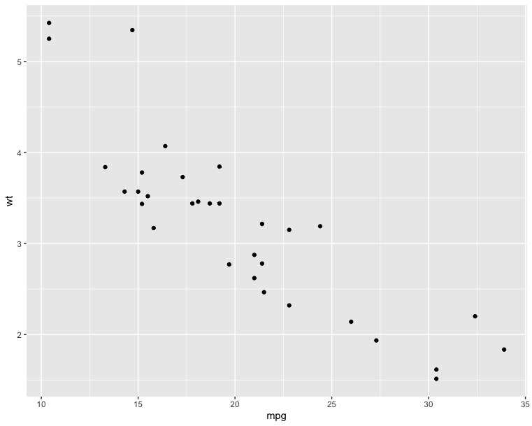
1 | # Scatter plot with smoothed line |
1 | # Basic scatter plot |
1 | # Scatter plot with smoothed line |
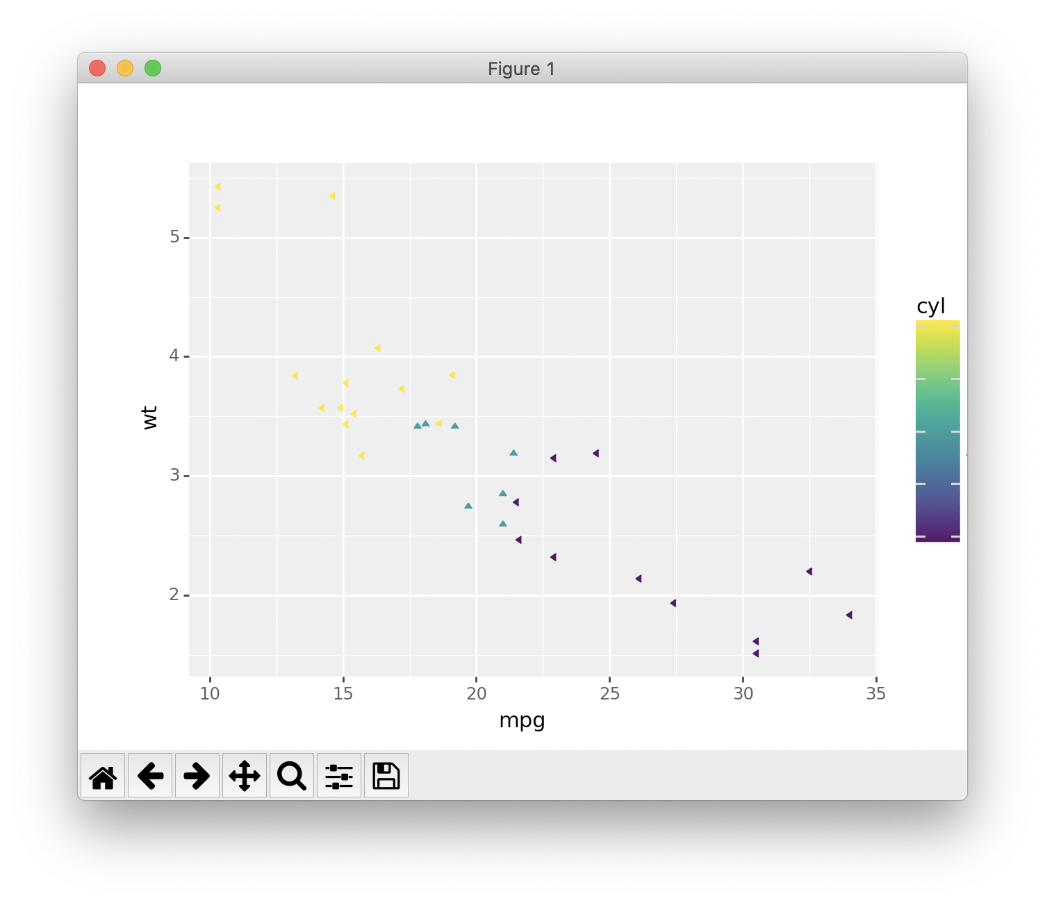
The following R code will change the color and the shape of points by groups. The column cyl will be used as grouping variable. In other words, the color and the shape of points will be changed by the levels of cyl.
1 | qplot(mpg, wt, data = df, colour = cyl, shape = cyl) |
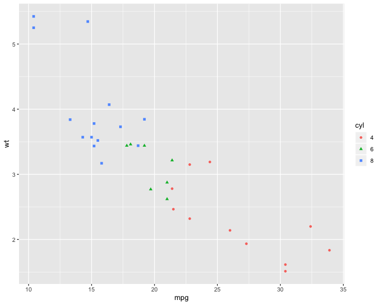
1 | library("ggplot") |
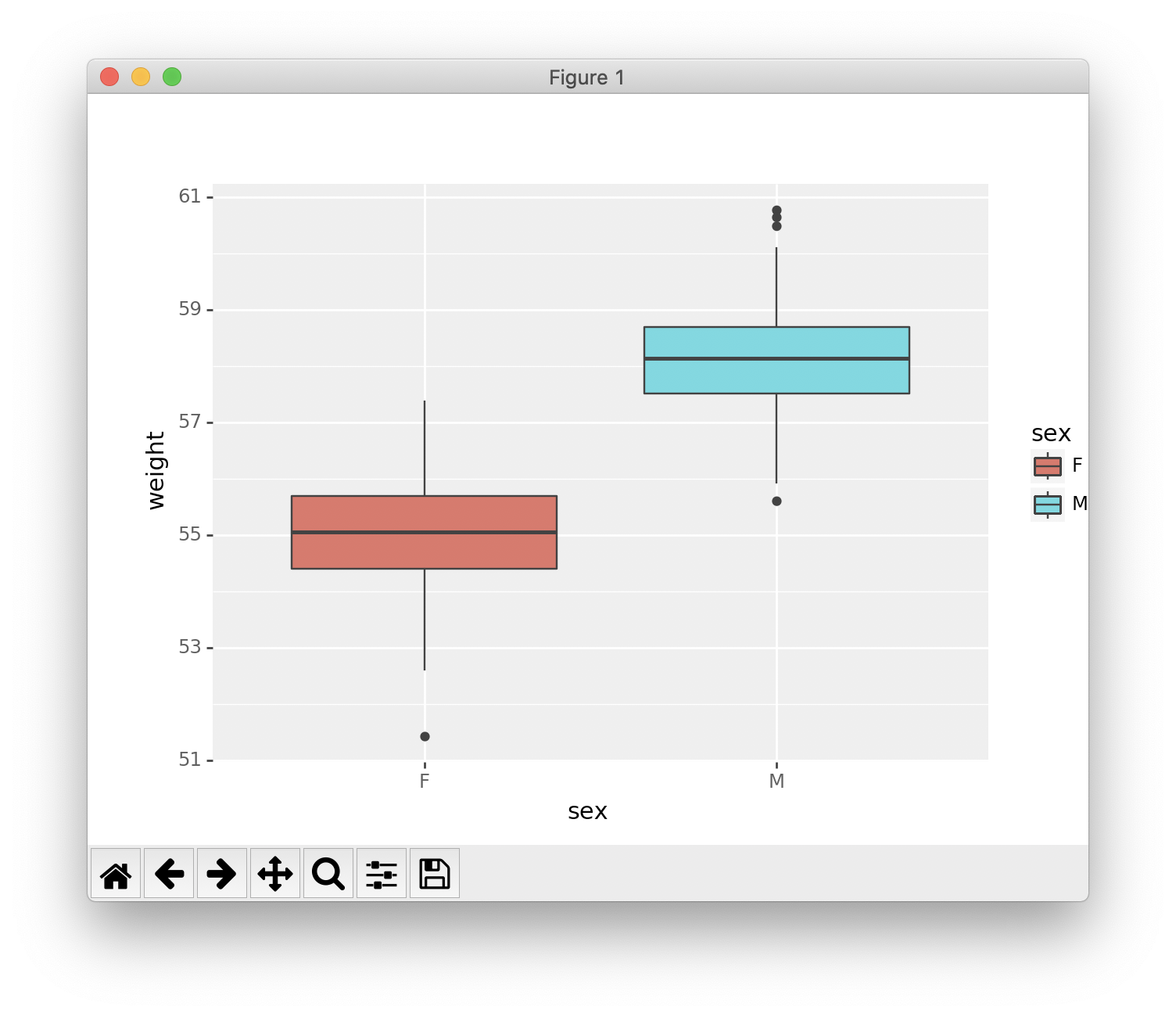
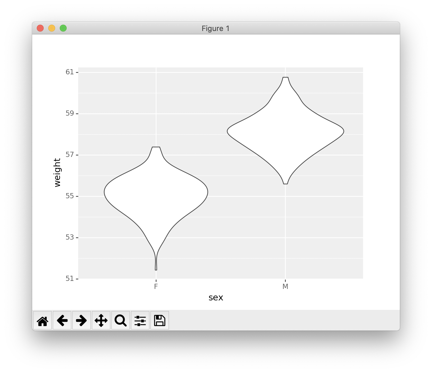
Box plot, violin plot and dot plot
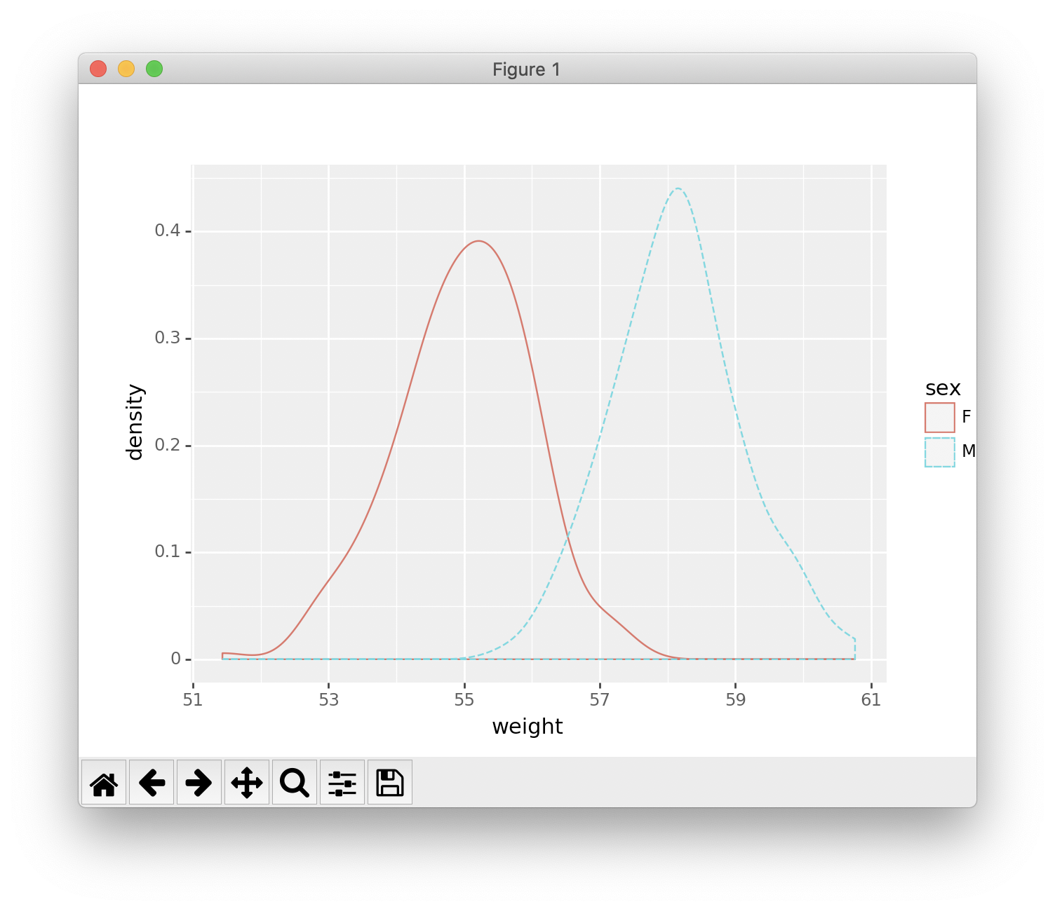
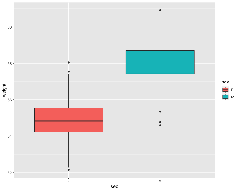
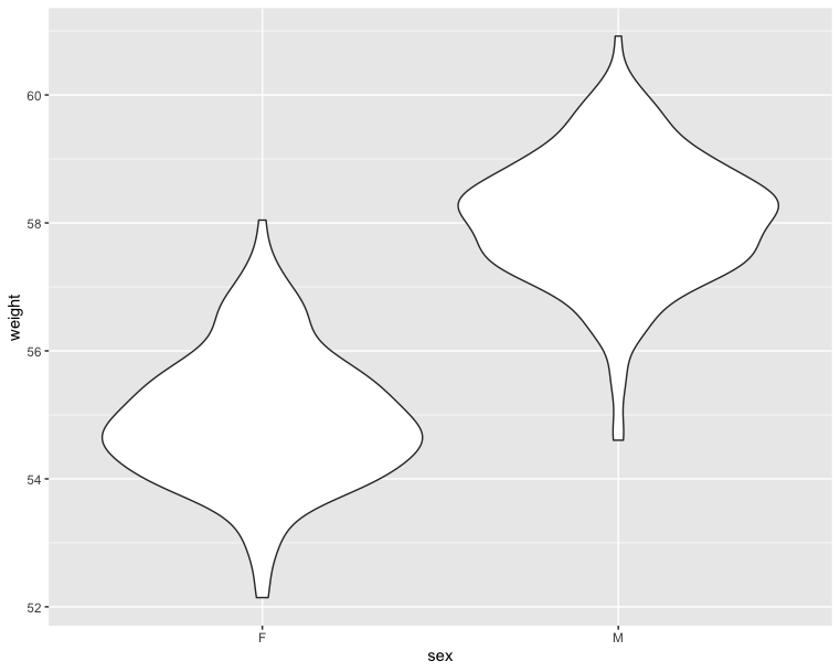
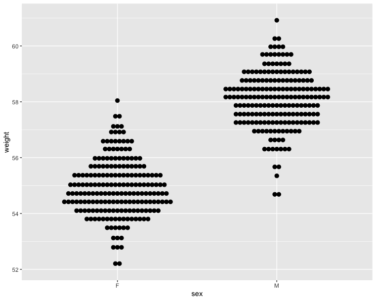
The R code below generates some data containing the weights by sex (M for male; F for female):
1 | # Define Data Frame |
1 | import pandas as pd |
1 | # Basic box plot from data frame |
1 | # Violin plot |
1 | # Dot plot |
1 | # Basic box plot from data frame |
1 | # Violin plot |
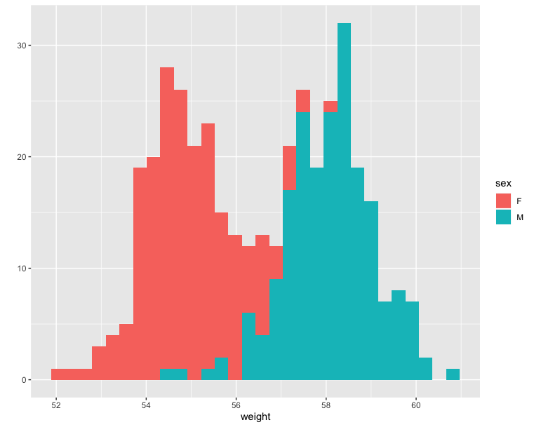
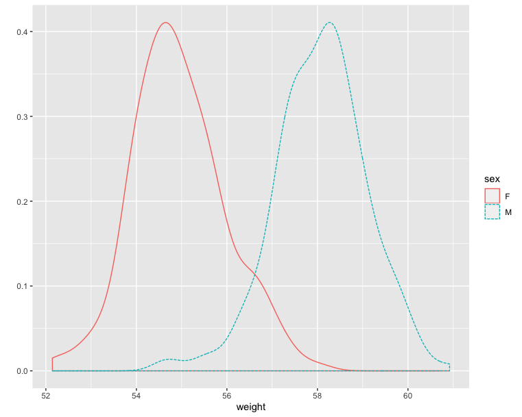
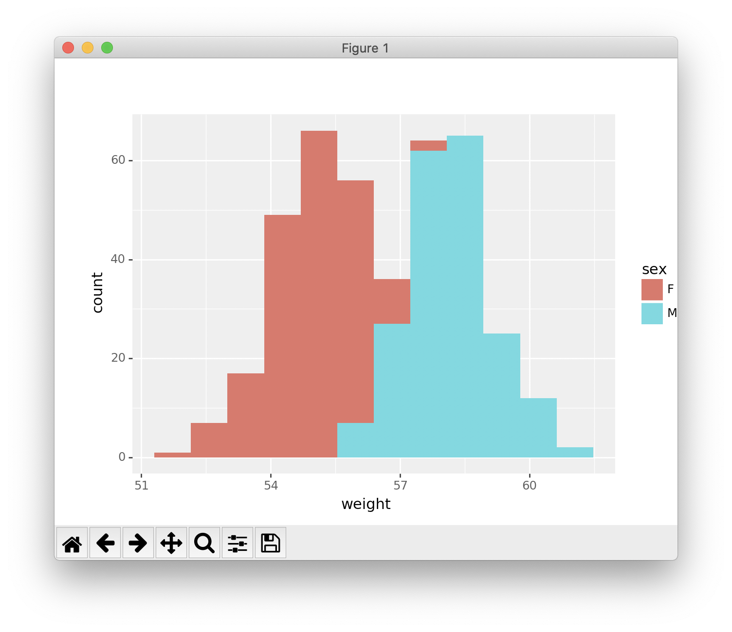
Histogram and density plots
The histogram and density plots are used to display the distribution of data.
1 | # Histogram plot |
1 | # Density plot |
1 | # Histogram plot |
1 | # Density plot |