Communication and Visualization for Data Analytics
ALY6070
02
05
Ethical Considerations in Data Visualizations
A Quick Guide to Spotting Graphics That Lie
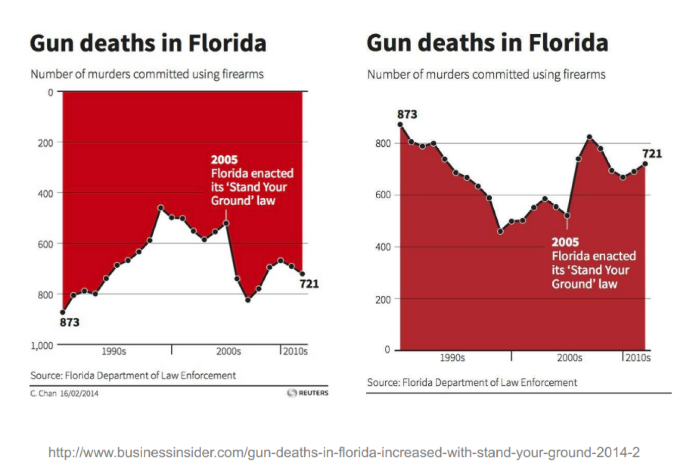
Broken scales show drama where it doesn’t exist
错误的使用坐标轴起点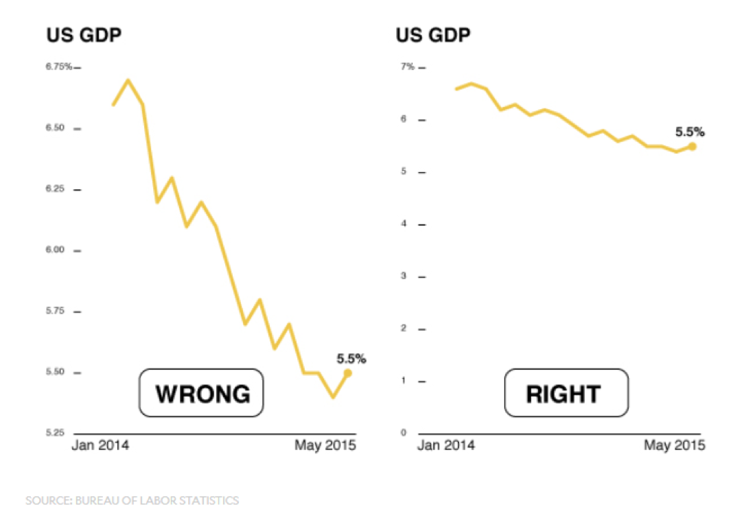

Showing data on two different scales can make for an apples-to-orange comparison
将不同维度的数据放到同一个坐标轴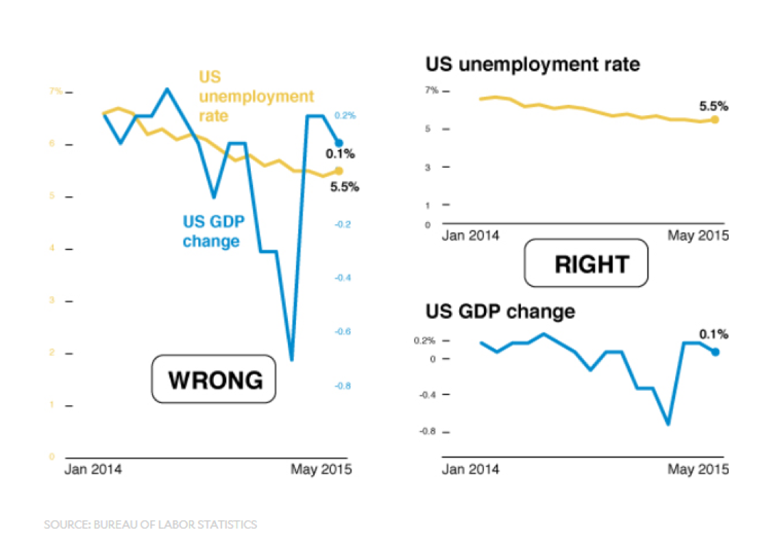
Showing a correlation can imply causation
将没有因果性的数据对比相关性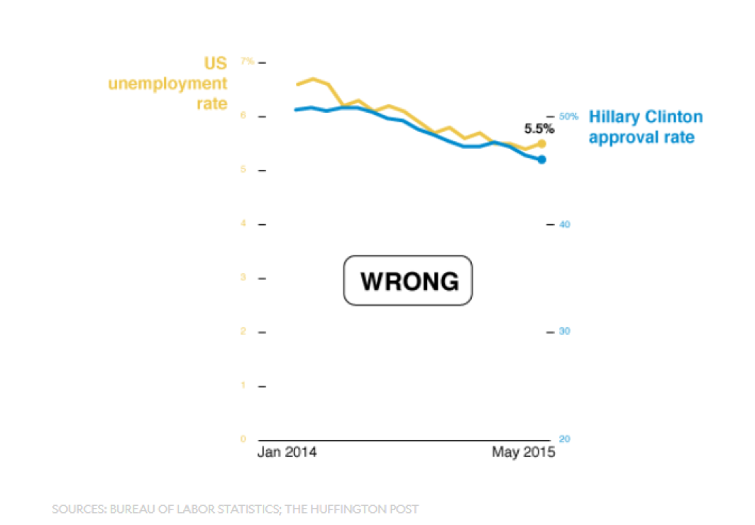
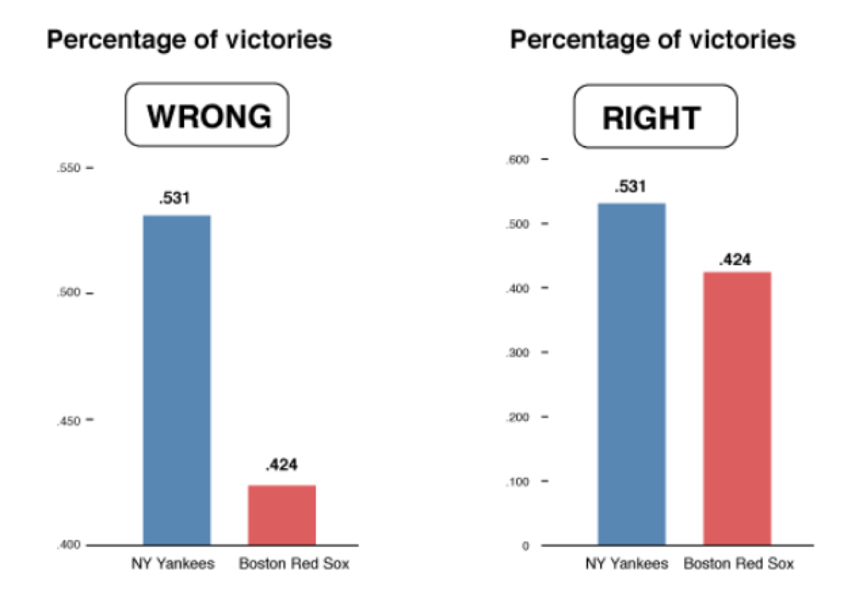
Ignoring population size makes rates impossible to compare
忽略总体数量进行局部对比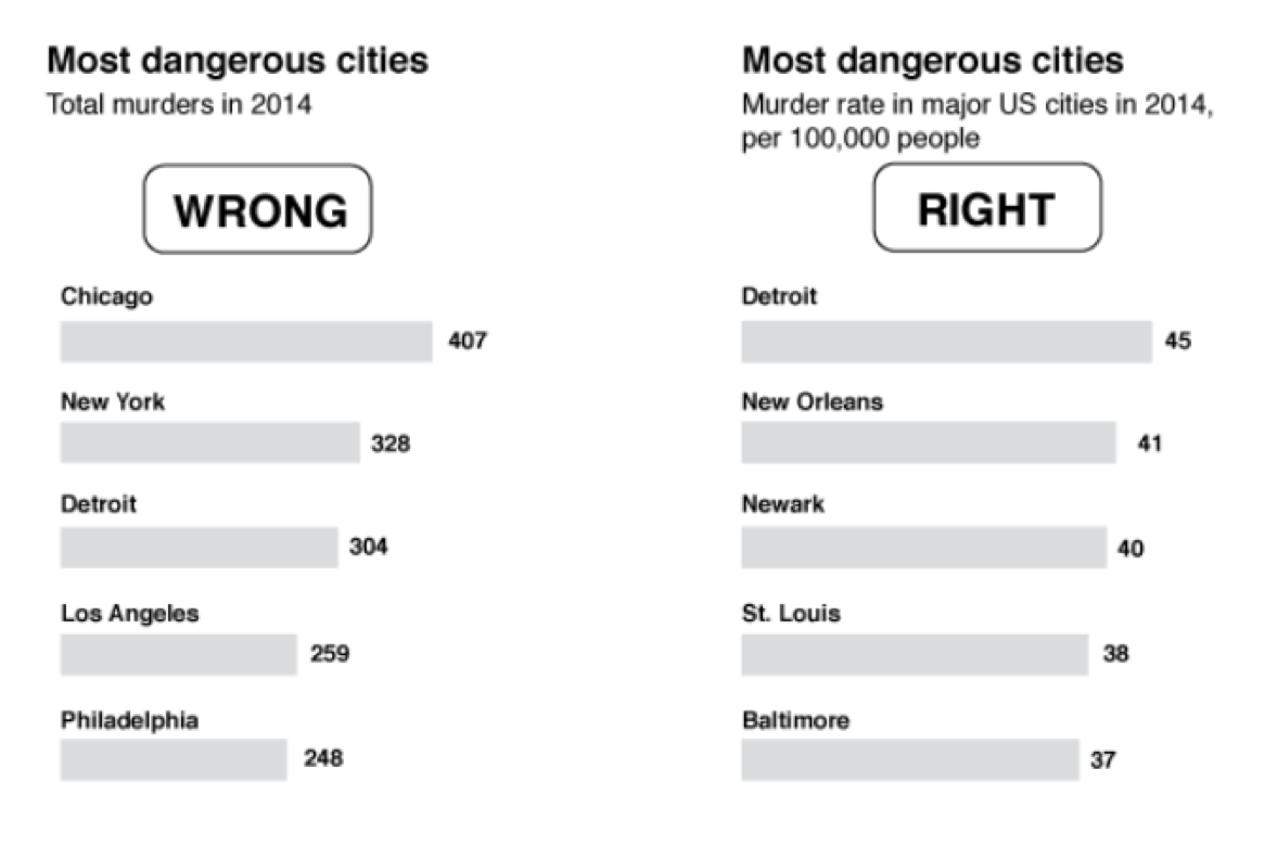
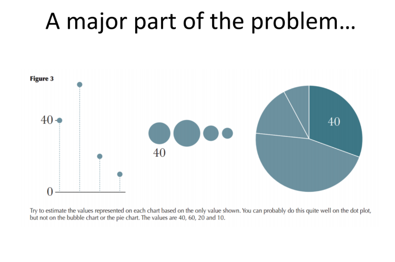
Decoration can be deceiving
无意义的展示方式造成了结论误判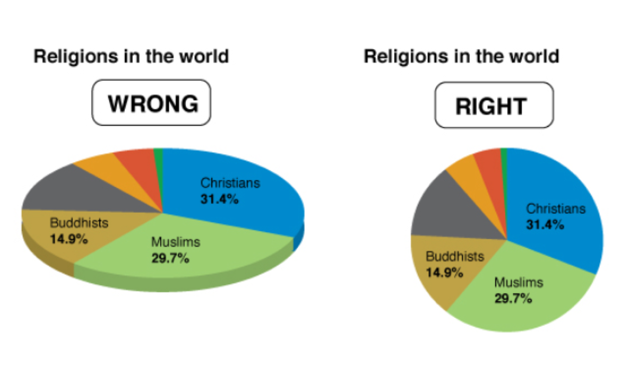
Famous Data Visualizations
Data is beautiful: 10 of the best data visualization examples from history to today
What Makes the Best Infographics So Convincing
Napoleon March Map
Information
- the number of Napoleon’s troops
- distance
- temperature
- the latitude and longitude
- direction of travel
- location relative to specific dates.
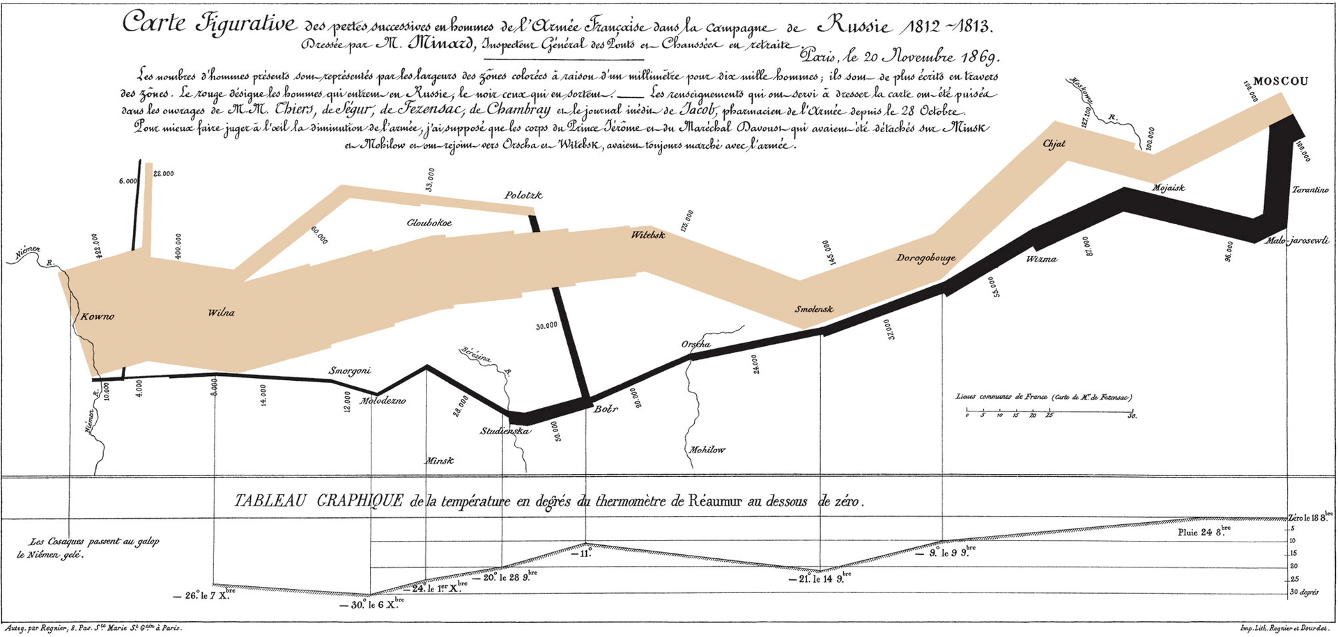
Visualization by: Charles Joseph Minard
Learn more: Wikipedia
In 1812, Napoleon marched to Moscow in order to conquer the city. It was a disaster: having started with around 470,000 soldiers, he returned with just 10,000. This chart tells the story of that campaign and has become one of the most famous visualizations of all time.
The map details the out-and-back journey of Napoleon’s troops. ==The width of the line represents the total number of soldiers and the color represents the direction (yellow for towards Moscow, black for the return trip). Below the central visualization is also a simple temperature line graph illustrating the rapidly dropping winter cold. It is effective, detailed, and paints a staggering picture of the journey’s devastation.==
Because of its fame, there is a lot of critical commentary about this chart (this post from Excelcharts.com is a good example). A lot of it is reasonable criticism, but this remains a hugely influential and successful chart, one which excels in telling a story with rich detail at each data point and encourages curiosity.
1854 Broad Street Cholera Outbreak Map
Information
- Small bar graphs at each house in London showing number of outbreaks that occurred there
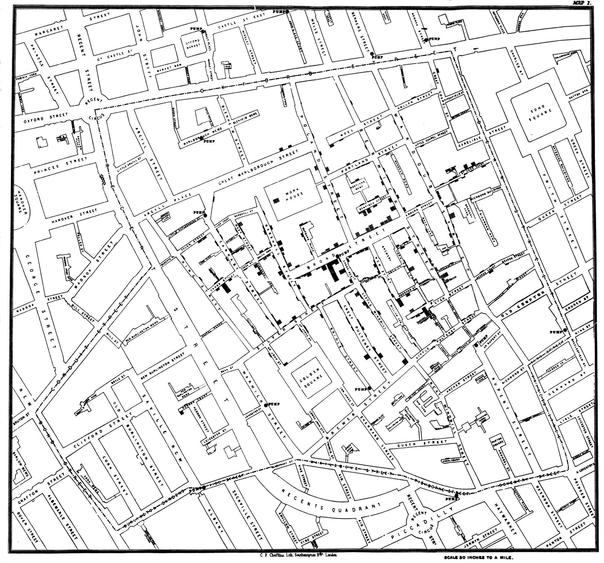
Visualization by: John Snow
Learn more: Wikipedia
The John Snow Cholera map (not the Game of Thrones’ Jon Snow) is essentially an early dot map visualization. It uses small bar graphs on city blocks to mark the number of cholera deaths at each household in a London neighborhood. ==The concentration and length of these bars show a specific collection of city blocks in an attempt to discover why the trend of deaths is higher than elsewhere.== The finding: the households that suffered the most from cholera were all using the same well for drinking water. At the time, this was a complete revelation. The well in question serviced an area with a high concentration of cholera outbreak—and that well had been contaminated by sewage. When applied to the wider trend of London cholera outbreaks, this finding helped trace a clearer line between the sickness and contaminated water wells. The solution to staving off cholera, then, was to build sewage systems and protect wells from contamination.
That’s why this is such a hugely successful visualization: it revealed a root cause problem and inspired a solution. Plus, in a time where dot maps and heat maps weren’t yet fully pioneered, this early attempt was incredibly innovative. The solution was only discovered because the analyst pushed the boundaries of visualization technique to create something useful and new.
Causes of Mortality in the Crimean War
Information
- Majority of deaths were actually caused by poor hospital practices (in grey).
- The shaded areas of the spiral charts show total deaths, and the darker shaded areas represent deaths due to combat.
- It is quick and easy to tell that something else was going on here, and on a large scale.
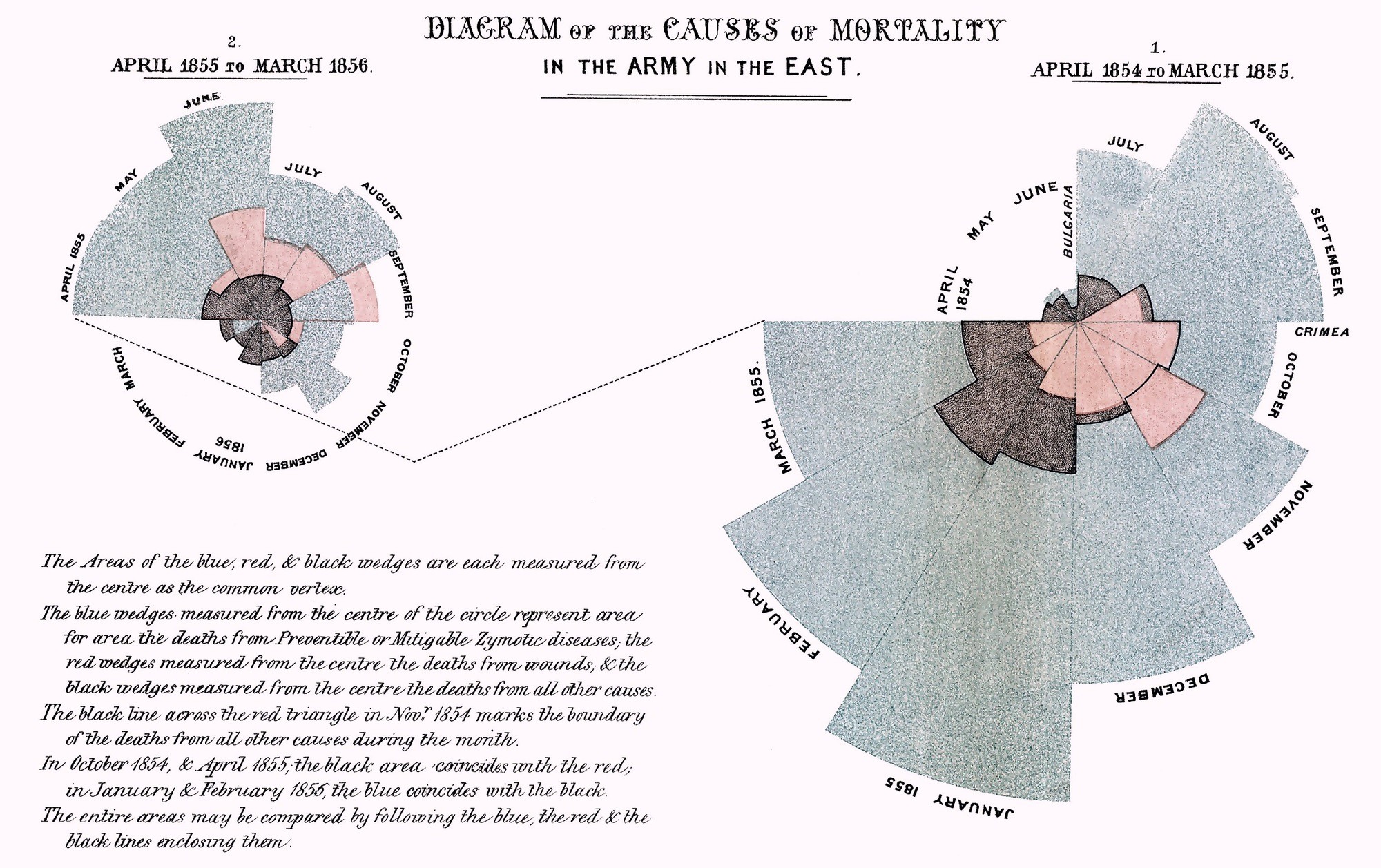
Visualization by: Florence Nightingale
Learn more: Wikipedia
During the Crimean War of the 1850s, soldier mortality rate was high and climbing. But not just because of the battles. Nurse, analyst, and data rockstar ==Florence Nightingale used this beautiful data visualization to reveal that the majority of deaths were actually caused by poor hospital practices. The shaded areas of the spiral charts show total deaths, and the darker shaded areas represent deaths due to combat.== It is quick and easy to tell that something else was going on here, and on a large scale. Nightingale’s medical expertise and hospital visits gave her insight to identify the bad medical conditions as the surprising and preventable cause of so much death.
The research was part of a Royal Commission looking into the causes of mortality of soldiers in the Crimean War. Nightingale worked with William Farr, a Victorian pioneer in statistics who did not support the idea of including visualizations, but Nightingale stood firm and advocated for this now-famed visualization.
New Chart of History
Information
- timeline that draws focus to the simultaneous existence and influence of major empires and cultures through history.
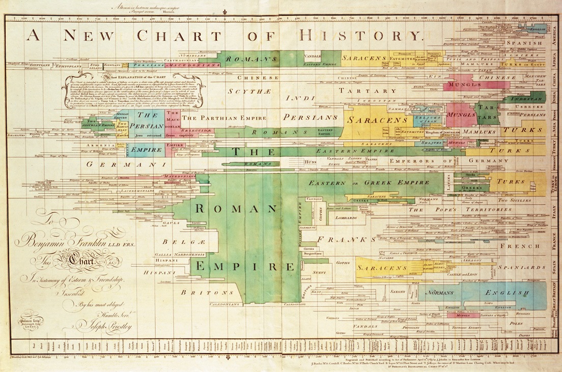
Visualization by: Joseph Priestley
Learn more: Wikipedia
Prolific and visual way to imagine the massive and complex timeline of recorded human civilization.
Joseph Priestly is well known for two timeline charts. The first is the Chart of Biography, which provided a 700-year timeline of famous men, leaders, and philosophers, and drew focus to which men were active in history at the same time. The Chart of Biography, as simple as it is, remains one of history’s most important visualizations.
His second timeline evolves the techniques in the Chart of Biography to create the New Chart of History. Similar to the first chart, this is a timeline that draws focus to the simultaneous existence and influence of major empires and cultures through history. Priestly innovates on his technique by introducing color, size, and a creative y-axis of location. The result is a fascinating visual story of history that speaks volumes. While it is a very visually busy chart, it is also endlessly creative and was an original and huge innovation at the time.
Interactive Government Budget
Information
- Key thing here is the fact that a major world power adopted interactive data visualization as way to communicate with taxpayers about where their tax dollars would go.
- This complicated and obscure topic was made accessible with a simple and clear visualization.
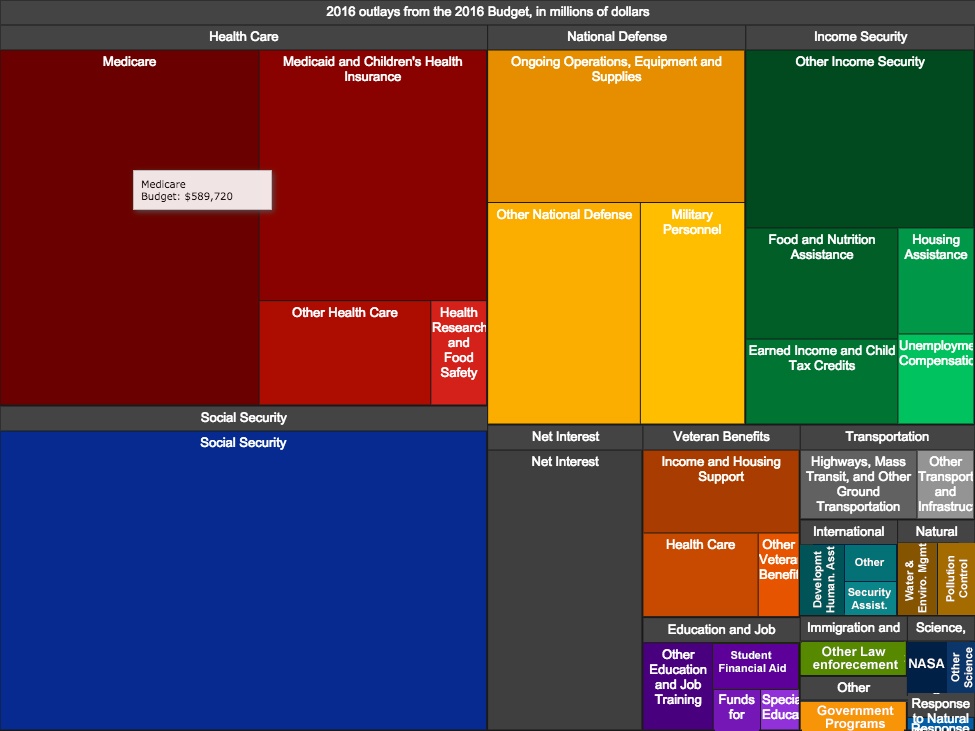
Visualization by: US Office of Management and Budget (2016)
Learn more: Obama White House Archives
All governments, and particularly the USA, have notoriously obscure and tough to understand government budgets. This treemap, created by The White House during Barack Obama’s presidency, visually broke down the United State’s 2016 the budget to put government programs in context. It’s unclear if this was the first ever interactive budget publicly published by the US government, but it remains archived and illuminating—even if it is a fairly basic treemap chart.
What makes this particular visualization so important is the delivery method. This isn’t the most innovative treemap, nor the most innovative interactive visualization, and it wasn’t the first widely-known visualization of a government budget (the New York Times had an incredible 2013 budget viz and candidate Ross Perot was well-known for his use of charts). The key thing here is the fact that a major world power adopted interactive data visualization as way to communicate with taxpayers about where their tax dollars would go. This complicated and obscure topic was made accessible with a simple and clear visualization.
After Babylon
Information
- Key thing here is the fact that a major world power adopted interactive data visualization as way to communicate with taxpayers about where their tax dollars would go.
- This complicated and obscure topic was made accessible with a simple and clear visualization.
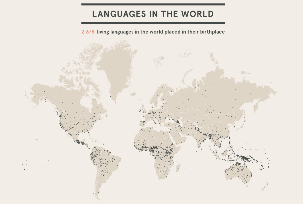
Visualization by: Density Design Lab
Learn more: After Babylon
Knowing the breadth of language proliferation is extremely tough-especially if you don’t travel or interact with other languages often. We know there are a lot of languages in the world, but it’s hard to internalize how many there actually are, where they are spoken, their prevalence across the globe, and how they influence each other.
DensityDesign’s After Babylon project presents the world’s languages in a collection of interactive maps and graphs using the World Atlas of Language Structures. All 2,678 languages are here, showing where they originate, where they are spoken, and populations of speakers. It even shows relationships between them, such as language families and loanwords, and exchange words between languages.
The Next US
Information

Visualization by: Pew Research Center
Learn more: Next America
Pew’s The Next US takes a comprehensive look at demographic data in the United States and brings it all together into a massive, interactive, beautiful data visualization project with several “chapters” of pointed visualizations (above is just one). This project displays things like growing diversity and interracial marriage trends, provides historical contexts to trend lines, and takes guesses at the projected demographic shifts and changes that the US might undergo in the coming decades.
One highlight is an animated age and gender demographic breakdown pyramid. In a few seconds, we can see how population demographics have shifted since the 1950s, with medical intervention and healthcare keeping people alive longer and birth rates decreasing after the post-WWII baby boom. As time progresses, the age pyramid turns into a rectangle.
Film Dialogue (broken down by gender)
Information
- It’s easy to notice the lack of female-led action movies, but it’s a whole other matter to visualize the absolute stark imbalance in gender representation for every genre.
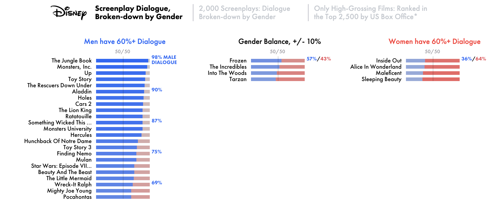
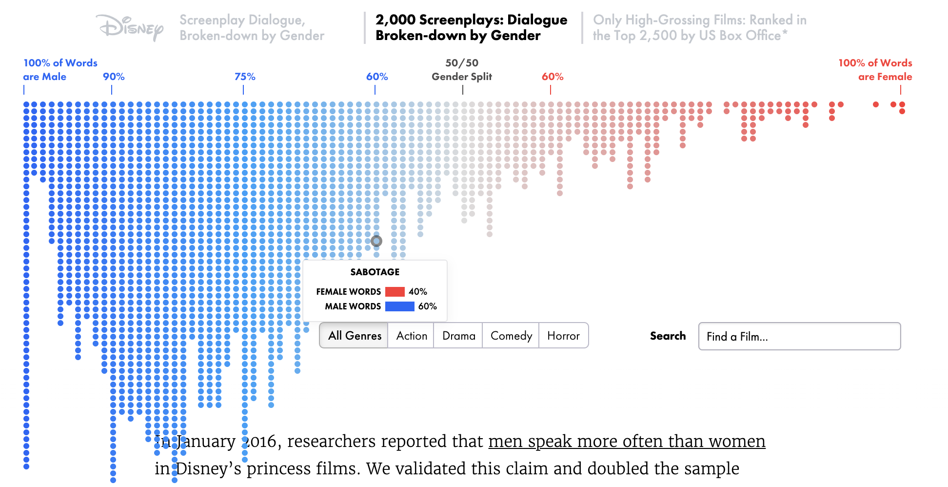
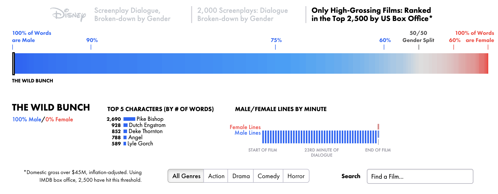
Visualization by: Hanah Anderson, Matt Daniels
Learn more: The Pudding
While Polygraph (aka The Pudding) is perhaps better known for a certain rap lyrics breakdown visualization, here Hanah Anderson and Matt Daniels visualize gender disparity in pop culture by breaking down the scripts for 2000 of the biggest movies in cinema history. Each movie tallies up spoken lines of dialogue for male and female characters and the findings are severe.
It’s easy to notice the lack of female-led action movies, but it’s a whole other matter to visualize the absolute stark imbalance in gender representation for every genre. This project hosts four main visualizations: a breakdown of Disney movies specifically, an overview of 2000 scripts, a simple gradient bar that allows the user to search for movies and explore a few key filters, and a brief look into the age biases shown towards male and female roles.
In addition to the impressive work of analyzing 2000 scripts and presenting the striking findings, this project is notable for its frank transparency: the data and methodology are public and detailed and are presented within the project itself. This kind of transparency is an incredibly welcome but slow-growing trend.
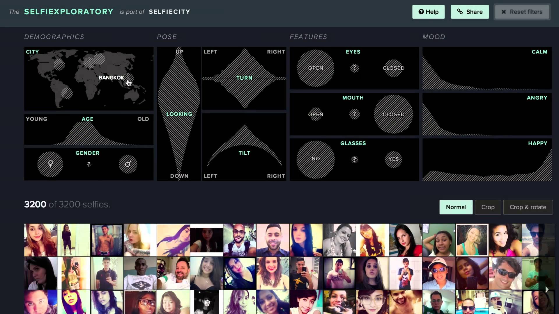
Selfiecity
Visualization by: OFFC
Learn more: Selfiecity
Don’t pass over this one just because it analyzes selfies instead of cholera prevention. Selfiecity presents a wide view of selfie data in the context of a transnational phenomenon. 120,000 selfies from around the world are analyzed to study how people take selfies. What’s incredible here is just how comprehensive the study is and how seriously it slices and dices every aspect of selfies. We can find trends in everything from head tilt or pose trends by city to smile frequency by age group and gender.
It probably won’t surprise you to learn that the selfie-takers tended to be young. But it may surprise you to learn that selfies aren’t as prevalent as is usually assumed, that women in Sao Paulo selfies favor an extreme head tilt compared to the rest of the world, and that Bangkok is all smiles. With social media influence becoming more ingrained in our lives, this is a fascinating look at a prolific global phenomenon. As a bonus, there’s an interactive element that allows users to apply filters in a unique way to further explore the world of selfies.
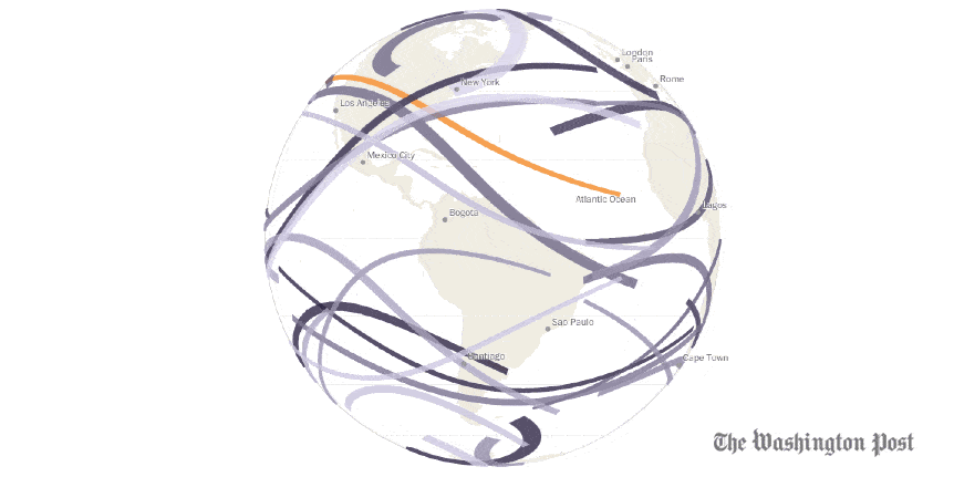
Every Upcoming Solar Eclipse (until 2080)
Visualization by: Denise Lu
Learn more: Washington Post
After the August 2017 solar eclipse, the first eclipse to travel from coast to coast over the US in nearly a century, the Washington Post created an interactive globe visualization showing the eclipse’s path, as well as all future eclipse paths until 2080.
The spinning globe shows paths of eclipse totality (the eclipse’s path where the sun is fully covered by the moon), where in the world they will occur, and when (time is denoted by light and dark shades, as well as hover text tooltips). If you put in your year of birth on the page, it will also tell you how many eclipses are left in your lifetime.
https://hbr.org/2014/04/what-makes-the-best-infographics-so-convincing


